“Thistle” – An Art Nouveau Inspired Drawing

I’ve spent some time over the last day or two looking at Art Nouveau flower designs. I was particularly fascinated by a thistle design.

This is my interpretation of the design drawn with Copic Multiliner SP pens (0.1, 0.25 and 0.5) on paper. Then, after scanning the drawing, I added colour digitally using Clip Studio Paint. So, this counts as ‘tradigital’ art!

I chose a simple colour palette; I was inspired by William Morris, the Arts and Crafts Movement and Art Nouveau. And, the colours are more mellow than is, perhaps, characteristic of my work.

The version on the left has just flat colours, no shade or highlight; I let the contour lines suggest volume. This is more true, I think, to the Arts and Crafts Movement and Art Nouveau.

To the version on the right, I added some shadows and highlights, but subtly for me. And even though they are subtle, they have a distinct effect, which surprised me.

These show just two of the many coloured backgrounds I tried out. This is why I love adding colour digitally! It’s so easy to try out different colour combinations, methods of adding colour, and so on.

Which version do you prefer?

I like them both, but I think the one on the right is my favourite; I like the stronger background colour which allows the flower to ‘pop’. I also think the subtle shadows and highlights do add a little something to it too.

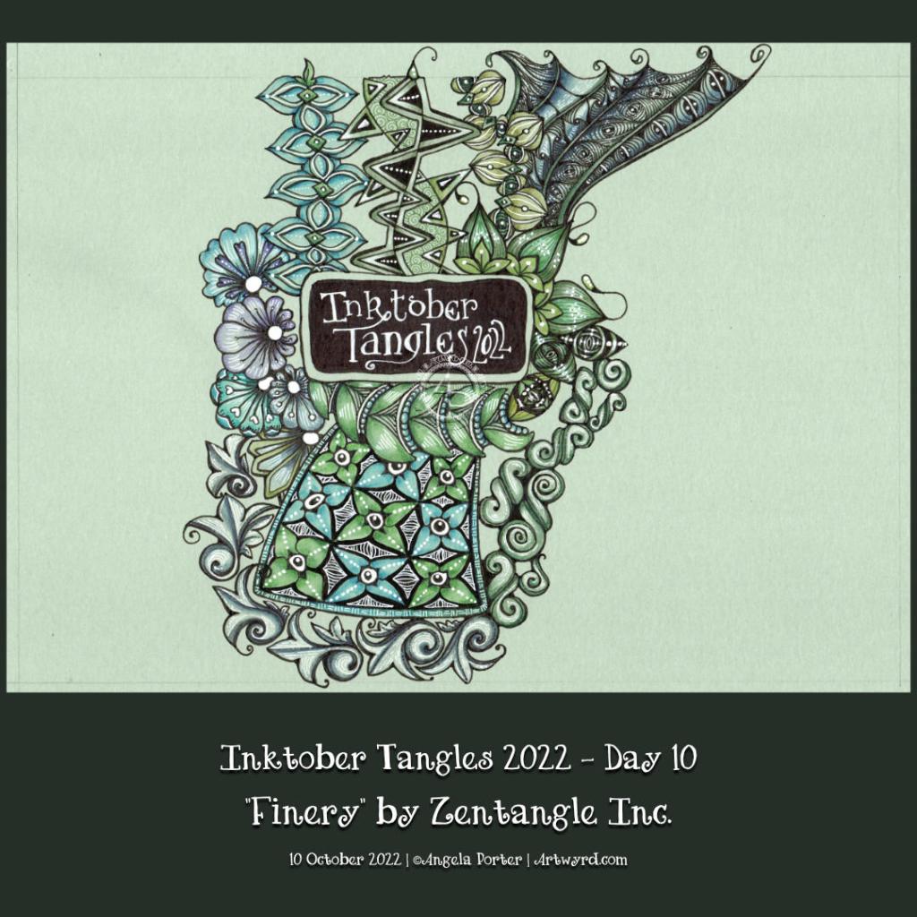
Inktober Tangles 2022, Day 10 “Finery”

It’s just one of them days…

I’m having one of those days, it seems. You know, the kind of day when you’re careless in deleting files, thinking that the video that’s processing is today’s. The reality is different. I managed to delete today’s video, and reprocess yesterday’s video as today’s!

I’m not going to repeat what I called myself when I discovered that… but at least I discovered what I’d done before I uploaded it to YouTube!

Inktober Tangles Day 10

I added ‘Finery‘ to the top right of my Inktober Tangles ‘sampler’ today, using its sections as a ‘reticulum’ to contain other patterns. To fill one part of Finery, I used Isea-u from day 3. I also used Well and B’tweed for two other sections. The last one is one that is a bit of a nod to one of the sections of ‘Souk‘, the tangle pattern for day 4.

I used Finery as a kind of reticulum (grid or net for a repeating pattern of fragments) as I, yet again, struggled with this tangle. I don’t know what it is about it, but I always mess it up somehow! However, if I hadn’t messed up this time, I may not have got the idea to fill the spaces with other tangles! So, it worked out fine(-ery) in the end!

It’s a shame I managed to send the file into the netherworlds of the recycling bin, never to be recovered or seen again. I realised my mistakes (yes, there were more than one!), but persevered saying that I had to trust I could recover from it(them). I think I did. As Adam Savage would say, I managed to ‘hide the crimes’!

William Morris Inspired Botanica

Click on this link to view the accompanying Draw With Me tutorial video on YouTube.

William Morris, one of the primary founders of the Arts and Crafts Movement, is one of my favourite artists. I love the ornate botanical and nature-inspired designs of quite stylised motifs. I also love the way that colour is used simply in them. That is definitely something I can learn from!

It can take a while for pennies to drop with me, and I don’t know how it has taken so long before I took a look at Morris’s work.

Like myself, Morris was inspired and influenced by Medieval manuscripts. That explains a lot!

I use some motifs from Morris’s designs in this drawing. I applied colour with chalk pastels to the pen drawings, with subtle white highlights from white charcoal. I’m quite happy with the result; I’ve not decided what to do about the background.

Where is this study going to take me? I don’t really know! But I know it’s going to be an interesting one. I’m particularly interested in how Morris used colour, and I hope that will make me comfortable with my own simple way of adding colour to my art.

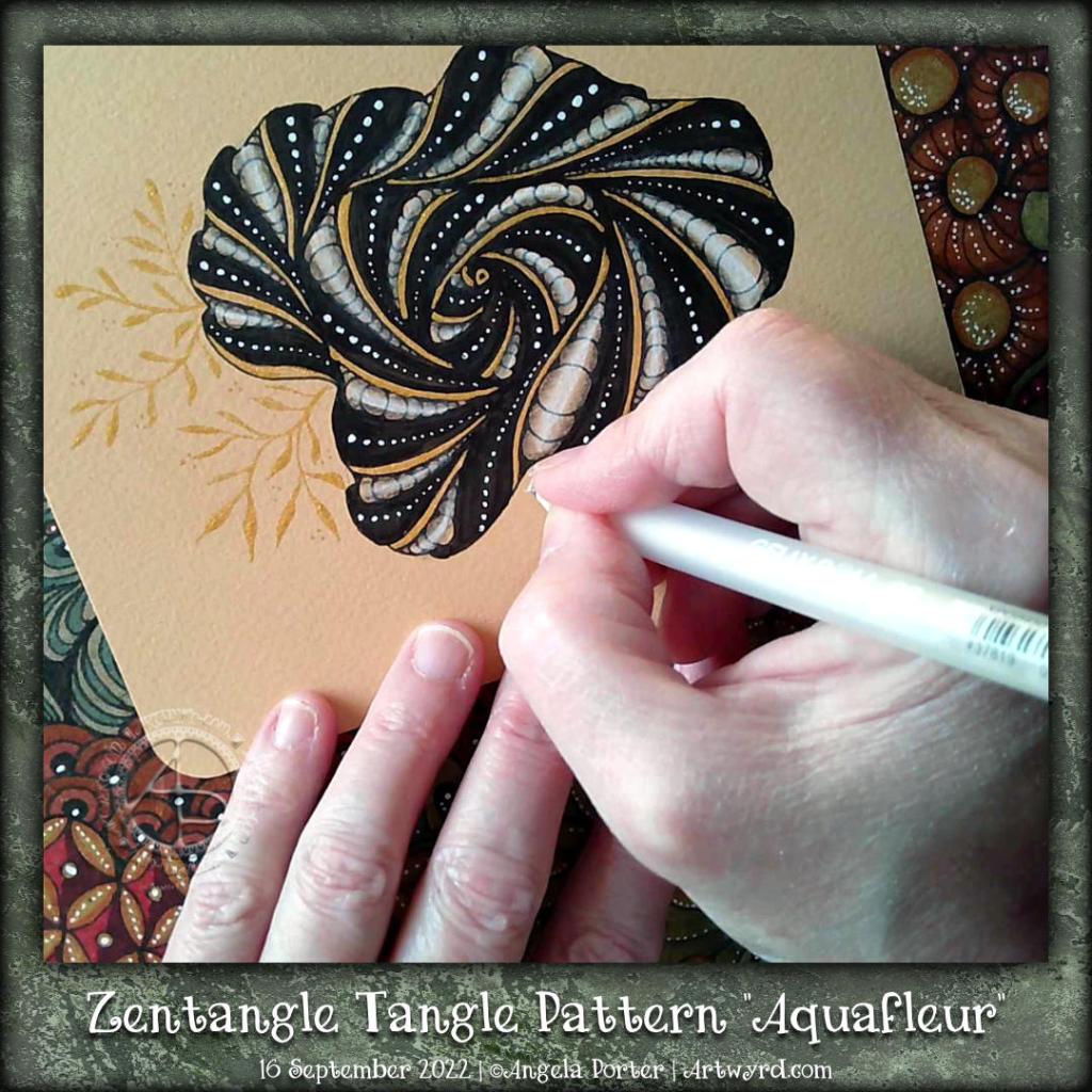
Zentangle Tangle Pattern “Aquafleur”

To watch the accompanying tutorial video on YouTube, just click on this link.

Aquafleur is a lovely, organic tangle pattern that creates layers as you draw. The result is reminiscent of a flower, coral, seashell or sea plant. It’s also a bold, high-contrast tangle with a lot of dimension. It’s not a tangle pattern I can remember tackling, and the version you see above is actually my second attempt! I misunderstood the Aquafleur deconstruction by Zentangle Inc.

Like most tangle patterns, Aquafleur is quite easy to construct once you’ve made sense of the pattern’s step out (deconstruction).

I used a graphite pencil and a paper stump to add shadow to the purks (nestled orbs). Highlights I added using white charcoal on the purks and a white Gellyroll on the black sections.

But this design needed something a bit more. So, I got a dip pen and a bottle of gold acrylic ink and added stripes of gold to the Aquafleur. Then, I added a few sprigs of golden leafy loveliness to the design and called it done.

I rather like how this has turned out. I particularly like the opulence of the gold against the very graphic black and white. I decided to leave this motif and the sprigs as they were, nothing else added to fill the piece of paper. I could add a drop shadow around the Aquafleur to lift it up. However, I like it just as it is!

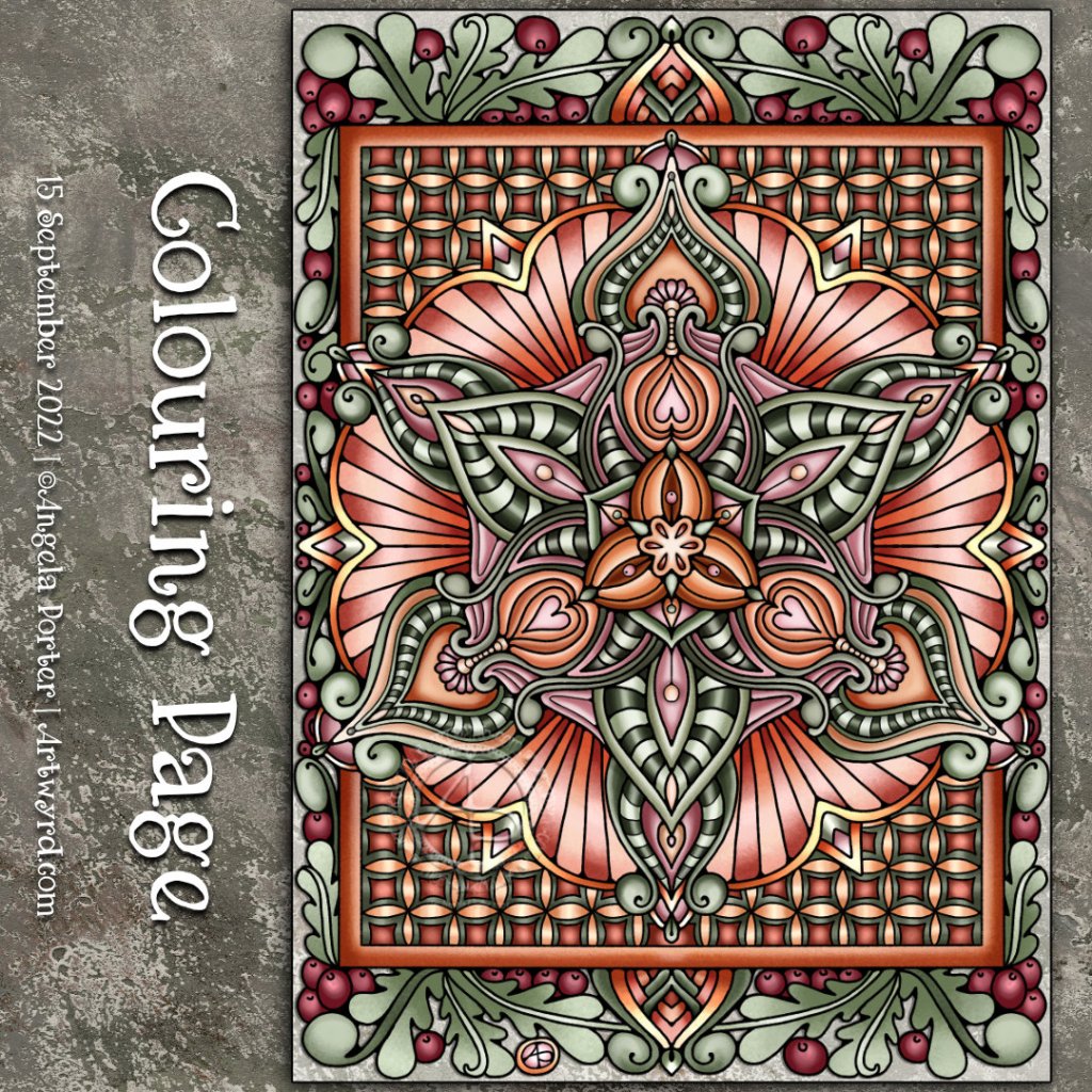
Template Thursyay!

Thursday is Template Thursyay! Most weeks, it’s the day I release a new colouring page exclusively to the members of Angela Porter’s Coloring Book Fans Facebook group.

This week, I’ve designed a mandala full of layers and patterns. I’ve chosen a limited colour palette of soft greens, pinks, reds, oranges and browns; a softer, calmer selection of colours that have that late summer, early autumn feel.

I love drawing mandalas. Seeing the repeating pattern building up is both fascinating and relaxing. Adding colour to bring out the layers and breathe life into the design is a magical process. I’ve not done much with high contrast to bring out the dimension today. Gentleness is the approach needed today both to my art and to myself.

I find it fascinating how my colour choices are often softer, more muted and in limited palettes nowadays. It does make a change from the riotous colours that I so often used not all that long ago, and still do when it comes to the more whimsical and cute colouring books that I create for Creative Haven.

Seeing how others choose to add colour to the colouring page designs I create is also endlessly fascinating and varied.

A flowy, abstract pen drawing.

Click on this link to view the accompanying YouTube Draw With Me tutorial video.

I was asked to look at the absolutely beautiful work by Angel_Draws on Instagram, use the work as inspiration, and explain how to create similar texture and volume.

I chose to use an extra fine Twisbi Eco fountain pen. The paper is Moss toned paper by Fabriano, which measures approximately 12.5cm square (approx 5″). For the shade, I used a Prismacolour Ebony graphite pencil. A General’s white charcoal pencil was my choice for the highlights.

I’ve had a go and done it my way, that’s for sure. I enjoyed creating lines that give the illusion of volume in the drawing. Adding shade and light really brought the appearance of folded space out.

It’s also complex, intricate, convoluted, and maelstrom-like, reminding me of roiling, billowing clouds. The textures of clouds are fascinating to me at this time. I’ve seen some amazing ones recently.

I’m not sure if this drawing is finished or whether I’ll add more of the frilly stuff around it. Only time and a good night’s sleep, or several, will tell!

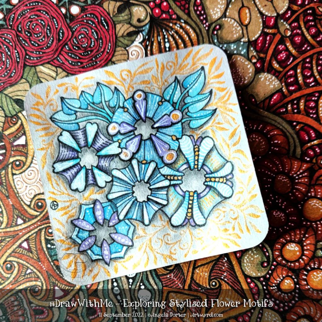
Exploring Stylised Flower Motifs

This morning I wanted to do something fairly simple, soothing and relaxing. So, I chose to look at some variations of a stylised flower motif.

The version I started with is in the centre bottom of the design.

I used various Distress Watercolour Pencils and a water brush to add colour.

The white and gold highlights and patterns were added using gold and white acrylic ink and a dip pen.

Finally, the more intense shade was added using a graphite pencil and a paper stump. I even put some graphite around the gold foliage surrounding the design.

Overall, I’m quite happy with this one. I like the mostly monochrome blue/teal colour scheme on the grey tile. I wasn’t sure bout the gold patterns, but now it’s finished, I think It’s turned out just fine.

Another Flowy Zentangle Inspired Pattern

In today’s video, I started drawing this design inspired by one by Doodlillusion on Instagram. I’d been asked to look at this one by a YouTube subscriber, so today I have.

I definitely used Doodlillusion’s art as inspiration, drawing it in my own way. I trust that I can show and explain how I approached this kind of pattern, along with some hints and tips and various ways of working with it.

I’m quite pleased with the end result. I like the graphic black and white. Something I need to consider more in my monogram and other explorations, maybe!

Rectangular Zentangle Fragment Explorations

Click on this link to view the accompanying video on YouTube.

This was a nice way to start my day! Exploring fragments and creating fragments is always a fascinating process. I never quite know what will come from my mind onto the paper. Some fragments work out, others don’t. Either way, it is still of value, even if just exercising hand-eye coordination, fine motor skills and the creativity ‘muscle’!

I can see some of these fragments working best as individual motifs. Others would work well in a reticulum – the zentangle name for a grid.

I still have quite a few rectangles to fill, so I will post them as a resource when that’s done.

Talking of resources… I now have quite a few sketchbooks and loose pages filled with explorations of fragments. I need to start organising them all so I can refer to them for inspiration. Or do I? I mean, it’s not a huge issue to just sit and do some of these fragments until I find one I’d like to use in a drawing. I worry about forgetting things, not using them or referring to them. Perhaps the value in all of this is to get a memory hoard of shapes and ways of putting patterns together, which can be drawn upon when needed.

Yes, a memory hoard, whether conscious or stored in the subconscious, is so important and trusting that all these things will be there, somewhere, ready to be used in different, unusual and even unique ways.

Entangled Drawing, 30 Aug ’22

I started this drawing in the wee small hours of the night when some night sweats woke me up. I’ve continued to work on it throughout the day as other things allowed me to.

I’m actually quite happy with this now it’s done. Along the way, I had some wobbly moments where I almost gave up. But I’m really glad I didn’t.

A friend thought it was rather ‘heraldic’ and expected to see a big letter in it! My next one will have a monogram as part of the design. It has a rather medieval feel and is typically Entangled with some Zentangle inspiration.

The drawing is approx 3.75″ x 7.5″ (10cm x 19cm) in size and was worked with a variety of fine liners, Arteza EverBlend markers and a white Gellyroll pen on All-Media paper by Seawhite of Brighton.