Little drawings

img_0564

Today, I’ve taken a bit of a break from drawing doodle art and played with Distress Oxides and other media.  The photo above shows just a couple of the small pieces of art I’ve created.

The top two are drawn on Strathmore Bristol paper with a vellum surface which was prepared with Distress Oxide inks brushed on using a stencil brush.  That worked really nicely!  I used a Faber-Castell Pitt Artists pen to draw the design on and then I used Inktense pencils to deepen colours and add shading, before adding just a few metallic highlights here and there.  I really enjoyed drawing these ones, and I have some more pieces of the inked paper ready to draw on – that’s the rest of my evening sorted then!

The bottom two are from some experimenting I did earlier in the day. Both were drawn using a Sakura Glaze pen.  I used Derwent Color Soft pencils to add colour to the design drawn on Kraft paper, and Inktense pencils with a damp brush on the other.

I also had some 3D Crystal Lacquer made by Sakura Hobby Craft arrive today, so I added dots of that to various elements in the bottom two to see what it’s like.

I have been trying out watercolouring with the Distress Oxides, and they end up with a finish that is similar to gouache.  I’m not sure I like using them in this way, however.

Distress Oxide Inks – my first play.

angela-porter20170217_0022

Today, I picked up the first 12 colours in the new Distress Oxide inks from my fabulous local art shop – Dandie Crafts. I’ve been looking forward to getting them since I saw them launched by Tim Holtz just prior to and during the Creativation 2017 craft show.

The above image is a typical ‘Angela-doodle’ drawn using Sakura Micron and UniBall UniPin pens on a background prepared using the new Distress Oxide inks.  Before I let you know what I think of them, here’s a little bit about them.

The Distress Oxide inks are designed by Tim Holtz and made by Ranger. This is the description of them from the Ranger website:

Tim Holtz Distress Oxide Ink Pads are water-reactive dye & pigment ink fusion that creates and oxidized effect when sprayed with water. Use with stamps, stencils, and direct to surface. Blend using Ink Blending Tools and Foam. Re-ink using Distress Oxide Reinkers.

My first job on opening my ink pads was to test them out on different papers so I gained an idea of the colours they’d be, as well as how they react with water.  To create these test swatches I stamped two ‘feathers’ with each colour on the paper/card.  I then used an ink blending tool to smear some colour onto the paper.  Next, I used a wet paintbrush to add water to the second feather before swiping the paintbrush across the smear and adding droplets of water to it.

Here’s the inks on watercolour paper:

angela-porter20170217_0019

Secondly,  here they are on Kraft card:

angela-porter20170217_0020

Finally, I made test swatches on black paper:

angela-porter20170217_0021

The first thing I noticed was how easy it was to stamp with the Distress Oxide inks.  The original Distress Inks tend to stamp ‘blotchy’ – that’s the nature of them though!  These, because of the pigment portion of the formulation, stamp with a more solid line.  Not only that, the Distress Oxide inks are much more opaque than Distress Inks.

Blending the Distress Oxide inks using a mini Smoothie blending sponge by Crafter’s Companion was an absolute dream!  The inks went on so smoothly and, because they stay wetter for longer than Distress inks.  Admittedly, I may not have picked the best paper for applying the Distress Oxide inks to, and there was some unevenness in the blend/smear, but it was much better than I’d manage to get with Distress Inks, unless I used a stencil brush to apply the Distress Inks very thinly and build the layers up.

I don’t think I let the inks dry for long enough before adding water as I did note that some of the pigment moved when I brushed the feather with a wet brush, and the smear.  That may be because I used a brush rather than using a spray bottle to mist water on them.

It took longer for the Oxide effect to develop as I’d added more water than a misting would have, but the colours kind of soften on the white watercolour paper, and brighten on the Kraft and black papers.  The opacity of the pigment ink is increased by the addition of water, and the colours really seem to glow.

I then just had to go and create a background using the Distress Oxide inks.  I used mini ink blending tools this time, and I used Strathmore Bristol paper with a vellum surface.  The inks didn’t want to blend all that smoothly on this surface, however I wasn’t really too concerned as I just wanted a background to draw on.  When I was happy with the colour blend, I did mist the surface with water to bring up the Oxide effect, as well as to have a few small water splatters on the surface.

The Distress Oxide colours are much more ‘me’ than the original Distress Inks. They’re so creamy and rich in colour thanks to the pigment part.  I also love the suede-like feel that results after a light misting with water.

I’m really happy with these new inks and I look forward to experimenting with them more.  I plan to use them like watercolour paints, I want to try using stencil brushes with them to blend the colours out, and no doubt I’ll find other ways to make colourful backgrounds for me to draw upon.

Drawing with colour…

I’ve been taking a little break today from the doodle art I’ve been doing lately, and the above is the result of a couple of pleasant hours this evening.

The image on the left has been drawn with Caran D’Ache Supracolour Soft watercolour pencils and a brush and water has been used to blend the colours.

On the right, I’ve used Derwent’s Inktense pencils, again with water and a brush to blend out the colours.

In each case, no sketch was made before drawing; I used the colours to create the patterns as I went.  So, I’ve been ‘doodling’, but in a different way to usual!

Time to Talk day, Hirameki fun and a partly coloured doodleedoo.

Time to Talk 2017

Yesterday was Time to Talk day; a day with the focus on encouraging people to talk, especially about mental health in order to help to end the stigma and discrimination that people with mental illness experience.  Many celebrities and organisations supported this day, which is brilliant!

I’m a champion for Time to Change Wales.  This means I volunteer to go to events, businesses and organisations to encourage people to talk about mental health, as well as to tell my story of my mental health problems and the stigma and discrimination I’ve faced, as well as the help and understanding I’ve been given and the little things that employers did that helped me to remain in teaching for as long as I did.

It was quite appropriate that the first time I went to tell my story was on Time to Talk day!  I went to Remploy in Pontypridd and talked to both the employees and some of their service users.  Bev from Time to Change Wales was there to support me the first time I did this.

Getting the powerpoint presentation sorted was a major job for me and showed me how much my concentration has been affected by my extended bouts of anxiety/depression in the past few years.  It took me forever to add just five slides to the presentation!

Telling my story was easy, yet at the same time it was difficult.  It opened up some sores, brought back things I thought I’d left behind when I left teaching, and had me in tears at some points, which resulted in me making some self-stigmatising statments such as ‘sorry, I’m being stupid with these tears’ and then saying that was self-stigmatising.

I got through it.  Bev, the longest serving champion who’s done over 100 anti-stigma talks, said I did well.  People thanked me for sharing my story.

It was a good thing to do.

I came home emotionally drained and well out of sorts though.  I’m feeling a bit more me today, but still drained.  It was still worth it, still a good thing to do, especially if it gave one person what they needed to get the help or to talk about mental health themselves.

Arty goings on

One of the things I do to help re-balance me when I’ve been drained/overly emotional/triggered as I was yesterday is to have a nap.  The other thing is to do art.

Art has been my great source of solace and peace for me during my worst times, and it continues to be so.

I partly coloured in a doodle-type drawing, using my Copic markers this time.

After the talk yesterday, I had a wander to Churchill’s stationery in Pontypridd to pick up some art supplies.  There, I found a little book called Hirameki:Draw what you see by Peng and Hu.

“In the beginning was the blot.

A flash of inspiration, a light bulb moment, a stroke of genius…

With just a few strokes of the pen and a dash of your imagination hirameki gives a sublime and unexpected sense of satisfaction and delights the hand, eye and mind.  The little blot will reveal its true self.

Hirameki: pleasure from the smallest things.”

From ‘Hirameki: Draw What You See’ by Peng and Hu.

So, I had to have a go at this!  Here’s my first go at it…

I had a lot of fun, both making the blobs of colour and then trying to let my imagination run free.  I found out, however, that my imagination isn’t what I thought it was, or that it is rusty and out of use.  I will persevere, however, as there are some characters/objects there that I can make use of in my doodly style of art!  They’ll be added to my visual vocabulary/library in my zibaldone.

Today’s doodle

Me and people … it’s kind of a ‘meh’ thing.  I try … and it’s never right.  All the same, here’s today’s doodle, with a kind of fairy/angel person in the middle…

angela-porter20170130_018small

Today’s doodle

I’ve had a couple of days busy with other matters and not much time to spend on drawing.  Today, however, I’ve taken the time to relax with pen and paper.  I’m feeling a bit out of sorts today.  I think that’s reflected in the drawing.

angela-porter20170125_011small

Sunday morning ‘doodle’

Having fun, but I think I’ll do something a little different later on today.

Oh, I finally got round to figuring out a ‘doodle’ cuttlefish, which makes me quite happy!  The badger also makes an appearance, along with a koala, pig, panda and monkey.  A fairy cat just adds to the whimsy.  My morning mug of tea is there too!

angela-porter20170122_009small

This mornings doodle all coloured.

Coloured using Chameleon Pens.

angela-porter20170121_008small

How I spent the last three days…

I have to admit that I, like so very many others, spent the Christmas period alone (except for a couple of hours playing Trivial Pursuit at my little sisters on Christmas night).  It’s not the first Christmas that this has happened, but it’s one in a very long succession of solitary Christmases.

I feel the pressure from society and the media greatly at this time of the year; the pressure to be in a happy family, showered with gifts and food and company and loving intimacy.

The image we’re sold that we can’t possibly be happy unless we’re part of a big, loving, happy family and in a meaningful, happy, loving relationship is a trigger point for my mood, for unlocking the kennel of the black dog that can nip at my heels all too often.

This year, though, I’m happy to say that the black dog didn’t visit as often or as long as it has in the past many, many years.  Oh, I’ve had my moments, but I’ve survived better than I have for a very long time, most probably 20 years or so.

What helped is indulging myself in my coping strategies – creating art, making music, reading, cat cuddling and generally being creative (which currently means knitting baby blankets for my neice who is expecting twins in 3 to 4 months time).  Also, avoiding social media – facebook especially – has helped too.

Reminding myself that I’m not at the point in my healing journey from the cptsd (complex post traumatic stress disorder) that I experience that I feel able to have healthy relationships has also helped.  It’s a work in progress, the healing that is.

Another sign of my recovery from the trials and tribulations of the cptsd that I experience is that I made a little effort to add some ‘decorations’ for the Winter Solstice/Yule/Christmas season, which include a trio of small, knitted christmas trees, which kept me a little occupied in the days/weeks leading up to this time, as well as knitting and needle felting some bacteria and viruses for a pharmacist I met at an event I attended as a Time to Change Wales champion.

So, now the next event that can cause the black dog to find some strength is New Year’s Eve…

…which I can survive by using my super-power of being creative to help me cope.

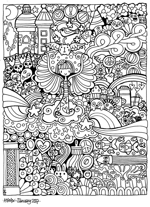
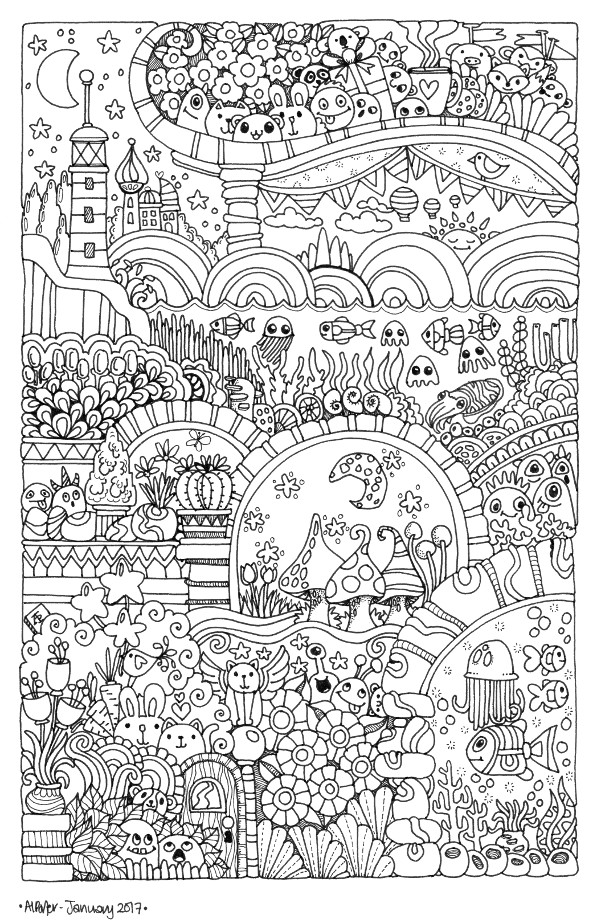
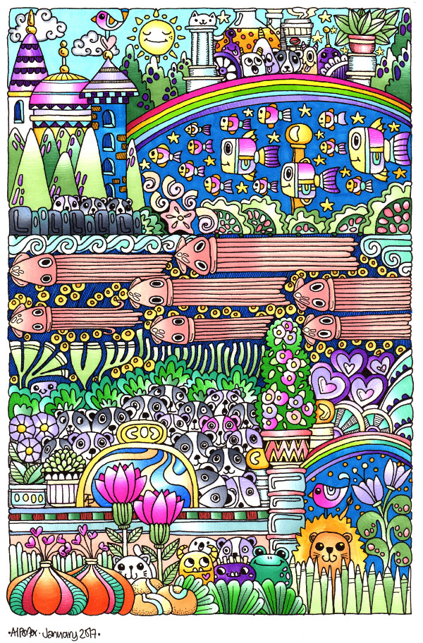
The piece of art above has been done over the past 3 days.  The black outlines were drawn first, followed by a base layer of Ranger’s Distress Inks applied with Clarity Stencil brushes.

I then used the Distress Inks as watercolours to intensify the colours in various places as well as to add the colour to the berries/seeds/buds.

Next, I used Cosmic Shimmer’s Iridescent Watercolour paints to add some shimmer in large areas, before adding detailed patterns using coloured pencils (I chose to use my Mitsubishi Uni Pencils for this).

Finally, I added metallic and ‘glittery’ sparkle using Sakura’s Gold Gelly Roll Metallic pen and a Clear Star Gelly Roll pen.

I was rather restrained for me by leaving areas just coloured, not embellished to high heaven and back! The areas I have added texture/pattern to stand out more and it’s not quite so overwhelming.

This could mean my artistic skills are maturing a little.

The most important thing, however, is that I enjoyed the process of creating this large (for me) piece of art. The paper I used is A3 in size, and the drawing is approx 9.5″ x 14.5″.

When I finally figure out how to price my art (any one wishing to offer help/advice/suggestions on this, then it will be gratefully recieved) I may put it up for sale on Etsy.

A little colouring break

I’ve been busy with black and white line art over the past few days.  Seeing so many people colouring artwork in with gay abandon had me hankering for my Polychromos coloured pencils, paper stumps and blending fluid for a while this evening.  I drew some designs just for my own personal fun over the weekend and decided to add colour to one of them.  Below is the result, the work in progress.

It could take a while to get finished as I have so much line art to do, which is great for me.  It is therapeutic, soothing, healing for me and that is just what I need at this point in life.

AngelaPorter_Artwyrd_Otherworldy_0001One thing I could do with an answer to is why do scanners always wash out the colours I have used?  I have a Brother A3 printer/scanner, which is great as I’m tending towards using larger paper these days, but try as I might I can’t seem to stop the color washout.

If anyone can give me any advice, help or instructions then that would be grand!