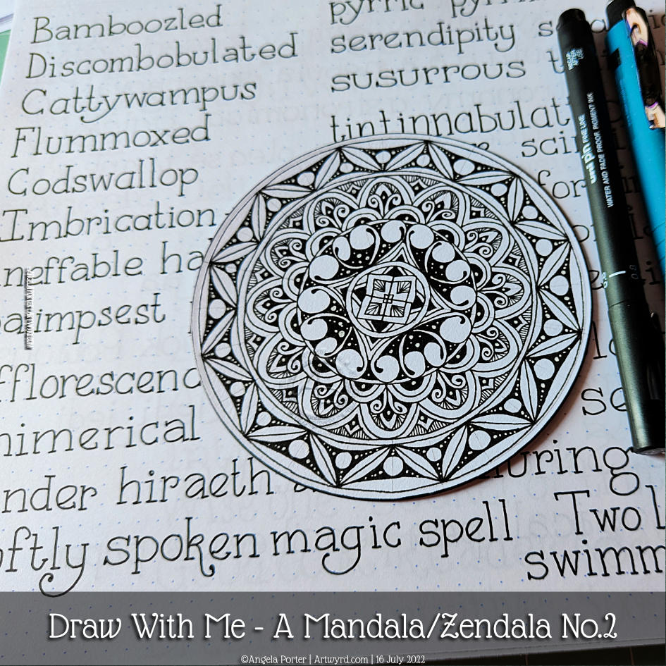
Just enough time before the heat has become uncomfortable to layout a mandala grid and complete the central motif. This was a lovely way to spend a wee bit of time this morning.
The video takes you through, one step at a time, how I got this far.
Now, it’s just about time for me to move myself to a cooler part of my home for the rest of this heat-scorched day.
Please click the ‘Watch on YouTube” button, if you’d be so kind. Cheers!
In this video, I draw a mandala (or zendala) step by step so you can join in with me.
I enjoyed creating yesterday’s mandalaso much, that I thought I’d repeat the experience! I finished drawing the mandala in this video, but I’ve yet to add shadow, highlight and/or colour. I’m not quite sure how I’m going to do that, yet; but there’s no rush to get it done either.
And here’s a photo of the mandala as it is at the moment, with some of my handlettering practice in the background!
This week’s colouring page (or template) is a rambling one, full of clusters of botanical motifs. There is no right way up for this design, despite me having included my initials somewhere.
I’ve gone for fairly pastel colours for this design, but the possibilities for colour palettes are endless.
If you’d like to download and print the colouring page, you need to visit and join the Angela Porter’s Coloring Book Fans Facebook group. It’s totally free to join and the template is free to download too.
My latest page in my lettering sketchbook. I’m still working on finding how lettering can work for me. It seems that these kinds of letters are something I keep circling back to.
All drawn with various fineliners and some coloured with Arteza Everblend markers. Some highlight dots of white gel pen too.
The past couple of days have seen me creating videos that go in a slightly different direction to my usual.
Yesterday’s YouTube video was a look at using and blending coloured pencils – not a skill I’m great at, especially when it comes to choosing colours.
I carried on experimenting with my drawing and trying out various media either alone or in various combinations – coloured pencils, Inktense, and/or graphite. I quite like the way graphite dirties up the colours and creates an almost metallic feeling. Not a shiny metallic, but a dull kind of one.
Today’s video was a response to a comment left for me on YouTube about fineliners smearing with alcohol markers. So, I thought I’d do a look at some of the various fineliners I have, the tricks I use to avoid this, and a bit more about achieving contrast, volume and blending markers.
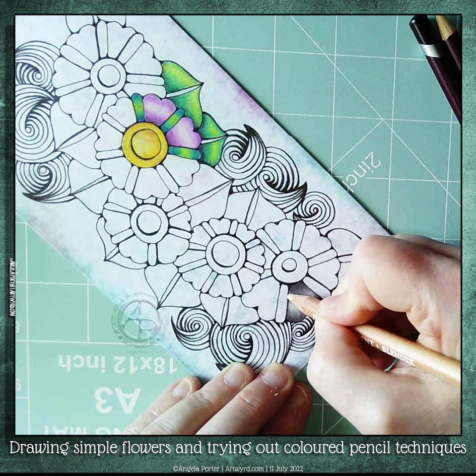
One of my YouTube subscribers (Chen Keith) requested I draw some simple flowers and show how I’d use coloured pencils to colour and add contrast.
Drawing, not a problem! Colouring? Yeuch colour choices! But I do show different approaches I use to adding colour with coloured pencils, or rather what I’ve done in the past. I rarely ever used coloured pencils now. Digital coloring or marker pens are my mediums of choice, with Inktense and the Karin Brush Markers close behind.
While the video was uploading and processing, I did try out other ways of adding colour and/or contrast. It’s way too hot here in the Valleys of South Wales for me to think clearly and explain things at the moment. The heat is making me feel very, very tired.
Drawing Zentangle Tangle Patterns Spoolies and Swerve and adding contrast/colour.
What to do on a Sunday morning? Arty things of course!
So, yesterday I drew the design to the right and added some colour to it. But it was lacking something. I eventually worked out, at around the same time someone made a suggestion on my YouTube video, that it needed more contrast.
So, I set about doing just that, as well as showing/explaining how I add weight to lines to help increase the contrast and sense of volume. That’s what the greyscale drawing is all about.
For the other one, I used sepia and red oxide Inktense pencils and a damp brush to add more colour and increase contrast. I made some bad decisions in adding cross-hatching to some of the elements of that design. But that meant it was a great piece to work on improving my skills.
I’m often way too timid with contrast, at the start. But as long as I use a medium that allows me to gradually build up layers, I eventually get there.
Today’s video shows how I achieved this higher contrast finish with both line weight and colour/shadow, and you can watch it by clicking on this link.
Last night when I arrived home after an absolutely visit with a dear friend, I found the postman had delivered a set of mini Distress Ink pads in the new colours released last year! It was way too late to do anything with the inks, so I decided I’d have a look at them in today’s video for YouTube.
I started by trying blends of the colours. My instincts were not to mix the salmony pink Saltwater Taffy with the other colours – Villanous Violet, Blue Ribbon and Salvaged Patina. Orangey tones with purple, blue and/or pale green-turquoise colour, would make mud, my instincts told me.
However, when I used them all for one background, I was really surprised by the colours that resulted. They were lovely! No mud! Just lovely, aged, vintage-ish colours. What a wonderful surprise!
After spraying water to create water stains, stencilling and another spray of water drops (drying in between each procedure), I edged each paper with Hickory Smoke. Then, it was time to draw!
I used an 0.1 and 0.3 Molotow fineliner pens for drawing. They’re new to me and so was keen to try them out. The ink is lovely! But, I found the pens rather light and awkward to hold. The natural place to rest my fingers was way too high up the pen to be comfortable.
I’ll use the pens until the nibs are wrecked or they run out of ink, whichever comes first. The ink is very black and very opaque. The nibs do write really smoothly on the paper I used. But, they’re just not comfortable for me to hold, and that comes down to personal preference! Otherwise, they really do seem to be great pens!
I started drawing with the tangle pattern ‘spoolies’ to the left. This is where I noticed how the grip I had on the pen was uncomfortable and making it really difficult for me to draw smooth, precise lines. I ended up doing a mash-up of spoolies and diva dance!
The pointy leaves (or shark fins or points of crescent moons, depending on how you want to see them) actually echo the pointed part of spoolies. These then were replaced by the tangle pattern swirl, which is very similar to spoolies. Finally, the pointy leaves/fins/horns of the moon returned.
As I wanted to lift these off the background, I used a crosshatch pattern to darken the spaces between them.
Then, in my not-so-clever wisdom, I decided to help the illusion of volume and layers along by adding colour using Distress Inks as watercolour inks or paints.
I’m not at all sure about the end result, which wasn’t helped as I decided to splatter gold paint over it.
I often ask myself what on earth was I thinking and will I ever learn. This is another of those occasions. I kept compounding the problem as I tried seemingly good ideas.
As I said, I wonder if I’ll ever learn …
No matter what, it was lovely to be sat drawing just for enjoyment. Even though I’m not happy with the end result, I learned a lot about these new-to-me Distress Ink colours. Also, I’ve learned that a spray of water really can make the background lovely. And it’s OK to repeat sprays as more colour or stencilling or edging colours are added.
But perhaps the most important thing is that sometimes the process, the enjoyment of creating and learning is more important than an end piece that I’m happy with. Perhaps, in the coming hours, days, weeks or months, I’ll be able to look at this with fresh eyes and see it as not as bad as I know think it is!
Mandalas are mesmerising to me. There is something so soothing about their rhythmic, symmetrical design. Creating volume in the design is always part of the fun! Choosing colours is always a bit tricky for me, however. So today I’ve gone with golds, yellowy greens and turquoise blues. A fairly analogous colour scheme, which means the colours will always work together.
I’ve not finished colouring the mandala, and it’s likely to sit unfinished somewhere on my hard drive. But it’s fulfilled its purpose of making me smile; a contented half-smile that is accompanied by a soft, warm, glow in my heart. That’s such a lovely feeling, and it took me many years of EMDR therapy to discover what contentment was. That glow, my touchstone of contentment, is always there. I can sense it even when the dark storm clouds of some emotional upset gather. It’s like a gently glowing lantern that leads me on through the storm back to contentment. It’s an amazing thing for sure!
This was just some fun! I had no idea where the drawings would lead … but drunken party skulls, mushrooms and tentacles seem to be the theme of the day! It’s nowhere near finished yet, but something fun for me to do later today, after I run an errand.
There is a video of me drawing this as far as it’s gone.