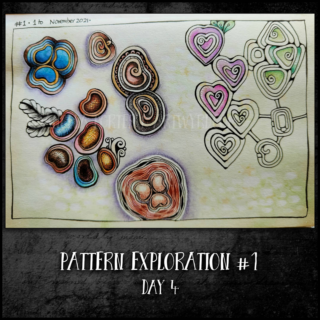
The sketchbook page for pattern 1 is filling up nicely! Some more variations added today. The pinky-purple and greens look nice together, adding a kind of playful feel to the drawing added today. Joining the motifs in a Morrisseau tangle pattern way also adds interest and plenty of spaces that may be begging for colour and/or patterns! Who knows what tomorrow will bring.
Here’s the video/vlog that shows the addition of the next bits and pieces of this page.
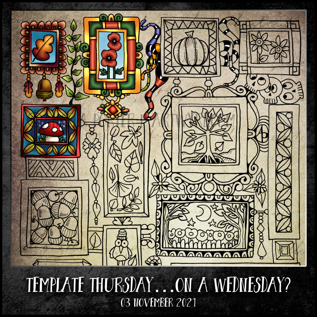
Sample is quite an apt word as this drawing does remind me a bit of an embroidery sampler. It’s been a while since I last designed one of these, and it’s always fun to do.
This kind of sampler template is perfect if you get overwhelmed by the thought of completing a full sized, intricate template. As this one is split up into small sections for you, you can spend as much, or as little, time as you wish adding colour.
Then, I turned my attention to drawing this week’s template for the Angela Porter’s Coloring Book Fans facebook group. I did video the process, but realised close to the end of the drawing I’d mostly worked out of view of the camera. Duh! I got so engrossed I forgot to check the part of the page I was working on was in frame.
Members of the facebook group suggested things to include in the template. I’ve included a fair number of them, but others will have to be included in future templates.
This was a really fun drawing to do. I pushed past the various points where I wasn’t sure about what I was drawing. The end result is something I’m quite happy with.
I’ve been awake since before 5am, UK time. It’s now nearly half past midday (UK time again!) and I’m so tired! I think a nap is in order very soon.
Inktober Tangles 2021 Day 23 “Ple-A” by Apple Lim CZT
This was a new tangle to me, but not any more!
It took a while for me to understand it’s basic structure. Then, it was experimenting with it to fill (mostly) a page of my A5 sketchbook with just a few possibilities.
I did start adding shadow and highlight, but went on to focus on patterns in both black and colour. I may return to add those shadows and highlights to increase the illusion of volume.
Sketchbook Saturday – My week in art
It took nearly an hour for me to look back on my week in art. I didn’t think I’d done this much as I’d been unwell for a few days and needed to sleep a lot.
In the video, I share with you my observations, reflections and lessons from all of this work.
This is an absolutely lovely tangle. Curves that are interwoven. Those delightful c-shaped arcs that create fan shapes that remind me of ginko leaves. The finished tangles remind me so much of medieval brooches.
It took me a little while to work out how the placement of the starting grid influences the final shape of the pattern. That was an interesting way to give my analytical mind a bit of a work out.
I did struggle finding different ways to complete the design, though I have started on a second page in my sketchbook just for this tangle. I also haven’t tried turning it into a border or repeating pattern…yet. As much of my signature art includes motifs rather than patterns, it’ll be a really useful pattern going forward I think.
Ing by Zentangle Inc
This is a rather angular pattern, which are not my favourite types. About the only thing that can be done with Ink is to fill the triangular spaces with patterns. That’s what I chose to do, not sticking to one pattern on each ‘ing’, but different ones to see how they worked (or didn’t) in the spaces.
I did, however, try to use a wavy line rather than a zig zag as the foundation of the pattern. It actually worked out, which surprised me. Whereas the zig-zag ing can look like folded paper, the sinuous version is much more like a ribbon, depending on the patterns that are placed in the sections.
I took this pattern as an opportunity to work on shading and highlight. I could kick myself with the lines of gel pen I used as stark highlights on this page. Goodness knows what I was thinking! Most probably not thinking is the more correct statement. Still, it’s only by doing can I learn, eventually, about what works and what doesn’t for me.
Some reflections…
I’m surprised how much I’m enjoying drawing the patterns much bigger than I would usually do. Despite my reticence about using other patterns to fill spaces, I think I’m learning that it just depends on what pattern you choose to fill the space.
In the ING wavy variation, I really like the nested tear-drops towards the bottom of the pattern. They really seen to give a lot of volume to that part of the design. I’m sure I could use nested triangles in the ziggy-zaggy version. However, I’m not sure the effect would be quite as dramatic.
Previously, I’ve used my finger to smudge white Gelly roll lines, which gives a softer edged highlight that is brighter than white charcoal. Today, I didn’t do that. I wish I had, or at least used broken lines or dotty lines.
Surprisingly, I’m using a 2B pencil more and more for shading. Today, I didn’t seem to have that ‘it looks grimy and I don’t like it’ thought. Maybe it’s just my mood today that appreciates that kind of shading. It’s certainly useful for adding shadow around motifs/patterns if nothing else.
This week’s template has a bit of everything that is ‘Angela’ in style. Entangled art, Zentangle patterns, florals and botanicals, cute and whimsical. Something for everyone. The template is available to members of the Angela Porter’s Coloring Book Fans facebook group.
Unusually, it’s in landscape format, and a strange set of dimensions too. I can only say I wasn’t feeling too well yesterday – upset digestive system, extremely tired. That meant I didn’t pay much attention to the size of the paper I decided to draw upon.
I am feeling somewhat better today, but still incredibly tired after another disturbed night with an upset tummy.
I know I’ll be getting my sketchbook page for Inktober Tangles 2021 Day 14 done after I’ve had a very late breakfast. I’ll post that later in the day.
This morning, I recorded drawing the final part of the template. I did some drawing yesterday evening, but didn’t record it, so there is a gap in the process. Here it is:
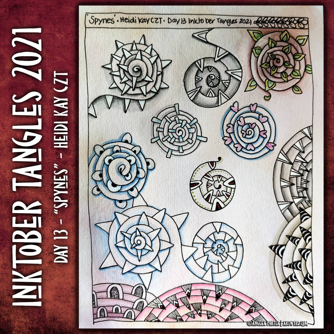
I love spirals, I really do. They tend to feature a lot in my abstract drawings. So, “Spynes”, by Heidi Kay CZT, was going to be a pattern I would enjoy.
Working on variations though … I’ve got a few, but, not as many as for other tangles. Shadow and highlight is the key to increasing the dimensionality of this particular pattern.
I could’ve done square-ish, rectangular-ish, hexagon-ish, or any other shape-ish for this pattern, but I kept it to a vaguely circle spiral. Instead, I focused on how I could change the ‘spynes’. I also changed the direction of the ‘spynes’ to pointing inwards. I have to say, those variations reminded me of the Sarlacc of the Great Pit of Carkoon in the Dune Sea of Tattooine in Return of the Jedi – the sand-pit dwelling monster that Jabba the Hutt attempted to throw Luke Skywalker, Han Solo, and Chewbacca into. Well not Jabba himself personally; he gave the order for it to be done.
I may not have been quite so creative as I am just so darned tired and not feeling too well in the digestive system. I’ve been awake much of the night. It’s now just after 8:30am here in the UK and I’m about ready to go and try to get some sleep before I tackle Wednesday’s task of creating a new colouring template for the facebook group. Yes, sleep is a very good idea, and soon. Very, very soon.
Fengle, a tangle pattern by Zentangle Inc, is a tangle I’ve found difficult to draw with any kind of success in the past. I just couldn’t seem to get my head around it.
So, today I watched Zen Linea’s video showing how to draw fengle. The pieces of the puzzle clicked into place and this higgledy-piggledy page of explorations resulted.
I discovered that it really is a lovely pattern to draw, and many, many variations are possible, including the direction in which the second stroke is added. I’m not entirely sure this is all that different, but the way the ‘leaves’ seem to overlap feels different and looks more exaggerated. Of course that could just be how I drew those second lines.
I tried to use individual ‘leaves’ to create linear borders, not all that successfully. However, sometimes you just have to go with an idea and see where it leads. As I’m typing, my mind is coming up with ideas of how I could make that work.
I’m not a big fan of putting other tangle patterns inside a tangle pattern. However, I was surprised; the large space inside the leaves lends itself nicely to this technique.
Yesterday, I did start a second page of hirari variations. Today, I can feel some fengling around being done to fill another sketchbook page!
Inktober Tangles 2021| Day 10 “Hirari” by Midori Furuhashi CZT
It’s Day 10 already, of October and Inktober! In the past, Inktober has felt, after the initial surge of excitement and energy, like a chore to be done. Except two years ago with the skull prompts and this year with the Zentangle patterns.
It’s hard to explain why this is. I think with the skulls, it’s because my scientific background has an interest in such things, and I often combined the drawings with mandalas. Mandalas are something I love to draw, though haven’t dome many in recent months. Of course, I draw upon many patterns and motifs to create mandalas, some of which are zentangle-ish in nature.
With the tangle pattern challenge, it’s a simple pattern each day, but it’s exploring variations and developing my own style that is fascinating to me. I’ve found the creation of one (at least) sketchbook page of variations on a theme an excellent way for me to approach the challenge. Not only can I look at different ways of drawing the tangle and keep it’s essence, I can also experiment with different media to add colour, shadow and highlight. These are all things that will spill over into my usual kinds of artwork.
Hirari was a bit of a challenge. I’ve struggled with drawing it. However, I’ve worked out that the addition of shadow and highlight is what brings this tangle to life. I wanted to see how I could arrange the motif to create both floral and border patterns. The floral patterns are relatively easy; the borders not quite so. But by drawing them, more ideas come as the issues with the drawing are identified and ways to overcome them are thought of. I’ve got work to do with the borders, that’s for sure!
I also liked the way the furls of the petals looked by themselves – rather leafy or frondy. So I made a note of them too. I think they’d work well in patterns of their own.
Talking of experimenting with different media… To add colour to this page, I used some tinted charcoal pencils from Derwent. And I’m well pleased with them. The don’t spread as far as chalk pastel pencils or graphite pencils. That means it’s much easier to control how far shadow or highlight extends. They can be layered to increase contrast, both with the same colour or other shades. In doing this, they actually blend rather well too. Once encouraged gently into the fibres of the paper with a paper stump or tortillon, they don’t smudge easily either! Oh, and they don’t have a shiny aspect to them like graphite does.
The colours of the charcoal pencils are all rather earthy and muted, which is what you’d expect from charcoal. These kind of colours really appeal to me at this time, and they’ll work well with the Graphitint pencils, also by Derwent.
So, I’m really pleased with my flash of inspiration that led me to them.
Entanglement
This drawing, on the right, was a pleasure for me to indulge in. It’s a typically ‘Angela’ entangled drawing with plenty of detail and characteristic curves and swirls and arches. Some tangle patterns have found their way into the artwork, which is to be expected as I’m focused on such things at this time.
My only worry now is whether I add shadow/higlight with the charcoal pencils or leave it as it is. I will scan it in before I make any decision. I may try to do that digitally and keep the original pristine, for now. Shadows, at the very least, are needed to bring out the layers and volume of the various elements of the design. But this is for later on.
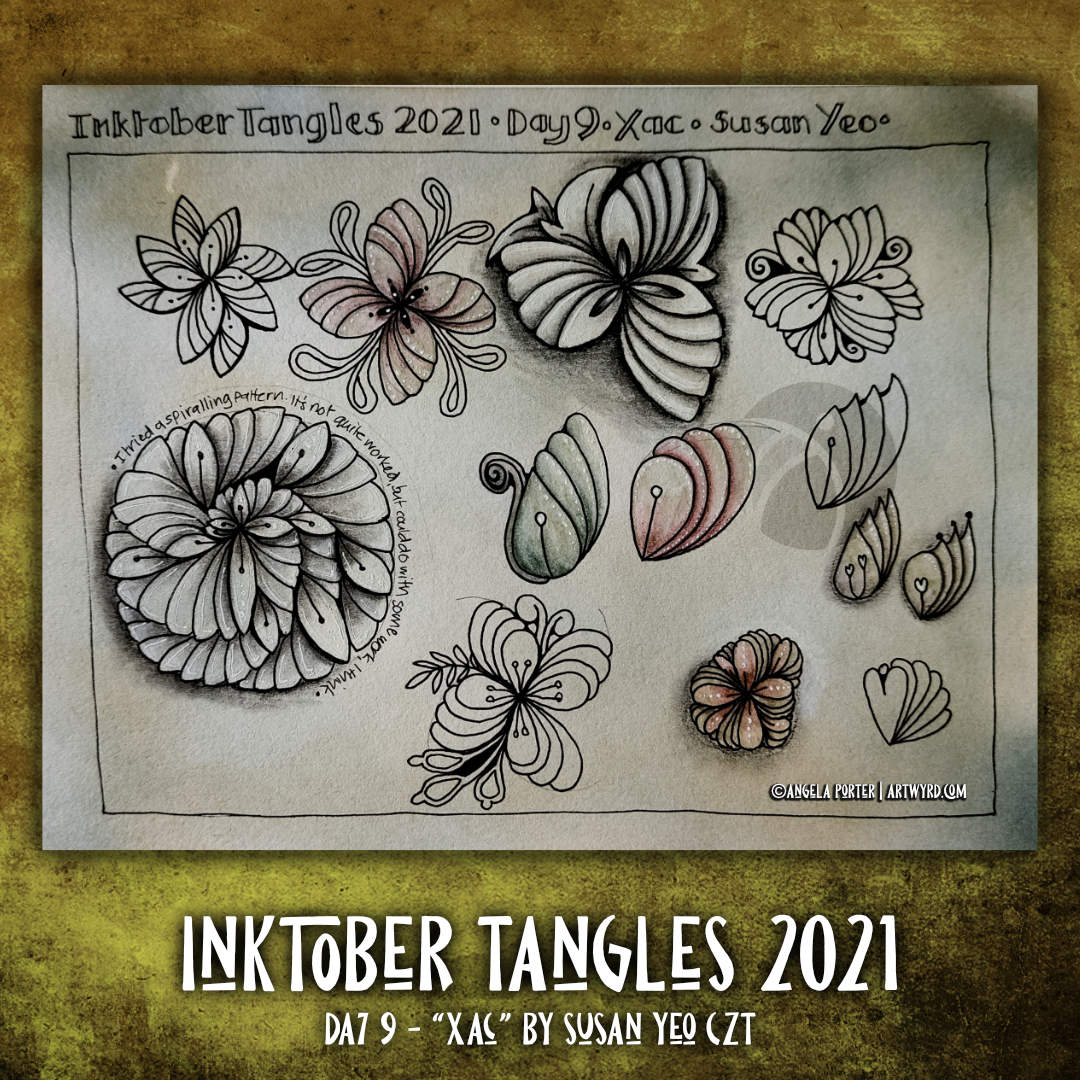
Today’s tangle is ‘Xac’ by Susan Yeo CZT. It’s another floral kind of pattern, which has plenty of possibilities for variations. This sketchbook page contains just a few. The spiral variation reminds me of a succulent. I particularly like the individual leaves/petals; they look like odd seedpods, and that is something I’d like to explore more, maybe.
Sketchbook Saturday | My week in art.
In this vlog, I look back at the first nine days of Inktober.
I’ve had a lovely tangle-y, arty, creative morning. Some good stuff. Some experiments that worked, some that didn’t quite. Either way, I have two more pages in my sketchbook filled with explorations of Zentangle patterns.
On the left is the page of explorations of Morrisseau by Cheryl Moote CZT. The white lines in the wavy border are just … too stark and a clear line/edge that I don’t like much, at the moment. I much prefer the dotty embellishments! Having said that, the white lines that turn areas of the design into shell-like fragments work rather nicely. The more I play around with Morrisseau, the more it’s becoming one of my favourite tangle patterns. I have a lot more exploring to do with it, no doubt too.
On the right is a page of explorations of today’s tangle, Zenith, by Zentangle Inc. This was kind of fun to play around with, some ideas more successful than others. less colour on this page, but plenty of dots and white highlights!
As these are pages in my sketchbook, I feel no need to finish them completely. They’re there as a reference for ideas growing forward. Also, they’re a record showing how I’m working at developing both patterns and addition of colour, shadow and highlight.
For colour, I’ve used Graphitint pencils with a damp brush to activate the colour and gently spread it out. I like the earthier tones much more than the bright and intense colours of the Ecoline pens at the moment.
For shadow and highlight on the Zenith page, I used charcoal pencils. Now, these I like far more than graphite pencils. They don’t add any shine at all. Hurrah!
For white highlights, a white Sakura Soufflé pen was used, both before and after adding colour/shadow/highlight. With the charcoal pencils it really needs to be added afterwards as the charcoal is abrasive enough to stick to the dry pen. With graphitint it doesn’t matter. Indeed, the way colour pools around the white dots/lines adds depth and interest to the colour.
I’ve also used some metallic paints that are fairly opaque in some of the drawings. I enjoyed doing this, especially as I could add different shades of gold to add a highlight. I think I’ll be using these more going forward; they give a much smoother finish in large-ish areas than a metallic gel pen would. I like smooth finishes with metallics. The uneven colour that results from spreading the graphitint pencils pleases me too.