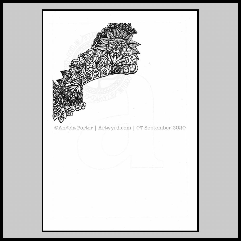
Over the past couple of days I’ve started work on the next monogram. I took a fancy to a lower case ‘a’, so that’s what I’ve gone with!
Instead of working on the Claire-Fontaine Paint-On mixed media paper, which wrecks the nibs of my UniPin pens, I’m using some Daler-Rowney Marker paper. It has a smooth, soft texture and the pens glide over it and it’s a joy to use. The ink seems a lot darker on this paper, probably because of the way it’s treated to work well with marker pens and stop them bleeding. The paper is also quite thin and this makes it translucent enough that I can easily see the letter template below.
I’m trying to use some different motifs in this template instead of my go-to ones. Of course I’m still going to use some of my favourites, but it’s nice to branch out too.
It’s going to take me a while to get this one done in between contract work. But I will get it done.
Finally finished it! It’s taken many hours to do – probably around 15 I think, and it’s taken some perseverance by myself to get it done.
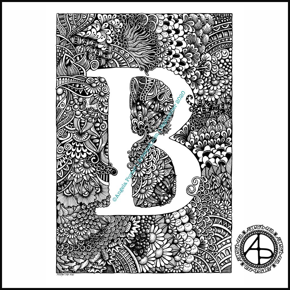
Uniball Unipin pens (05, 03 and 01) on Claire Fontaine Paint-on mixed media paper. Two pen nibs now wrecked; the paper is velvety smooth to touch, but just too rough for the tips of the Unipin pens. Will move to Bristol board for the next monogram.
Wednesday is WIP day! WIP is work in progress, and this is one of my current one.
I’m working on A4 (29.7 cm x 21 cm) Claire Fontaine Paint-On mixed media paper with 05 and 01 Uniball Unipin pens.
It’s taken several hours so far, and there’s several yet to go! I’m enjoying creating such detailed drawing in just black and white. Lots of botanical elements, but there’s also arches and spirals and geometric patterns in there too.
I never have much of a plan in mind when I tackle a drawing like this. I know what patterns I like, and if I lack inspiration I can always refer to my visual dictionary or design motifs and patterns. It’s all about intuition. It’s not entirely mindless. I do make conscious decisions about what design element to use, how to use line and pattern to add volume and contrast.
I sometimes wonder, when I see my work like this, why I try to work with colour. I always feel I struggle with colour, but black and white, with or without grey, always seems to work so well for me.
I love to play with the illusion of volume in a drawing, and whether that is done with density and shape of line/pattern, or with colour (even though I really do feel I struggle with colour).
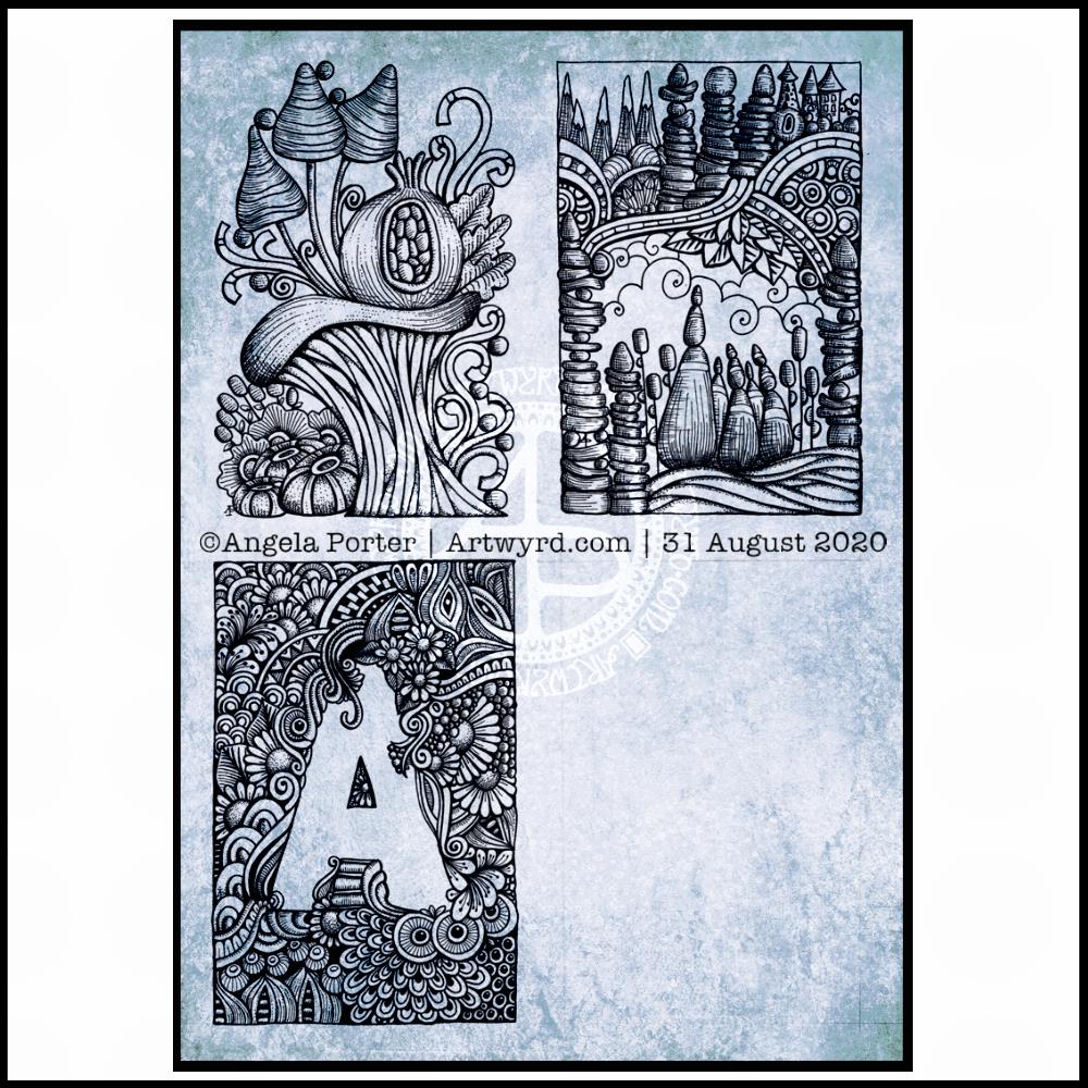
I will persevere with this illustration, drawing, artwork over the coming days. In fact, I may spend time on it today. I’ve completed my morning errands, so I can remain at home, which is where I need to be. I’m tired today; I didn’t sleep at all well last night, or for the past few nights and my mood and ability to concentrate is suffering as a result.
I finished the top right design, and have completed the ‘A’ illustration on the bottom left. That leaves one space to be filled, no doubt later today.
I’ve used either Faber-Castell Pitt Artist pens or Uniball Unipin pens to complete the drawings on ClaireFontaine’s Paint-On mixed media paper. This paper is fairly weighty (250g/m²) and has a lovely velvety feel to it.
The only pencil lines I’ve used have been to delineate the ‘boxes’ to draw in, and for a couple of the design elements in the top left image as well as the A.
Reflecting on the designs
The white space in the top left design works really well I think, and is quite an accomplishment for me. The same is true, to a lesser extent for the top right design. In both cases, the white space brings attention to the design.
In contrast, the densely pattered area helps to bring out the monogram A, making the white space the focus of the design.
I think I’m going to work on some more monograms in this style. They are fun to do, and dense, entangled patterns are one of my signature artistic voices. It’s been a long time since I’ve completed art like this, with a lot of detail to bring out dimension/volume in the design.
In fact, I’ve enjoyed using line and stipple to add volume in all the designs, exploring how I like to do this as I go. All the work I do with colouring books means I have put this to one side. It’s interesting how I’ve circled back to this style. It’s even more interesting to look at how my drawing skills have developed and evolved over time as well.
I found some peace, contentment and joy while drawing these, and feel a sense of accomplishment, particularly with the two on the left.
Do I prefer digital or traditonal drawing?
A difficult question to answer. I think it depends on what I’m creating.
I really do enjoy using pen on paper. I get a better sense of the overall design. Paper and pen is very portable too – whether I’m sketching when out and about, or drawing in different places at home.
Drawing on the screen of my Surface Studio with a pen is a lot like drawing on paper. The smoothness of the screen makes it a very different tactile experience. It also is great for inking in sketches. It also makes correcting mistakes or re-working areas a lot easier, and there are techniques I can use that are near impossible or very time consuming when working traditionally.
Sometimes, the lines produced digitally are too perfect. I’m still working on developing the brush styles that will mimic the unevenness of an inked line. I do have to use some element of line-smoothing as I draw; without it the lines are really wobbly, but with it they can be too perfect and I lose, to a degree, that personal and unique way that my pen moves on paper.
I also find it difficult to have a sense of proportion or detail when working digitally, even though I can look at the design at the same size as it will be printed. The ability to zoom in and work on a small area means I lose all sense of relative size and complexity/detail of a design. So, if I’m going to work on a drawing digitally, I prefer to start with a sketch to give me that sense of scale.
I rarely sketch out my design when I work on paper, except if I need the outlines of a design element as I’m drawing. I do tend to work very intuitively.
So the answer is, I prefer each for different purposes, and also to suit my different moods and purposes.
Of course, once I’ve drawn a design, I then have to decide if I want to add colour, and then what media I will use – traditional or digital!