I know, I know, I’m really late, but … so much else seems to have got in the way this year. Still, I thought I’d share the drawing process of one design today.
I just started with the idea of having a small focal area on the 4″ square ’tile’. I also had decided that holly would be the motif I’d use. The rest was really not thought about, until I started working.
In the video I share not only how to draw the card, but my thoughts and reflections. I start with a plain piece of paper and end up with this design.
This isn’t finished yet. Colour, shadow, highlight, and, perhaps, more gold need to be added to really lift the design. That’s for another arty session.
For now I need to work on the last few templates for ‘Adorable Dogs’ and get them nailed before the weekend is out!
Number 1 has some really intricate details in the inner rings of the mandala. Number 2, not quite so many.
They may be tiny, but I managed to add colour with the bullet tip of Arteza Everblend markers. So it’s not impossible to do, just a tad challenging. But I do know some people like that challenge.
One way is to colour the whole section in one colour, or a gradation of colours, and let the drawing just be like it’s etched into the colour, a texture if you will.
Another way is to take a larger section of pattern, and just colour it all in, like the small squares in template 1.
Whatever you feel comfortable doing is fine!
There’s no video today. I’ve tried a couple of times, but have spilled ink on the paper, made a total pig’s ear of colour, and so I need to focus on getting as many of the templates for Adorable Dogs inked in as I can. I only have a few left to do, and I haven’t done any over the last two days due to the stress of appointments. When I’m totally stressed/anxiety-ed out, I become incredibly tired and lacking any kind of focus for anything. The priority then is self care. Naps, quiet time, nothing that will get me stressed again as it will be all to easy to get stressed once again.
I’m not saying I’ve totally destressed, but the frustration with videoing today shows there’s still a fair amount there. Self care. Do what I can. If I get frustrated, take a break, even if it’s a break until tomorrow. When I’m not stressed, work flows and gets done more quickly than pushing myself and I end up redoing it all when I’m calm again.
Sometimes, you have to go slow to go fast. Not an easy lesson to learn, given the way that being productive is in your face everywhere, from adverts to social media influencers.
I’ve learned, the hard way, that taking care of myself has to be a priority. Taking those breaks knowing that by nurturing my mental and emotional wellbeing and getting that into a good shape I’ll soon get all the work done that I need to do.
I managed to film some drawing this morning, putting into practice some of the things I learned from yesterday’s ‘messes’, and some kind of successes.
For this tile, I’m using Arteza Everblend markers to add colour, and a humble black ball point pen to add shadow.
Oh, what a difference the ballpoint pen makes. Graphite always feels a bit ‘grimy’ to me, which is fine. But the lines and cleaner grey that can be achieved by the ballpoint pen… well, they’re different.
Today, I focused on getting coloring templates inked in. I’m taking a break now, until tomorrow, and my attention turned to what I could do.
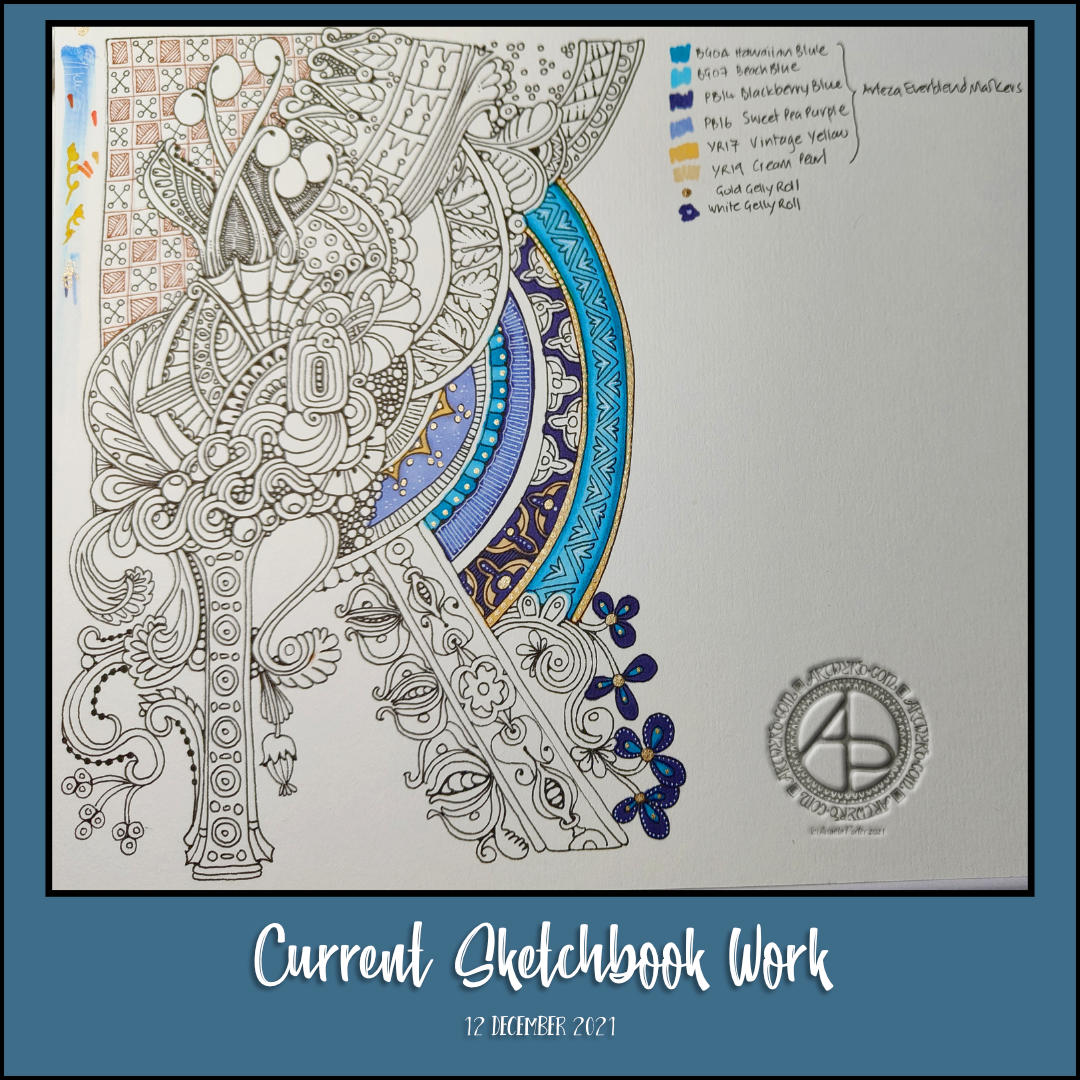
I tried some stuff out, disastrously. So, I thought I’d turn to adding colour and embellishments to this sketchbook drawing.
Not sure how well it’s turning out; it’s deuced difficult for me to capture the golden and white highlights/embellishments on this drawing. But, it is what it is now.
I decided to use Arteza Ever Blend alcohol markers, along with gold and white Sakura Gelly Roll pens for this.
The paper’s not the best for alcohol markers – they bleed just a bit. I’d prefer a more opaque white for the details, and a much finer gold. I have that in hand, possibly.
I’ve been looking at Illuminated manuscripts lately, at the patterns used and how colour was made use off too. That’s what’s inspired me to experiment in the way I have done today, not all that successfully to my mind. This gives me food for thought though, and perhaps pushes me in a different direction for the use of colour.
Colour, the thing I love and that which vexes me most in my arty expression! Still, I do persevere, even if I keep going down a road that leads to a similar dead end. It may be that monochrome-ish work is my forte and I need to accept that.
My warm up art this morning was to add some pattern to this particular 4″ square tile. I made a couple of booboos, again. Decided to leave them and see what would happen when I added shadow to the design.
I decided to use a brown Micron pen to add pattern to the inner segments, to separate them from the outer edges.
I have to say, I’m not at all sure about this. Perhaps that’s because I know there are booboos in it. It may be because I’ve not added enough shadow, particularly to the brown segments. Or, it could be that I need to do something to help with the confusion of all the borders around the various sections.
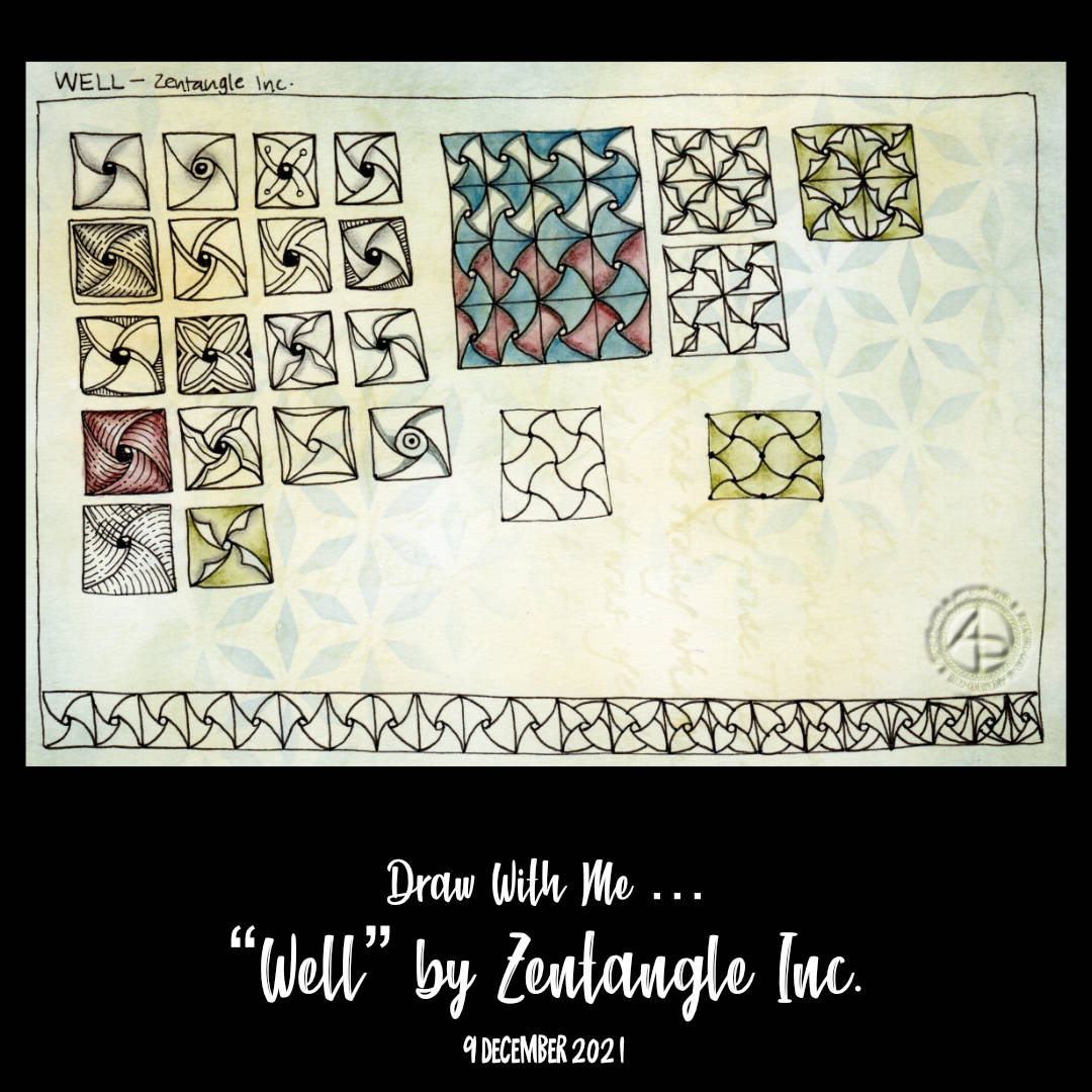
Today, I continue the exploration of “Well”, a tangle pattern deconstructed by Zentangle Inc.
Some of the variations work out well, others not quite so, and a couple I’m just a tad confused about too. I also decided to create a 4″ square Zentangle “tile” using Well as the main pattern. I slipped up on one of the sections and now I have a dilemma – do I try to work with it and make it part of the whole design, or do I re-draw the tile so far.
In the realms of Zentangle, there are no mistakes. Whatever you do you work with. The hyperperfectionist (which is edging closer to just being a perfectionist!) in me is getting rather antsy about that though. Perhaps I’ll just do two tiles!
It’s that time again – Template Thursday (or Thursyay!).
Each week during the pandemic, I’ve created a coloring page for the members of the Angela Porter’s Coloring Books Fans facebook group. And this week is no exception.
A wintry themed page full of small drawings. Perfect for moments of peace and calm when feeling stressed or overwhelmed. There’s some tangle patterns (zentangle patterns) in there too.
I had had a thought to colour this in Hallowe’en colours, but totally forgot about it! It may be wintry themed, but any colours will go!
I now need a bit of a break – before I turn my attention to the next Adorable Dogs template.
I started my arty day by drawing variations of the pattern “Well” deconstructed by Zentangle Inc.. I filmed it for today’s vlog, and you can see it by following this link.
This is one of my favourite patterns (I have many !). It is one I’m familiar with from Early Celtic art, and possibly Anglo-Saxon. Also, it’s not a pattern that I’ve tackled as a pattern exploration. But I have now, in part. I have the feeling there is a lot more I could do!
But not today. I now need to focus on getting today’s coloring template done. Then, inking templates for Adorable Dogs.
A sneak peek at this week’s coloring template / coloring page.
My Wednesday mornings nearly always begin with drawing, either in part or full, this week’s coloring page / coloring template for the members of the Angela Porter’s Coloring Book Fans facebook group.
This week it has a bit of a winter theme going on, and a part of it you can see above. I did film my drawing process this morning, and you can view the video by following this link.
The video does start with me showing how I’ve been enhancing the trees drawn and coloured on previous days.
There was no post, nor video, yesterday as between focusing on inking the templates for adorable dogs, a medical appointment, and a couple of online meetings, there just wasn’t time.
And the third day of trees. Why? Because I can! And there’s so many variations on the theme I can share. It can be difficult to work out which to do so.
For this series of videos, I have drawn lots, and lots of trees in my A4 sketchbook (two pages full, near enough). Some are successes, others not quite so. Indeed, there were a couple of “Oh, that didn’t go so well” trees in today’s video.
All of this, however, is sketchbook work. It’s OK to try things out. It’s just fine that things don’t always work out the way you thought they might. It’s quite okay that what may have seemed like a good idea in the head doesn’t translate too well onto paper.
In fact, it’s the ‘oops’ trees (and other drawings) that lead to artistic growth. They make me work out what’s not right, what I don’t like about them, and what I can learn from this. Sometimes I have another go at the idea, but better informed from the first version. Sometimes I realise it’s a lost cause…for now perhaps. Other times, it’s worked out, but it’s not just my thing. And that too, is perfectly OK.
Without trying things out we won’t know what we do and don’t like. It’s like cooking and tasting to see if the seasoning and spices are right or need adjusting. And just like cooking, sometimes things just don’t work, and occasionally can’t be saved!
The only difference is I’m not likely to make someone ill by drawing in a sketchbook!
Today’s video really brought home how important colours is in artwork. And shadows/highlights. But colour especially. Colour serves not only to bring life to the drawing, but to lift it from the background.
Yes, that can be done with various ways of adding shadow – cross hatching, line width, stippling, and so on. But there’s just something about colour, even simple colour, that just helps things along.
Indeed, simple colour seems to be my kind of style. At the moment. And looking at the upper picture, mixing coloured elements with monochrome is an interesting approach too. That may be a way I can move forward adding more colour to drawings, but only to parts that are focal points or where colour would really help with the composition. Otherwise, shading is the way to go.
And not just graphite pencil shading. I need to spend some time experimenting with other media – alcohol markers, grey watersoluble media, Pitt Artist pens, and so on.
Lots of things to think about and consider today. All insights I may have missed if I wasn’t making videos and having to talk about what was passing ephemerally and abstractly through my mind. Giving those passing thoughts words results in awareness, understanding, and, perhaps, learning.