Wishing each and every one of you the very best of the season’s blessings, not just for the seasonal holidays, but for each and every day ahead of you.
Wishing each and every one of you the very best of the season’s blessings, not just for the seasonal holidays, but for each and every day ahead of you.

This week’s colouring page is cute, whimsical and silly. It’s one in my Doodleworlds style. Although it has a kind of wintery, Christmassy kind of theme, Hallowe’en has to make an appearance too! After all, the mushrooms, monsters and drunken party skull would be most upset if they didn’t ‘art bomb’ the drawing!
It’s been a long time since I drew some Doodleworlds art, and I’m tad out of practice. But I think it’ll do.
If you’d like to print the colouring page, then you need to head over to the Facebook group called “Angela Porter’s Coloring Book Fans“. It’s available for free there.

I’ve spent some time over the last day or two looking at Art Nouveau flower designs. I was particularly fascinated by a thistle design.
This is my interpretation of the design drawn with Copic Multiliner SP pens (0.1, 0.25 and 0.5) on paper. Then, after scanning the drawing, I added colour digitally using Clip Studio Paint. So, this counts as ‘tradigital’ art!
I chose a simple colour palette; I was inspired by William Morris, the Arts and Crafts Movement and Art Nouveau. And, the colours are more mellow than is, perhaps, characteristic of my work.
The version on the left has just flat colours, no shade or highlight; I let the contour lines suggest volume. This is more true, I think, to the Arts and Crafts Movement and Art Nouveau.
To the version on the right, I added some shadows and highlights, but subtly for me. And even though they are subtle, they have a distinct effect, which surprised me.
These show just two of the many coloured backgrounds I tried out. This is why I love adding colour digitally! It’s so easy to try out different colour combinations, methods of adding colour, and so on.
Which version do you prefer?
I like them both, but I think the one on the right is my favourite; I like the stronger background colour which allows the flower to ‘pop’. I also think the subtle shadows and highlights do add a little something to it too.

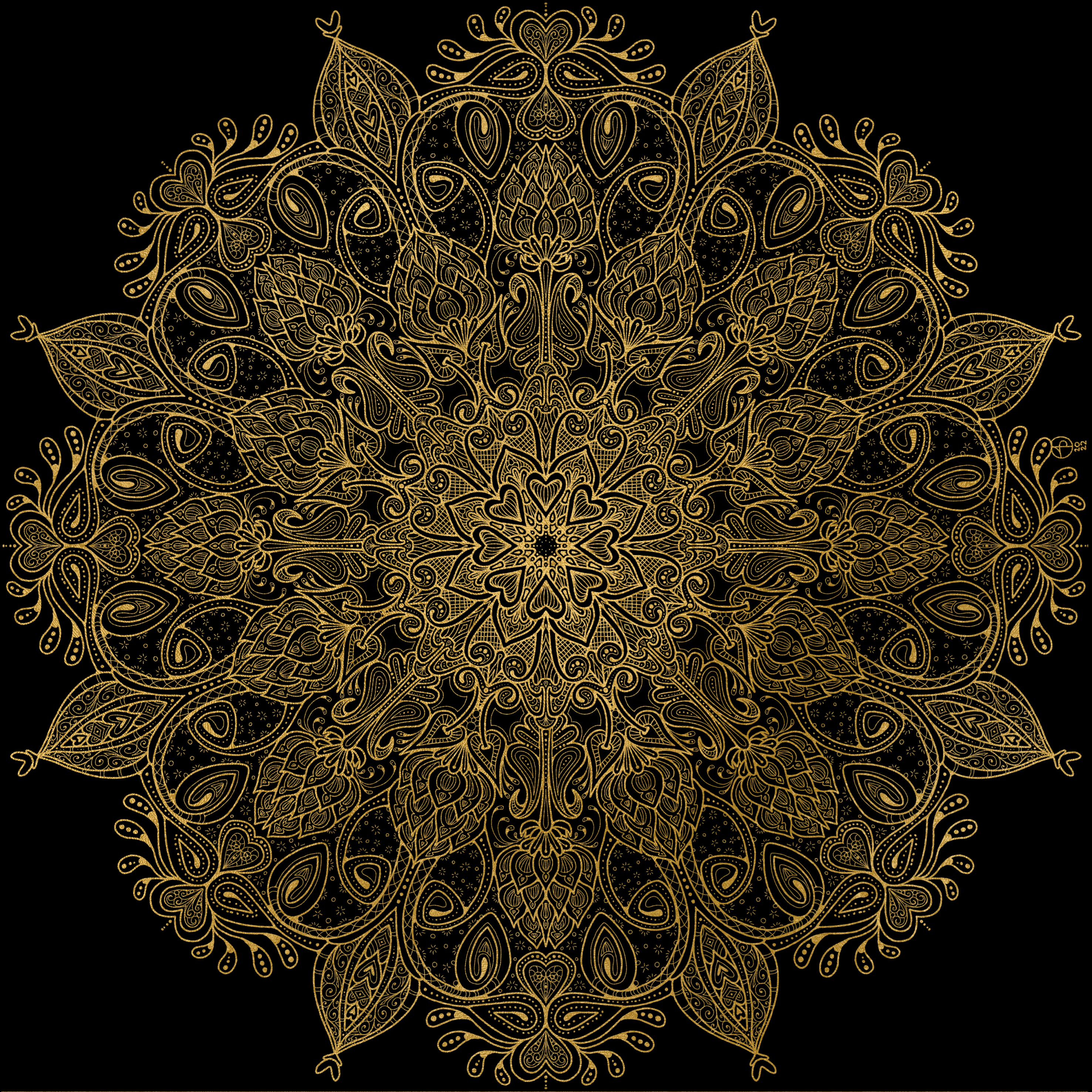
Thursday is Template Thursyay! Most weeks, it’s the day I release a new colouring page exclusively to the members of Angela Porter’s Coloring Book Fans Facebook group.
This week, I’ve designed a mandala full of layers and patterns. I’ve chosen a limited colour palette of soft greens, pinks, reds, oranges and browns; a softer, calmer selection of colours that have that late summer, early autumn feel.
I love drawing mandalas. Seeing the repeating pattern building up is both fascinating and relaxing. Adding colour to bring out the layers and breathe life into the design is a magical process. I’ve not done much with high contrast to bring out the dimension today. Gentleness is the approach needed today both to my art and to myself.
I find it fascinating how my colour choices are often softer, more muted and in limited palettes nowadays. It does make a change from the riotous colours that I so often used not all that long ago, and still do when it comes to the more whimsical and cute colouring books that I create for Creative Haven.
Seeing how others choose to add colour to the colouring page designs I create is also endlessly fascinating and varied.

Sunday morning (and Saturday evening, which was when this page was started) is the perfect time to practice my lettering, a quirky kind of illustrated journal page, and digital art practice.
I had intended to use just three, maybe four, basic colours for this page, but the vegetables threw me a tad!
I drew the page on paper with a fine Zig Mangaka Flexible pen. The Colour was added digitally after scanning the page. And I had a lot of fun as ideas clicked into place to add colour to the lettering.
Admittedly, some of the inking work is a tad clunky, but that could be fixed if I wanted to. It is a sketchbook page, and so perfection isn’t required. Giving myself permission to work with what I deem as less than perfect is an important lesson I’m trying to learn. Expressing myself in this wobbly, wonky, imperfect, quirky, eccentric, whimsical kind of way is a work in progress.
Oh, I’ll still draw detailed, intricate black and white pen designs. But I suspect I’ll do much more of this style of art. I have much to learn about it, using colour with no black lines, for instance. But I know it’s all a process, and I’ll get to where I need to be. I know that I’m really enjoying the combination of traditional ink drawing with digital colour – tradigital?
I’m not sure my Doodleworlds critters belong, but I just couldn’t resist popping them in to fill an awkward space!

It’s Thursday, so that means it’s time for a new colouring page (template) for the facebook group Angela Porter’s Coloring Book Fans.
I was in a bit of a whimsical mood this morning, so spending some time visiting Doodleworlds was just perfect. I also got a tad lost in adding colour to this template.
These are a lot of fun to draw, and to colour. Because of their cute, whimsical and imaginary nature, any colours go! These are drawings I find easy to add colour to; it seems the brighter, more vibrant and varied the colours are the better! Unline a lot of my other art,w which can become confused and incoherent looking.
So, I lost myself in adding colour to this drawing, even though I’ve not totally coloured it in.
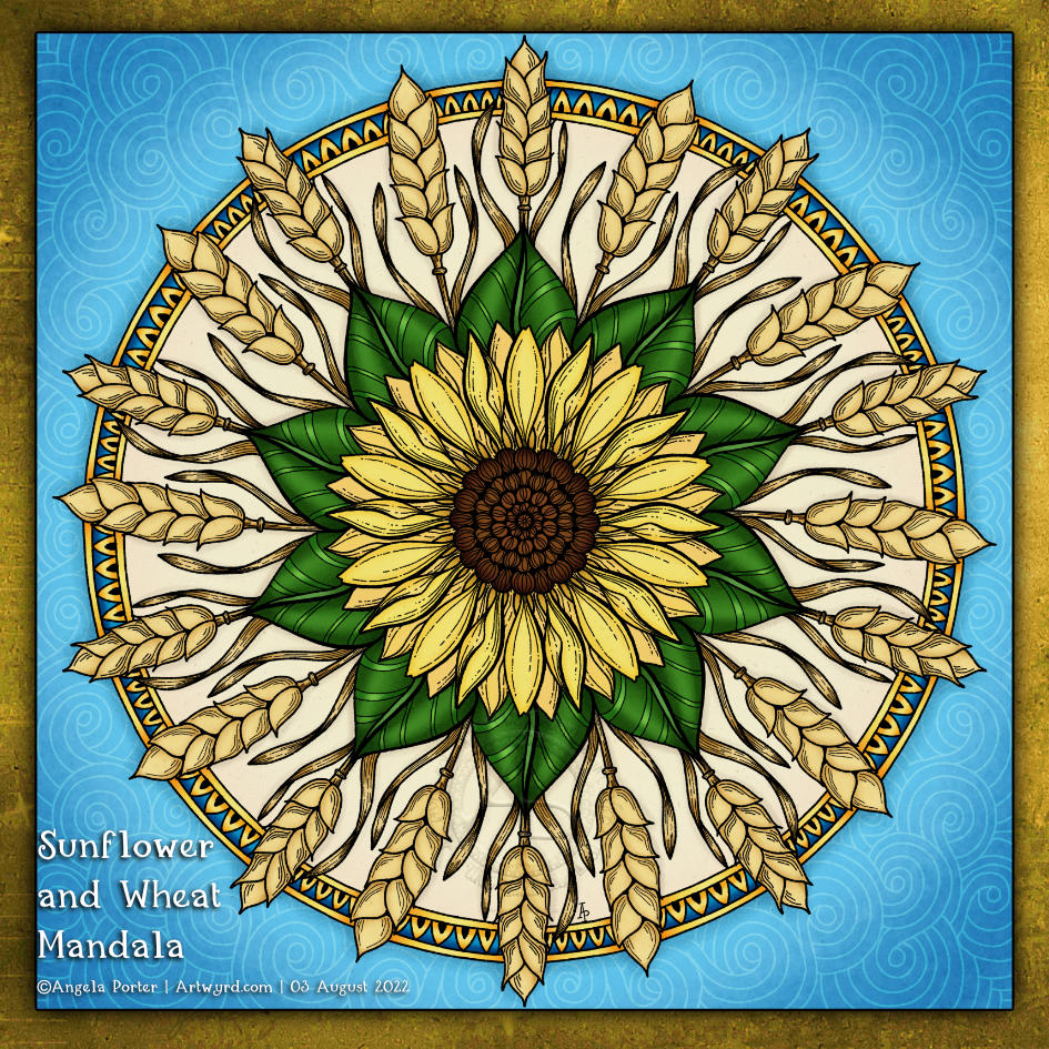
I decided that I’d like to turn the sunflower and wheat elements of yesterday’s drawing into a mandala. And this is the result.
I’m fairly happy with it, though I think some parts lack contrast to really give them some visual volume. But it will do, for now. I like the hint of a suggestion of the whole mandala being sun-like. it also reminds me a little of hand-coloured etchings or prints. It would have looked more like a woodcut if I’d used heavier lines and more texture. These are things to try to remember and put into practice in my next mandala like this.
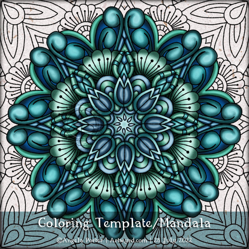
Thursday is the day I gift a colouring page (or template) to the members of Angela Porter’s Coloring Books Fans Facebook group.
This week it’s a mandala. Why? Well, I just really wanted to draw a mandala!
I enjoy the calming, meditative process of mandala drawing. And as I didn’t want to disturb that calm space I found myself in by making a right mess of adding some colour, I decided to go with an analogous colour scheme. Soft blue, teal and green are also very calming colours.
As it’s a colouring template, I’ve not added lots of textural patterns. However, that is something I can always play around with at another time. For now, the high contrast that brings a feeling of volume and dimension to the design is good enough.

I’ve had a funny couple of days, not necessarily in the funny ha-ha way, though!
I had a migraine yesterday, so no video nor post was possible. I’m feeling better today, just still very, very tired.
Today, I had plans. I was awake around 5am, again, and so did some pencil lettering ‘sketches’; the finished result of one is in the photo.
I thought I’d start to digitally ink the lettering in and add colour before turning my attention to a YouTube video. And the phone rang, and it was a friend. So, during the over two-hour-long chat, I managed to mostly get this done! Yup, I can ink in a sketch and so on while chatting. I just can’t chat and sketch, generally.
My plans to record a video this afternoon were then scuppered as I couldn’t keep my eyes open! So, on waking, I completed this particular piece of lettering and doodling.
It really is practice for me. I’m not only practising my lettering skills, but I’m also trying out new brushes and tools and so on in Clip Studio Paint. That is a constant practice for me. I tend to learn how to do something when I need to do that something!
This one is probably as good as it’s going to get. Time to move along to the next mini-lettering project and learn and practice more!
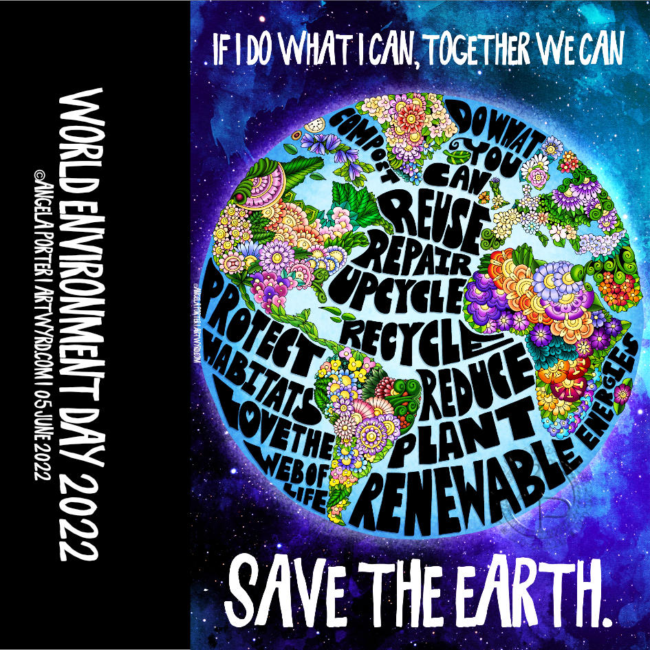
If we all do what we can, no matter how little we think it is, then collectively we can make a huge difference.
I just couldn’t fit all the ways we can do things to reduce our impact on the world’s habitats.
Hand lettering along with whimsical plants. This was definitely a labour of love and took me well over 20 hours to complete. But I got there!


