It’s a lot of fun to use my artwork in an app called Repper and create new, geometric patterns from it.
I did have to redraw the basic unit (tile) of the pattern to clean it up and remove some tiny details. But that let me adjust the pattern a little too.
For my coloured example, I used a palette of medieval illuminated manuscript inspired colours – red, green, gold and blue almost jewel tones.
The colour really does help to make sense of the pattern. It also brings out different ways in which the different layers and motifs are joined together, which really makes me smile!
It’s not until I look at it now that I can see the way the contrast and highlights have added a lot of layers and depth to the design.
I may have to do more of these in the future; they’re just so much fun!
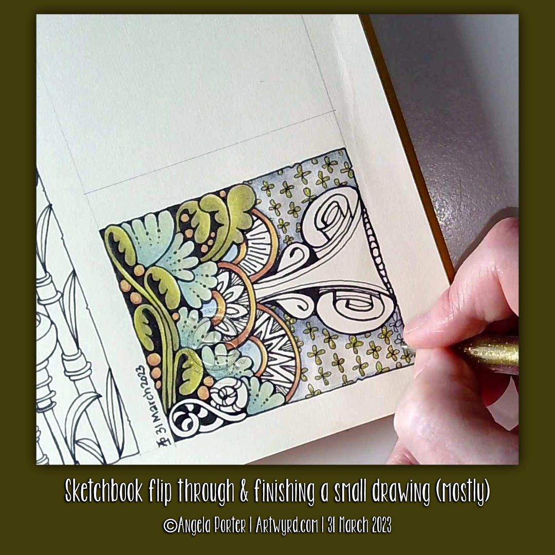
In today’s video on YouTube, I share a look at one of my current sketchbooks. Then, I finish drawing this little design and start to add colour to it.
The drawing is only teeny – a little less than 3″ from side to side – but that makes it fun to do! The tiny floral background pattern just needed to have glittery shimmery gold pen added to the petals; it’s so reminiscent of medieval illuminated manuscripts.
It’s unusual for me to work on such a small scale, but when I do I really enjoy it! I think it’s something I need to do more often. Especially so as I’ve been watching videos showing mixed media grid journal/sketchbook spreads.
Mixed media really isn’t my kind of thing … usually. However, these videos are sparking off some ideas in my noggin. I’ll see how that pans out over time for sure.
As to other things… I’m doing OK. I’m feeling less off with the fairies for sure. A number of ‘peopley’ days last week left me exhausted and needing a lot of quiet time this week. My emotions and thoughts are much more even too, which is a good thing. Fortunately, I can still feel emotions, unlike my last periods of burnout when I had the same meds. So all’s looking better on that front.
I still have an interesting journey to make in knowing and understanding myself better. Slowly is the best way to do that after the confusing and unsettling revelation at the end of last year, yet it was a relief for sure too.
The longer hours of daylight are helping too, though some more sunshiny days would really help! It feels like it’s been raining here in Welsh Wales forever! It hasn’t, but some sun would be welcome for sure.
Until that time, I shall enjoy my times of art and creativity for sure.
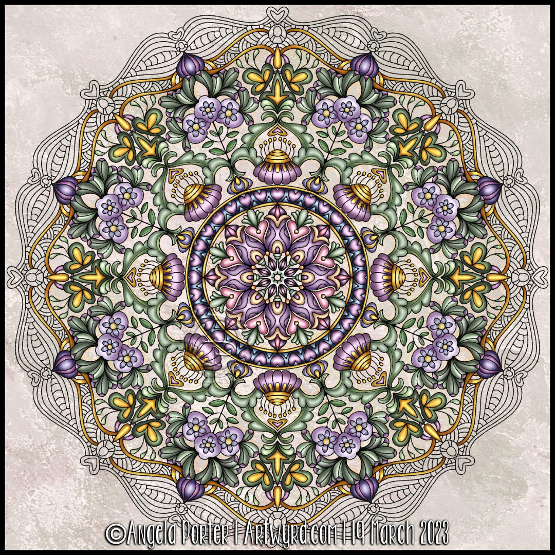
I love drawing mandalas. I love the symmetry, the flow, the sense of calmness that they bring when being drawn or coloured. I am fascinated with the never-ending possibilities of mandala design. They also make it easier for me to arrange motifs and patterns when my head is filled with pink fluffy and sparkly fairy dust (all due to prescribed medication).
This one was fun and a bit different, with some new kinds of motifs in it. The colour palette is soft and soothing, with the splashes of gold give those sunshiny-joyful accents that lift it.
Yes, I know I’ve not finished adding colour. But I really, really need to finish the social media stuff and then go and get something to eat!
Given how unsettled my maelstrom and tsunami stricken inner being is, I really needed to draw a mandala.
I love the soothing creativity that drawing a mandala brings. This one, partly coloured in monochrome greens with those little dashes of purple-ruby, looks like some weird succulent or an alien sea creature of some kind. Maybe a jellyfish.
I’ve been asked several times if I’d make my visual dictionary, pattern and motif collection, journal or art zibaldone available for others. I’ve shown it a few times in videos. It’s my go-to reference when I need some inspiration for my art.
So, today, I thought I’d take some elements from a current WIP and start to put a page together.
I used a piece of A5 dot grid paper with holes punched in it for a six-ring binder. However, I may use an A5 dot grid notebook. To draw the design, I used an 05 Sakura Pigma Micron Pen. Shade was added with a 2B matt Pitt graphite pencil and paper stump/tortillon.
I enjoyed doing this. It was fun to add alternative ways of approaching various elements. That’s how I like to work in my visual zibaldone. And, of course, the variations are not exhaustive! No doubt more will appear in time, either in the zibaldone or in some artwork.
That is what I love doing. Varying and shifting the pattern or motif into something new and different.
Of course, I have filmed myself drawing this page so far, and you can draw along with me by clicking this YouTube video link.
It took me a long time to summon the oompf and draw. And my creative brain defaulted to this style of art – comfort art. It’s familiar to me and doesn’t need much focus. I trust my intuition. And the last pen stroke determines the next. There’s a flow to this kind of drawing that is soothing, calming, and healing. And I really, REALLY need that today!
It’s been a very people-y week. I’ve been overwrought emotionally and mentally for a few weeks now, at least a few weeks. And venturing into the world where I’ve had to interact with people means putting that smiley, happy mask on. And that is very draining all on its own.
Although time with one friend this week helped to sort out where I was latching the fear and anxiety, my upset and downright glum mood was not where it should be docked.
But, the fear, anxiety, exhaustion and inner gloom have settled in again. I am peopled out. While I’m this emotionally and mentally tired, I can’t trust the thoughts that arise from the emotions. Yes, that anxiety has been there for as long as I can remember. It has been relatively quiet for the past three or four years since I found my touchstone of contentment. However, things are happening that have provoked the beast. I’m trying to remember and re-learn that I can feel anxiety even if there is no reason to. My mind will try to find a logical explanation for it.
So, today has been a day where I need some time to recover. I must remember how to be gentle to myself and give myself the space I need to express my emotions and rest. Drawing entangled art, my default style, was in order. And a hefty dose of Star Wars has definitely been needed! Oh, to be a Jedi!
Ice cream would be most welcome too. However, it’s not good for me, so I’ll decide what to eat later.
This was an interesting experiment. I was inspired by a video tutorial by Ellen Crimi-Trent Artist. In the video, she used a charcoal pencil to create an abstract line design. Next, watercolours were used to fill the spaces. Finally, details were added with pen.
I thought it could be a lot of fun to use this as a way to display some Zentangle style patterns. So I did! However, in true Angela style, I’d first tried not only a charcoal pencil, but a watersoluble graphite pencil, an Inktense pencil and an Inktense Outliner to create the grids on separate pieces of mixed media paper. Then I added watercolour to them to see which method of laying out the main pattern I liked the most.
As it turns out, it was the charcoal! I didn’t expect that!
I filled in the majority of the spaces with tangle patterns. Finally, I used charcoal and white chalk to add shade and highlight to each section of the design. I should say I didn’t do all the sections in the video. Oh, and I added some white highlights/patterns with a white GellyRoll pen.
The intense black of the charcoal really dials up the contrast by quite a few notches! I really did have a lot of fun playing with the illusion of volume in this design.
I’m also glad that I didn’t fill all the sections with pattern; I like that I have some simple, volumised areas whose simplicity contrasts with the complexity of the patterns.
I now have quite a few pieces of coloured, patterned paper to play with in the coming days.
Well and truly people-d out!
It’s true. I’ve not had such an intensely people-y week since well before the pandemic hit. I both feel very much by myself and a little sad about that, but also rather relieved that I get to sigh, relax and breathe for the next couple of days at least.
And with the relaxation may come the introvert hangover or social migraine! Maybe not. I’ll see tomorrow. I know as I take my time to relax, unwind, settle back into my solitary existence I will feel intense tiredness creep over me. Indeed, I can feel it beginning to extend it’s soft cloudy folds and start to enevolop me. I will give in, later. I have a few things to do first! Social media posts, a huge mug of tea, maybe something to eat. And then…I’ll see!
I need soothing, calming art today. One day I may share why I’m so topsy-turvy emotionally and mentally. But not now.
For now, I’m being creative in a way that soothes my inner maelstrom. It’s a mini maelstrom, but still enough to provoke unease, fear, and unsettling emotions. Still, these things pass in time. And I have a lot to experience and learn connected to this unease and fear. I just don’t know the timescale and that kind of makes it worse!
But art is always my solace, though I need to find others too. There’s my illustrated journal – writing and, erm, art! It’s been a long while since I played my flute. Nearly a week since I went out for a walk. I still have an electric folk harp I’ve not learned how to play! And there’s plenty of tea to drink.
Tea! Twice, thrice and twice-twice blessed! Tea is always soothing, especially at that magic temperature where it just feels like every part of you relaxes, and a sigh of relief and pleasure is released!
So, once I’ve finished all my social media stuff, I’ll get another mug of tea and get a YouTube video done. Yes, more art. But I love drawing!
Today’s art is a mandala with hearts and flowers as the main themes. I’ve only used three colours – red, green and gold! That’s surprising to me; usually, I go to town on colour. However, in this case, it gives a coherency to the design I prefer.
One thing I may do is to revisit it and add textures to the spaces between the design elements. And a drop shadow would help to lift it off the paper a bit more.
Mandalas are really soothing and meditative to draw and add colour to. And I certainly need that today.
The last few days have had me intensely inking in colouring pages and adding colour to some of them. Yesterday I was determined to get the last couple done, and I overdid it a bit; my damaged muscles/tendons/ligaments between two ribs are rather stiff and sore. But I got it done! Whimsical Houses is complete, and the cover and back art for the next book is also done. So, now I can take a bit of a breather and spend some time on personal projects.
I’m also so tired today. My mind was working twenty-nine to the dozen last night. I woke before 4 a.m. and couldn’t get back to sleep. So, I see a nap not too far in the future. But before that tea. Lots of tea. Probably some lunch too!
I love curvy, flowy, abstract patterns and the illusion of depth, volume, twisting, and bending space. And seed pods. And seeds. So lots of my favourite things in this design. I even snuck in a few spirals!
To add shade, I used three cool grey Faber-Castell Pitt Artist Pens. Though they haven’t blended smoothly, I’m quite happy with that. The design looks almost metallic as a result. In fact, I am happy with this design in its entirety. I could increase the contrast a bit more between the darkest shadowed areas and the white highlights. But I can always revisit that in my own time.