I’m really not feeling too grand again today. Tummy cramps kept waking me up through the night. I know what the cause of them is – hormones is all I’ll say. But I am so tired today, but I don’t want to sleep as that will impact on my sleep tonight. So, quiet art time it is!
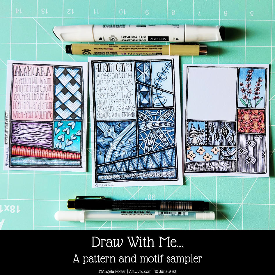
I like the idea of pattern and motif sampler pages in my sketchbook. However, I like to work on paper on the worksurface rather than in a book. So, I dug out one of my Distress Ink coloured papers to work on.
I used a selection of Zentangle tangle patterns for the first row. They are, from left to right Savana by Yvette Cambell CZT Holly by Linda Farmer CZT ‘Nzepple by Zentangle Inc Dorsal by Anita Aspfors Westin Crazy ‘Nzeppl by Zentangle Inc Pufanflower by YuRu Chen
I used alcohol markers to add shadow to the patterns and a white Gelly roll for the highlights.
This will be a series of posts with accompanying videos until the page is done.
This seems to be the natural progression of my work earlier this week where I put motifs in boxes and added background colour only.
When looking at Rebecca Blair’s artwork, which I absolutely love, I got inspired to create the first ‘sampler’ on the left. I say sampler because splitting space up in this way reminds me of needlework samplers created to practice different stitches.
This is a lovely way for me to indulge my love of hand-lettering, patterns, stylised motifs, colour, shadow, texture and boxes split into boxes!
Colour continues to vex me. I think my favourite is the centre example in a monochrome colour scheme. No chance of any weird colour combinations with that one!
I keep saying this about me and colour, don’t I? But I really need a huge sign that lights up and flashes to remind me to stick to monochrome colours, possibly analogous, and with tiny flashes of a complementary colour. Actually, I need the sign to detect when I reach for colour and shout this advice at me!
Of course, I wanted to share my experiments with the world; well, a few hundred people may be, who may find this an interesting idea to try. If you’d like to see the video then click on this link!
It’s been a quiet day for me. My digestive system is playing up, and self-care is the order of the day. That means not doing anything that has to be the best I can do. I know today that it’ll be harder for me to get things done because I’m under the weather. Fingers crossed, I’ll be fine and dandy again tomorrow.
Please click on the “Watch on YouTube” button to play the video on YouTube. Cheers!
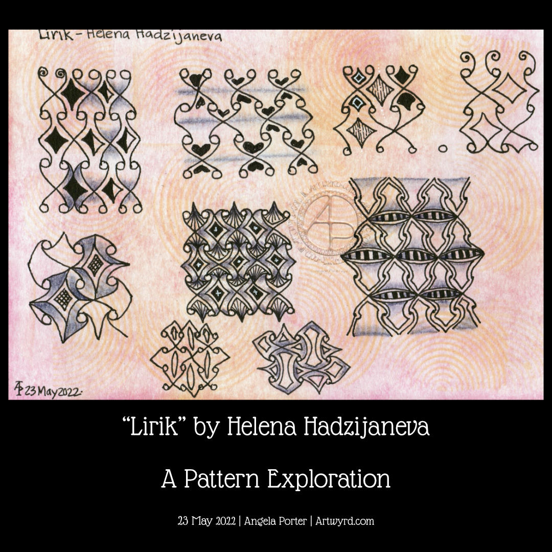
Oh this was a lovely pattern to explore for a page in my sketchbook. It’s quite simple to draw, but it has so many possibilities that I’ve barely touched upon in this video.
The page I’m drawing on I coloured with various Distress Inks – Mustard Seed, Wild Honey, and a touch of ripe persimmon around the edges. I also used some Abandoned Coral to add subtle patterns through a stencil.
It’s always a pleasure to draw on paper that is coloured. The colour always brings some interest to whatever is being drawn, or so I think. Not that I’m averse to drawing on white paper, but colour adds something I can’t quite put into words.
As well as using black 05, 03 and 01 Sakura Micron and Uniball Unipin pens, I added some vintage red from an 0.5 Zebra Sarasa gel pen.
For shadows, I used a purple-grey Stabilo Carbothello chalk pastel. White highlights were created using a white charcoal pencil from General’s.
Exploring a totally new tangle pattern may not have been the best choice for me as I wait for the last pain of a migraine to go so I can sleep the rest of it off! Plenty of mistakes and not good choices here, but plenty of opportunities to learn from.
In today’s video on YouTube, I first make some Distress Ink backgrounds, then I explore this lovely tangle pattern, mangling it completely at times! This isn’t a problem as it’s all sketchbook work!
Please click on the ‘Watch on Youtube’ button. Cheers!
Step 1 – Create a Gesso and Neocolor II background
Yesterday, I had a delivery of Finnabair Art Basics Clear and Heavy White Gessos, made by Prima Marketing. Neocolor II backgrounds are a lot of fun to make, but they do leave a smooth, waxy finish to the paper. I like drawing on it, but my pens aren’t too keen.
So, I wanted a way to seal the Necolor IIs into the paper and a surface I could draw on. Yesterday, I tried some glassy gel medium from my stash. It worked well, and the colours appeared more vibrant. It was OK to draw on, but the pen took a long while to dry, and I’m not sure how permanent the Micron ink would be on it.
Synchronicity-like, some suggested videos cropped up on YouTube where gesso had been used to prepare the paper and then seal in the Neocolor IIs, even using the gesso instead of water.
I have used gesso in the past, but it always felt very rough and gritty. However, the Finnabair Art Basics gessos had reviews that suggested they are smooth and chalky in feel. So, I had to try them.
I’m glad to say that they are smooth and chalky! I did spend a little time last night testing them out and gessoing some “polaroid pops” image tiles.
In today’s video, though, I wanted to quickly show what gesso is and how I’m thinking of using it, particularly in my sketchbooks with paper that won’t take much water.
I covered a page in my Hahnemuhle D&S sketchbook. The paper in this book is for drawing and sketching and is not designed for water-based media. I can get away with a barely damp brush on the paper, but only one, maybe two layers are possible before the paper starts breaking down. Gesso solves this by sealing the paper’s surface and creating a thin, flexible layer that can be worked upon. I used the heavy white gesso to do this.
Gesso dries really quickly, but a craft heat tool (or hairdryer) can help to speed the process up.
The next step was to add colour with the Neocolor IIs. I used water to activate them, though I could’ve used gesso. I wanted to create an uneven, weathered or worn kind of background. I started with the browns, sealed them with clear gesso. After this had dried, I added the blues and finally another layer of clear gesso.
Then, I was ready to try drawing on this.
2. Drawing on the gesso surface
I really didn’t know what would happen. I know I’ve used gesso in the distant past, but couldn’t remember if I’d used pens to draw on it or not.
As it happens, it was really lovely to draw on! The Sakura Pigma Sensei 04 pen did feel like it caught on the tooth of the gesso from time to time, but nothing more than a rough-surfaced paper. It may be my imagination, but the ink seemed darker on the gesso, perhaps because it dries on the surface and doesn’t sink into it, like it would with paper.
I did a test to see if, once dry, the ink would be affected by water or gesso. There was a tiny amount of pigment that seemed to move, but nothing noticeable.
3. The arch motifs/fragments
I really love round arches! It stems from my love of Romanesque architecture. I use them a lot in my artwork. So, I thought it was about time I explored individual arches as if they were fragments of a tangle pattern.
4. Reflections
I’m so glad I rediscovered gesso. I’d forgotten how it could be used. I know the rough grittiness of the gessos I’d used in the past really did put me off using them again. However, this lovely, chalky smooth gesso is really nice to draw on. It also opens up more ways to create backgrounds and use colour. I’m sure I’ll continue to experiment and explore it going forward.
Watching some arty videos yesterday, I stumbled upon one that involved creating “Polaroid Pops”, part of a challenge hosted by AALL and Create back in January 2022. In this challenge, you had to create mixed media polaroid ‘photos’ using stamps by a specific artist in the AALL and Create range.
I really liked the format of the images created and thought it could be fun to try this for myself!
Polaroid photos have the following dimensions: The image is 3.1″ x 3.1″ (approx. 8cm x 8cm) The whole photo is 3.5″ x 4.2″ (approx 9cm x 11cm).
So, yesterday I cut up some of my Neocolour II backgrounds to 8cm x 8cm and got to drawing on them!
I really like the square format. At 3.1″ x 3.1″ (8cm x 8cm), they’re only a wee bit smaller than a standard Zentangle tile. And they do look fab when mounted on the white card to create the polaroid.
After drawing a kind of botanical scene in silhouette (not quite my thing, but you have to try, you know.), I tried popping a hand-lettered monogram into the square and using Zentangle patterns to fill in the negative space.
That was much more ‘me’. And in today’s video, I continue with the letter B, though it looks like an R because I deliberately drew it as bigger than the ‘photo’. Duh, didn’t check for it looking weird before inking it in. Luckily, there’s space on the white background to write in what it is!
While the video was uploading and processing, I drew the ‘H’.
I think I may make an alphabet collection for future reference and inspiration! So, if you fancy having a go take a look at today’s video on YouTube.
Yesterday, I recieved my tin of 40 Caran d’Ache Neocolour II watercolour wax pastels. I finally gave in to a long-held urge to try them. I kept telling myself, “I don’t need them. I have watercolours, distress inks, water-soluble pencils, distress oxide inks, and more”.
However, a couple of suggestions of videos about the Necolor IIs popped up on my YouTube feed. I looked, and thought that these could be perfect for backgrounds for my hand lettering, or drawings, or even for using like watercolours.
The colours stay nearly the same vibrancy when dry, even the rather watered versions. They can be opaque to fairly transluscent, though not transparent. This is great for layering as the translucency still lets the lower layers show through us much or as little as you want.
Although they can always react with wither, drying with a craft heat tool seems to help set them a bit; perhaps by melting the ‘wax’ into the paper. And of course, not working too hard with a brush helps with preserving the layers.
Brush? Did I say brush? I find that adds way too much water for my liking. So, I used a piece of cut ‘n’ dry foam, black side down, to add small amounts of water and blend gently.
I have had a lot of fun playing with them for sure. In this video I make the pinky background seen behind the Zentangle tile. I already have a use for that background!
I used one of my first experiments with Necolour IIs from yesterday to turn into a Zentangle tile (3.5″x3.5″ or approx 9cm x9cm) and to draw this monotangle on it. Instead of using a graphite pencil or chalk pastel or any other medium to add shadow I used varying line thicknesses and pattern to do this. I really didn’t want to take away the vibrancy of the colour, even in the shadows.
Of course there was another reason why I wanted to draw on a Neocolour II background – to see what it was like to draw on the surface with fineliner pens.
It was actually lovely! The Necolour IIs add a slight slickness to the paper that is just noticeable. That made it a bit nicer drawing on the fairly textured mixed media paper for the tile. The points of my pen didn’t catch as much on the texture, though I still got some wobbly lines thanks to the more bumpy bits!
All I need to do now is to remember to scan the background in before I work on it. That way, I will always have a background I love available for use in digital art or, perhaps, for printing out.
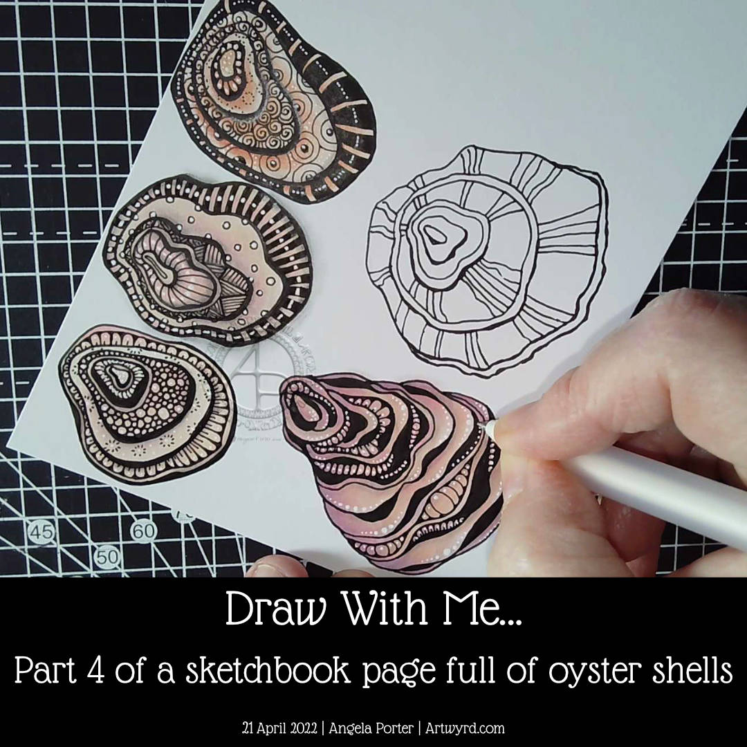
In part 4 of this video series, I draw a couple of oyster shells, one of which I add colour, shadow, highlight and pattern to. The other I’ve left until my next video.
I really enjoyed drawing these oyster shells. The one I’ve completed has used a kind of variation of the Diva Dance tangle pattern to construct it.
I’m really quite happy with how this one has turned out. I actually think I’ve done a fairly good job on adding colour – so unusual for me! Alcohol markers really do seem to be working well for me. Something to seriously consider going forward, that’s for sure.
I like how the areas of dense black add a lot of contrast. But I like how I’ve added white dots to soften the harshness of them and make them feel they belong in the pattern.
As I was wittering and musing during filming, I realised how much I enjoy creating line art. I enjoy the elegance of simplicity, focusing on the key elements that make the drawing instantly recognisable. This hearkens back to my time studying science and then the 28 years I spent as a science teacher. In science, observational drawings have to focus on the essence of what you see, making sure you get the essential identifying features correct. I was always a bit of a maverick going a little further than the bare essentials and even adding some colour! I got a tad chastised for that, but it didn’t stop me.
Now, this love of focusing on the essentials, the basic line art, shows in my artwork so much. In fact, it’s essential for me to do this otherwise I try to incorporate everything I can see into the drawing. Then, the drawing ends up so detailed it’s not really recognisable!
There seems to be a lot of sudden realisations and connections being made with my relationship to art and my particular style lately. Signs, I hope, that I’m finally settling into what is ‘me’ and recognising where my artistic roots lie and what I really enjoy doing.
Speaking my thoughts and reasoning out loud for the videos brings this process into awareness. I’ve often written about how I don’t think in words, but in feelings or abstractions. I have to be forced to put them into words by being given the opportunities to speak them out loud to people, or sometimes to write them in journals or blogs.
I hope that by sharing these thoughts and processes with others it will help them to find ways to discover and become comfortable with their own artistic style, as well as gaining some confidence in expressing themselves artistically just for the pleasure of creating art.
The other thing that working with the bare essentials line art style is that there are plenty of spaces for me to get creative with pattern and texture! I’ve learned over time how not to become overly ornate. What I like about today’s artwork is how I didn’t try to fill every section in with intense and intricate pattern. Oh, there’s plenty of white highlight dots scattered around, but the tangle pattern style of textures are thoughtfully placed and not too many of them.
This is something I’m still developing – not to overwhelm the drawing with pattern/texture. How much to use, and how much ’empty’ space to leave.
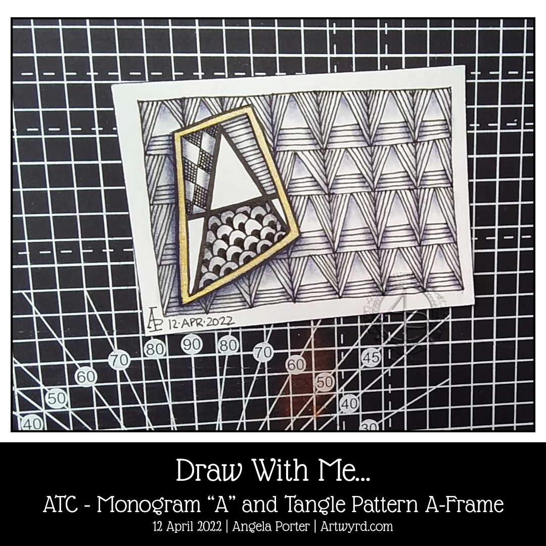
Today, I woke with the idea to create an ATC (Artist Trading Card) using a monogram from one of the hand lettered alphabets I’ve been drawing in my lettering sketchbook.
The monogram is a simple one, with some of the spaces filled with tangle patterns. The background is formed from the tangle pattern A-Frame by Angie Gittles CZT. When I chose it, I wasn’t fully aware it was based on the letter A; I really can be a bit dense at times!
Some indigo chalk pastel and a tortillon to add shadows and some gold watercolour paint to frame the monogram and all was done!
I enjoyed the process of drawing. I’m fairly happy with the end result. However, I think a more organic background may have worked better with such a strongly geometric shape. It’s all a experimenting, exploring, experiencing and learning.
I may end up doing a series of monograms. It’s a good way to work with lettering and to get some practice in of figuring out how patterns and letters/words can work for me.
Today’s YouTube video is a step by step tutorial of how you too can create this ATC.
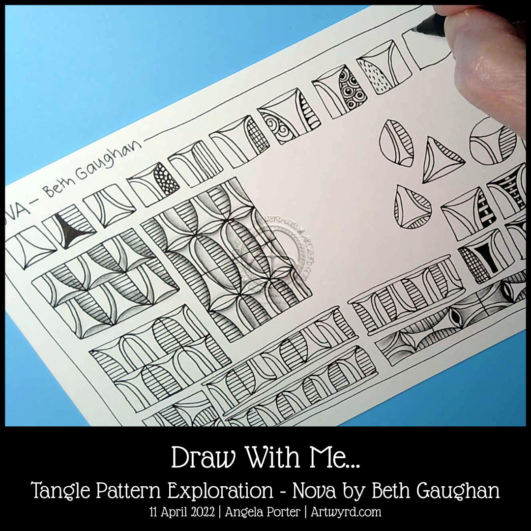
It’s a funny old day today. I think I’ve overextended myself in exploring/experimenting with art. I just felt I needed a bit of ‘comfort art’ today. It’s like comfort eating, but healthier! Something familiar, not too taxing, soothing to the senses and mind. So, some pattern exploration fitted the bill!
The pattern I chose to look at is Nova by Beth Gaughan. It’s a lovely pattern but not one that I would ordinarily choose. Just challenging enough to make things interesting, but not so challenging that I get more and more disheartened with artwork.
It turns out that Nova was a good choice. There are some interesting variations to be explored for sure.
I hope you’ll come and join me in drawing these variations over on YouTube. This kind of exercise is good for getting the creative juices working, coming up with ideas in my sketchbook, and continuing to work with and understand how to vary tangle patterns. In turn, these things have an effect on my other art.