Exploring a square Zentangle fragment

Click on this link to view the accompanying video on YouTube.

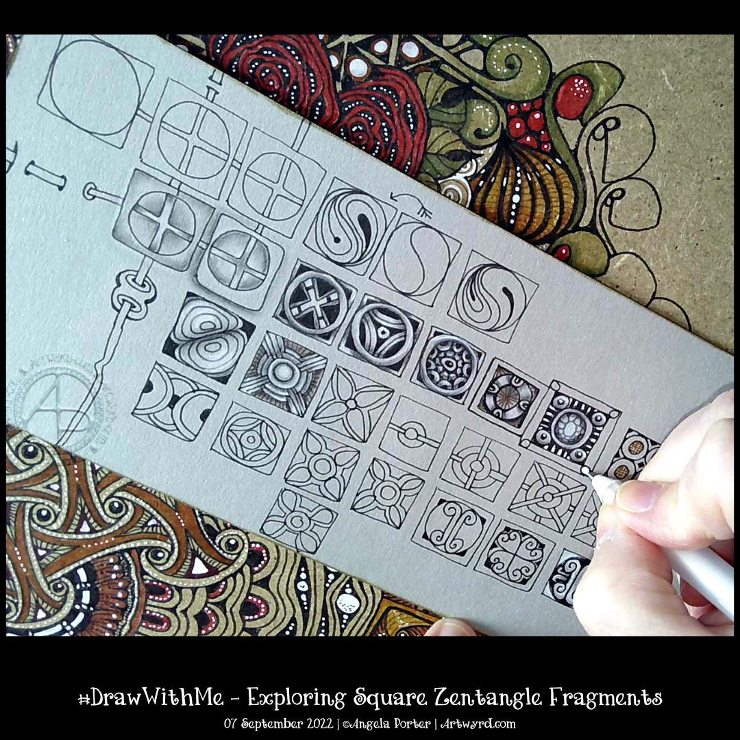
Time seems to fly when I get engrossed in a task. Today, that was exploring a simple Zentangle fragment – a circle in a square.

In Zentangle terms, a fragment is the basic unit of a repeating pattern, whether repeated as is or rotated/reflected.

It is always a lot of fun to see what kinds of fragments I can develop using the chosen one to spark some creativity.

It’s always lovely, too, to work on toned paper, in this case, it’s from Fabriano and is in the colour ‘Clay’. Whenever I use toned paper, I realise I’m drawing in shadow and light; the paper is the mid-tone. This is why I love to colour plain paper with Distress Inks or NeoColor II water-soluble wax crayons. The colour immediately becomes the backdrop for dark and light and a strong contrast ‘twixt the two extremes.

In art, chiaroscuro is the term used for the use of high contrast between light and dark in a composition. In drawing, this is affected by using a coloured background, and black and white ink or media are used to create the drawing.

As I was typing this, I realized I’ve long loved working in this way. Since my early days of exploring my artistic nature that started some 20 years ago, I discovered I loved to use coloured paper with white and a black or much darker tone of the paper to draw with. It was far more fascinating to me to draw in light and shade rather than tones of grey graphite on white paper. It was my chosen way to work when I did some life drawing. When I go out and about sketching, I will colour the pages in my sketchbook with Distress Inks and use black and white pens/pencils to draw on them. The shapes of shadows and highlights fascinate me; everything becomes very architectural.

I’ve often mentioned the only oil paintings I’ve ever done and how three-dimensional they appear. When people see them for the first time, they’ll touch them because they think they are dimensional and are always surprised to find out they are totally flat. The high contrast I favour in my work creates the illusion of volume.

This little journey down the pathways of memory has allowed me to make some connections. I’m smiling as some pieces of the jigsaw puzzle that is me fall into place, clicking together satisfyingly.

There are times when I have to work with black pen on white paper, but there are many times when I can choose what colour paper to use. And going forward, I think much of my entangled drawing that isn’t for colouring books will be done on toned paper.

Zentangle Fengle variations, Pokeleaf and Mooka

I enjoyed drawing this design, though I wasn’t sure of the grubby-looking graphite and white charcoal on the big leaves. However, I persevered and am now fairly happy with this design.

I started with the Zentangle pattern Fengle and drew it in two different ways. The Fengles are stacked on top of each other.

Rather than try to squash another Fengle in, I elected to add some large, furled Pokeleaves, and of course, some Mookas had to grow with them.

The paper I used to draw on was a piece of Fabriano Toned paper in sand. The paper becomes the mid-tone of the design, so it’s perfect for using both graphite and white charcoal to add shade and highlight. Which I did, and the leaves ended up looking rather grubby.

So, while the video was uploading and processing, I completed adding all the shades and highlights. Then, I re-drew all the black and brown lines. Next, I added dotted highlights using white Gellyroll and Posca pens. Finally, I used a brown Arteza Everblend marker pen to fill the background gaps and draw around the design.

I’m so glad I added so many white dots to the pokeleaves and mookas. They just lifted the colour so much. The richer brown background also helped with this, though I think I need to tidy up the edges somewhat.

For someone who really doesn’t like using graphite/white charcoal in this way, I’m quite pleased with how this has turned out. I’m so glad I remembered I had this toned paper in my stash!

Oh, the patterned background is actually my drawing board! I decided to decorate it with all kinds of patterns and motifs. I’ll finish this side, seal it with some tough spray varnish, then start on the t’other side! Inspired by Zentangle’s Maria Thomas’s suede mat.

Another Flowy Zentangle Inspired Pattern

In today’s video, I started drawing this design inspired by one by Doodlillusion on Instagram. I’d been asked to look at this one by a YouTube subscriber, so today I have.

I definitely used Doodlillusion’s art as inspiration, drawing it in my own way. I trust that I can show and explain how I approached this kind of pattern, along with some hints and tips and various ways of working with it.

I’m quite pleased with the end result. I like the graphic black and white. Something I need to consider more in my monogram and other explorations, maybe!

#DrawWithMe – A #Zentangle Pattern Tile

To watch the accompanying video on YouTube, just click on this link!

Today, I spent more than two hours creating this tile. I like how it’s turned out, particularly the volume and dimension achieved by shadow and highlight.

I started with a 4½” (11.5 cm) square of Artway’s Flat White Enviro mixed media paper, which is sturdy and works well with alcohol markers. My first step was to colour the paper with some Distress inks – I used Dried Marigold, Spiced Marmalade, Saltwater Taffy, Seedless Preserves and a hint of Aged Mahogany around the edge.

In true Zentangle fashion, no pencil was used to set the grid. And I chose to use a square fragment from my explorations yesterday. Of course, the fragment had a bit of a twist, with some weaving done in the style of the Zentangle pattern ‘Hurry’. Oh, and I used an 0.3 Unipin fineliner pen to do all the line drawing. Apart from the tattered burlap pattern, which I used a rusty red Staedtler Triplus fineliner for

The next step was to start to add shadow and highlight to warp space. Not really, but the illusion of dimension! I chose to use a trio of red-brown Ohuhu Art Markers. They don’t blend as well on this paper as they would on marker paper, but I like the texture that results in this case.

The final steps included: adding some shadow to the overlying grid with alcohol markers, highlights with a white charcoal pencil and a white 08 Gelly roll pen, and finally, the gold outer of the ‘buttons’ or ‘beads’ that hold the grid together.

I wanted to complete a piece of art for today’s video to mark a YouTube achievement of getting 1000+ subscribers. If you are one of those subscribers, I thank you from the bottom of my heart!

#DrawWithMe – Exploring some square Zentangle pattern fragments

Click on this link to view the accompanying video tutorial on YouTube

Earlier today, I just wanted to explore a simple Zentangle Pattern fragment, or two. I started with two square fragments, each with a circle in the centre. One had a diagonal cross, the other vertical/horizontal. And I went from there to create some more ornate versions of them.

I never know where this kind of exercise is going to go, but it is always interesting and some pleasant kinds of fragments result.

These are just a few fragments I came up with during the course of the video; I’ve barely scratched the surface of all the possible variations.

This exercise is good for flexing your creative ‘muscles’, warming up hand-eye coordination and fine motor skills, and playing around with colour, shade and highlight. Also, it’s perfect for relaxing, taking a break from all that is happening in this world. Even if for just a short while.

#DrawWithMe – Flowy Patterns

Click on this link to view the accompanying YouTube video tutorial

I’m pleased that I’m recovering from my people-filled weekend, though still not quite focused and feeling a bit ‘lost’ in myself. And I’m still rather tired. But, these things will not last, and I’ll soon be ticketty boo again.

This morning, I filmed a tutorial based on a request from one of my YouTube subscribers. He asked if I could show him how to draw some ‘flowy’ patterns he’d seen, particularly one by ladyzadzakiya on Instagram.

Well, how could I refuse such a polite request? I’ve just shown how I draw my own kind of such patterns, as I can only really draw in my own way, as can any of us. I’ve included a few Zentangle patterns in the design. And I even got around to adding some shade! Adding shadows and highlights is what really brings the drawing to life. Part of me wished I’d used blues and/or sea greens for this. But no matter, I can always draw another one sometime.

Tangle Pattern “Calibree” by Nancy Domnauer

Click on this link to watch the #DrawWithMe video that accompanies this design.

Phew! It’s really hot again today here in the Valleys of South Wales, UK. And in many other places too. I’ve slowly been wilting through the morning. However, I was determined to get a video done and uploaded before I find somewhere cooler in my home for the rest of the day.

I had a really poor night’s sleep, and so I’m also struggling to keep awake. But keep awake I must. Delivery is due in the next three hours or so, and then I have errands to run.

So, my frazzled emotions, sleep-deprived brain and overly hot body really wanted to do some art that was soothing, comforting and simple. I knew I had this circular piece of paper already coloured with Distress Ink, so all I needed was a tangle pattern or two to add some pattern to it.

A very quick look on Tanglepatterns.com, and I saw Calibree by Nancy Domnauer CZT and thought it perfect. It’s got an uneven grid pattern, so it will deliberately turn out all lovely and wonky. I actually feel rather wonky myself today, so that fit perfectly!

I decided to stick to a monochrome colour scheme, again keeping it simple. You can see the whole process and materials I used in the video.

Although I may not have made the best choices with some of the colours, I’m fairly pleased with how it turned out. I’m also really pleased with how it picked up my mood as well.

Drawing simple flowers, leaves, #tanglepattern spoolies and adding colour with coloured pencils.

Click on this link to watch the accompanying video on YouTube.

One of my YouTube subscribers (Chen Keith) requested I draw some simple flowers and show how I’d use coloured pencils to colour and add contrast.

Drawing, not a problem! Colouring? Yeuch colour choices! But I do show different approaches I use to adding colour with coloured pencils, or rather what I’ve done in the past. I rarely ever used coloured pencils now. Digital coloring or marker pens are my mediums of choice, with Inktense and the Karin Brush Markers close behind.

While the video was uploading and processing, I did try out other ways of adding colour and/or contrast. It’s way too hot here in the Valleys of South Wales for me to think clearly and explain things at the moment. The heat is making me feel very, very tired.

#DrawWithMe – A Whimsical Bird and Flowers – Part 2

Please click on the button “Watch on YouTube”. Cheers!

I had a really, really cruddy, broken night’s sleep. So, doing art that doesn’t have a bit more than good enough was in order.

Getting the pen drawing done for this cute bird I started a couple of days back was just the thing!

It’s always interesting to look at my art, whether finished or, like this one, a work in progress after a day or so’s break from it. With fresh eyes there’s a different perspective. With this drawing, I needed to alter the design and size to get it to work. Not sure I’ve got it right, but it’s better than it would’ve been if I’d carried on as I originally planned.

The next decision to make, and the trickiest, is whether to just add shadow and highlight or whether to go with colour. The next tricky decision is what media to use to this.

I’m so aware that my colour choices can be … quite dire. And so I am tempted to add colour digitally initially. Maybe. Perhaps.

A little break from it will be in order before I make that decision.

Draw with me – Tangle Patterns. A Sketchbook Page

Please click on the ‘Watch on YouTube’ button – cheers!

I’m fine, but feeling a tad out of sorts today. So, I needed some art that would be self-soothing for a bit of selfcare. Nothing is better than starting to fill a page with tangle patterns, and all of these are new to me!

From top to bottom, the zentangle patterns I used are:
Wigwag – Jody Genovese CZT
Moonrice – Ilonka Weerts
QuaSahnt – Heidi Kay

I coloured the page with Distress Inks (Wild Honey, Spiced Marmalade) then added some Ripe Persimmon through a stencil.