Please click on the “Watch on YouTube” button. Cheers!
Carrying on with my look at arches is an exploration of the tangle pattern “Kruffle” by Kelli King CZT.
It actually took me a little while to understand the deconstruction of this pattern, it’s deceptively tricksy! But, when I’d got it, quite a few variations appeared in my sketchbook.
Of course, I go through these, step by step, in today’s video.
I really do enjoy exploring tangle patterns, as well as all my favourite motifs. They are such a good way to get creative juices flowing, but also of practicing your drawing skills, as well as other techniques, such as adding shadows or colour, or further patterns.
Please click on the ‘Watch on YouTube’ option. Cheers!
Before filming this video, I primed a piece of watercolour card with white gesso. Then, I added colour using Inktense pencils and water. I added each colour separately, drying them before adding the next. Finally, a layer of clear gesso was added to seal the colours.
I had no particular idea as to how I would add the colour or what I wanted to use the paper for after this. But, as I looked at it, the pink areas just looked like very fuzzy flowers, so that was it! A floral based drawing it would be!
I do not intend to fill the whole area with flowers. I have plans for the ‘white space’ around the designs. But you’ll have to wait to see how that pans out!
In the video, I take you through drawing each flower design, one step at a time. I try to vocalise my reasons for doing certain things too.
Please click on the ‘Watch on Youtube’ button. Cheers!
Step 1 – Create a Gesso and Neocolor II background
Yesterday, I had a delivery of Finnabair Art Basics Clear and Heavy White Gessos, made by Prima Marketing. Neocolor II backgrounds are a lot of fun to make, but they do leave a smooth, waxy finish to the paper. I like drawing on it, but my pens aren’t too keen.
So, I wanted a way to seal the Necolor IIs into the paper and a surface I could draw on. Yesterday, I tried some glassy gel medium from my stash. It worked well, and the colours appeared more vibrant. It was OK to draw on, but the pen took a long while to dry, and I’m not sure how permanent the Micron ink would be on it.
Synchronicity-like, some suggested videos cropped up on YouTube where gesso had been used to prepare the paper and then seal in the Neocolor IIs, even using the gesso instead of water.
I have used gesso in the past, but it always felt very rough and gritty. However, the Finnabair Art Basics gessos had reviews that suggested they are smooth and chalky in feel. So, I had to try them.
I’m glad to say that they are smooth and chalky! I did spend a little time last night testing them out and gessoing some “polaroid pops” image tiles.
In today’s video, though, I wanted to quickly show what gesso is and how I’m thinking of using it, particularly in my sketchbooks with paper that won’t take much water.
I covered a page in my Hahnemuhle D&S sketchbook. The paper in this book is for drawing and sketching and is not designed for water-based media. I can get away with a barely damp brush on the paper, but only one, maybe two layers are possible before the paper starts breaking down. Gesso solves this by sealing the paper’s surface and creating a thin, flexible layer that can be worked upon. I used the heavy white gesso to do this.
Gesso dries really quickly, but a craft heat tool (or hairdryer) can help to speed the process up.
The next step was to add colour with the Neocolor IIs. I used water to activate them, though I could’ve used gesso. I wanted to create an uneven, weathered or worn kind of background. I started with the browns, sealed them with clear gesso. After this had dried, I added the blues and finally another layer of clear gesso.
Then, I was ready to try drawing on this.
2. Drawing on the gesso surface
I really didn’t know what would happen. I know I’ve used gesso in the distant past, but couldn’t remember if I’d used pens to draw on it or not.
As it happens, it was really lovely to draw on! The Sakura Pigma Sensei 04 pen did feel like it caught on the tooth of the gesso from time to time, but nothing more than a rough-surfaced paper. It may be my imagination, but the ink seemed darker on the gesso, perhaps because it dries on the surface and doesn’t sink into it, like it would with paper.
I did a test to see if, once dry, the ink would be affected by water or gesso. There was a tiny amount of pigment that seemed to move, but nothing noticeable.
3. The arch motifs/fragments
I really love round arches! It stems from my love of Romanesque architecture. I use them a lot in my artwork. So, I thought it was about time I explored individual arches as if they were fragments of a tangle pattern.
4. Reflections
I’m so glad I rediscovered gesso. I’d forgotten how it could be used. I know the rough grittiness of the gessos I’d used in the past really did put me off using them again. However, this lovely, chalky smooth gesso is really nice to draw on. It also opens up more ways to create backgrounds and use colour. I’m sure I’ll continue to experiment and explore it going forward.
After getting my daily quota of sketches done for the next Creative Haven book, I turned my attention to some sketchbook work. This time I chose to do a tangle pattern exploration of Kangular by Tomàs Padrós CZT.
I love all of Tomàs’ patterns, and Kangular is no exception! It’s a charming, geometrical pattern with lots of possibilities for variations. And there’s only a small number here.
Adding shading really brings volume to the individual fragments and overall pattern, as does the use of fairly high contrast.
I enjoyed my time with this pattern, and you can see my explorations in today’s YouTube video.
In today’s YouTube video tutorial, I do my best to describe and show how I draw a stylised seashell or two from reference photos.
I had a request from one of my subscribers to do this. I find it hard to put into words how I do this, I don’t have conscious thoughts/words about it – I just do it. So, this forced me to slow my mind down and put into words what goes on. And I do hope those words make some sense.
The end results are good enough for my sketchbook, and the spiral shell is perhaps my favourite of all time that I’ve drawn, including realistic, diagrammatic, whimsical and stylised.
I’m particularly fond of stylised drawings. The spaces within them are perfect for adding pattern and texture. All my favourite things combined! Shading, highlight and/or colour can be the icing on the cake or shell.
This was a nice diversion from the lettering projects I have on the go. It was also something quiet, relaxing and soothing and perfect for me. Today, I’m exhausted after a stressful yesterday. It was a good kind of stress, but still stress/anxiety. I knew I’d be doing something yesterday a week ago, and so the stress built up gradually over the week. I’ll gradually recover, but today is a quiet, down-day with plenty of self-care, but not any naps as I’ll need to sleep properly tonight.
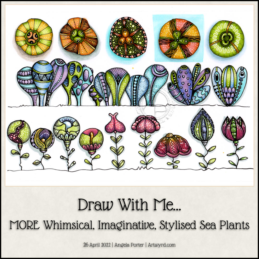
This sketchbook page is now complete! I had so much fun doing this one for sure. There’s a whole host of plants to populate any number of whimsical worlds. There’s a third video tutorial showing how to draw, step by step, the last row as simple line art as well as the start of adding colour and pattern.
Some of the motifs look a bit ‘flatter’ than I like them to, and a couple I’m not quite happy with in terms of pattern/texture. But still, it’s a page full of inspiration and possibility, something I can look back on for inspiration.
I say ‘plants’ as they all have seeds inside them. They could, however, be critters of the sea urchin family, albeit a bit on the alien side!
I drew all five designs in today’s Draw With Me video on YouTube. I added colour to the first two on the video. But as YouTube was taking its own sweet time to upload and process the video, I decided to complete the group of designs.
There are a few favourite patterns that I tend use to add texture to my drawings these days – tangle patterns tipple, between, and diva dance. I do make use of other patterns involving lines and dots.
I think I went overboard with the tipple on the middle sea plant! Still, you learn by doing…hopefully eventually in my case!
Oh, I used alcohol markers to add colour and shadow. I chose yellow-green, yellow and yellow-orange colours today. Keeping to a limited colour palette really helps me work with colour in a way that is pleasing to me.
It was really enjoyable to do, as drawing always is.
I followed this up with work on my next colouring book. The style of drawing is different to what I’ve been doing of late, so the first template I’ve inked in and added colour to so I can see what it will look like coloured. Well, I’ve partly coloured it. Colour really does make all the difference. I do love black and white drawings/lettering. But for these stylised, whimsical, imagined kind of drawings, like my colouring templates, the colour is what really does bring them to life.
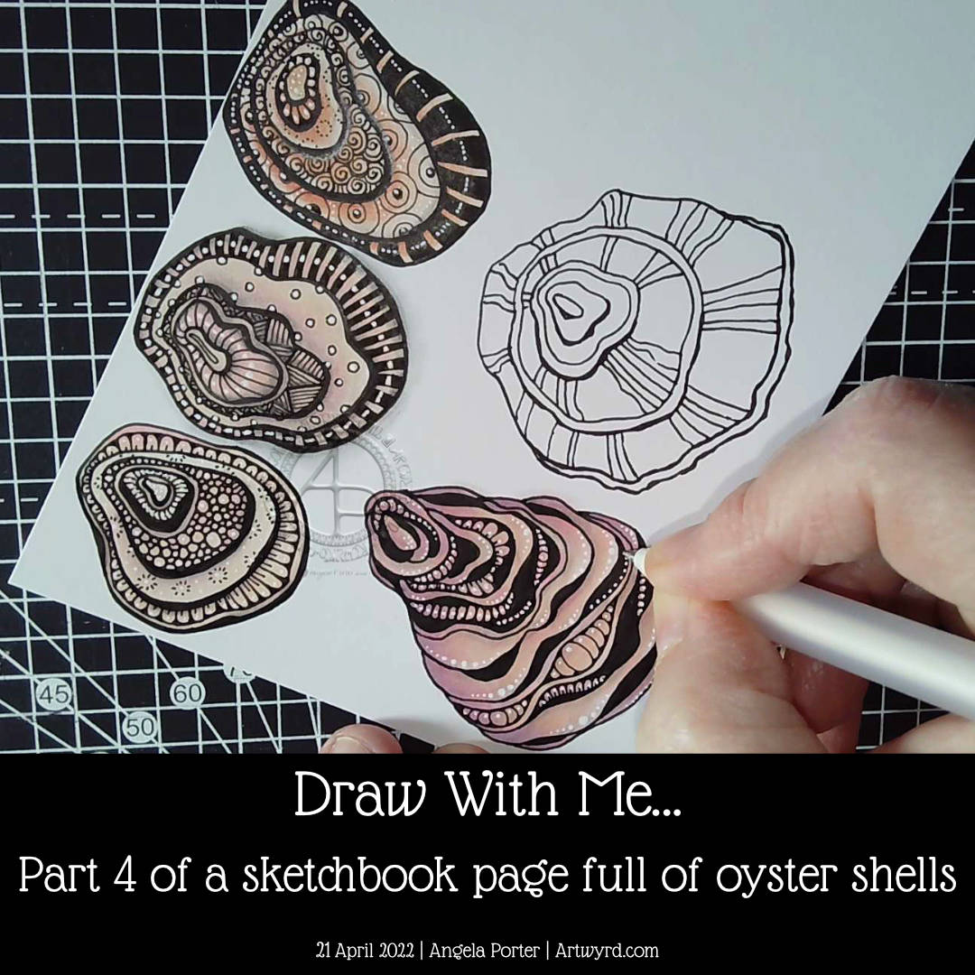
Finally, the page is as full as I’d like it to be of oyster shells! I did some hand-lettering before filming the video. I just wanted to add a quote about oyster shells and practice hand lettering.
I really enjoyed drawing all of these shells. The last one, a more whimsical one than the others, is my least favourite. It did, however, give me the chance to do something a little different when adding textures.
I really didn’t think out the layout of the hand-lettering. Maybe I’ll work that out, eventually. Maybe!
Overall, I now have a great reference page in my sketchbook as far as oyster shells are concerned.
I may do some further work on this page. Part of me wants to add words/quotes/facts as a background to at least one shell. I’ll see how I think about that after a little break from it.
In the process of drawing this page over the past five videos, I’ve gained some insights and understanding about my motivation to start a YouTube channel. I didn’t seem to have any clear purpose for making the videos, but with time and working on it all I think the pennies have finally dropped. That’s a good thing, maybe. All I have to do is to keep this purpose in mind (and remember it!). Fortunately, I’ve recorded my ah-ha moments in a journal, just in case I need to refer to them.
Now all I need to do is work out the next motif to focus on!
In part 4 of this video series, I draw a couple of oyster shells, one of which I add colour, shadow, highlight and pattern to. The other I’ve left until my next video.
I really enjoyed drawing these oyster shells. The one I’ve completed has used a kind of variation of the Diva Dance tangle pattern to construct it.
I’m really quite happy with how this one has turned out. I actually think I’ve done a fairly good job on adding colour – so unusual for me! Alcohol markers really do seem to be working well for me. Something to seriously consider going forward, that’s for sure.
I like how the areas of dense black add a lot of contrast. But I like how I’ve added white dots to soften the harshness of them and make them feel they belong in the pattern.
As I was wittering and musing during filming, I realised how much I enjoy creating line art. I enjoy the elegance of simplicity, focusing on the key elements that make the drawing instantly recognisable. This hearkens back to my time studying science and then the 28 years I spent as a science teacher. In science, observational drawings have to focus on the essence of what you see, making sure you get the essential identifying features correct. I was always a bit of a maverick going a little further than the bare essentials and even adding some colour! I got a tad chastised for that, but it didn’t stop me.
Now, this love of focusing on the essentials, the basic line art, shows in my artwork so much. In fact, it’s essential for me to do this otherwise I try to incorporate everything I can see into the drawing. Then, the drawing ends up so detailed it’s not really recognisable!
There seems to be a lot of sudden realisations and connections being made with my relationship to art and my particular style lately. Signs, I hope, that I’m finally settling into what is ‘me’ and recognising where my artistic roots lie and what I really enjoy doing.
Speaking my thoughts and reasoning out loud for the videos brings this process into awareness. I’ve often written about how I don’t think in words, but in feelings or abstractions. I have to be forced to put them into words by being given the opportunities to speak them out loud to people, or sometimes to write them in journals or blogs.
I hope that by sharing these thoughts and processes with others it will help them to find ways to discover and become comfortable with their own artistic style, as well as gaining some confidence in expressing themselves artistically just for the pleasure of creating art.
The other thing that working with the bare essentials line art style is that there are plenty of spaces for me to get creative with pattern and texture! I’ve learned over time how not to become overly ornate. What I like about today’s artwork is how I didn’t try to fill every section in with intense and intricate pattern. Oh, there’s plenty of white highlight dots scattered around, but the tangle pattern style of textures are thoughtfully placed and not too many of them.
This is something I’m still developing – not to overwhelm the drawing with pattern/texture. How much to use, and how much ’empty’ space to leave.
I’m about halfway through filling this slightly smaller than A5 sketchbook page with different kinds of oyster shells. Today’s even has a pearl in it!
I’m using the same peachy-pink and warm grey alcohol markers, but with the addition of a pale dusky kind of mauve colour for the shadow inside the shell.
I never claim to be an expert at colouring. However, using a very limited colour palette works in my favour, that’s for sure! The end result is good enough, which is what I always aim toward these days. Perfection is something that is unattainable. So good enough is just great!
I’ve been wintering on, both in speech and typing, about the purpose of my YouTube channel. Synchronicity struck today as two quotes about art appeared on my Facebook newsfeed today:
“Go into the arts. I’m not kidding. The arts are not a way to make a living. They are a very human way of making life more bearable. Practicing an art, no matter how well or badly, is a way to make your soul grow, for heaven’s sake. Sing in the shower. Dance to the radio. Tell stories. Write a poem to a friend, even a lousy poem. Do it as well as you possibly can. You will get an enormous reward. You will have created something.”
Kurt Vonnegut
“The one thing that you have that nobody else has is you. Your voice, your mind, your story, your vision. So, write and draw and build and play and dance and live only as you can.”
Neil Gaiman
These two quotes eloquently sum up what I think I want to bring to YouTube, my social media, and to you.
Confidence to create art just for the pleasure of it and in your own way too.
Building self-confidence is the first step, and sometimes that needs help, instruction, step by step methods, and suggestions for variations and making it your own.
We all can draw. We just have to unlearn that drawing isn’t always about photographic representations. It’s about self-expression, and each of us expresses ourselves differently. Maybe in a similar way to others, but uniquely our own.
To have a bit of confidence to do this, in a sketchbook, where no one else has to see until you’re ready to share in a supportive environment, is all that is needed. I wasn’t lucky enough to have a supportive environment for creating art until I was in my 40s. If I can provide a supportive environment here, around social media, on YouTube, and perhaps in a closed Facebook group or some such place, then I will.
It’s nice to find a purpose, don’t you think? I do, and I’m glad I’ve found that purpose for YouTube at the very least.