This was a lovely way to spend an hour or so on a sunny Saturday morning! I’ve often said it and will say it again and again, I do enjoy drawing things of whimsy.
Houses are one of my current themes. As they’re all imaginary, I can ignore any architectural/structural rules. Towers I love, in particular. I’d love to be able to afford to buy or build a wonderful, quirky tower to live in. I’d like a dome on top so I can watch the night sky or thunderstorms clearly. For now, though, I can dream of living in a tower and create what I can imagine on paper with pen and ink.
I hope you’ll join in and try your hand at whimsical buildings and create your own village full of peace and harmony!
Please click on the “Watch on YouTube” button to play the video on YouTube. Cheers!
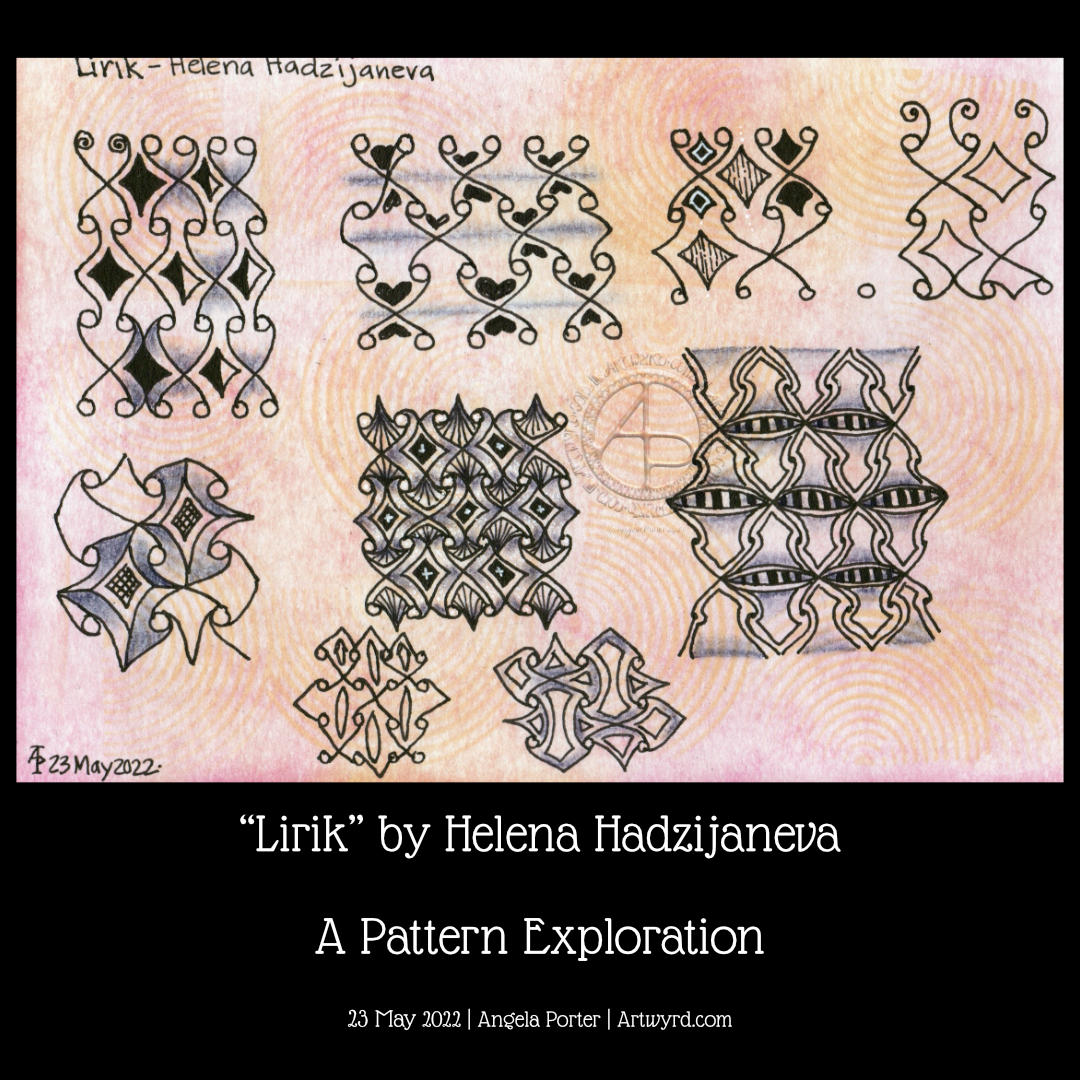
Oh this was a lovely pattern to explore for a page in my sketchbook. It’s quite simple to draw, but it has so many possibilities that I’ve barely touched upon in this video.
The page I’m drawing on I coloured with various Distress Inks – Mustard Seed, Wild Honey, and a touch of ripe persimmon around the edges. I also used some Abandoned Coral to add subtle patterns through a stencil.
It’s always a pleasure to draw on paper that is coloured. The colour always brings some interest to whatever is being drawn, or so I think. Not that I’m averse to drawing on white paper, but colour adds something I can’t quite put into words.
As well as using black 05, 03 and 01 Sakura Micron and Uniball Unipin pens, I added some vintage red from an 0.5 Zebra Sarasa gel pen.
For shadows, I used a purple-grey Stabilo Carbothello chalk pastel. White highlights were created using a white charcoal pencil from General’s.
This week’s coloring template for the members of Angela Porter’s Coloring Books Fans Facebook group is a Doodleworlds design. The group is free to join and the templates are free for members’ personal use.
These kinds of pages do make me smile. The silly, whimsical nature of them certainly lifts my spirits somewhat.
Drawn with pen on paper. Colour added digitally in Clip Studio Paint.
Doodleworlds is the title of one of my coloring books. It can be found on Amazon and also in my Etsy shop – Artwyrd.
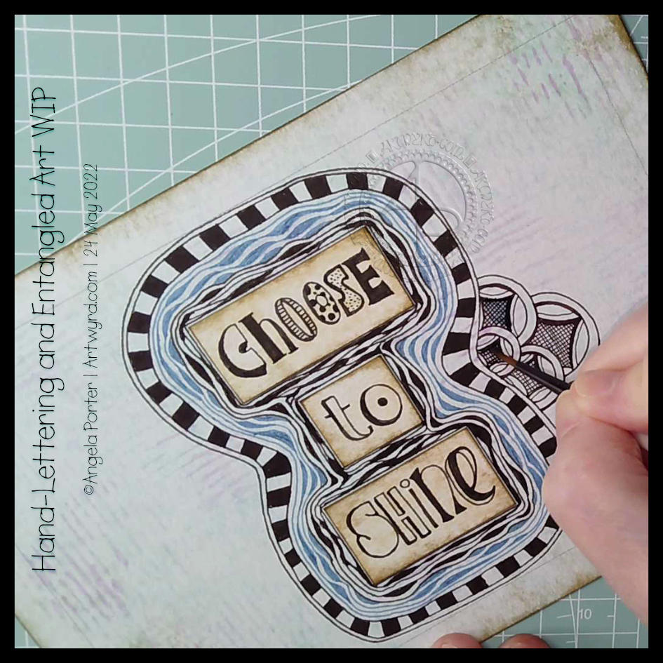
I’ve finished it, I think. I’m feeling a bit happier with it now. I really like the abstract, curvy, swirly bits that remind me of La Tene (early Celtic) art. I’m still not happy with that central ‘moat’, though.
Oh, I’m also really pleased I stuck to an analogous colour scheme, mostly. Having the words in an almost complementary colour to the blues and purples makes them stand out. But I still rather like the swirly abstract patterns, and I’m so glad I added them!
I’ve not quite found my way with hand-lettering. I keep trying new and different things out, but nothing seems to sit well with me yet. Although I like the more formal lettering layouts, I don’t think that’s for me. I tend to work fairly instinctively and intuitively with little forethought or planning. When I do think my way through something, that’s when disaster tends to strike!
I suspect a looser, expressive, intuitive kind of style is going to work for me, along with my style of entangled, abstract art. Probably. Possibly. Perhaps…
Please click on the ‘Watch on Youtube’ button. Cheers!
We all need some whimsy in life at one time or another. Given all that’s going on in the outside world, I definitely need a huge dose of whimsy! So, today, I drew three whimsical houses, one step at a time.
It was one of those mornings when I wake up with what seemed to be a good idea on my mind. Then, I execute the supposedly good idea to realise it’s not working out as expected, and it may not have been such a good idea at all. That is what is happening here!
I think the idea of doing my hand-lettering like this may have some mileage in it. I do feel I have problems pleasingly arranging lettering. If I work on pieces of paper and cut out the words, I can arrange them on the paper until I’m happy with it. So that’s fine. A good plan.
But, I’ve ended up with a birdseye view of an “I” shaped moat around a blocky castle “rolls eyes”. Having “choose to shine” inside a capital I works rather well – I choose to shine. But what possessed me to use blue Diva Dance around the letters? I really didn’t think it through or see the consequences of that choice. Duh!
Of course, this may just be that part in drawing where I think it’s all awful and I should just give up. But I’ve learned to be a bit stubborn and push through to the end, with a drawing at least. Adding colour is an entirely different matter.
So, I will push on and see what happens. Who knows, it may work out nice enough in the end. Or not. Either way, there are plenty of opportunities for me to learn some stuff.
Sheesh, I really can drop some rather heavy clangers at times. But it’s through these that we learn, grow and develop as artists. In my case, I seem to drop the same clangers time after time after time and never quite seem to learn. One day the pennies will drop!
Exploring a totally new tangle pattern may not have been the best choice for me as I wait for the last pain of a migraine to go so I can sleep the rest of it off! Plenty of mistakes and not good choices here, but plenty of opportunities to learn from.
In today’s video on YouTube, I first make some Distress Ink backgrounds, then I explore this lovely tangle pattern, mangling it completely at times! This isn’t a problem as it’s all sketchbook work!
I’m a tad out of sorts today, just a dose of gloomy emotional weather, that’s all. It’s also beginning to pass on by too, which is a good thing! Even with the gloomy weather, I’ve been able to feel the touchstone of contentment within me, but my thoughts have been on shaky ground concerning art.
I was drawing last night, and this morning a different page, and lots of questions came up about my art style. I wasn’t feeling happy with my hand-lettering journey and what my ‘style’ is. I’m finding it really hard to feel comfortable with the hand-lettering I’ve been doing lately. I don’t know why that is, not entirely anyway.
So, my solution is to draw! Well, hand-letter and then draw, but hand-lettering is drawing letters rather than writing. So drawing it is!
Instead of popping words/phrases into my ‘entangled’ art style as I draw, I thought I’d place them on the page first. Then I can do the pattern stuff, repeating various motifs to bring some coherence to the whole design. Not sure I’ve managed it.
Instead of filling the whole space with lots of black pen work, I thought that I could use a brown pen to add just lines to the spaces between. I think I like this as the spaces just looked cold and empty before.
I’m still not sure I’m finding my way with this. I know I do get all flustered and fed up with my art from time to time and start to question myself and be quite harsh with myself.
Working on this, and talking my way through some of it in today’s video, has certainly helped, and my mood is lifting. But regardless of my emotional weather, this was something that still needed to be thought through to do my best to pinpoint what I was struggling with when it comes to including hand-lettering in my art.
Please click on the “Watch on YouTube” button. Cheers!
Carrying on with my look at arches is an exploration of the tangle pattern “Kruffle” by Kelli King CZT.
It actually took me a little while to understand the deconstruction of this pattern, it’s deceptively tricksy! But, when I’d got it, quite a few variations appeared in my sketchbook.
Of course, I go through these, step by step, in today’s video.
I really do enjoy exploring tangle patterns, as well as all my favourite motifs. They are such a good way to get creative juices flowing, but also of practicing your drawing skills, as well as other techniques, such as adding shadows or colour, or further patterns.
Thursdays come around quickly, or so it seems. And with Thursday comes a new colouring page (template) for members of Angela Porter’s Coloring Books Fans Facebook group. The group is free to join, and the templates are free to the members of the group.
This week, I indulged myself in creating a tile mandala kind of design. That central panel looks really awkward, but I suspect it has more to do with my colour choices than anything else! I’ll be interested to see how people tack that one. Ho hum.