A little, pastel mandala

Angela Porter mandala 17 July 2018 watermarked

Today, I’ve been artfully busy with drawings for a new book for Dover Publications Inc., but have taken time out this evening to draw a simple mandala, and to colour it in.  Oddly, I’ve chosen lots of pastels!

Mandala created using Autodesk Sketchbook Pro and my Microsoft Surface Book.

By the sea, more about digital art

EscapesByTheSea_AngelaPorter_Coloured1

At the end of this month, a new colouring book by myself is due out.  It’s called ‘By The Sea’ and is one in the Escapes series of books from Dover Publications Inc..

Above, is one of the templates from the book, along with my work in progress based on it.

I’m using Autodesk Sketchbook Pro on my Microsoft Surface Book to do the colouring/drawing.  It’s taking me a long time to do; if I’d used my Chameleon pens, it would’ve been all done a couple of days ago!  However, it’s all a process of learning and exploring, working with different brushes and so on.  Working in layers is a revelation to me, and I love the glowing colours I can get.

Working ‘outside the lines’, or even totally ignoring the lines’ is something very new for me to do, and I’m very uncertain about the results I’m getting.

I know from past experience with different traditional media such as oil or acrylic paints, I really don’t get the hang of them.  I also don’t like the smell or texture of them.  Watercolours are fine as long as I don’t try to get fancy with them and just colour areas in then work on top with pens and pencils…

Digital art is opening up my horizons…and shaking me out of those old, comfortable ways.

I make lots of ‘mistakes’ in colour choice.  I make lots of ‘mistakes’ in using the different brushes and textures and blending.  I end up unhappy with what I’ve done for example, I’ve tried four or five times to add the wiggly seaweed strands to the bottom right of my coloured area, and I’ve been unhappy with the five times I’ve done that.

What I do know is, that I’m not going to screw my work up and chuck it.  The beauty of being able to work in layers means it’s easy to remove what you’re not happy with and re-do it.

The other side of this coin is that it’s really difficult for me to know when to stop fussing and fiddling with things!  I sometimes end up erasing work I’ve done as I’ve gone too far and can’t undo it, and the only way to go is to start that section over again.

This is all fascinating for me, as well as frustrating, and can lead to me being hard on myself.

Backing off from it isn’t an option.  Where I get very frustrated with traditional media when I try to add colour in a way I’d like it to be there, a lot of that is taken away from me as I use digital methods.

I have a lot to learn, a lot to explore, but the more I do, the more I’m determined to acquire myself a Microsoft Surface Studio.

Rainbow Mandala – another

Rainbow Mandala01-Angela Porter

Late last night I spent some time playing with mandalas where the background is completely black and the design is in colour.  I came up with a few where the design was the same, but the colours were different.

This morning, I felt I wanted to try a bigger, more complex mandala, and this is what resulted.

I love the way the colours seem to glow against the black, there’s something almost magical about it.

Of course, I now want to play with different colour combinations, particularly complementary colours.

It’s fun!

Playing with colours and mandalas

Rainbow Mandala01-Angela PorterRainbow Mandala02-Angela PorterRainbow Mandala03-Angela PorterRainbow Mandala04-Angela PorterRainbow Mandala05-Angela Porte1Rainbow Mandala06-Angela PorterRainbow Mandala07-Angela Porter

I’ve just spent an hour or so playing with a mandala design and colour, and these seven mandalas are the result.

Over the past few days I’ve been working on a new book for Dover Publications.  One of the templates I designed took me 3 full days of work to colour digitally.  I had to get my head around layers and experimented with texture and the like.  The result I rather like…and no doubt I’ll show in the fullness of time.

Etsy Listings for Colouring Pages


In the last day, I’ve uploaded three more colouring sheets to my Etsy shop – Artwyrd.

For each, there’s either a fully coloured, or partly coloured, version of the line art to see.  Yes, I’ve been using them to practice colouring in digitally.

I’ve also started work today on a new book for Dover, the theme for it being eerie.

Digital art- it’s a learning thing

Flower1_AngelaPorter2017

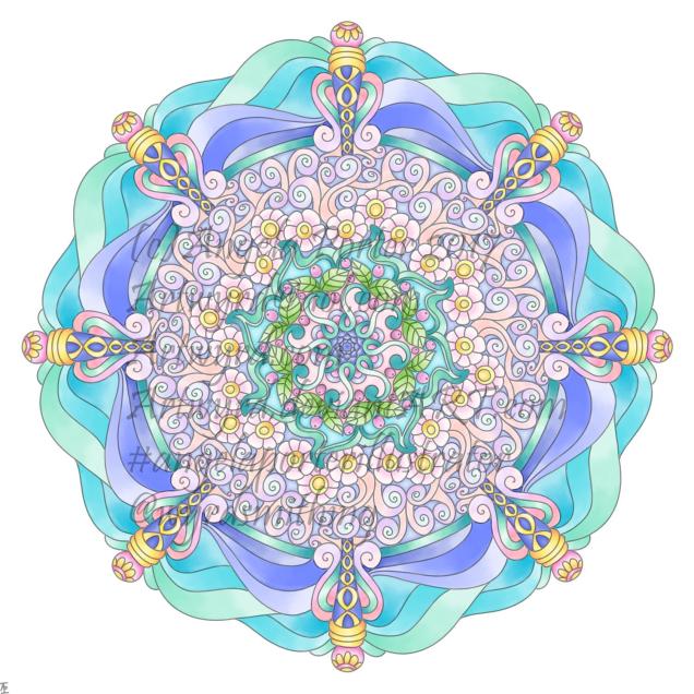
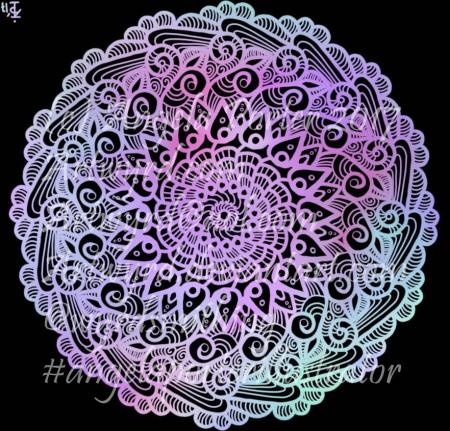
Over quite a few hours I’ve used this design to explore digital colour a bit more.  Of course, it’s one of my own designs.

Flower2_AngelaPorter2017

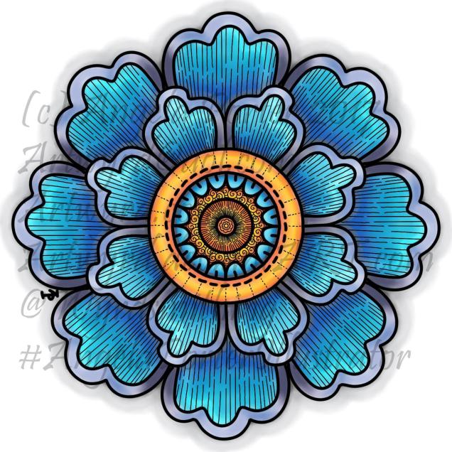
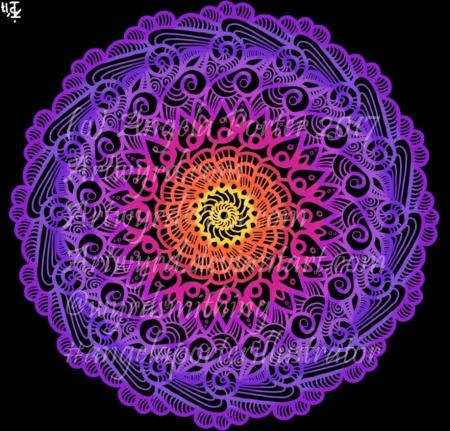
This is the first coloured version of the template.  I’ve left the black lines in and added some more line patterns for interest.  To colour the flower, I used a couple of pencil ‘brushes’ in Autodesk Sketchbook Pro along with two blender ‘brushes’.  The colours come from the Copic colour palette.

I’m quite happy with this; it’s very much like what I’d do with traditional media.  However, the digital environment means it’s far easier to correct mistakes.

As I’ve said before, you may think that digital colouring/art is faster and easier than traditional media; I have to tell you it’s not! It took me 2 hours or so to colour this simple flower – and that was just colouring one-eighth of the design and letting the symmetry tool copy it around the flower!  With traditional media it would have taken me much less than 1 hour to achieve a similar effect.

I don’t think that the extra time is due to me not being familiar with the ‘brushes’ I’m using, but more to do with the way that you can use layers as well as intensifying the contrast after each blending session.  It is quicker to lay colour down – it doesn’t have to be neat and smooth as the blending tools can help to smooth out the unevenness.

Flower3_AngelaPorter2017

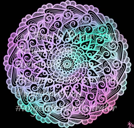
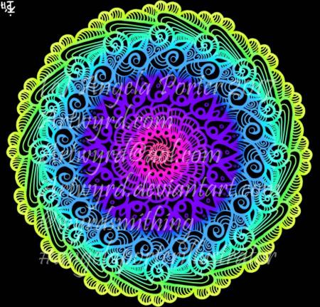
Now, this one really is something quite different from me.  NO black lines.  Not one.  Just colour.

It took me a lot longer to do this one – 3 to 4 hours in total I think, and it’s only a small and simple design!  Part of that time is because this is something very different for me – no black lines…

I also made good use of layers to keep the colours separate so they didn’t blend; one layer for blues/purples and another for the yellows/oranges.  A third was added for the background.

Getting my head around the concept of working in layers after a long time only ever working on one sheet of paper, is a really challenge, but as  I work in this way it becomes more familiar to me.

I’m also a bit ‘stubborn’ in terms of exploring and discovering what works and how to do things my own way rather than reading/watching tutorials.

Like any skill, it takes time to develop some level of competence with it, and a lot longer to achieve a mastery.  The more I do with digital art, especially in Autodesk Sketchbook Pro, the more I like working with it.  I like Sketchbook, lots.  It may not be as complex as Photoshop or Illustrator, but it does what I want it to do without struggling with a complicated interface.  It allows me to draw/create a lot like I would with paper and pen, and then to explore more media than I’d ever use with traditional art media, and media that don’t even exist outside of the digital environment.

The more I work with it, the more I know I will need a Microsoft Surface Studio sooner rather than later; as much as I love my Surface Book, I do find it difficult to understand how things will look 1:1.

I’m in no great rush though, my Surface Book works just fine, and if the worst comes to the worst, I can sketch my ideas out and scan them in and work from that, using layers of course!

Digital art musings


AngelaPorter_ColouredMandala2_26June2017

As you know, I’ve been spending quite a lot of time developing a good relationship with both my Microsoft Surface Book and Autodesk Sketchbook Pro.

I’m fairly happy with drawing on the surface, though I’ve yet to get the texture of the ‘pen’ I use to be a little less perfect and a bit more ‘human’.  There’s also the issue of not quite getting how big patterns will be when printed out, and then finding out that a powerful magnifying glass along with microscopically fine pointed pens/pencils will be needed to colour the patterns if not done digitally.

Now, I have mostly been printing my designs out and then colouring them with traditional media; particularly my Chameleon Color Tones and Color Tops marker pens.  I do love doing this – it’s a very sensory experience.

However, I am aware I have a different tool for colouring viz. Sketchbook Pro and it’s suite of brushes and textures and so on.

Believe it or not, it takes me longer to colour an image in digitally than it does with traditional media, and I mean a LOT longer.

AngelaPorter_ColouredMandala1_26June2017

I love the way the colours are clean, almost glowing, when I use the marker pen ‘brush’ or one of the watercolour brushes.  I’m getting to grips with which particular kind of blending or smudging ‘brush’ I like to use.  I’m starting to get the idea of working with layers.

What is vexing me, is how ‘perfect’ the finish is, and how simple it looks.  I wonder if it is way too simple a finish.  It also frustrates me that I’m kind of trying to replicate the effects of traditional media but with digital tools, and failing as everything either works out almost perfectly blended with bright, clear colours, or ends up as a bit of a mess as I try to use different brushes or textures.

5x7Flower3 coloured 1.1

A dear friend of mine pointed out to me that I’m trying to compare apples and oranges, that perhaps I should treat digital colouring as an art medium all of it’s own instead of trying to make it like traditional media.

It was also pointed out that I do have a tendency to give myself a hard time when things seem too easy to me, or end up too perfect.

All of the images in this post have been coloured digitally, and the colours have shading/gradation in colours, but there’s no texture in them.  But then, there’s little texture in the colouring when I use marker pens, such as my Chameleons or Copics, unless I deliberately add it, which I’m always disappointed with.  I much prefer to add texture with black lines, which I need to bear in mind now as I work with digital colour.

I also recognise that I need to do a bit more to make more ‘contrast’ between the paler and darker shades of colours, as well as making sure there’s good deep shadows to add that illusion of 3D to the drawings.

I will continue to experiment and explore the other digital media and brushes, as well as special effects, and in time I may work out how it can all work for me in a way that I’m happy with.

Artwyrd at Etsy

Last night I bit the marker pen and uploaded two sets of small greetings cards to my Etsy shop, Artwyrd.

Each set has ten cards featuring a coloured flower/mandala design stored in a small, custom made box along with matching envelopes.

The flower/mandala designs I drew myself in Autodesk Sketchbook Pro on my Microsoft Surface book.  I printed out multiple copies of the designs and then used my Chameleon Markers and Copic Markers to colour them.  Distress Ink was used to add colour around the designs.

The next step was to create colour mats for the designs; I used my marker pens to colour some Centaura Pearl card.

Before mounting them on the 3″ x 3″ (7.5cm x 7.5cm) card blanks, I embellished the designs with dots of metallic and pearlescent acrylic paint, as well as adding coloured gems.

Of course the cards sparkle!

The boxes are made from cardstock with the lids decorated with designer series paper; the colour ways chosen are complementary to the colours of the cards. I also used Distress Inks to distress the edges and corners of the boxes.   I’ve yet to embellish the boxes.

These are my fifth and sixth attempts at making the boxes.  I had to purchasing a new paper cutter that’s more accurate than the one I had been using.  I had used a template for a box that would take ten 3″ x 3″ cards, but wasn’t big enough for the envelopes.  So, I also had to work out and adjust the measurements needed for the base and lid so that the envelopes would fit in the box!  Frustrating, especially as maths isn’t my strong point …but I got there in the end.

I do have a couple of jobs to do to the cards/boxes; the boxes need some embellishment, and I need to add makers labels to them too.

The boxes will be nice for other things once the cards are used up – the lids are a snug fit.

All of the designs I have stored and may, in the fullness of time, put them together as a pack of digi-stamps so people can use them to create their own cards!

Dragonfly mandala

DragonflyMandalaWatermarked_AngelaPorter_19June2017

Over the last couple of days, my focus has been on designing mandalas.  I also have been learning a little more about Autodesk Sketchbook Pro and how I can import images, cut them and have them as an opaque image that ‘floats’ on top of other layers or designs.  The image above is an example of the work I’ve done.

My only issue with it is that I’ve used too thick a pen for the mandala. Now I know how to do this, I can always re-do the mandala part, or the dragonfly!

I also spent a fair part of yesterday doing some mixed media work.  A friend of mine asked if I’d do something with her wedding speech for one of her family so it’d become a keepsake for them.

I’d been puzzling about how to do it, when inspiration struck with the colours I needed to use, and off I went!  I’ll post a photo of it once the wedding is all done!

One dragonfly

Dragonfly13patterned_AngelaPorter_17June2017

Seeing as I’ve focused on butterflies over the past few days, I didn’t want to have dragonflies feeling they’ve been overlooked.  So, I have a few templates done and saved, and so far I’ve added patterns and shading to one.

Oh, I’ve also worked out how to add a watermark to my art to try to protect its copyright…just have to remember to add a watermark to every image of my art I upload now…

Of course, I’ve been drawing on my Surface book in Autodesk Sketchbook Pro…no better way to get to work out how the software works for me and with me!