Sunday Morning Entangled Art

Link to today’s vlog on YouTube.

A late summer, rather cool and sunny start to the day is something I’m luxuriating in, and that means arty pursuits.

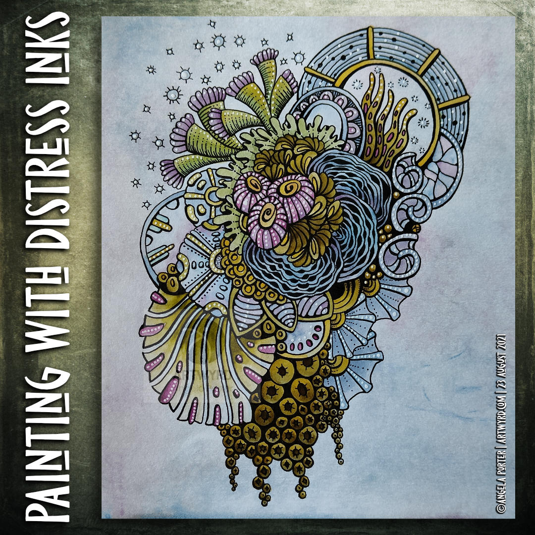
I’ve completed one drawing, which I kind of review at the start of today’s vlog over on YouTube. I’m not too happy with the colour I’ve added at all. I started with Ecoline watercolour inks, but they felt too bright and jarring with the distressed, grungy, quite dark background. So, I then tried out distress inks, but I’d already gone down the rabbit hole of poor colour choices. When I’d finished adding colour, I had some rather dull, uninspiring colours that really didn’t fit in with other parts. So, I tried using coloured pencils to lift the colours, with not much success. Finally, I tried some chalk pastels, which helped somewhat. Finally, I added embellishments with a variety of gel pens,w hich helped to lift the colour somewhat, bu kind of seem over the top.

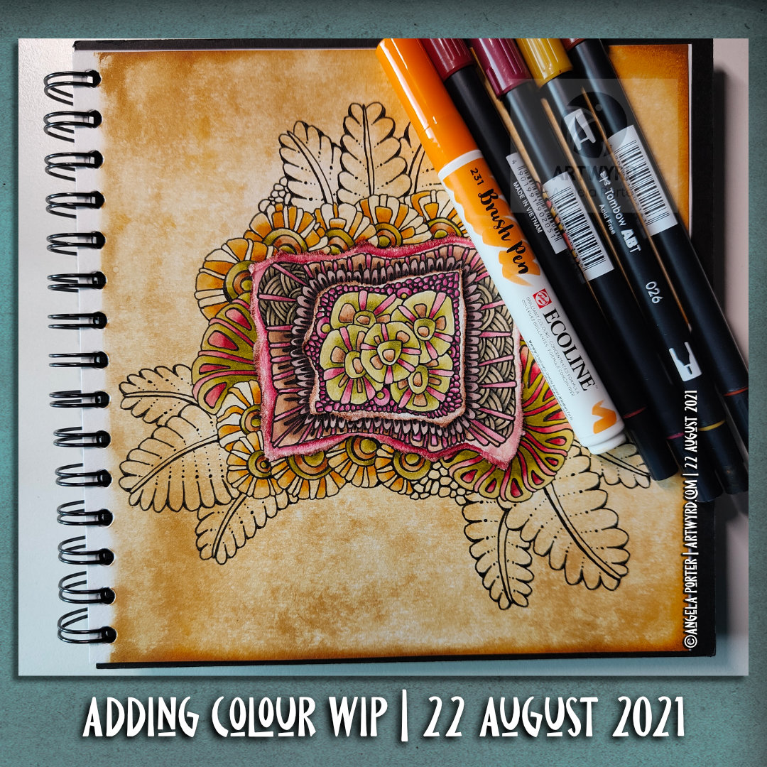
So, to shift my disgruntled arty mood, I thought I’d go back to an earlier drawing and use a really simple set of colours – cerise and purple – to add colour and shadow to the drawing. And white to help bring out highlights if needed, though I will use various gel pens to embellish this when I’m done. This is the drawing you can see at the top of the post.

I’m liking what’s happening with this drawing. I do have to layer the chalk to get an intensity of colour when using the tortillon to blend the colour out as well as working the chalk into the paper. I’m enjoying the way the different colours will blend nicely with each other. And I like the simple colour choices too.

I keep saying I’m going to complete drawings with monochrome, or nearly monochrome colour palettes. And I keep forgetting to do this when I leave a host of colours near me!

I shall persevere with this particular drawing, and see how I feel about once it’s all coloured.

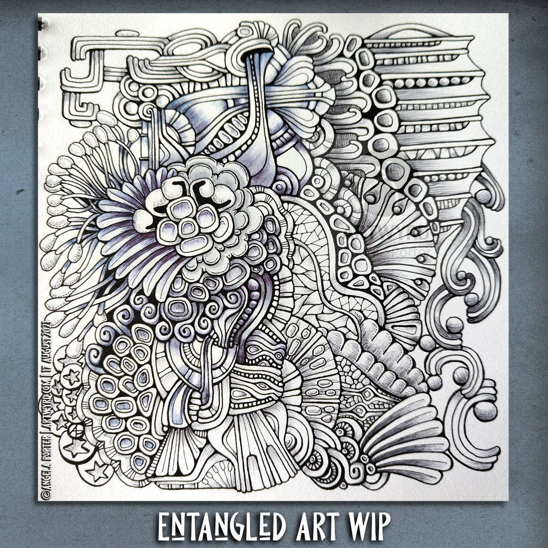
As to the other one, well it’s being put to one side for a few days so I can return to it with fresh eyes and a fresh mind. Perhaps I’ll see it in a different way then.

Saturday Sketchbook | A Week Ink Art

Link to today’s vlog on YouTube.

My vlog today is a flip through of all the art I’ve been doing in the past week, both in sketchbooks and on paper.

The image above shows my bedtime drawing last night. I’m not happy with it, but it is what it is. Finishing the drawing followed by the addition of colour and shadow/highlight may change my mind about it. As may the passage of time and a fresh view of it.

This is but one of quite a few drawings done this week. The rest can be seen in today’s vlog.

Pen Drawing and Distress Ink Background

Link to today’s vlog on YouTube.

I woke to morning sunshine and the lovely coolness of an autumn morning. I feel so much more alive on mornings like this. The coolness is so refreshing, invigorating. Although we’re not quite into autumn yet, there are hints it is on the way. Hints of leaves changing colour. Sunlight is much more golden rather than the bright quality of summer light. It really is wonderful!

It put me in the mood to create a coloured background (or two) to draw on. This time, I’m using a vintage brown gel pen from Arteza. Usually I’d use black, but I’m starting to explore the possibilities of other colours, particularly on such distressed, grungy backgrounds.

Today’s vlog starts with the creation of two coloured backgrounds, then starting to draw the design. This drawing isn’t finished, yet. When it is complete, then it’ll be time to add colour and/or contrast and highlight. Finally, it’ll be time to add embellishments.

I know that when these gel pens are dry they are water resistant, so the world of coloured media is open to me. I am likely to keep the colours with in the green and brown palette of this background, however.

Pen and Wash | Entangled Art | WIP

Link to today’s vlog on YouTube.

A very small penny dropped yesterday. I realised that what I’m doing is pen and wash, or ink and wash, or line and wash. I’m not entirely sure that a label is required, but it seems to fit.

I’m adding watercolour of one kind or another – Inktense, Ecoline, Mijello Mission Gold, Distress Inks, etc – to a pen drawing. Why I haven’t made that connection to the description of the method/process? I have no idea! Still, I have made that connection and a realisation that it gives a sense of artistic legitimacy to my work. That is a function of my insecurities when it comes to my artistic espression.

Yes, that’s right. Insecurities. Lack of confidence. Lack of belief in myself. Self-questioning about what on Earth I’m doing.

It is always nice for me when pieces of a rather abstract, metaphoric jigsaw fall into place, giving me a more coherent view of my method, my artistic voice.

These pieces always fall into place at the right time for me. I’m ready to accept that line and wash is what I do well, when I work within ‘an elegance of limits’ to quote the team at Zentangle. In this case a limited palette of colours harmonious with the background.

As well as working on this particular drawing, I have included some views of recent work in my sketchbook in today’s vlog. This other work shows me trying to work out how to add more contrast to the wash of colour. Fine ballpoint pen, graphite pencil and tortillon or coloured drawing pencils/chalk pastels are what I’m exploring. Eventually, I will settle on a method that I particularly like. I’m not happy with any of these at the moment.

I will continue to explore an figure it out. That’s what I’ve done with adding colour to my drawings, and that’s what I’ll do when it comes to increasing contrast with shadows and highlights.

Of course, I’m talking here about traditional art. When it comes to digital art, I think I have found a way I’m comfortable with in adding colour to pen drawings. I’m not quite there yet with traditional media, as well as finding the traditional media I like to work with.

Painting with Distress Inks

Link to today’s vlog on YouTube.

I woke with a stinking headache this morning. So, spending some time adding colour to an entangled drawing, along with a couple of headache pills, was just what was needed. And listening to a podcast or three.

I decided to use Distress Inks as paints, along with a Caran d’Ache waterbrush. Here’s a list of the colours I used:
Forest Moss, Fossilised Amber, Weathered Wood, Broken China, Dusty Concord and Seedless Preserves.

Hindsight is a wonderful thing, and I think I really should’ve stayed away from Dusty Concord and Seedless Preserves – the purple and pink colours. Either other analogous colours and/or browns/greys would’ve worked so much better.

I keep doing this with colour. I’m so used to choosing complementary colours that I still reach for them. In this case it’s understandable as I chose some of the colours that were in the background.

Note to self – monochrome-ish or analogous colours!

To help tone these brighter pink and purple colours down, a liberal use of dot highlights from a white Sakura Soufflé pen was needed! I’ve not finished adding embellishments yet.

Nor have I started intensifying shadows. I’m not sure whether to use biro or either a graphite pencil or a chalk pastel and a paper tortillon. My head isn’t clear enough to decide about that! As the headache is wearing off, my need to sleep the last of it off is increasing.

Adding Color WIP

Link to today’s vlog on YouTube.

Yesterday, I added pieces of paper coloured with either Distress Ink or Distress Oxide to pages in one of my sketchbooks. These pages had been previously coloured with Distress Inks.

I wasn’t at all sure that what I was doing was a great idea. So, I decided to add patterns to one page using a micro Uniball Eye pen. I still wasn’t sure, but a bit more confident in my idea. So, I started to add colour to see if that would make me happier with what I was doing.

To add colour, I started with some Tombow Dual brush pens in rather vintage, autumnal colours that work well with the background.

As the Distress Ink tends to alter the properties of the paper, I thought I’d try the Ecoline Brush pens. And, they were so much easier to blend out with a waterbrush. Actually, the Distress Ink makes it much easier to blend the Tombow Dual Brush pen ink out too.

So, I’m quite happy with the result. Now, I can complete the drawing and finish up adding colour. And I look forward to working on the other pages in the sketchbook too.

Entangled Drawing | Adding Colour Part 5

Link to the Adding Colour Time Lapse Video

This morning, I spent nearly two hours adding colour to this drawing. It’s getting close to being completed. Well, the adding colour part. There’s embellishing to be done too!

I’ve used Inktense pencils through out, along with a damp brush to activate and blend the colours.

As well as colouring new areas of the design, colour was added to intensify various areas that were appearing too insipid. I still have some of this to do to bring out a sense of volume in various elements.

I’m fairly pleased with this, though in hindsight adding the shadows with a grey Faber Castell Pitt Artist pen first may not have been the best idea. Still, it’s a learning experience, again.

It’s Template Thursyay!

This week’s coloring template / coloring page for the members of Angela Porter’s Coloring Book Fans facebook group is a typically entangled one. But one that’s a bit different too!

Instead of having an outer frame, I’ve included a frame, but behind the drawing. I wanted the elements to grow out of the frame in places, just for a change. And I’ve just noticed where I’ve not coloured a little piece of that frame! Oops! Still, I think that by colouring the frame in, it helps any colourist to work out some of the more intricate and fiddly places where it lies.

I’ve chosen a vintagey, halloweeny colour palette. As we’re nearing the end of August, autumn won’t be far away here in the valleys of South Wales, and the rest of the northern climes. I’m quite eager for nature’s change of clothing. Indeed, I’ve spotted some small changes in colour here and there, a quiet heralding of autumn.

Yesterday, I completed colouring the cover for the book I’m starting on soon for Creative Haven. It was proclaimed as being ‘the cutest thing ever!’ by my editor.

Entangled Art WIP

Link to today’s vlog on YouTube

I made a bit of a serendipitous discovery yesterday. I have no idea if anyone else has come across this, but I haven’t before.

Anyway, I was waiting for the sun to get less strong in the afternoon so I could venture out for a walk. So, I thought I’d add some Copic shading to some of my entangled drawings. All was fine and good with the first one (which you can see in the vlog).

Then, I started to do the same to this drawing. I’d used a black biro to add shading to the drawing and didn’t expect anything to happen. But, the biro reacted with the alcohol marker. Some of the colours in the ink were dissolved and moved a little way by the marker – purple when moist and blue when dry.

I had a ‘duh!’ moment when the scientist in me awoke. Of course alcohol would dissolve the coloured dyes in the biro.

It was an also quite magical moment too. It added to the shadows in an interesting, subtle way. This is something that needs to be investigated further with different coloured ball point pens!

So, I actually feel a tad excited by this discovery and wanted to share it.

Entangled Drawing | Adding Colour Part 4

Link to today’s vlog on YouTube

It seems to be dry outside, weatherwise. Cloudy with the odd bit of sunshine. It’s a nice day to go out for a walk. But first I’ll need to get some work done.

The day started with adding more colour to this entangled drawing. I continue to use Inktense pencils. As well as adding colour to new areas of the design, I also started to intensify the colour on the collection of red ‘seeds’ in the centre. It’s subtle, but the colours there no longer look washed out.

As I type, the vlog I recorded while adding colour is uploading and I’m going to get all my social media posts done. Then, I’ll get a fresh mug of tea, put a load in the washing machine and then start to ink in the cover of the new book I’m working on.

Then, if the weather holds, I’ll go out for a walk.

It all sounds like a plan, a good plan for the day.