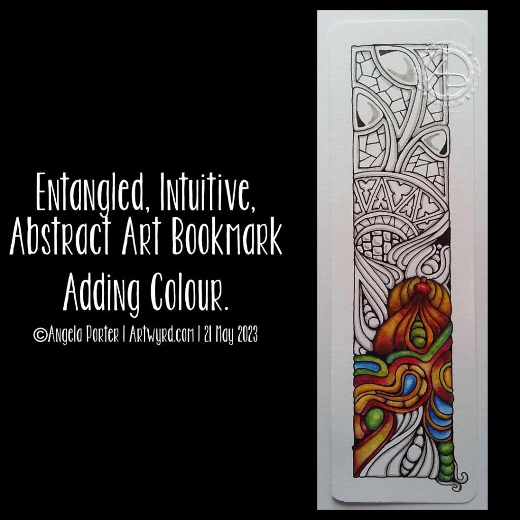
Adding a bit more colour to the bookmark

Accompanying colour with me video on YouTube.

I so love Inktense pencils! However, I noticed that a lot of graphite was picked up by the brush and dissolved Inktense when I was adding colour. I had a sudden flash of insight; try using a grey Faber-Castell Pitt Artist brush pen to put in the shadows. So I did.

The Pitt artist brushes have india ink in them; when the ink dries it is waterproof. If I was working on larger areas, I’d use a damp brush to soften the edge of the shadow before the ink dries. That wasn’t an option for me with this small drawing.

As I added Inktense, I could tell the colour was much more vibrant, but the shadows subtly show through. There was such a difference between the latest sections added and the ones in my previous video/post that I went back and added another layer of colour to these areas. That then matched the vibrancy and clarity of colour across the whole coloured area.

I decided to add some jewel-toned blue. Though I’m not sure that was a good idea at this point, it kind of works as it is kind of a complementary colour to all those yellow-orange-red tones! I also added the blue to the green areas, which seemed to make them more vibrant too.

I always find it easier to add colour to more abstract artworks, using a fairly limited palette too. I have started adding colour to the Entangled Botanic drawing in my previous blog post. I’m really not sure about the colours at all. Fortunately, I scanned the drawing in before setting to it with Inktense pencils and waterbrush. I also know that if some of the colours are a bit garish, I can always tone them down with a layer of another colour. I also think I may add some golden texture/dots to the design too.

Today, I spent a rather lovely couple of hours swatching all my Inktense pencils, including the new set of 24 released this year. There are some beautiful colours in that set and they fill in some holes in the original colour palette. I may very well scan my swatch in and use it to create a colour palette in Clip Studio Paint.

The pot I keep all my Inktense in is a tad small for them all, so I’ve splurged on a case that will hold all of the Inktense and my set of Chromaflow pencils (as long as I weed out the duplicate Inktense pencils). Putting them in order in the case will reduce the frustration of not being able to find the pencil I need in the pot they’re in now!

For now, I think I need some tea!

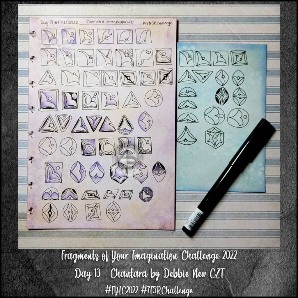
#FYIC Day 13 Chantara by Debbie New

Another lovely tangle pattern that I’m unfamiliar with – Chantara by Debbie New CZT.

It did take me quite a few attempts to understand this particular fragment and it’s construction. Then things fell into place. I did alter, slightly, the original shape so it was more symmetrical, but that helped me to come up with a few interesting variations.

Here is the link to today’s video on YouTube

“Draw With Me” … Trees No.3

And the third day of trees. Why? Because I can! And there’s so many variations on the theme I can share. It can be difficult to work out which to do so.

For this series of videos, I have drawn lots, and lots of trees in my A4 sketchbook (two pages full, near enough). Some are successes, others not quite so. Indeed, there were a couple of “Oh, that didn’t go so well” trees in today’s video.

All of this, however, is sketchbook work. It’s OK to try things out. It’s just fine that things don’t always work out the way you thought they might. It’s quite okay that what may have seemed like a good idea in the head doesn’t translate too well onto paper.

In fact, it’s the ‘oops’ trees (and other drawings) that lead to artistic growth. They make me work out what’s not right, what I don’t like about them, and what I can learn from this. Sometimes I have another go at the idea, but better informed from the first version. Sometimes I realise it’s a lost cause…for now perhaps. Other times, it’s worked out, but it’s not just my thing. And that too, is perfectly OK.

Without trying things out we won’t know what we do and don’t like. It’s like cooking and tasting to see if the seasoning and spices are right or need adjusting. And just like cooking, sometimes things just don’t work, and occasionally can’t be saved!

The only difference is I’m not likely to make someone ill by drawing in a sketchbook!

Today’s video really brought home how important colours is in artwork. And shadows/highlights. But colour especially. Colour serves not only to bring life to the drawing, but to lift it from the background.

Yes, that can be done with various ways of adding shadow – cross hatching, line width, stippling, and so on. But there’s just something about colour, even simple colour, that just helps things along.

Indeed, simple colour seems to be my kind of style. At the moment. And looking at the upper picture, mixing coloured elements with monochrome is an interesting approach too. That may be a way I can move forward adding more colour to drawings, but only to parts that are focal points or where colour would really help with the composition. Otherwise, shading is the way to go.

And not just graphite pencil shading. I need to spend some time experimenting with other media – alcohol markers, grey watersoluble media, Pitt Artist pens, and so on.

Lots of things to think about and consider today. All insights I may have missed if I wasn’t making videos and having to talk about what was passing ephemerally and abstractly through my mind. Giving those passing thoughts words results in awareness, understanding, and, perhaps, learning.

Talking of videos, here’s todays!

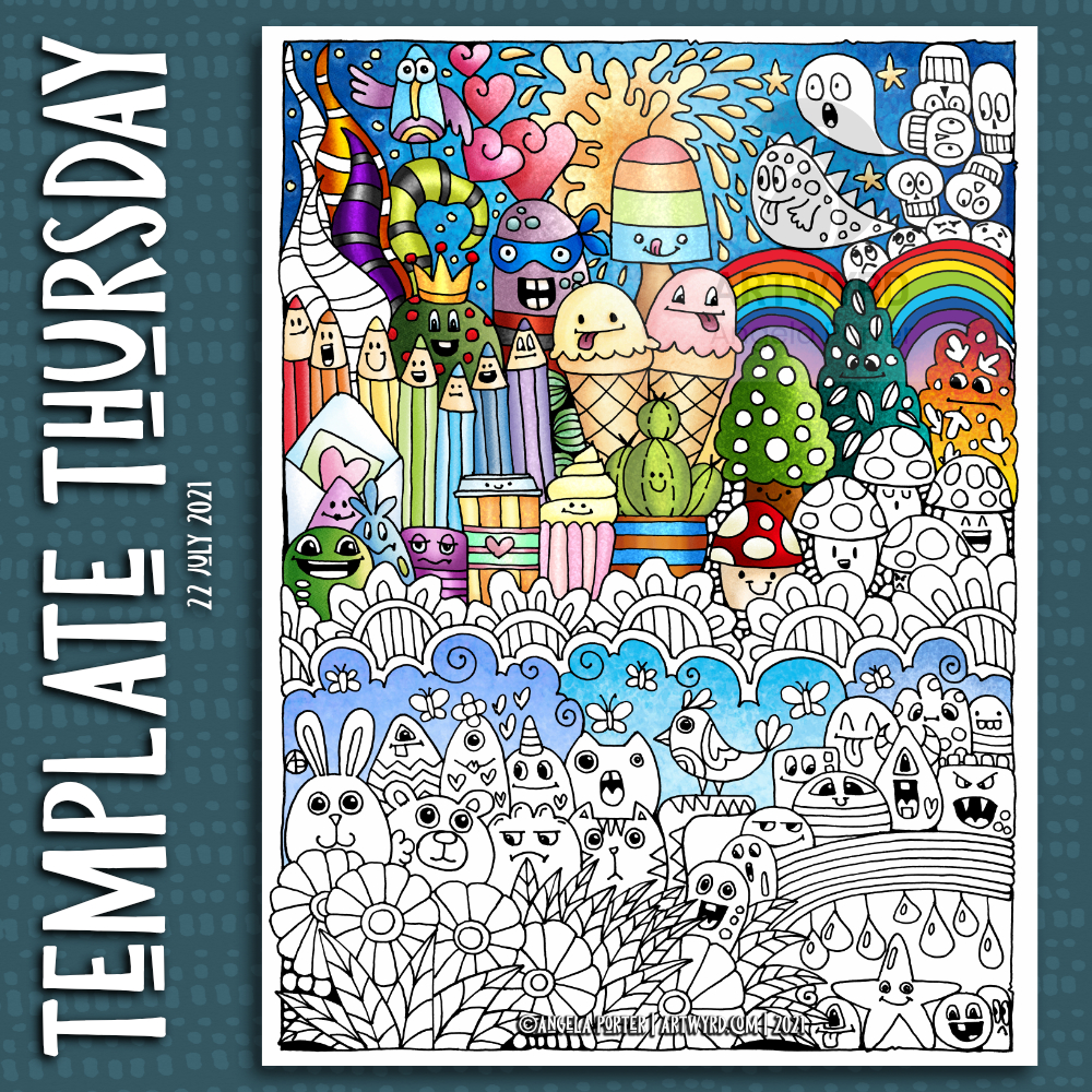
Template Thursyay!

Time for another coloring template/coloring page for the Angela Porter’s Coloring Book Fans facebook group.

Today, I felt the need for some cuteness and whimsy in my arty pursuits. So, I’ve drawn a Doodleworlds style template, with some ice-creams and an ice lolly included. It’s still blisteringly hot here today.

There is a time lapse video showing the process of drawing this template.

Today, I’m aching after my fall yesterday. At least the headache has gone! I’ll be glad to retreat to the downstairs rooms in a little while. It’s 26ºC outside according to the ‘puter. That means it’s rather warm inside too. It’s forecast to be cooler tomorrow, with the high being 25ºC, which will be manageable. Just.

Time to finish my social media postings and then to get more tea!