I used variations of the Zentangle tangle patterns Ginili, Gingo and Fragment D5, plus the little seeds/stones.
Not only did I use a limited number of patterns, but I’ve also used a limited colour palette too. That’s what I seem to do best with when it comes to colour.
As it’s grey and damp and a bit miserable out in the world here in the Valleys of South Wales, UK, warm, bright colours are very much needed. They serve as a reminder that spring is almost upon us!
This week’s colouring page (or template) is drawn and I’ve added a little colour to it. I decided to feature some of the tangle patterns I’ve been exploring in the last couple of days. These are Ginili, Gingo and Fragment D3.
It’s really unusual of me to stick to a fairly limited number of patterns/motifs in my drawings. It was a really good experience!
I was so tempted to use the space between the stems of the Gingo leaves to add various blues, making it a bit like stained glass. I didn’t this time. Maybe for tomorrow. I’m not too keen on my colour choices today. Perhaps I really do need to get to grips with the idea that a limited colour palette is best for me and to stick to it!
That’s if I can drag myself away from the hand lettering course and practice that I’m so enthused about. I quickly show the pages completed so far in my lettering sketchbook in today’s video.
In today’s video, I do a little pattern exploration of two lovely, organic tangles. Ginili is by Randi Wynne-Parry, and Gingo is by Lisa Chang CZT. The deconstruction of the tangle patterns can be found on TanglePatterns.com.
On the face of it, they may appear to be rather different tangles. However, there are some commonalities between them. This means it was quite natural to look at them together.
I particularly enjoyed using the brown 01 Micron pen for the textural lines in the patterns. It really helps to separate the different ‘petals’ or ‘leaves’ of Ginili from each other.
Gingo, based on the lovely Ginko leaves (my favourites of all!) also benefited from the use of the brown pen. It gave a light, airy feel to the pattern.
Also, I made use of a white gel pen to add dotty highlights. Sometimes, however, I used a finger to smudge the gel ink while it was still wet to give a softer, more natural highlight.
This was a lovely way to spend a little while in my sketchbook this morning. I hope you have a look at the video and try drawing these patterns and variations too.
I always enjoy exploring tangle patterns and motifs. I never quite know what I’m going to end up with. Today, I stumbled upon ‘Flurry’, a tangle pattern by Suzanne McNeill CZT. It reminds me of ‘Shattuck’, which is one of my favourite tangle patterns to use as a border or ribbon filler.
So, I took a look at variations of Shattuck that I often use before having a little exploration of Flurry.
So, as the video was uploading and processing, Used the time to draw some tripoli-style gridded patterns.
The one to the centre-right was not a happy outcome. The one to the left is much happier! It reminds me of the view through the Millenium Falcon’s windows when jumping to hyperspace, just a bit, not exactly the same. That was a fun realisation.
I didn’t do as many variations of the patterns as usual. I like the triangular shapes of the basic fragments too much.
On another positive note, I finally figured out how I can draw the tripoli style arrangement of triangles! I don’t know how long I’ve struggled with it, but finally, the penny dropped today. Huzzah!
Time for Tangle Tuesday! This week, I have a brief look at three tangle patterns that feel very related to each other – Hatooringlke by Mina Hsiao, Springle by Zentangle Inc. and Zinger by Zentangle Inc.
I wanted to add some botanicals to a pile of greeblie, robotic, mechanical space junk and these patterns spoke to me. They could very well be made from metal and futuristic material themselves!
At the last knocking, I remembered to try Diva Dance, another tangle pattern from Zentangle Inc, as a variation to the nice curvy lines. Something interesting happened … and that needs a bit more exploration.
Well, I have been a bit busy with variations on the simple flower motif in the bottom left corner of the image!
I’ve said (typed?) it before; I really, really enjoy taking a simple motif and seeing how I can vary, alter and create patterns with it. There is something fascinating in doing this. Some explorations don’t work out and need amending, others lead my thoughts to unexpected versions.
Today, I felt the need to play around with a simple flower motif. I had planned on doing a page showing how to draw my current favourite patterns/motifs. Instead, as I started to draw this flower, I wanted to explore variations and patterns I could create with it.
There’s only about one third of an A5 page filled with such line drawings, and that took about an hour or so to do. But there’s so much in there already!
Being able to just lose myself, guilt free, in drawing over the past couple of days or so, has been a pleasure. ‘Adorable Dogs’ is almost done, just three templates to add colour to remain. I have a break before I start work on the next colouring book for Creative Haven from Dover Publications Inc.
That doesn’t mean I won’t be working on another project or two. But for the next few days I’m just going to indulge myself in drawing for the sheer pleasure of drawing! And that includes a New Year template for the facebook group Angela Porter’s Coloring Books Fans.
I was awake way too early this morning, but just couldn’t get back to sleep. So, what am I going to do? Art of course, after a while of tossing and turning that is.
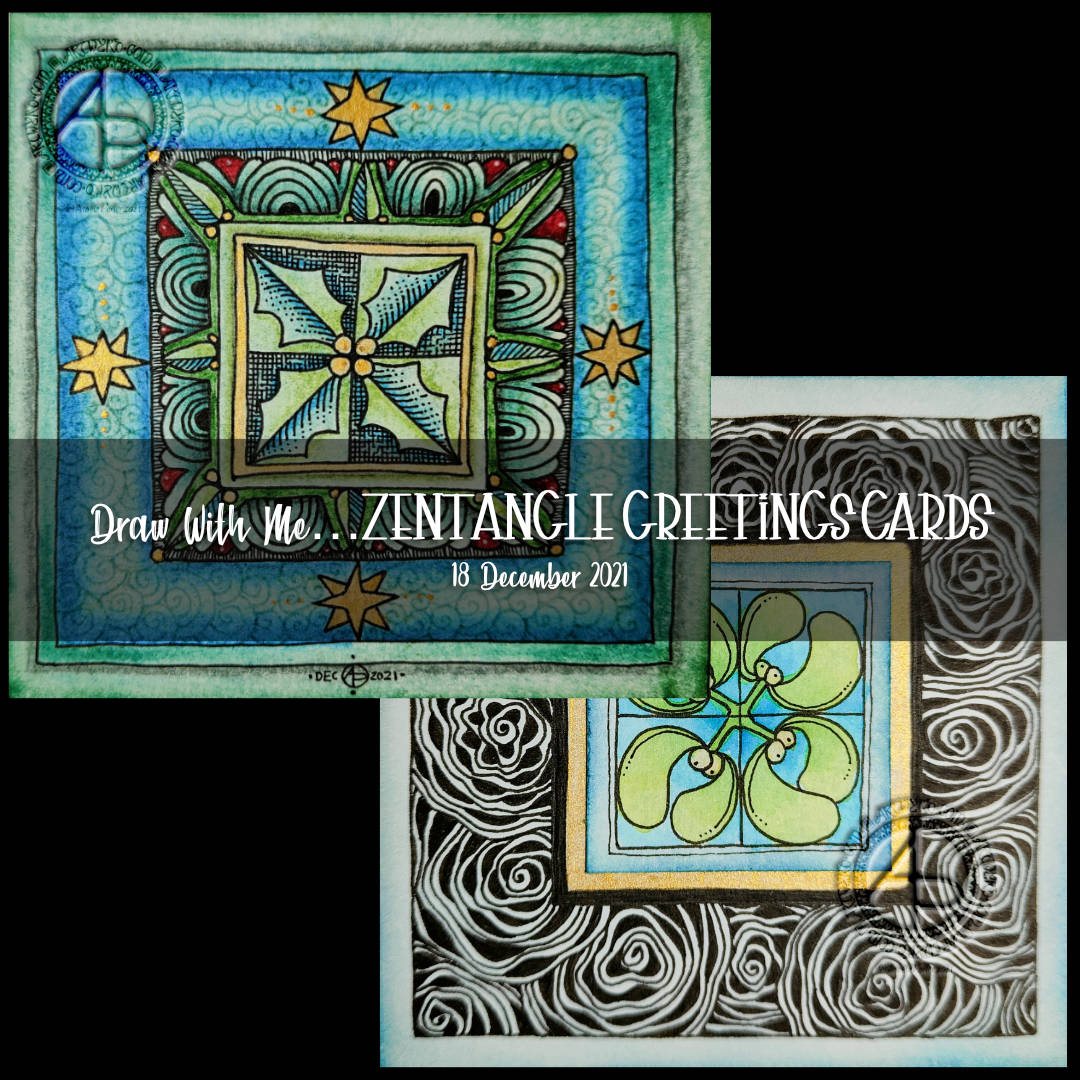
Completing the holly design.
I spent some time yesterday adding colour with various chalk pastels. I finished off the last few areas with fineliner pens. Then, I added another layer of gold to the stars and inked around their outlines again.
To finish the holly design, I wanted to seal the surface. I’d done some experiments to see how a multi-media gloss finish and micro-glaze would work. With both, there was very little shift of any of the media I’d used on my test pieces – chalk pastels, graphite pencil, tinted charcoal, and Ecoline watercolour inks. The only difference was the gloss medium was a bit glossy, while the micro glaze lacked any brush strokes.
I decided on the microglaze. It helped to bring out the colours, as well as stop them being rubbed off. There’s also less chance of me making a total mess of things too.
All in all, I’m fairly happy with this panel for a card. Despite all my doubt and misgivings during the process of drawing the design, it’s turned out quite OK.
Notes on the mistletoe design
For this design, I decided to create a separate centre panel. I also painted a square of gold beneath where this panel would go.
I used Ecoline watercolour ink to add colour to the drawing on the Distress Ink coloured panel. Then I attached it to the base ’tile’.
Next, it was time to decide what to do with that big border around the mistletoe. I went with the tangle pattern Diva Dance Rock and Roll.
I knew this tangle pattern would add a lot of black to the border, but I think I wanted that to be the case. The black helps the central panel to stand out, I think.
I still have some work to do on this panel, but I to focus on inking in more of the last couple of templates for Adorable Dogs.
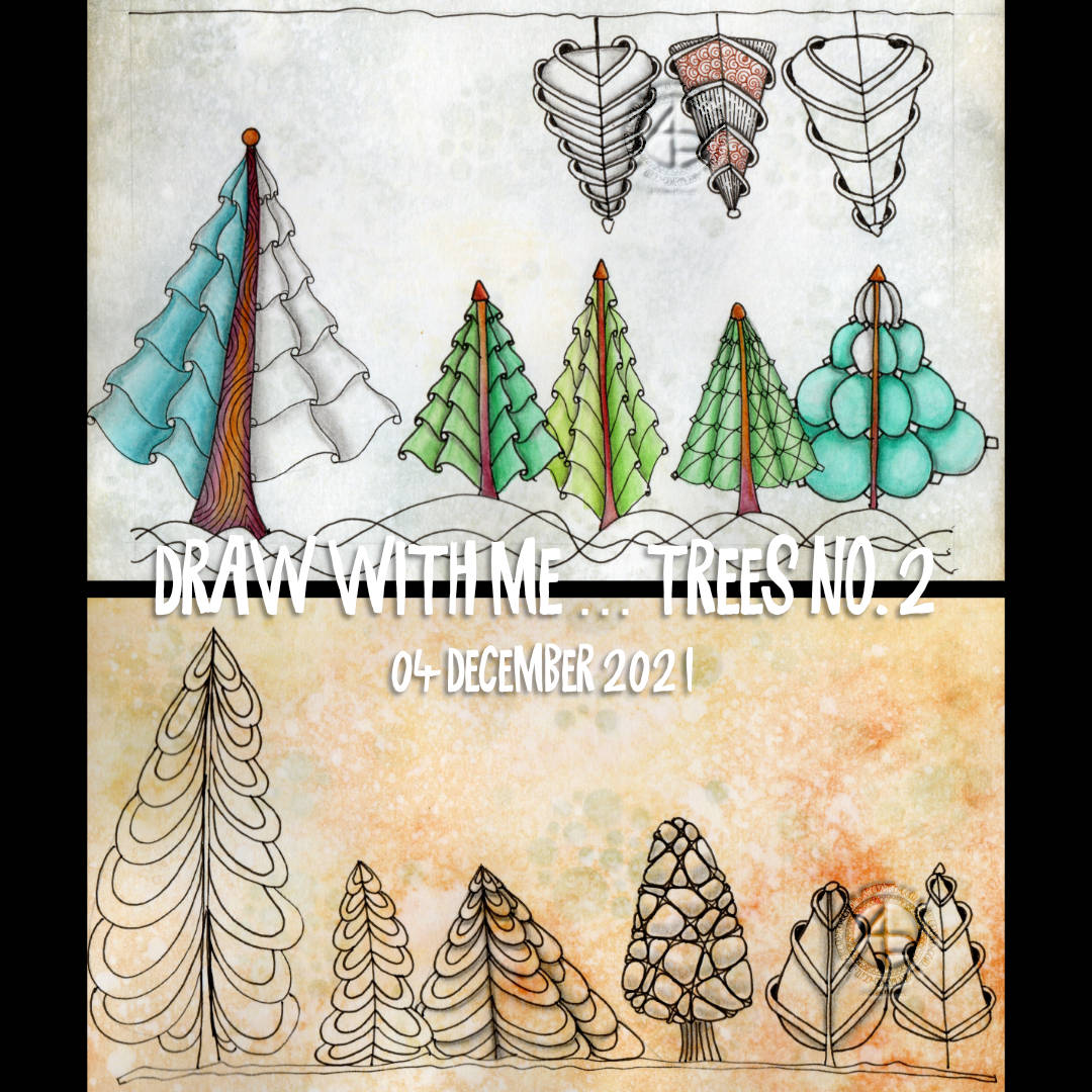
And the third day of trees. Why? Because I can! And there’s so many variations on the theme I can share. It can be difficult to work out which to do so.
For this series of videos, I have drawn lots, and lots of trees in my A4 sketchbook (two pages full, near enough). Some are successes, others not quite so. Indeed, there were a couple of “Oh, that didn’t go so well” trees in today’s video.
All of this, however, is sketchbook work. It’s OK to try things out. It’s just fine that things don’t always work out the way you thought they might. It’s quite okay that what may have seemed like a good idea in the head doesn’t translate too well onto paper.
In fact, it’s the ‘oops’ trees (and other drawings) that lead to artistic growth. They make me work out what’s not right, what I don’t like about them, and what I can learn from this. Sometimes I have another go at the idea, but better informed from the first version. Sometimes I realise it’s a lost cause…for now perhaps. Other times, it’s worked out, but it’s not just my thing. And that too, is perfectly OK.
Without trying things out we won’t know what we do and don’t like. It’s like cooking and tasting to see if the seasoning and spices are right or need adjusting. And just like cooking, sometimes things just don’t work, and occasionally can’t be saved!
The only difference is I’m not likely to make someone ill by drawing in a sketchbook!
Today’s video really brought home how important colours is in artwork. And shadows/highlights. But colour especially. Colour serves not only to bring life to the drawing, but to lift it from the background.
Yes, that can be done with various ways of adding shadow – cross hatching, line width, stippling, and so on. But there’s just something about colour, even simple colour, that just helps things along.
Indeed, simple colour seems to be my kind of style. At the moment. And looking at the upper picture, mixing coloured elements with monochrome is an interesting approach too. That may be a way I can move forward adding more colour to drawings, but only to parts that are focal points or where colour would really help with the composition. Otherwise, shading is the way to go.
And not just graphite pencil shading. I need to spend some time experimenting with other media – alcohol markers, grey watersoluble media, Pitt Artist pens, and so on.
Lots of things to think about and consider today. All insights I may have missed if I wasn’t making videos and having to talk about what was passing ephemerally and abstractly through my mind. Giving those passing thoughts words results in awareness, understanding, and, perhaps, learning.
After several hours digitally inking in colouring templates for “Adorable Dogs”, I needed to do some pen drawing, on paper. So set to drawing … more trees. Even a couple of gravity defying ones!
I had a lot of fun with these. Some of them, I realised, would make fab earrings. Shame I can’t make jewellery! Though I would love to design jewellery, for someone else to make!
Of course there’s a video showing how I drew these trees, and here it is!