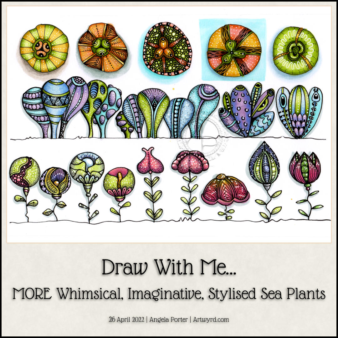
This sketchbook page is now complete! I had so much fun doing this one for sure. There’s a whole host of plants to populate any number of whimsical worlds. There’s a third video tutorial showing how to draw, step by step, the last row as simple line art as well as the start of adding colour and pattern.
Some of the motifs look a bit ‘flatter’ than I like them to, and a couple I’m not quite happy with in terms of pattern/texture. But still, it’s a page full of inspiration and possibility, something I can look back on for inspiration.
I continued the theme of sea plants today with a row of clusters of variations on a shape. Seriously, just one basic shape with small variations from cluster to cluster. The YouTube video that accompanies these drawings takes you through how to draw them, one step at a time.
Of course, I don’t stop with the main shape being varied. It was a lot of fun to add simple patterns and textures to these plants (or creatures if you will).
Alcohol markers in an analogous colour scheme of violet, blue, blue-green and yellow-green were used. The yellow greens were a late addition as I felt the first cluster needed an extra colour. The yellow-greens also link this row to the first one done yesterday.
The final steps are adding the detailed patterns and textures using both a black 0.1 fineliner and a white gel pen.
Oh, I did use a couple of cool greys to add shadow to the drawings before I added colour.
I’ve just realised I haven’t put any drop shadows behind these plants, or sea squirts, or… Maybe I’ll do that before tomorrow’s video session!
I say ‘plants’ as they all have seeds inside them. They could, however, be critters of the sea urchin family, albeit a bit on the alien side!
I drew all five designs in today’s Draw With Me video on YouTube. I added colour to the first two on the video. But as YouTube was taking its own sweet time to upload and process the video, I decided to complete the group of designs.
There are a few favourite patterns that I tend use to add texture to my drawings these days – tangle patterns tipple, between, and diva dance. I do make use of other patterns involving lines and dots.
I think I went overboard with the tipple on the middle sea plant! Still, you learn by doing…hopefully eventually in my case!
Oh, I used alcohol markers to add colour and shadow. I chose yellow-green, yellow and yellow-orange colours today. Keeping to a limited colour palette really helps me work with colour in a way that is pleasing to me.
It was really enjoyable to do, as drawing always is.
I followed this up with work on my next colouring book. The style of drawing is different to what I’ve been doing of late, so the first template I’ve inked in and added colour to so I can see what it will look like coloured. Well, I’ve partly coloured it. Colour really does make all the difference. I do love black and white drawings/lettering. But for these stylised, whimsical, imagined kind of drawings, like my colouring templates, the colour is what really does bring them to life.
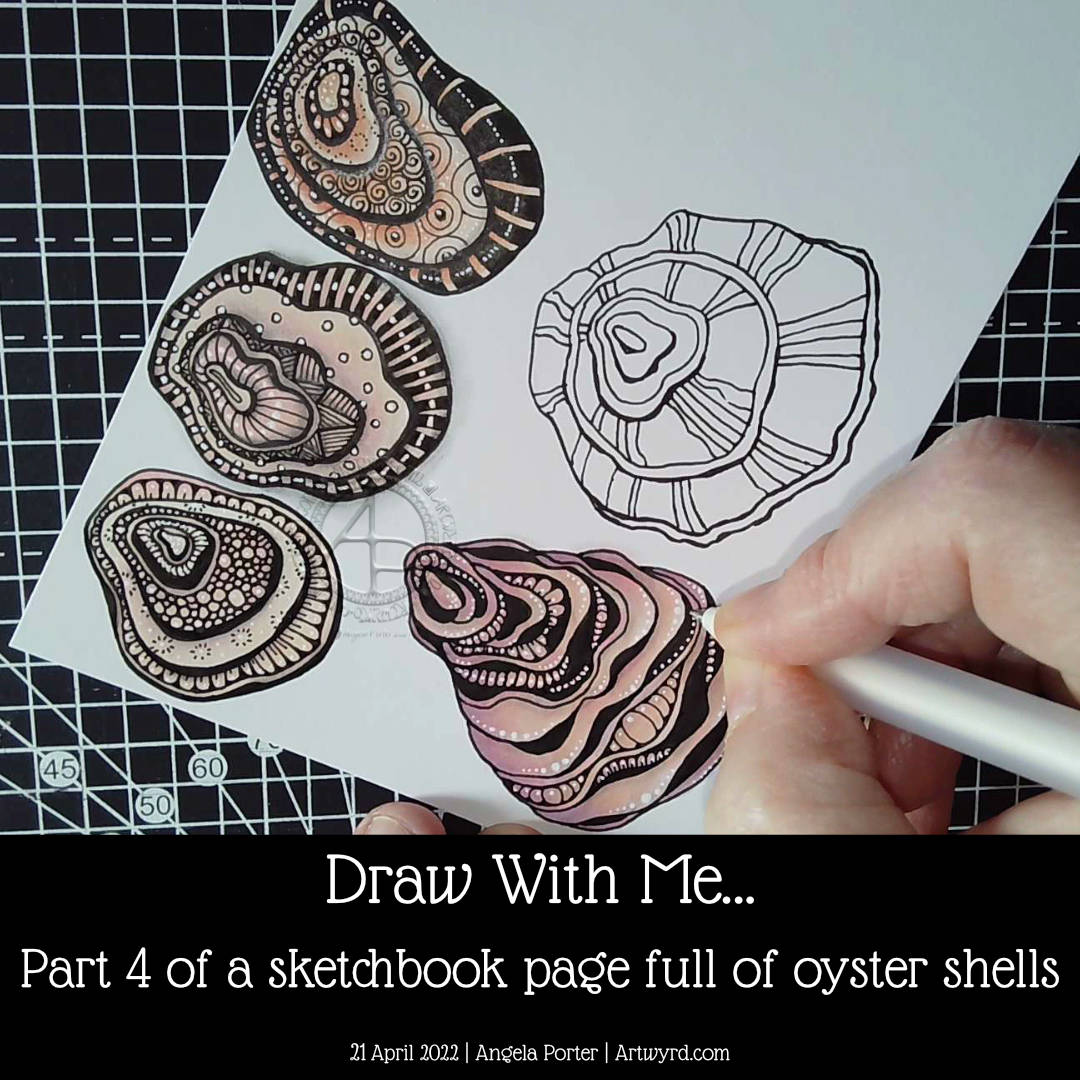
Finally, the page is as full as I’d like it to be of oyster shells! I did some hand-lettering before filming the video. I just wanted to add a quote about oyster shells and practice hand lettering.
I really enjoyed drawing all of these shells. The last one, a more whimsical one than the others, is my least favourite. It did, however, give me the chance to do something a little different when adding textures.
I really didn’t think out the layout of the hand-lettering. Maybe I’ll work that out, eventually. Maybe!
Overall, I now have a great reference page in my sketchbook as far as oyster shells are concerned.
I may do some further work on this page. Part of me wants to add words/quotes/facts as a background to at least one shell. I’ll see how I think about that after a little break from it.
In the process of drawing this page over the past five videos, I’ve gained some insights and understanding about my motivation to start a YouTube channel. I didn’t seem to have any clear purpose for making the videos, but with time and working on it all I think the pennies have finally dropped. That’s a good thing, maybe. All I have to do is to keep this purpose in mind (and remember it!). Fortunately, I’ve recorded my ah-ha moments in a journal, just in case I need to refer to them.
Now all I need to do is work out the next motif to focus on!
In part 4 of this video series, I draw a couple of oyster shells, one of which I add colour, shadow, highlight and pattern to. The other I’ve left until my next video.
I really enjoyed drawing these oyster shells. The one I’ve completed has used a kind of variation of the Diva Dance tangle pattern to construct it.
I’m really quite happy with how this one has turned out. I actually think I’ve done a fairly good job on adding colour – so unusual for me! Alcohol markers really do seem to be working well for me. Something to seriously consider going forward, that’s for sure.
I like how the areas of dense black add a lot of contrast. But I like how I’ve added white dots to soften the harshness of them and make them feel they belong in the pattern.
As I was wittering and musing during filming, I realised how much I enjoy creating line art. I enjoy the elegance of simplicity, focusing on the key elements that make the drawing instantly recognisable. This hearkens back to my time studying science and then the 28 years I spent as a science teacher. In science, observational drawings have to focus on the essence of what you see, making sure you get the essential identifying features correct. I was always a bit of a maverick going a little further than the bare essentials and even adding some colour! I got a tad chastised for that, but it didn’t stop me.
Now, this love of focusing on the essentials, the basic line art, shows in my artwork so much. In fact, it’s essential for me to do this otherwise I try to incorporate everything I can see into the drawing. Then, the drawing ends up so detailed it’s not really recognisable!
There seems to be a lot of sudden realisations and connections being made with my relationship to art and my particular style lately. Signs, I hope, that I’m finally settling into what is ‘me’ and recognising where my artistic roots lie and what I really enjoy doing.
Speaking my thoughts and reasoning out loud for the videos brings this process into awareness. I’ve often written about how I don’t think in words, but in feelings or abstractions. I have to be forced to put them into words by being given the opportunities to speak them out loud to people, or sometimes to write them in journals or blogs.
I hope that by sharing these thoughts and processes with others it will help them to find ways to discover and become comfortable with their own artistic style, as well as gaining some confidence in expressing themselves artistically just for the pleasure of creating art.
The other thing that working with the bare essentials line art style is that there are plenty of spaces for me to get creative with pattern and texture! I’ve learned over time how not to become overly ornate. What I like about today’s artwork is how I didn’t try to fill every section in with intense and intricate pattern. Oh, there’s plenty of white highlight dots scattered around, but the tangle pattern style of textures are thoughtfully placed and not too many of them.
This is something I’m still developing – not to overwhelm the drawing with pattern/texture. How much to use, and how much ’empty’ space to leave.
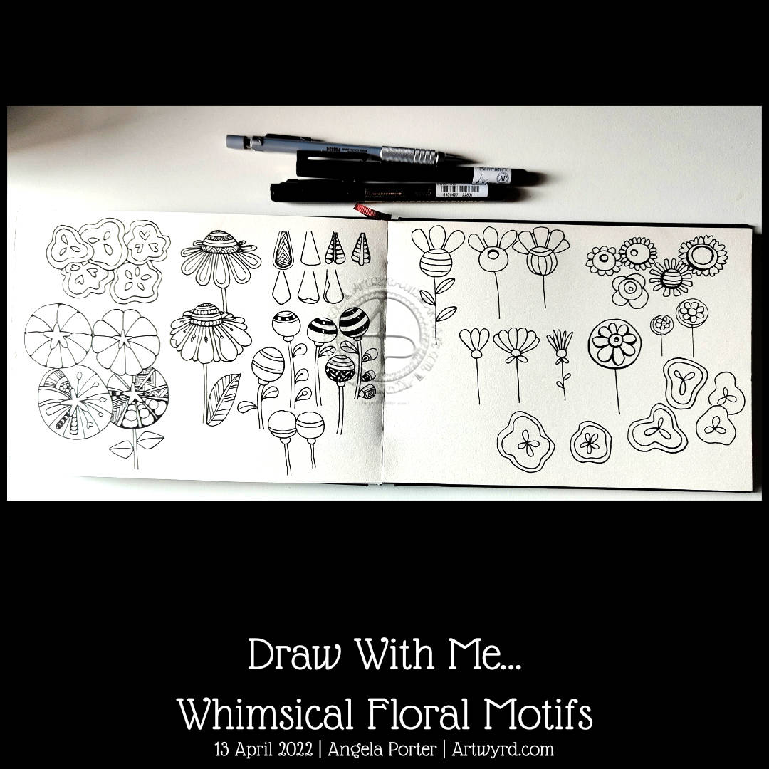
The flowers are all rather whimsical and stylised, but that’s no bad thing. I’ll never stop thinking that we need some more whimsy in this turbulent world (and that’s putting it mildly!). If I can create a little world of beauty and whimsy with pen on paper, then I think that’s a good thing. And it’s even better if others can use colour to bring the worlds to vibrant life, or can learn how to draw their own whimsical worlds too.
I was a science teacher for 28 years, until I left to focus on my mental and emotional well being as well as art. My desire to help others gain confidence and inspire them to learn new skills, to find enjoyment in this process, then that’s a good thing too.
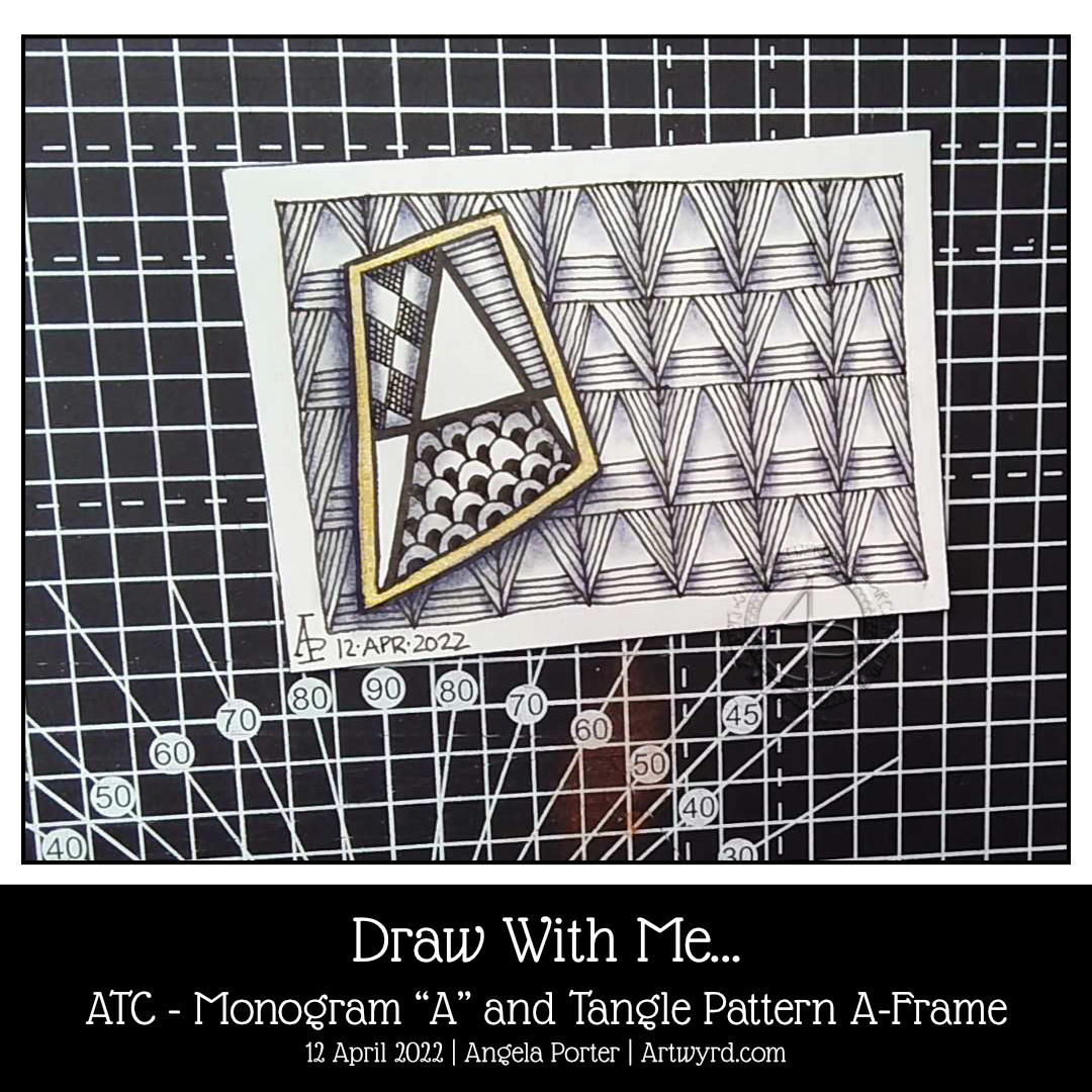
Today, I woke with the idea to create an ATC (Artist Trading Card) using a monogram from one of the hand lettered alphabets I’ve been drawing in my lettering sketchbook.
The monogram is a simple one, with some of the spaces filled with tangle patterns. The background is formed from the tangle pattern A-Frame by Angie Gittles CZT. When I chose it, I wasn’t fully aware it was based on the letter A; I really can be a bit dense at times!
Some indigo chalk pastel and a tortillon to add shadows and some gold watercolour paint to frame the monogram and all was done!
I enjoyed the process of drawing. I’m fairly happy with the end result. However, I think a more organic background may have worked better with such a strongly geometric shape. It’s all a experimenting, exploring, experiencing and learning.
I may end up doing a series of monograms. It’s a good way to work with lettering and to get some practice in of figuring out how patterns and letters/words can work for me.
Today’s YouTube video is a step by step tutorial of how you too can create this ATC.
Do you ever have one of them days when all that you try seems to go awry? That’s today for me.
I tried three times to create a video and ended up with total messes. I then tried a stop motion project. My camera wouldn’t hold autofocus. So, I think I’ll give up on this for today.
So, instead, I have an oldie of mine, but with words that perhaps make sense. Maybe today I’ve not been working delicately, trying to force it. A rest may be in order.
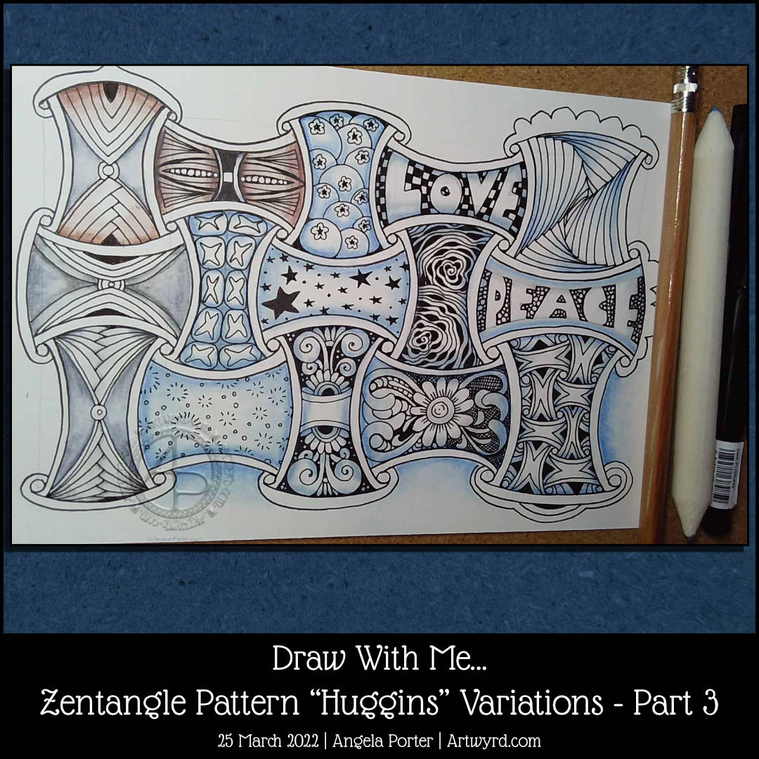
This morning, I completed filling in the ‘Huggins’ spaces in this drawing. As always, it was a lot of fun to do, and possibly some unusual filler patterns appeared.
Given that I’m working at a lettering course, I’m particularly pleased that I got some lettering into the grid! It may not be everyone’s cup of tea, but I rather like how it’s turned out.
This sketchbook page is now complete. However, I have so many more variations to look at – filler patterns, various grids, ribbons, arches and so on. I think I’ll stop bothering Huggins for a little while and do something different for my next Draw With Me video tutorial.
Exploring “Huggins” is way too much fun! Actually, exploring all patterns and motifs is, but Huggins just lends itself to so many variations in lots of different ways. Even as I’m typing, another idea has come to me. It’s never ending!
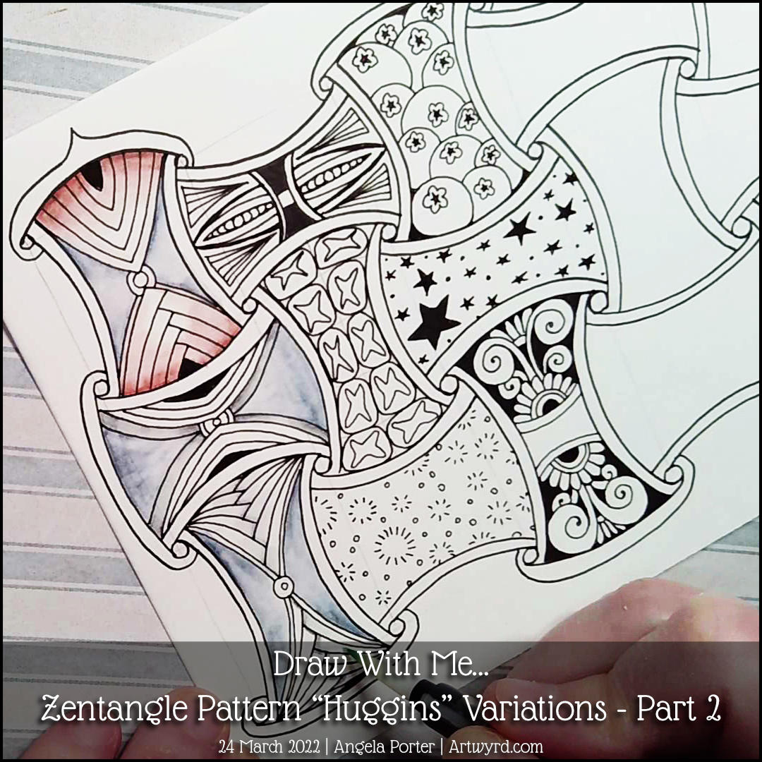
I look at just a few more variations in today’s video, and I invite you to join in with me as I draw these variations.
I have lots more variations in my sketchbook, no doubt soon to have some more added!
I’m noticing that the practice of exploring, working on iterations, of these patterns and motifs is making it easier for me to do this elsewhere in my art, particularly lettering. It is fascinating how just small changes make a huge difference and lead me down paths I may not otherwise have trod, so to speak.
Becoming flexible in my creativity is something I hadn’t thought about. But here I am experiencing it and loving the process! In some ways, more than creating new artwork! I do feel, however, this is a path I need to journey down on a regular basis to keep my creativity exercised and flexible.