Sketchtember Day 12

I’m still on the seed-pod kick as far as Sketchtember goes. Today, I sketched out some lovely heart-shaped nuts/seeds.

After drawing and adding colour to the first couple with Arteza EverBlend markers, I re-drew more stylised versions. Finally, I had a go at designing some Zentangle style ribbon patterns. I particularly like the one on the bottom right.

A quiet Sunday morning has been had, and the afternoon is likely to be pretty much the same.

Sketchtember days 4 and 5

Continuing with DeadlyDots’ prompt list for Sketchtember. Thyme was day 4’s prompt, and Basil is today’s. I’ve got the title for tomorrow done (Bay leaf).

Plenty of pen drawing and some coloring with Chameleon color tones markers. A little bit of messing around with patterns on the thyme page.

It’s an enjoyable process, though today I think I’ll take a little break from it and turn my attention to projects that need some work done on them, and maybe new drawings to be done.

Sketchbook Saturday | Sketchtember Day 4

Link to today’s vlog on YouTube – A flip through of my sketchbooks and this week’s art.

I’ve had fun creating art this week. Here’s some highlights.

The rediscovery of how much I love my Chameleon markers was a wonderful thing. I love the way I get a smooth gradient of solid colour from them. Such a stark contrast to my bumbling, chaotic attempts with other media.

Taking up the Sketchtember challenge was a good idea to dust off some of my neglected drawing/sketching skills and ways of adding interest to a sketchbook. It’s also made me try to think differently to how I would when creating entangled art.

Hand lettering, and some typographic art today, has made a reappearance in my work. That’s a good thing; it’s something I would like to do more of.

Adding a rectangle of colour behind a drawing and adding handwriting to create texture is something I’ve not done before, but I like the results.

Thyme is the herb for today, day 4 of Sketchtember and my offering is in the photo at the top of the page.

There’s been some real lowlights too. Colour choices, mediums and doing things that seemed like a good idea when I started them! There’s a lot more about this in today’s vlog on youtube.

Even with the facepalm moments, it’s been lovely to spend time just drawing with no expectation of a finished project, polished work, or even perfection.

It’s hard work trying to convince myself that it’s ok to make mistakes, to mess up things as long as I learn from them.

Sketchtember Days 2 and 3

Link to today’s vlog on YouTube.

Here are my sketchbook pages for days 2 and three of Sketchtember. I’m using DecayingDots’ list of herbs and spices for this one.

I’m enjoying working in a different way to my usual entangled art. And, I’m making some awful mistakes/art in these pages. However, these are learning moments, not least of which it’s ok to do things that are grim, mainly my use of colour. But, if I didn’t try things out and learn from the mistakes I’d not progress at all.

What I think it shows me is that pen drawing, with just shading or monochrome colour is my strength, colour my weakness. As if I don’t keep saying that, yet I keep going back to using colour.

Today’s vlog focuses on Day 3 – Saffron. Tomorrow’s vlog will be a look at all the art I’ve worked on in the past week.

Sketchtember 2021 | Day 1

Link to today’s vlog on YouTube.

I’ve decided that it would be quite nice to take part in a monthly art challenge, perhaps as a warm up to Inktober next month. Maybe.

So, I looked around at the challenges I could find, and settled on one from @DecayingDots on Instagram and Twitter. Their list of prompts is all herbs/plants. That, unlike others, inspired me to take up the challenge.

It’s been a long time since I used a sketchbook truly as a sketchbook. It may take me awhile to get back into such things. I do have some lovely, pre-coloured pages to make use of as a start.

Not only will I practice my kind of sketching – which is usually with a pen – I can practice hand lettering and handwriting. My idea is not only to sketch the day’s plant/leaves, but to add notes and information. Those notes may be about the plant, or about the colours I’m using, or even recipes/uses for the particular herb.

As it’s a sketch challenge, there’s also no pressure to complete every drawing, or even to do perfect drawings. It’s all about observational drawing for me.

Now, as i don’t have green thumbs (I can kill any self-respecting plant in a matter of hours, well days maybe) and I’m not feeling able to visit shops or gardens at this time ( social anxiety is a heckofa thing), photographic references will have to do. But that’s ok.

So, here’s my page for day 1, which is all to do with sage. In today’s vlog I talk about this page, the media I’ve used, and I add some drawings to day 2’s page – Rosemary.

I’ve got some work still to do on both pages I think … but that’s the fun of a sketchbook. It’s not meant to be finished at one go, pages can be revisited and added to as needed!

Sunday Morning Entangled Art

Link to today’s vlog on YouTube.

A late summer, rather cool and sunny start to the day is something I’m luxuriating in, and that means arty pursuits.

I’ve completed one drawing, which I kind of review at the start of today’s vlog over on YouTube. I’m not too happy with the colour I’ve added at all. I started with Ecoline watercolour inks, but they felt too bright and jarring with the distressed, grungy, quite dark background. So, I then tried out distress inks, but I’d already gone down the rabbit hole of poor colour choices. When I’d finished adding colour, I had some rather dull, uninspiring colours that really didn’t fit in with other parts. So, I tried using coloured pencils to lift the colours, with not much success. Finally, I tried some chalk pastels, which helped somewhat. Finally, I added embellishments with a variety of gel pens,w hich helped to lift the colour somewhat, bu kind of seem over the top.

So, to shift my disgruntled arty mood, I thought I’d go back to an earlier drawing and use a really simple set of colours – cerise and purple – to add colour and shadow to the drawing. And white to help bring out highlights if needed, though I will use various gel pens to embellish this when I’m done. This is the drawing you can see at the top of the post.

I’m liking what’s happening with this drawing. I do have to layer the chalk to get an intensity of colour when using the tortillon to blend the colour out as well as working the chalk into the paper. I’m enjoying the way the different colours will blend nicely with each other. And I like the simple colour choices too.

I keep saying I’m going to complete drawings with monochrome, or nearly monochrome colour palettes. And I keep forgetting to do this when I leave a host of colours near me!

I shall persevere with this particular drawing, and see how I feel about once it’s all coloured.

As to the other one, well it’s being put to one side for a few days so I can return to it with fresh eyes and a fresh mind. Perhaps I’ll see it in a different way then.

Saturday Sketchbook

The newest drawing in my sketchbook

Link to Sketchbook Flip Through Vlog on YouTube

Sketchbook Saturday is upon us once again. I’ve created a vlog for YouTube where I flip through my current sketchbook.

The drawing at the top is now finished. I used a Tombow Fudenosuke ‘hard’ pen to draw the design on paper that has been coloured with Distress Inks. The sketch book is 21cm x 21cm (approx 8″ x 8″).

Drawing on coloured paper is something that is pleasurable to do. The colours add mood to the drawing and are an inspiration for any colour scheme I may use, should I choose to add colour.

The grungy, distressed nature of the page is also interesting; already depth and dimension are added to the artwork.

I’ve enjoyed drawing on coloured paper so much, that I actually have coloured quite a number of pages in my sketchbook and you can see them all in the vlog. What I can’t remember is exactly which colours were used for each page.

Some of the pages I like so much that I really do need to scan them in so I can use them as backgrounds for digital art, social media posts and so on going forward.

The colour choices I’m making are often veering away from the bright, saturated colours that were so characteristic of my earlier work. Such colours are still used for my colouring templates / pages and that’s not likely to change much going forward. However, for my more personal art, less saturated, vintage, even grungy, are what I am drawn to so much at the moment. Also, I seem to favour analogous colour schemes, sometimes with a pop of complementary colours.

Friday Flip-through

https://https://youtu.be/1dh93w3C6Fk

Friday seems the perfect day to have a look back on the week’s sketchbook art. A vlog seems the perfect way to do that.

I also start to add colour to the latest drawing using a limited colour palette of Ecoline brush pen colours – gold ochre, burnt sienna, indigo and prussian blue. Another colour (or two) may be added to the limited palette. I’ll see how I get along.

This particular drawing is being used as a place to test out ideas concerning adding shadow and highlight, simple colour washes, and anything else that springs to mind. It may never been completed, but that’s not the point! Experimentation and experience are the points of this particular exercise.

Biros and Inktense Sketchbook Abstract Art

I am so, so tired today. So tired that my head feels heavy and my thoughts are slow. All due to me waking around 5 am and not being able to get back to sleep. So I drew. In my sketchbook. With biros.

I thought I’d like to see how adding colour to these drawings changes them. If it’s an improvement or a mess up. Whether it’s best to put the biro down first, or the colour, or a little bit of the biro shading.

So, with that intention I set to making today’s vlog.

I’ve found that either way of adding colour works, though it seems the pen lines are a little darker over the Inktense. Colours bring the drawings to life. The uncoloured biro drawings (other than the colour from different biros) work really well and nicely, but that addition of colour.

I’ve said (typed?) it before; I’m enjoying this journey of exploration with abstract art, the humble biros in particular.

Buggy Sketchbook

Time Lapse Video

Drawing

Today is a lazy, artsy day, Sunday. It’s raining, on and off, so I’m disinclined to wander out anywhere.

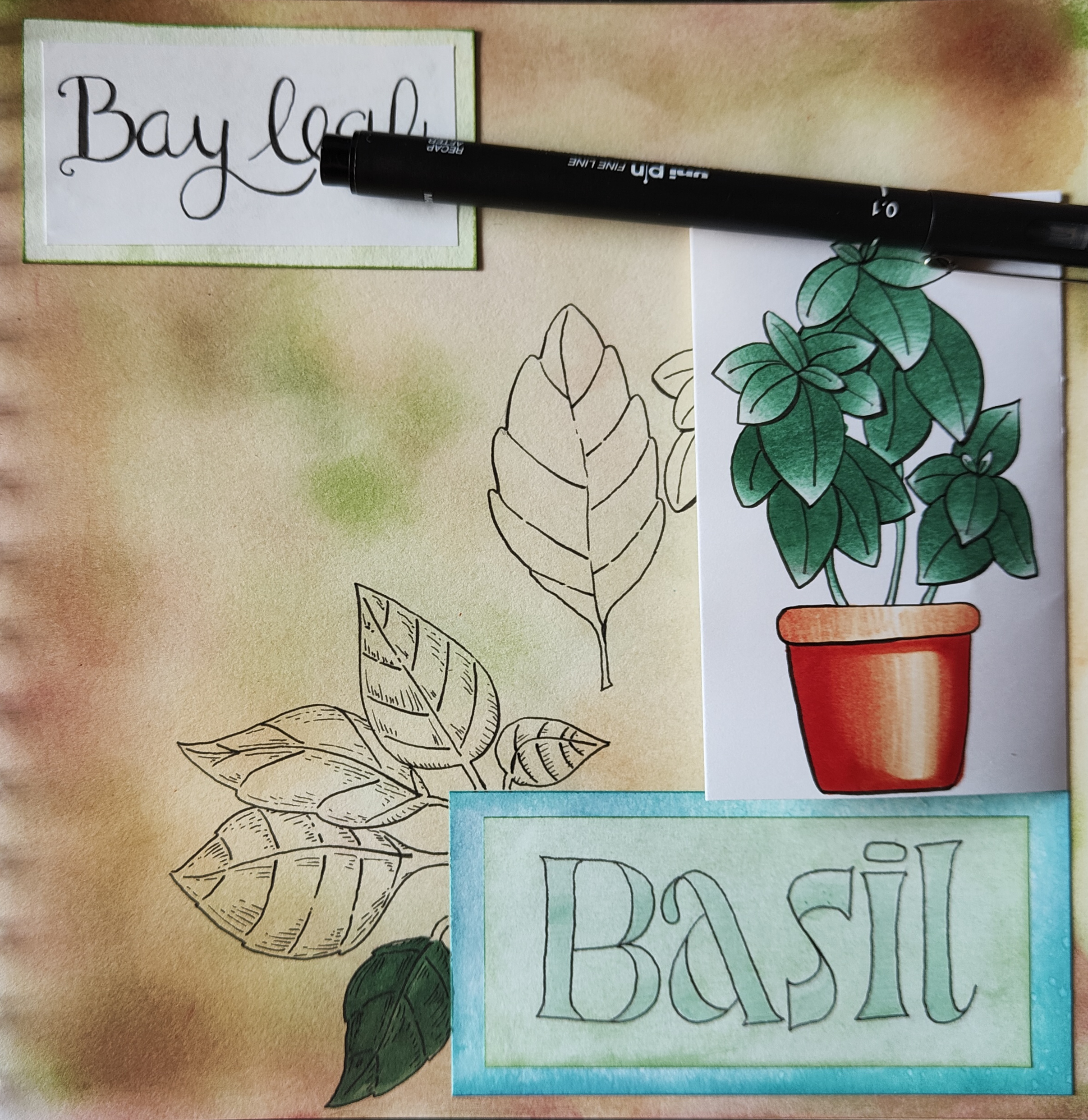
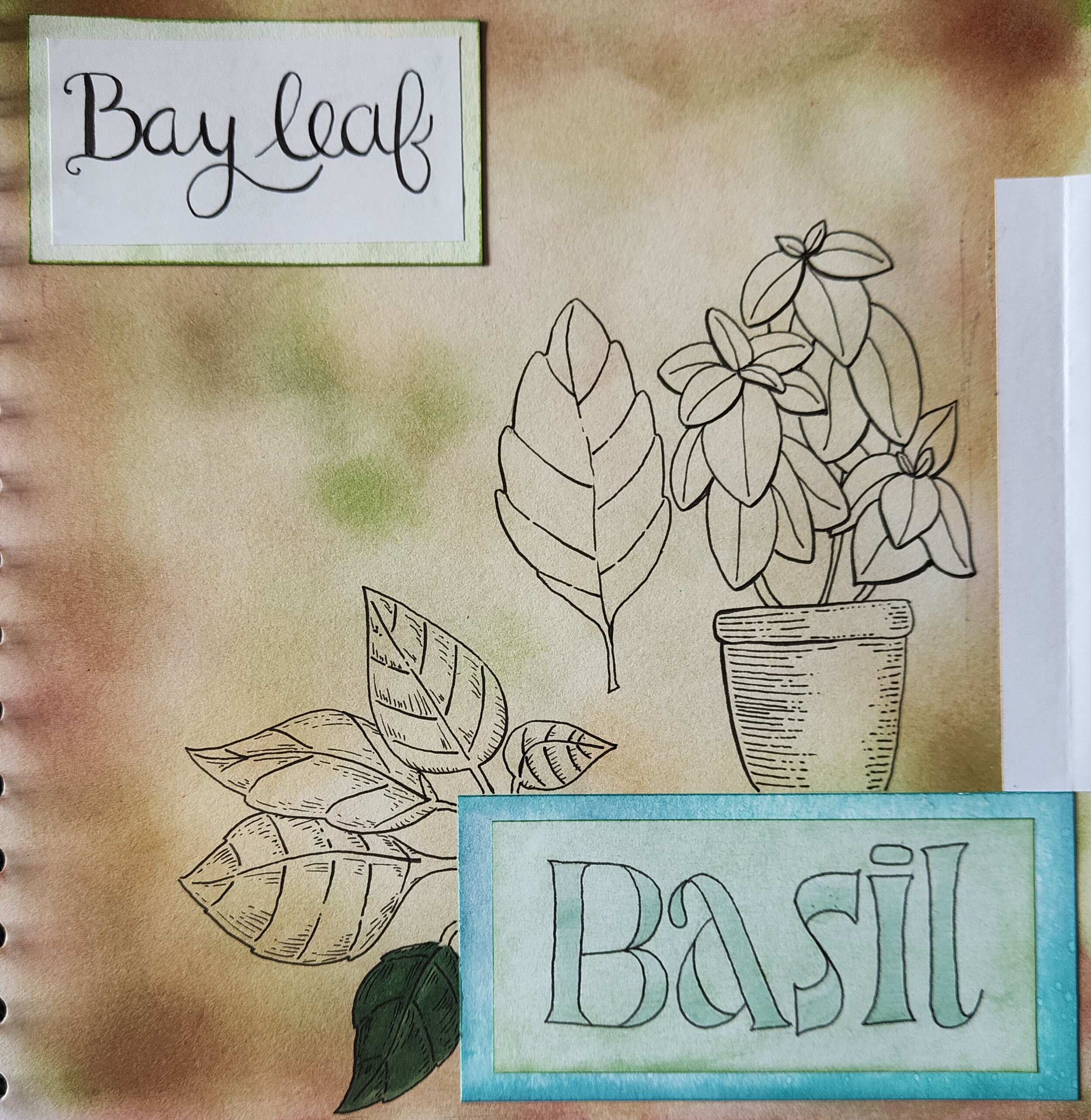
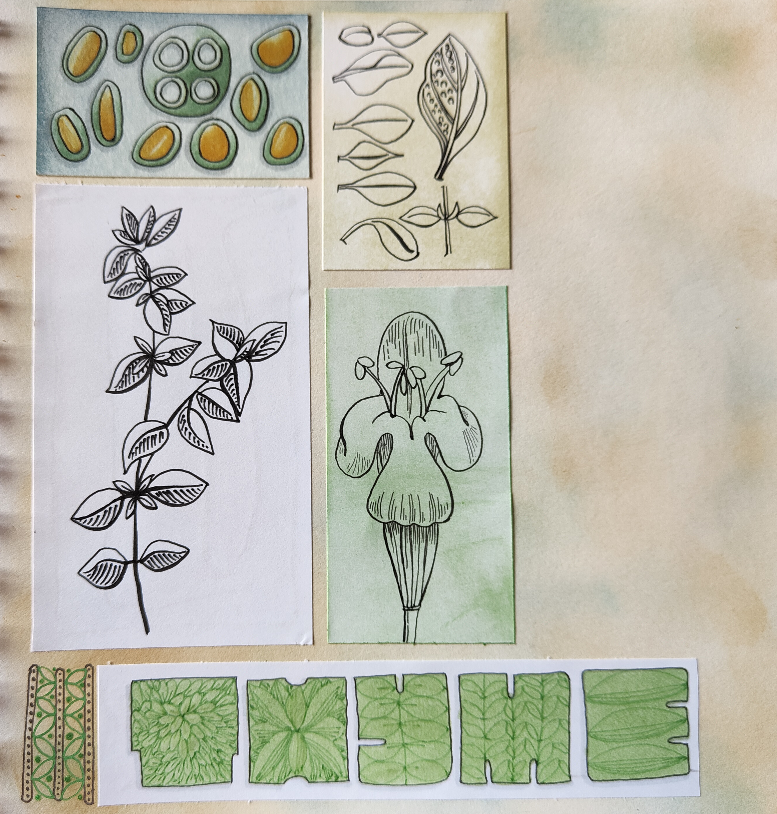
I started the morning drawing some half insects. Why half? Well, the plan is to scan the sketches in (which I’ve done), ink them in digitally (done too!) and then add colour (started!). Digitally, I can use the symmetry tools to complete the other half of the insect.

Of course, I could create mutant hybrids … but that doesn’t appeal to me much, that’s for sure.

I did film me drawing and wittering about my sketching and other arty stuff. I haven’t published the full-length video; I was very wittery and disjointed. My attention was focused on the process of observing and drawing. It seems that my ability to speak coherently vanishes as my concentration increases!

I enjoyed the half hour or so of quick sketches. I was focusing on creating simplified, stylised drawings, rather than detailed realistic ones.

Thoughts

Some connections were made as I wittered on. One was that when I draw in a stylistic way, I have no problem with using non-representational colours. It’s when I’m drawing more realistically that colours vex me. This is a problem that occurs with traditional media in particular.

I had a memory of falling in love with the work of Kandinsky, Juan Gris, and similar artists while doing my A Level art two decades ago. I particularly love the use of colour to communicate inner emotions, relationships with the art, and symbolism and metaphor.

I found this an interesting connection to make, even though I’m not entirely sure what that means yet. Other than that I’ve always found non-representational colour and stylised, abstract art something I’ve enjoyed doing. Indeed, as I write I remember that in front of me are three oil paintings I did for one of my art exams. They are abstract patterns from locomotive parts and Romanesque sculpture. Fiery reds, oranges, yellows and magentas were used for the locomotive parts. The painting based on Romanesque sculpture was in cool, calming blues. My focus for all the paintings was on pattern and contrast to get a feeling of volume/dimension.

Last summer, I was playing with watercolours and patterns abstracted from rock strata and nature. I used colours that appealed to me in these paintings.

I keep circling around this style of art. I return to it from time to time, enjoying the process of creating such art, often on a small scale too.

Where art comes from is a mystery. It comes unannounced. It has the quality of gift. The source from where it comes is hidden from us. Like all creativity, it stands us in possibility. It comes from impulse and dream, from raiding the inarticulate, from going below the floor of consciousness. To do this we must break free of the confines of the known and fixed. As artists we do this with our materials—with our hands. And in this confluence of mind and matter abstraction is not only relevant, it is essential. —Timothy Hawkesworth

Working from my creative subconscious is something I do…a lot. All my entangled art that just flows onto the page. Mandalas. Using observations of pattern and texture to create something that is non-representational, just, to my mind, pretty, pleasing.

I do the representational for coloring books, but my personal art … well … that can be anything I want it to be. I can use any colours I wish to use for it, and accepting that isn’t an easy thing.

The Inner Critic

I do my best to let colorists know that there are no rules for colour, that if they want purple trees and green people, that’s fine! And I’m able to do this in my coloring template style work. The stylised nature of these drawings allows that freedom. There really are no rules other than the ones we impose on ourselves.. I love to see the different ways people use colour, and the unexpected ways especially.

Yet, I am just realising that I’m very critical of myself when it comes to representational colors.

My problems start when I’m trying to create work that is representational of what I see with my eyes, such as succulents, or plants or anything else.

I can draw these things fairly well. Sketching and line art isn’t a problem, though it could be improved no doubt. But that improvement comes through practice.

My problems come when I start to add colour. If I can work with something that is non-representative then it works out OK, if often full of quite bright colours. Monochrome or limited color palettes really work well for me and produce a coloured piece of art that is cohesive.

It’s when I have a representational drawing that I want to add colour, that’s when my inner coloring critic comes knocking.

This inner critic took up residence most probably in my earliest school days when I was five or six. Well meaning teachers making sure you coloured inside the lines, that the sky was blue, the grass green and so on. If you deviated from these rules, well … trouble followed.

Trying to stay safe by using representational colours, and keeping this inner critic happy isn’t working at all. It’s time to sort this limiting inner voice out.

Moving along

Making observations, creating stylised, imaginative versions of what I see, using patterns and textures I collect and not worrying about realistic colours is my way forward.

As Yoda said, “You must unlearn what you have learned.”

I thought I’d done that, I didn’t realise I was subject to the attentions of the inner coloring critic. Not until I started talking and writing about this as starting to dip into a book full of exercises for creating abstract art.

Time to invoke my inner art jedi master and deal with the self-criticism that is limiting me! “This is Jedi business, go back to your drinks.”