“Choose to Shine”

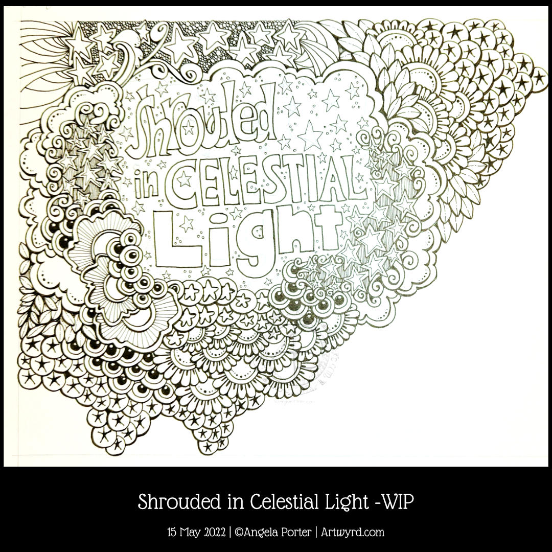
I’ve finished it, I think. I’m feeling a bit happier with it now. I really like the abstract, curvy, swirly bits that remind me of La Tene (early Celtic) art. I’m still not happy with that central ‘moat’, though.

Oh, I’m also really pleased I stuck to an analogous colour scheme, mostly. Having the words in an almost complementary colour to the blues and purples makes them stand out. But I still rather like the swirly abstract patterns, and I’m so glad I added them!

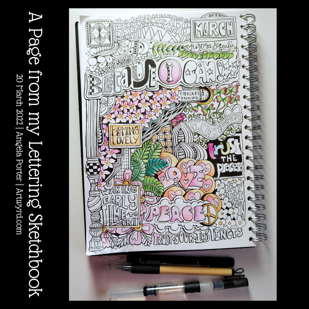
I’ve not quite found my way with hand-lettering. I keep trying new and different things out, but nothing seems to sit well with me yet. Although I like the more formal lettering layouts, I don’t think that’s for me. I tend to work fairly instinctively and intuitively with little forethought or planning. When I do think my way through something, that’s when disaster tends to strike!

I suspect a looser, expressive, intuitive kind of style is going to work for me, along with my style of entangled, abstract art. Probably. Possibly. Perhaps…

Hand-lettering and Entangled Art

I’m a tad out of sorts today, just a dose of gloomy emotional weather, that’s all. It’s also beginning to pass on by too, which is a good thing! Even with the gloomy weather, I’ve been able to feel the touchstone of contentment within me, but my thoughts have been on shaky ground concerning art.

I was drawing last night, and this morning a different page, and lots of questions came up about my art style. I wasn’t feeling happy with my hand-lettering journey and what my ‘style’ is. I’m finding it really hard to feel comfortable with the hand-lettering I’ve been doing lately. I don’t know why that is, not entirely anyway.

So, my solution is to draw! Well, hand-letter and then draw, but hand-lettering is drawing letters rather than writing. So drawing it is!

Instead of popping words/phrases into my ‘entangled’ art style as I draw, I thought I’d place them on the page first. Then I can do the pattern stuff, repeating various motifs to bring some coherence to the whole design. Not sure I’ve managed it.

Instead of filling the whole space with lots of black pen work, I thought that I could use a brown pen to add just lines to the spaces between. I think I like this as the spaces just looked cold and empty before.

I’m still not sure I’m finding my way with this. I know I do get all flustered and fed up with my art from time to time and start to question myself and be quite harsh with myself.

Working on this, and talking my way through some of it in today’s video, has certainly helped, and my mood is lifting. But regardless of my emotional weather, this was something that still needed to be thought through to do my best to pinpoint what I was struggling with when it comes to including hand-lettering in my art.

Shrouded in Celestial Light WIP

Late afternoon yesterday, I was listening to my “Liked Songs” playlist on Spotify and “Shining Light” by Ash came on. The lyrics “Shrouded in Celestial Light” just stuck in my head, so hand-lettering had to be done, followed by some entangled art!

I wanted to put the letters of “shrouded” overlapping, cwtched close together as if they were covering and protecting each other, apart from that brave S at the front (which I may alter digitally when I’ve finished this off). And that is one of the meanings of shrouded – to be protected and/or covered.

Naturally, stars had to feature in the entangled artwork around the hand lettering. What better to represent “celestial”, though the flowers and plants and seeds are related in a roundabout way.

Our sun is the star nearest to us and the source of natural light. The moon is closer, but it doesn’t generate any light itself, the light we see from the moon is reflected sunlight. Anyhoo, most life, as we know it, on Earth depends on the sun’s energy to remain alive. Without photosynthesis in green plants, there’d be no food. Some living things can exist without any energy from the sun, but they are extremophiles and live around extreme habitats, such as the deep ocean volcanically driven ‘smokers’.

I’ve digressed and slipped into science teacher mode! The point is, that though flowers and plants and seeds don’t seem to have a link to celestial light, they do, as they depend on sunlight to produce food, which gives them the energy they need to live and grow and reproduce and so on. All of us here on the Earth are shrouded in celestial light!

I really wasn’t sure how this was going to work out without a definite frame for the words, but I think by placing clouds and drifts of other things around the lettering it kind of looks like a view through to the celestial night sky, perhaps, with a bit of fanciful whimsy.

Hand lettered capital I

Click on this link to see how I drew this letter I and draw along with me!

I thoroughly enjoyed drawing this ‘I’ in today’s video. The combination of hand lettering and using various patterns and motifs… well it’s a match made in my idea of arty heaven!

The pencilled letter is just a space to add patterns to, and they can spill out of the lines just a little.

Drawing with a fountain pen (EF TWISBI Eco pen filled with dokumentus ink by Rohrer and Klinger) was an absolute delight! The paper I used was nice and smooth, and even though there was a bit of feathering, I was fine with that; it adds character and a human touch.

The more I do letters like this, the more I become comfortable with this kind of hand lettering.

For now, this will live in one of my lettering sketchbooks, along with, eventually, the rest of the alphabet. They’ll be a resource to dip into for some inspiration at later points in time.

I’ll also need to work out if I leave the letters as they are or whether I’ll try adding shadows and/or colour. I’m undecided on this.

The letter may be a bit on the wonk, but I’m quite happy with it. It makes me smile when I look at it and remember the process of drawing. That means it’s good enough!

Lettering sketchbook pages

I’m thoroughly enjoying exploring hand lettering that’s for sure. I’m still trying to find my way for how best to express myself using words and letters, or perhaps the best ways would be a better description!

I’ve absolutely loved creating these two pages. The top one was done first and is OK. I think colour may improve it somewhat.

I much prefer the bolder lines and higher contrast in the lower drawing. This one isn’t quite finished, and then I’ll have to decide whether I add colour or not.

I really like the imperfections that there are in this way of hand-lettering. Those imperfections make the lettering human and uniquely mine. This is definitely something I want to embrace, whatever directions my lettering journey goes in. And of course, combining lettering with my style of drawing is going to so important to me. I just have to figure out how to make it work for me!

I have a lot more exploration to do, but it’s a fun process and I kinda know I’ll get there!

Funky Fungi Lettering Practice

Carrying on with the mushroom theme … I’m taking a course on hand lettering and it just seemed a good idea to have some fun and combine mushrooms and letters!

I actually did this originally in pen in my sketchbook and I was quite happy with the result. However, I wanted to see how I could rework it digitally. So I did. And here it is!

I’m so much happier adding colour digitally. Though I do need to play around with different kinds of brushes to get different textures in the colours.

Onwards and upwards with the lettering, a little at a time!

A page from my lettering sketchbook

I’m having a lot of fun practicing hand lettering! I’m taking a course on Domestika :

Hand-Lettering Sketchbook: Techniques to Unlock Creativity A course by Adam Hayes

I really am enjoying it and I’m gaining confidence in creating and using hand lettering. I suspect some of that confidence in playing around with shapes and patterns comes from all the pattern explorations I’ve been doing.

While this page isn’t strictly what the course involves, it is my kind of thing. It combines both hand lettering, my kind of pen drawing, and a way for me to get used to using hand lettering in artwork.

While the black and white version is just fine. I think it needs colour to bring it to life. So, Inktense and Colorsoft pencils are being used to do this. Once I’ve finished adding colour, I may add pattern/texture using other pens e.g. Gelly Roll pens, coloured fineliners.

Oh, I did scan this page before I started to add colour, just in case I make a total mess of it!

The words/phrases are just things that came to me as I was drawing, often commenting on my life at the time I was drawing parts of the design.

“Because I can!” is a phrase I use often during my video tutorials. Talking of videos, there won’t be one today. Time has run away with me and I have things I need to do today. There’ll be another video tomorrow, all things being well!

Draw with me … Part 2 of the Siros Zentangle Inspired bookmark. Also, a peek inside my lettering sketchbook.

Please click on the ‘Watch on Youtube’ button to view this video on YouTube. It helps my stats. Cheers!

Today, I finish the bookmark with some subtle colour and shading. Indigo blue for a suggestion of water, and sepia for the shadows.

In the video, I also give you a peek inside my lettering sketchbook 🙂 I’m actually quite proud of some of the pages!