Holly Mandala – Version 2

© Angela Porter 2018

I woke early this morning, it was still dark. The night has now lifted to reveal a dull, grey, misty, damp morning here in the Valleys of South Wales.

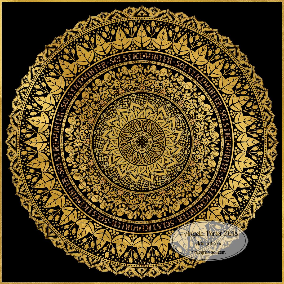
I wanted to re-colour the holly mandala in a more traditional colour scheme of red, green and gold, and so I have done so.

The colours help to give an illusion of dimension to the concentric rings in the design. Of course, the colours are kind of my signature – bright and jewel-like. I chose to change the background colour from stark black to a very dark, inky night-sky blue. I did add some lighter texture to the background to break the colours up just a tad.

It’s worked out ok. I think I prefer it muchly to the green foil version. The foil images are fun to do, that’s for sure. And of course they’ve allowed me to work out another way of creating art digitally, which is essentially by removing black to reveal the design. This has resulted in me drawing my motifs in a slightly different way to how I’d usually do them. They definitely have more of that lino-cut feel to them with the simplification of designs and lines. I like that.

I also like how the holly berries in the outer ring seem to be floating above and below the leaves. That wasn’t intentional! It’s just how it’s all worked out.

Sprinkling stars everywhere is one of my favourite things to do it seems and they do add a little magic to this design for sure.

Which version do you prefer? This one or yesterday’s green foiled version?

Tools used – Microsoft Surface Pen and Surface Studio. Autodesk Sketchbook Pro.

Holly Mandala

© Angela Porter 2018

Holly is the major motif in this mandala, along with stars and geometric patterns.

Again, it’s a mandala I’m pleased with. The green metallic designworks quite nicely with the stark black background. I like the simplicity of the motifs too; they remind me of lino cuts just a little.

This one was, too, created with a Microsoft Surface Pen and Surface Studio along with Autodesk Sketchbook Pro.

Winter Solstice 2018

©Angela Porter 2018

Winter begins! It’s the end of one astronomical cycle and the start of a new one. Winter Solstice is one of my favourite days of the year, along with All Hallow’s Eve. There’s always a feeling of excitement on this day that’s associated with ending and beginnings. Time to lay to rest that which is completed to make way for the new that replaces them as the Sun symbolically ‘dies’ on this day and will begin to ‘grow’ again in the days that follow until the Summer Solstice. It’s also a time to be grateful too.

I know there are many endings and beginnings; every moment in our lives is both an ending and a beginning. However, I feel that days like this, where we can focus on this never ending process in a bigger, more symbolic, more formal way, is important. Traditions are important as they bring a semblance of order to our rather chaotic lives.

I spent some time yesterday drawing this mandala to go with today. The dull gold represents the weakness of the Sun, relatively speaking. I’ve included mistletoe, holly and ivy as they’re traditionally associated with this day. I’ve also added berries as symbolic of the fruits of gratitude I carry for all the days since the last Winter Solstice. And, of course, there are plenty of sun-ray-like motifs and patterns. And stars. Plenty of stars, which from a distance look like snow drifting down.

Yes, I can say I’m rather pleased with this mandala. That’s not something I say often as I’m highly critical of myself and my work. But this one I really do like. I like the more graphic nature of the motifs. I like my hand lettering. I like the rhythm and flow of the design with the rings of designs radiating out.

So, I wish you all the very best that comes with the Winter Solstice, for today and all the days ahead of you and yours.

This was created using a Microsoft Surface Pen and Surface Studio along with Autodesk Sketchbook Pro and a gold texture purchased via Creative Market.

Winter Mandala

©Angela Porter 2018

A mandala today. Cool, wintry colours over a white-pearl background for the mandala. Just something relatively simple for me to create, but quite complex looking in it’s final form.

I did draw this digitally using my Microsoft Surface Pen and Surface Studio along with Autodesk Sketchbook Pro. I also used a pearl white texture and starry backgroun I purchased via Creative Market.

I have also created a winter solstice dangle design for later in the week (Friday), as I know tomorrow I’ve got a bit of a busy day.

Today, though, is a quiet day for me. I’m not feeling too well. Nothing specific, but my appetite isn’t there, I’m a bit sniffly and I just feel more than a little ‘meh’. Mind you, I do feel a little better than I did yesterday.

Now, it’s time for me to go cuddle up and complete some more amigurumi tiny toys which will go to add to stockings for children spending Christmas in a women’s refuge local to me.

Medieval Monogram Dangle Design ‘C’ – 18 December 2018

©Angela Porter 2019

I’ve spent around two and a half hours on this monogram. I’m still playing with metallic/glitter textures rather than black line work.

I still haven’t ‘cracked’ how to achieve a more dimensional look to the gold lines/beads. No doubt I’ll have a bright idea to try sometime soon.

Medieval, Anglo-Saxon, Celtic and Romanesque art and architecture has long been an inspiration for me, though it’s not often I express it in such an obvious way. This definitely has a medieval ‘feel’ about it, but there’s also a more modern take with the rectangular dangle charms and the very  contrasting gradient colours that fill the patchwork pattern inside of the letter.

I was thinking of adding more complex patterns inside some of these patchwork sections. However, I decided that could be way too busy and went with the dots.

Dots are  a very common embellishment in Anglo-Saxon and Celtic manuscripts. After adding dots to those patchwork panels, I had to go and add them elsewhere. Such a simple thing, the humble dot, but how much it can add to a design.

I love the plain blue panel behind the C, so the letter doesn’t get entirely lost in the background pattern – my favourite little spirals. I like the thicker lines around the letter too, but they’re too ‘flat’ for my liking at the moment. The little square-ish gems in the main outline help to break that thick gold line up, adding a bit more opulence in the process.

I love the dimension in those rectangular panels, particularly the lower one. The high contrast gradations in colour really give it some dimension. I wasn’t at all sure about using the pale yellow to orange color gradations anywhere in the design, but once I’d completed this particular ‘charm’ I absolutely loved it!

Although I don’t show such complex monogram dangle designs in my book ‘A Dangle A Day‘, this design really isn’t all the complex to do. 

Talking of ‘A Dangle A Day’, Lydia at #quartocreates sent me a link to a nice review of the book by Funky Frugal Mommy.

This is a piece of digital art using my Microsoft Surface Pen and Surface Studio along with Autodesk Sketchbook Pro and some texture files purchased via Creative Market.  I did start with a pencil sketch of the monogram and dangle design which was then redrawn digitally.

Golden Mandala 16 Dec 2018

© Angela Porter 2018

A little bit of playing around with textures and so on and I created this fun mandala, more like a concentric series of ‘wreaths’, but it was fun to do and I’m quite happy with the result. It’s fun, whimsical and just a bit shiny.

I used simple foliage and floral motifs, with the odd berry and heart thrown in for good measure, not to forget dots and stars! It’s amazing how simple motifs can result in a fairly complex looking design.

Instead of a black background for the design I went with midnight blues, with some texture added, though it’s rather subtle. Blue and gold is a classic colour combination – rich and opulent. Mind you, I rather like a rich burgundy with gold.

I have no idea how this would look when printed out, however it’s pretty to look at on the screen.

However, the main purpose of me creating these kinds of mandalas is to have fun and to explore more in the way of digital art and how I can make it work for me.

My tools for this were Microsoft Surface Pen and Studio, Autodesk Sketchbook Pro and a gold texture that I acquired in a set from Creative Market.

Yesterday I didn’t do that much in the way of art. I did get a template done for New Year, but I’m not at all sure about it. My mood was ‘off’ yesterday so I just spent a fair amount of the day relaxing and resting up. Sometimes that’s what is needed.

I’m feeling a bit more upbeat today, but I have a case of the sniffles. I know I have things to do later on in the day, but this morning, now I’ve tidied up the house a bit, I’m going to relax and maybe do some arty stuff.

Monogram B – another version

©Angela Porter 2018

This version is totally digital. I used the pen and ink drawn version to re-draw the design in Autodesk Sketchbook Pro, making use of a glitter texture.

I think I got my head around how to do this, and colour the images in and I’m kind of pleased with it, though I’d like a bit more of a highlight/shadow on the glitter bits. That will take some thought and experiments as to how to achieve that, but for now my head is overloaded with working in layers and with digital art techniques I’ve barely used before.

I’m pleased with how it looks rather medieval in style – medieval drawn using modern technology. This version doesn’t even exist in physical form, which is crazy!

I have no idea how this would print out as, say, a book mark or note card. As it’s a fairly high resolution file on my computer it would print as a photograph. Of course, there wouldn’t be any real glittery sparkle and shine.

Yes, I’m fairly pleased with this and for myself for figuring it out how to do it, though there’s lots of improvements that could be made.

I think I’d like finer ‘glitter’ on the texture background I used – that’s just a matter of creating another tiled image via GiMP. However, until I do something I never quite know how it’s going to work out, nor do I know if it’s going to be a good idea.

It certainly satisfies a part of me that likes glitter and sparkle and shiny things.

All I have to do now is try to remember how I did this so that I can repeat it in the future, if I’m so inclined.

I am waiting for some metallic inks to be delivered today, so no doubt I’ll be drawing with them on paper.

Mongram B

© Angela Porter 2018

One monogram dangle design, three different versions.

The first is just the black and white line art. This was drawn with Uniball Unipin pens on dot grid paper then scanned in so the dot grid and faint marks could be removed as well as making a transparent background. This dangle design is much more ornate in terms of pattern than is in my book ‘A Dangle A Day’ but is still easy to do if a bit time consuming.

The second is the line art coloured digitally with some texture added.

The third has the coloured line art floating on a golden sheet.

I’ve not quite managed to get my head around how to convert the black and white line art into golden line art where I can add colour. I suspect it’ll have to be re-drawn, which I’ll most probably do while I’m waiting for a delivery.

I kind of like the gold background, but it is a bit too much as well.

Which version do you like best? Let me know your thoughts!

Golden mandala

©Angela Porter 2018

It’s stupid o’clock here in the UK and just as I was getting ready for bed I had an idea that I just had to try out. So, this was a very quick mandala where I used a gold texture background and drew on top of it.

Digital art this time. Had to try it out. My idea kind of worked out. Now how to figure out how to use this with dangle designs! But I think I may have to sleep first!

Microsoft Surface Studio and Pen, Autodesk Sketchbook Pro and a texture I found lurking in my files.

#createdonsurface