I’ve been working on this mandala from time to time. Originally, I wanted to stick to fairly warm brown tones. But today, I just wanted to lift the colours with blues and oranges.
I’m glad I did. The colours are stilly vintage-y, rusty, corroded, aged. But there’s a warmth to them that I like. It is a limited color palette, and I do seem to do well with them.
The shadows and highlights really help to add some volume to the design.
I can see some Zentangle patterns in the design -Morriseau, Shattuck, Mooka – and perhaps others that have shades of tangle patterns about them. It seems that Inktober Tangles 2021 is having an effect even on my mandalas, though this is the first mandala I’ve created in a couple of months.
Round Square, by Karin Guzzetta CZT, has turned out to be an interesting pattern to try variations out on.
At first sight it seems a rather, well, boring pattern. However, with just a little creativity, it’s become fascinating rather than boring. From adding ‘auras’ and patterns, to threading laces through the pattern, to inverting the dark and light areas, and even changing the shape from square-ish to triangular, this has become a pattern full of possibility.
I’ve just realised that I didn’t try adding white (or coloured) patterns to the darker borders in some of the patterns.
Will it make it’s way into my artwork? I don’t know. I can see some interesting optical illusions going on in places. A bit more forward planning with the ‘laces’ running through the pattern could have a really interesting effect, maybe.
However, these will have to be shelved for now as I do need to turn to other work for the day.
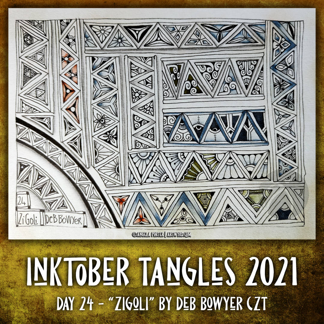
Zigoli is a lovely repeating kind of pattern, full of possibilities of variations. It’s one that interests me as it will lend itself so well to the arches I love to include in my entangled artwork.
I haven’t really experimented with shadow and highlight here, but I know full well how they can really sculpt a drawing.
Although I’ve put my variations together in ribbon form, they would work well in a grid format, but also as individual motifs as kind of carved stones or ‘gems’.
Inktober Tangles 2021 Day 23 “Ple-A” by Apple Lim CZT
This was a new tangle to me, but not any more!
It took a while for me to understand it’s basic structure. Then, it was experimenting with it to fill (mostly) a page of my A5 sketchbook with just a few possibilities.
I did start adding shadow and highlight, but went on to focus on patterns in both black and colour. I may return to add those shadows and highlights to increase the illusion of volume.
Sketchbook Saturday – My week in art
It took nearly an hour for me to look back on my week in art. I didn’t think I’d done this much as I’d been unwell for a few days and needed to sleep a lot.
In the video, I share with you my observations, reflections and lessons from all of this work.
Today, I thought I’d share part of my explorations of Oswaldo Burbano’s lovely organic tangle pattern “Paradisum”.
It’s not easy for my to vocalise my thought processes, as my thoughts are not in words, but in symbols, images and feelings. But I try, and making videos forces me to vocalise them.
Tomorrow, I’ll be sharing all the art I’ve done this week in a vlog, so you’ll see the whole of this page if you don’t get to see it on my other social media.
As October has progressed, my weekly coloring templates (or coloring pages if you prefer!) have grown increasingly spooky. All in a cute and whimsical way, of course! It is now only 10 days away from Hallowe’en after all!
I’m particularly fond of my potion bottles and the drunken party skulls. Colour really does bring the line drawing to life.
I fell quite ill yesterday afternoon, digestive issues once again. I’m feeling better this morning, but still a goodly way from being ticketty boo.
I’ve yet to sort out my sketchbook page for today’s tangle pattern for Inktober Tangles 2021. I’ll do that once I’ve finished the social media stuff and had a mug of tea.
This tangle, with it’s use of heavy lines for shadow/dimension is just up my street. Or so I thought. I ended up experimenting with how the thicker lines can change whether the layer appears to be growing up from or digging down into the page.
I enjoyed varying the inny or outy nature of each layer in the pattern, but I’m not entirely sure I’ve got the shadow and highlight right for the innies!
I’m going to put it down to sheer tiredness. I had a poor night’s sleep again. I’ve been up since before 5am and I’ve done nearly a day’s work already, and I still have more to do. But first I really do need to go sleep for a while. I’m just about falling asleep at my desk.
Oopsmie, by Hanny Nura CZT, is an organic tangle that reminds me of a feather. I’m glad I created many variations on the Oopsmie theme here. I gained a better understanding of this tangle, even if I haven’t worked out how it really can work for me yet.
I think the key for me, as I look at the sketchbook page on the screen, is to start with drawing the ‘seed’ – it’s shape and size – and then work from that out. I need some more time with this tangle to explore that idea more.
Today may very well be the perfect day for such a journey. It’s wet and grey out. I’m tired after a poor night’s sleep and early waking. I’m not up for the challenge of working on templates for ‘Adorable Dogs’ today. I need do to comforting art that gently challenges me to stretch my visual vocabulary.
The grey, wet, gloomy day isn’t helping my energy levels or mood. I think more tea is required, lots more tea!
Moonpie is a tangle pattern by Zentangle Inc. It’s based on crescent moon, another pattern by Zentangle Inc. In keeping with that, I divided the triangular segment up in the way that crescent moon is drawn – in circular arcs. Next, the addition of patterns to the segments.
This motif is something that is a familiar feature of my art, usually nestled betwixt arches or other elements of the design. The variations are endless.
Shadow and highlight, and/or colour really helps to bring these drawings to life.
I thought it would be fun to add stems to some of the moonpies. Some end up looking like flowers, others like very architectural seedpods! And, of course, I started the whole page with a couple of wobbly moonpie pies!
Matt graphite pencils?
I have long disliked using the humble drawing pencil to add shading to drawings. It’s also rather reflective, giving a sheen to the drawing that obscures the pen lines, no matter how carefully the graphite is blended out.
Towards the end of last week, a video popped up You-Tube for some pencils that claim to be matt graphite pencils. These are the Pitt Graphite Matt pencils by Faber-Castell. I watched the video and the review for them seemed to be fab. So, I had to get some to try.
In the same video, Staedtler Mars Lumograph Black pencils were mentioned as having less shine than traditional graphite drawing pencils. So, I thought I’d try those out too.
The result? They are a lot less shiny than traditional graphite pencils! They don’t blend out as far as traditional pencils do, which is fine by me as it really helps to keep the shading in the area you want it.
There’s still a little shine with them; graphite is a shiny material. When I was a science teacher, it was always surprising to myself and my students how slippery a piece of shiny-grey graphite feels. It really is shiny too. So that doesn’t surprise me. So, it’s not the graphite that’s less shiny itself, it’s what is included in the mix.
Carbon and charcoal pencils are duller, but messier and impossible to erase if you need to. I think this may be one of the ingredients in the pencil ‘leads’ in both makes. The Mars Lumograph Black also seem waxier, though I’m not sure of that yet.
I’ve only been using these for a couple of days, and so far I much prefer them to traditional graphite pencils. Time and use will tell if they become my go-to drawing pencils for shading.
I wondered what I was going to be able to do with this tangle, which is essentially a series of zig=zags that become broken and smaller so that they seem to be wearing ‘hats’.
Surprisingly, I found it a really interesting tangle to work with, especially with the addition of shadow and highlights. They really bring the tangle alive.
It is, however, fun to add ‘dangle’ elements to the peaks of the design, both above and below, or ornaments that act like finials atop roofs.
I think there’s a lot more exploring of this pattern.