Today was a day for quiet art, with some colour. I’ve started in a new A5 Sketchbook – A Royal Talens Art Creations one. It seems monograms are the theme for this one, at least for now!
It was a nice way to spend an hour this afternoon. It’s been very warm here in the Valleys of South Wales, UK, today. Thankfully, the sun has moved around from the front of the house and it’s feeling cooler now, just a bit.
Anyways, back to the art.
I drew the basic outlines of the design. I knew I wanted to add colour before adding the details of patterns. It also meant I could just enjoy adding colour without worrying about having to reink the lines affected by the paint; that’s always a recipe for disaster for me!
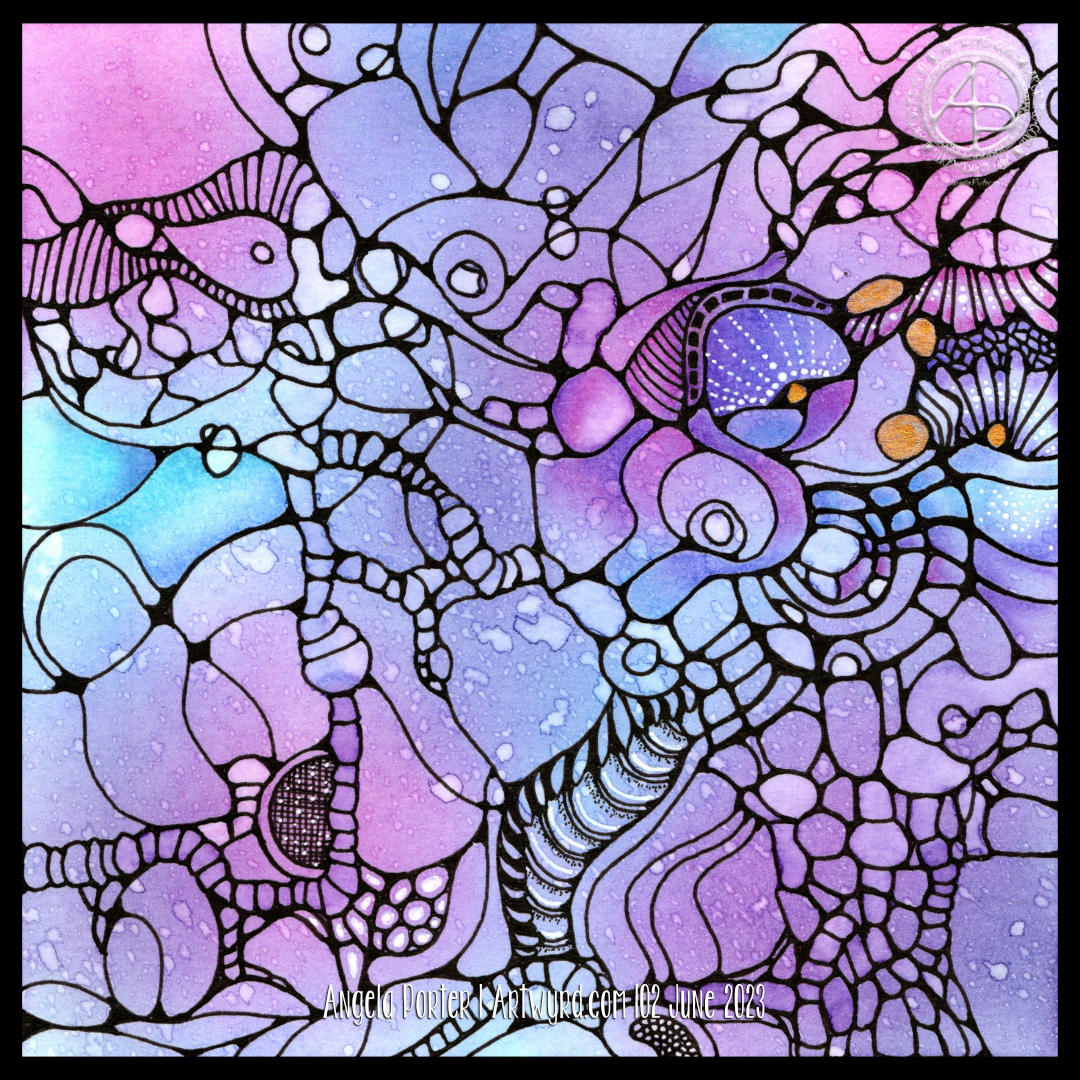
To add colour, I used soft yellows, greens and pinks from the Kuretake Gansai Tambi Art Nouveau set of watercolours.
I really, really love these watercolours. I love the way the imperfections and water-spots create a wonderful background texture. I think I’ve finally accepted that imperfections can be perfectly acceptable and wonderful! I now want to work out how I can replicate this in my digital and tradigital art. But not now. Not today.
Today, I’m flagging in energy once again. I could just go to sleep. But if I do that, I may not sleep well tonight. So, instead I will go get a drink and make something to eat. And maybe do some more art!
Cool, soothing, calming blues, teals and purples are just what my migraine befuddled self needed this afternoon. The migraine had mostly lifted, but left me feeling tired, ‘off with the fairies’. I decided to film this drawing as I thought those who like to draw along with me would enjoy some flowers, this time roses.
I coloured the background with Distress Inks, and added a little texture with a stencil. Water splatters are a must, dried with a heat gun to give that darker edge to them.
I love the way the texture and variation in the depth of colour shows through the coloured pencils that are applied to bring volume to the drawing. I used Gamsol and tortillons/paperstumps to blend the colour pencils out and create highlights and shadows.
Touches of gold ink will bring some precious luxury to the design.
There’s still a lot to do, however. The first coat of added pencil colour needs to be completed. There may be a need to intensify contrast. And then there’s the patterns and contour lines to be completed with ink. A drop shadow, white ink highlights, and more shimmery golden details.
The appearance of torn, collaged, patterned paper to the right of the tag is becoming a favourite thing of mine to add.
I hope a good night’s sleep will come tonight and I’ll wake tomorrow feeling as ‘with it’ as I’m able to be. I have work to do for my next colouring book called “Daydreams”.
I decided to add colour to this artwork using Derwent Chromaflow pencils and Gamsol with tortillons/paperstumps.
I loved the colour as it was, but the design looked rather flat; there was little sense of ‘volume’. So, I hope to bring that out.
So little of the coloured pencil is needed when it is blended out with Gamsol, and it is translucent enough that the underlying waterdrop texture is still visible.
Although I mostly used pink, purple and blue to create the background, I thought that teal would make a good addition. That was a good decision, in my humble opinion!
White dots and lines from a Uniball Hybrid Gel DX pen add highlights that show up much better on the more intense colours. Spots and lines of gold will also add some interest, but I need to be conscious of not overdoing it!
I was really nervous about using Gamsol with linework drawn with Dokumentus ink. I had no real need to be; the Gamsol didn’t affect the ink. I let out a huge ‘Phew!’ at that!. My TWISBI Eco fountain pen with Dokumentus ink and an extra fine nib worked beautifully on areas where coloured pencil and Gamsol had been added.
I have a lot of work to do until this design is complete. I am, however, in no rush to do that. I can work on it a bit at a time. I am likely to post updates from time to time though!
If you’d like to see how I added colour with pencils and Gamsol, then a YouTube video will be available to view from 16:00 UK time on Friday 2 June 2023.
It’s been a funny few days here, culminating in a bit of shopping therapy yesterday. One of the items I bought was a set of the Art Nouveau Kuretake Gansai watercolour paints.
I’ve been eyeing them up often since I knew they were a thing. Yesterday, I finally splurged out on them, as well as various metallic (mostly gold) acrylic paints and inks and some beautiful ramen bowls. Well, even an artsy person has to eat!
This little drawing was done in my latest video, all for the purpose of trying out the colours and the paints.
I absolutely love the colour palette and I need to recreate it digitally for sure!
I get so frustrated with watercolours, perhaps because I’m trying to do it the way other people do watercolour rather than trusting my own way of expressing myself with colour. So, I did my very best to let go of any preconceptions of these watercolours as I worked with them.
I love the way some delicious textures appear spontaneously. How different for me to like this compared to my usual very smooth colour blends. I find the randomness, the spontaneity and magic with which they appear quite fascinating. It’s something I can’t control, and I find that I don’t want to control it. I want to be surprised!
Oh, before adding the Gansai Tambi, I used a Payne’s Grey Inktense pencil and a waterbrush to add some shade to the areas I’ve added colour to.
The Gansai Tambi colours are transluscent enough to let the shading show through. Indeed, they fade gradually and wonderfully as they are blended out in an area.
The other thing I did, well one of them, was to add colours to the sections before adding any texture patterns. That worked nicely; the paint does seem to have a chalky residue that shows up on the black lines. Must remember to make the gaps between lines big enough for my favourite paintbrush! Or, just use traditional brushes and a jar of water; but with that comes the danger of clumsy me knocking the water over…
I tried out a white pigment ink gel pen (Pilot choose) to draw with, as well as a gold Pentel Hybrid Dual Metallic pen.
This drawing really is an opportunity for me to try things out, with no stressing about wrecking an original drawing. I’ve already managed that with one drawing that will now be kept for trying out different colours, media, mixes of media and so on. Luckily, I had scanned that one in before I attacked it with Inktense pencils and gold acrylic paint! Tradigital it is for that design then …
It’s so nice to feel comfortable with a medium I’ve struggled with so much -watercolour. Doing it my way seems to be somethign I need to accept as being acceptable. Art is a personal expression, as such is there a wrong or right way to create? I know in my videos I often mention ‘this is how I do things, it’s not the only way and if it helps you find your way, then that’s fantastic!’.
I think we have to try lots of different things and eventually we circle in to what are the ways that really express something of ourselves creatively. It means many attempts that end in frustration or disappointment or failure. But these aren’t really failures; the lesson is that this may not be right for us at this time, if ever. They aren’t a failure if they spur us on to try out something new.
And that is why it’s important to take time to create more personal art, just for the joy of creating and exploring and trying things out. It freshens us up, even if, as I have done recently, we return to way of drawing that is is so familiar it’s comforting to do.
And perhaps art that gives us that comforting, satisfying feeling along with true self expression is the place where our arty heart wishes to reside, with trips out to add inspiration and blow the cobwebs out of the vault of motifs, patterns, textures, themes, techniques and materials. And that trip out can be physical or through looking at books or online or even through dreams and daydreams or the view from a window, music or stories, films or tv programs, and more. Not all journeys are physical ones, are they?
My brain now hurts, so I need some tea to drink soon! Just some social media posts to finish first…
I easily forget how much I enjoy drawing ‘small art’. A small piece of paper is less overwhelming, and the creativity is no less soothing to heart, soul and mind.
Drawing with pen on paper is never overwhelming. It is a contented, peaceful, delighted experience for me, especially when I work intuitively. The flowy, abstract patterns, with various patterns and textures are always a joy to draw and work with. Starting with just one shape and allowing the design to form, not knowing what will appear from the nib of my pen, is a think of wonder, surprise and magic.
I lose myself in the intricacy of the drawing. then, there’s the addition of colour and contrast to bring the drawing to life. What was flat now appears to have volume to it. The colours may evoke emotions or memories. There is a story to be told in the drawing, but not one that is obvious as an illustration would make it. This is an inner story, an inner expression of my creativity, emotions, thoughts, and what shapes, lines, patterns, textures and items that make me smile.
If my art makes you smile, or brings you joy, peace and/or calm, then it’s done it’s job. There is enough in this world to make us think, to make us feel uncomfortable. We’re assaulted by such things constantly through the media. Time and space to have a break from all of that, to remind us that there is still wonder and beauty, kindness and compassion and creativity in this world is important. It’s also important to remind ourselves that us humans have a great capacity to create these important qualities that heal and soothe and connect us, help us to feel we belong as a member of humanity.
I’m not sure I got all the words I could say out there. Hopefully you’ll understand what I’m trying to get across.
I think what I’m trying to say is that I hope my art reminds you that beauty and wonder, times of peace and contentment, joy and belonging are essential to each of us. That’s still not right. Perhaps once day I’ll manage to express these feelings succinctly in words.
Adding colour, however, is a another tale. I get overwhelmed by the process at times. I doubt my choice of colours, and soon regret what I’ve decided to do. I always try to remember to scan my drawing in before I start to apply colour with traditional media; if I mess up at least I have a clean copy I can add colour to digitally.
Also, there are many times where I just get fed up of the process of adding colour and give up before completion. I can find it a very tedious process. Yet, when I complete the process and it all comes together I’m often really surprised and pleased with the end result. The frustration comes in because it takes so much longer to add colour than it does to draw a design!
Having said that, there have been a couple of pieces of artwork I’ve done recently where I’ve partly coloured them and I really like the effect, especially one where I’ve added shade first. That is something for me to consider going forward for sure.
There is a ‘Draw With Me’ video on my YouTube Channel, available to view from 1900 UK time this evening (19 May ’23).
Here’s a list of the materials I used in the video.
Canson Imagine mixed media paper – 6.3cm x 21cm (2.5″ x 8.25″)
TWISBI Eco fountain pen, extra fine nib
Faber-Castell Pitt Graphite Matt pencil, 4B and a paper stump (tortillon)
Derwent Inktense Pencils – Madder Brown, Red Oxide, Sienna Gold, Willow, Mustard, Shiraz, Poppy Red, Leaf Green and Fern.
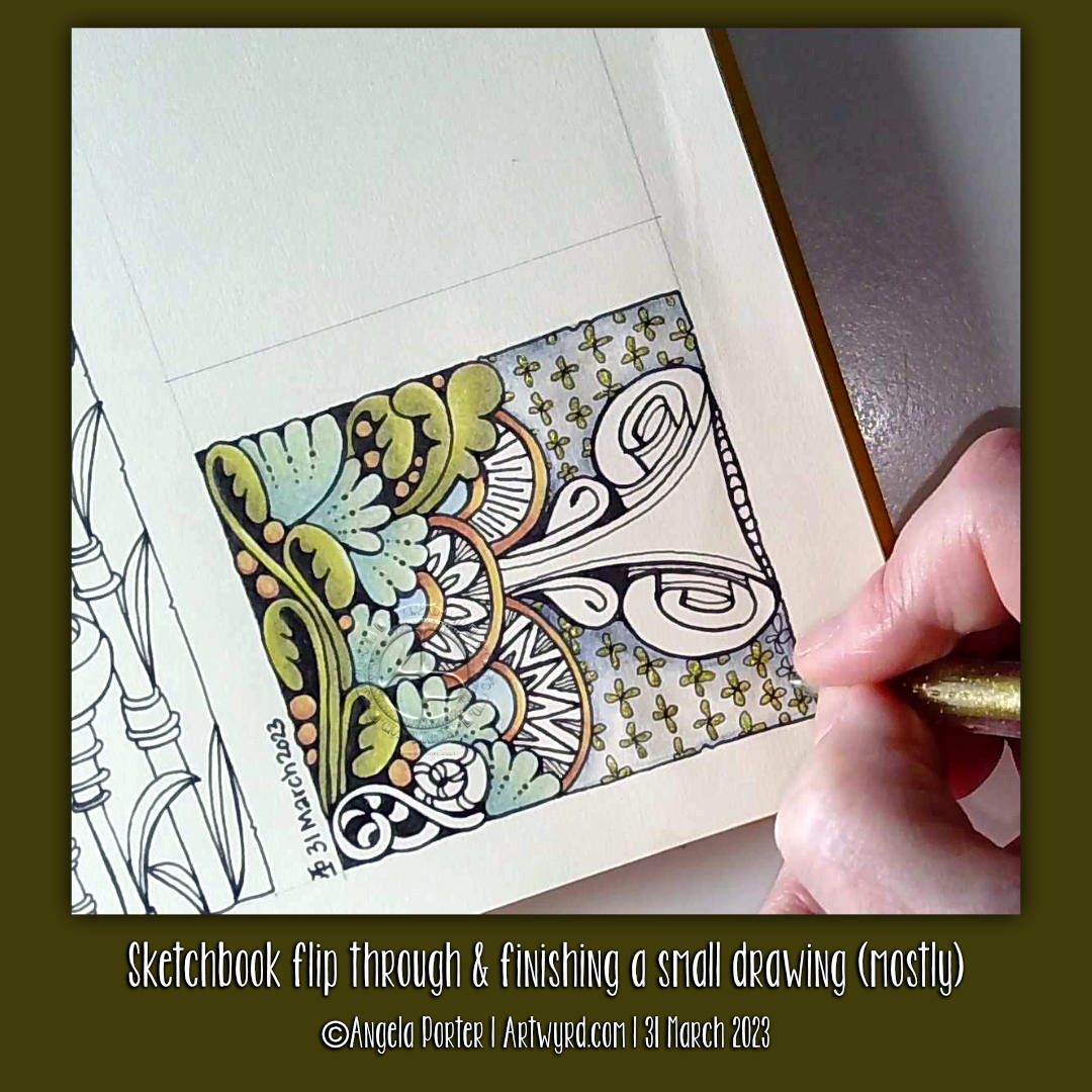
I had a lovely couple of hours this afternoon drawing and then adding colour to this small artwork. And small it is; the paper I used is an approx 10cm x 10cm (about 4″ square) piece of Canson Imagine mixed media paper.
I chose this paper as I enjoy drawing on it with a fountain pen. Today’s pen was an extra fine nibbed TWISBI Eco pen filled with black Documentus ink. This particular ink is archival and waterproof. Perfect as I had decided to add colour using Inktense pencils and a waterbrush.
The more muted, earthy tones do suit my present mood. I’m feeling rather tired, flat and disconnected from everything. Perhaps the earthy tones represent a need to spend more time with the physical world rather than in my head, imagination and creativity?
I do know what has caused this mood – too much adulting, people-ing and a couple of other things that I’m not going to share (sorry!). Out of sorts is what I am and have been for a while. I know it’s a temporary thing for me, a readjustment to changes that are ongoing.
The daily dose of anti-depressant/anti-anxiety meds keep me from sliding down into a dark pit of despair and tsunamis of tears. I know they only mask the anxiety I feel when I’m around people, whether one or many. My hands shake, my vision is different as the hypervigilance kicks in. Getting home means time relax and rest and it can take me days to recover from each people-ing.
All I’ve wanted to do for the past couple of weeks (or even few months) is to lose myself in art, audiobooks, music, and interesting tTV.
And, to circle back, my art tends to reflect this in one way or another.
I am learning to embrace the imperfections that appear as I use Inktense pencils and a water brush to add colour. I’m starting to accept that the imperfections create intriguing textures.
Discovering interesting shapes and patterns in my drawings is also fascinating to me. I need to remember to use a ‘viewfinder’ as I did two decades ago when my art journey began. Isolate a section of a drawing to re-draw on a bigger scale and work on developing it as a new work.
Hanging on my walls are three oil paintings I did about twenty years ago. They are abstracts of patterns from the robes of a Romanesque angel sculpture, the cogs from a diesel locomotive and the worm screws from a steam locomotive. I used a view finder to isolate the sections of my photographs/drawings to enlarge and recreate as abstract paintings. The colours I used for each painting reflected my emotional response to the original items and places where I found them.
Each of these oil paintings have a lot of contrast and trick the eye into thinking they are three dimensional. I didn’t realise I’d done that until the art exhibition at the end of my AS course. People kept touching these paintings and I didn’t know why. So, I asked a friend. She said she expected to feel ridges and valleys and was surprised to find they were totally flat and the illusion was purely optical.
Once she’d pointed it out to me, I could see what she meant!
That love of using high contrast to bring out dimension hasn’t left me. I’m not sure I’ve achieved a great level of contrast in this small drawing; there are some areas where shapes appear to curve up or down and where layers are more apparent. I may revisit this little artwork to increase the contrast at some point in the future. Maybe.
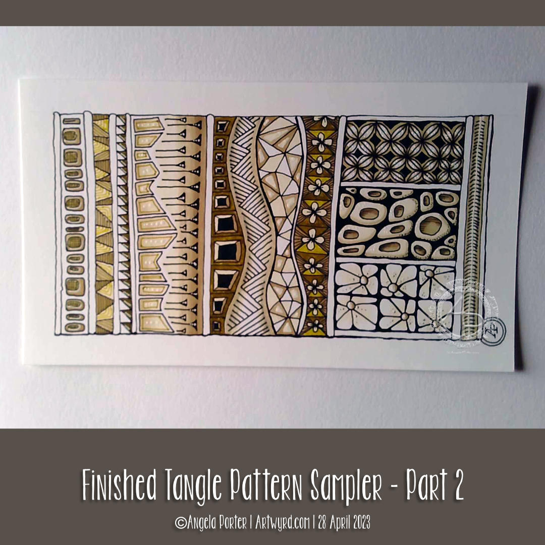
This little pattern sampler has been fun to do! I’ve used patterns inspired by the work of Rebecca Blair, some Zentangle style tangle patterns, and possibly some variations of my own too.
I do love Rebecca’s work. I can see the influence of medieval manuscripts on her work and her love of pattern, texture and a wonderful use of textured lines too! The simplicity of her colour palettes and the myriad of ways she combines her signature patterns/textures is wonderful! I really do suggest you take a look at her work on Instagram.
I used a piece of Ohuhu marker paper that measures 4″ x 7″ ( approx 10cm x 1.7cm) and marked out the basic sections with a Uni Kuru Toga 0.3 mechanical pencil (and a ruler for the straight lines). The pencil lines were just a guide for me.
In the first video, I did most of the black line work using an 03 Sakura Pigma Micron pen. In part 2, I added colour using Winsor and Newton Promarkers in Ivory, Sandstone and Caramel.
After that, I added some fine line work and some colours using three Stabilo Point88 0.4 fine pens. These had olive-green kind of tones to them that worked well with the soft browns of the Promarkers.
I also added some black lines in places using a 0.1 UniPin fineliner pen.
Finally, I added highlights using white gel pens.
I really like the more monochrome, subdued colours of this finished drawing. The various panels really do have the feel of a needlework or cross-stitch sampler; hence the name!
I spoiled myself with a set of Promarkers last week, and I don’t feel a bit guilty about it! I was getting frustrated with the Ohuhu markers – way too many bright, in your face, vibrant colours and not enough subtler, less saturated colours.
I’ve also found that as nice as the Ohuhu marker paper is (and it is lovely and smooth and fab to draw on), I much prefer Winsor and Newton, Daler-Rowney or Canson Marker paper for my alcohol marker work; the ink doesn’t sink into the paper as much and the colours are more vibrant. Also, you use less ink in creating the artwork!
Organising a new pattern, texture and motif ‘repository’ and a bout of illness
I keep faffing about with this. After getting frustrated with a six-ring A5 ringbinder and the limited number of pages that can be stored within, I discovered there’s such a thing as A5 landscape lever arch files! So one was bought post haste! I still can’t draw/write directly in it, but it makes it so much easier to store paper and finished pages. So, I’m one happy bunny.
I’ve spent quite a bit of time in the last couple of weeks starting to put together my collections of patterns etc. Especially as I’ve not been too well. I had been in contact with some people who subsequently tested positive for Covid. I had a nervous few days wondering whether I’d get it. I didn’t. Instead I had runny nose, slight cough, and a mild case or tonsillitis!
I’ve not had tonsillitis for the best part of twenty years. The last time I was getting it 4 times a year and was referred to an ENT surgeon. Let’s just say he didn’t need to use the tongue pressor thing to see my tonsils – they’re permanently large and have lots of tunnels (crypts) inside them from all the tonsillitis I’ve had from a young age. Seeing the surgeon seemed to scare the tonsillitis away; I elected not to go through with surgery to remove the tonsils. There are potentially serious complications that can arise in an, ahem, older person.
Anyhoo, It was a mild case. All covid tests for over a week were negative. But I’m left feeling run down from being ill. I’ll recover gradually!
Losing myself in reorganising and redrawing patterns etc was just what I needed. I’ve barely made a dent in my collection, especially as I’ve added loads more variations as I go! I know it’s going to be a long term project, for sure.
Other arty stuff
I have done other arty projects since my last post here. But the fatigue has been strong and my concentration and focus weak. I will post a gallery of them in the next day or two!
It’s been a while. First, here are three images of the videos I’ve made since my last post. They’re all exploring how I can make colour and colour pens work for me. There’s also been some exploring of filler or textural patterns too; some are zentangle patterns, others are more classic pen drawing textures, and others are inspired by the work of Rebecca Blair.
I’m not quite sure where this is leading…yet. But I do know I’ll work things out.
I do like drawing a design all in one colour ink, such as a rich red-brown, or olive green, or blue-grey. But I also like drawing in black over a coloured background (like the stylised flower drawing).
Figuring out what medium I like to use to add colour is a tricky one. Of course, tradigital art (design traditionally drawn on paper with pen, colour added digitally) is a way I love to work. However, I do enjoy working in sketchbooks on ideas.
Today, I settled on Karin Brushmarker Pro pens and a Kuretake Zig waterbrush. I like to use a waterbrush. There’s a steady flow of water to the brush. I find it much easier to achieve a nice gradient with this brush. I love the vibrancy of colours in the Brushmarker Pro palette, and there are enough earthy ones to keep me happy too!
As well as working in my sketchbooks, I’ve started to sort my collection of patterns, tangles, textures and motifs into an A5 six-ring binder. I thought it was time to make sense of it all and to have a more systematic way of organising them to help in finding inspiration.
And I’ve been sleeping…lots. I’m not sure if the sleep is part of the healing process from the burnout earlier this year, the antidepressant/antianxiety medication I’m taking. My emotions are more stable, my mind is calmer, in the greater part; that is a good thing for sure.
So, thank you for bearing with me while I’m managing the changes with me at this time.
In today’s video on YouTube, I share a look at one of my current sketchbooks. Then, I finish drawing this little design and start to add colour to it.
The drawing is only teeny – a little less than 3″ from side to side – but that makes it fun to do! The tiny floral background pattern just needed to have glittery shimmery gold pen added to the petals; it’s so reminiscent of medieval illuminated manuscripts.
It’s unusual for me to work on such a small scale, but when I do I really enjoy it! I think it’s something I need to do more often. Especially so as I’ve been watching videos showing mixed media grid journal/sketchbook spreads.
Mixed media really isn’t my kind of thing … usually. However, these videos are sparking off some ideas in my noggin. I’ll see how that pans out over time for sure.
As to other things… I’m doing OK. I’m feeling less off with the fairies for sure. A number of ‘peopley’ days last week left me exhausted and needing a lot of quiet time this week. My emotions and thoughts are much more even too, which is a good thing. Fortunately, I can still feel emotions, unlike my last periods of burnout when I had the same meds. So all’s looking better on that front.
I still have an interesting journey to make in knowing and understanding myself better. Slowly is the best way to do that after the confusing and unsettling revelation at the end of last year, yet it was a relief for sure too.
The longer hours of daylight are helping too, though some more sunshiny days would really help! It feels like it’s been raining here in Welsh Wales forever! It hasn’t, but some sun would be welcome for sure.
Until that time, I shall enjoy my times of art and creativity for sure.
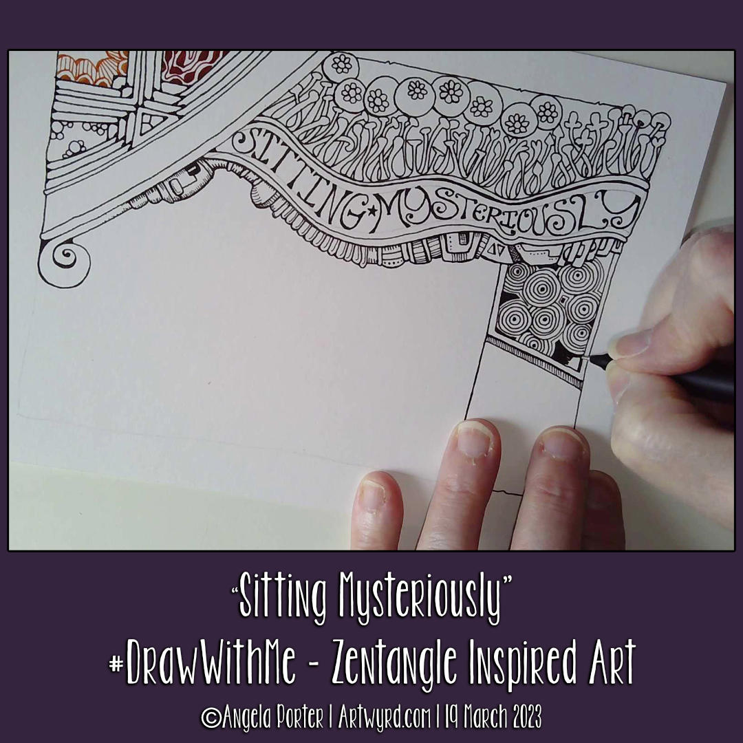
This was a fun ‘Draw With Me’ drawing tutorial on YouTube. Unusually, I used a lot of Zentangle tangle patterns – Arukas variation, Crescent Moon variation, Tipple variation, Quabog, Sez and Mooka. Plus a couple I like to draw – the flowers within circles and the mechanical kind of things under the hand lettering.
It is a work in progress, however. I have no idea what will appear next on it…intuitive art is a wonderful thing to do!