I woke before 5am today and so I did what I do until I’m ready to go back to sleep – letter and/or draw.
Today, this quote from the wonderful Maya Angelou appeared on my Facebook newsfeed. So, it deserved to be used in some way.
This lettering thing is still vexing me. Today I thought I’d try using some vintage, grungy lined paper from a digital download from WhichCraft Do You Do.
Yes, lined paper. Because, why not! Not that it’s made much of a difference to me feeling a bit better about my lettering. But, you gotta keep trying things out until you find what just sits right, yes?
Next step, after gluing the quote in what seems a suitable space on my sketchbook page, was to add patterns to the background. I started with the border of the Zentangle pattern Crescent Moon around the quote. Then, I added the river of Diva Dance upon which the quote floats. The tangle pattern at the bottom is Crazy ‘Nzeppel.
It seem that looking at and creating some work inspired by Rebbeca Blair has influenced me here. Instead of splitting the background up into smaller sections, like a quilt, I’ve worked in layers that look a bit like torn paper. Now that is an idea to explore further.
I’ve started to add colour with Inktense pencils – Red Oxide and Deep Indigo so far, but I will use some Mustard too. I also intend to add some gold to design, probably in the narrow channels either side of the rusty red section and a few ‘Nzeppel ‘pebbles’.
I think I prefer the torn paper edge of the quote panel, though I may re-try this with straight cut edges.
Digital Downloads
Using digital downloads is a bit new to me. Well, in this fashion at least. I have used digital backgrounds a lot in my digital art, and still do. But printing them out is something I’ve not considered before.
I do think I could make my own papers, going forward, to use in this way. All I need to do is remember to scan them in before using the paper! Easier said than done though. We’ll see.
Having some papers already in my digital stash is a worthwhile start to experiment and see where this leads me.
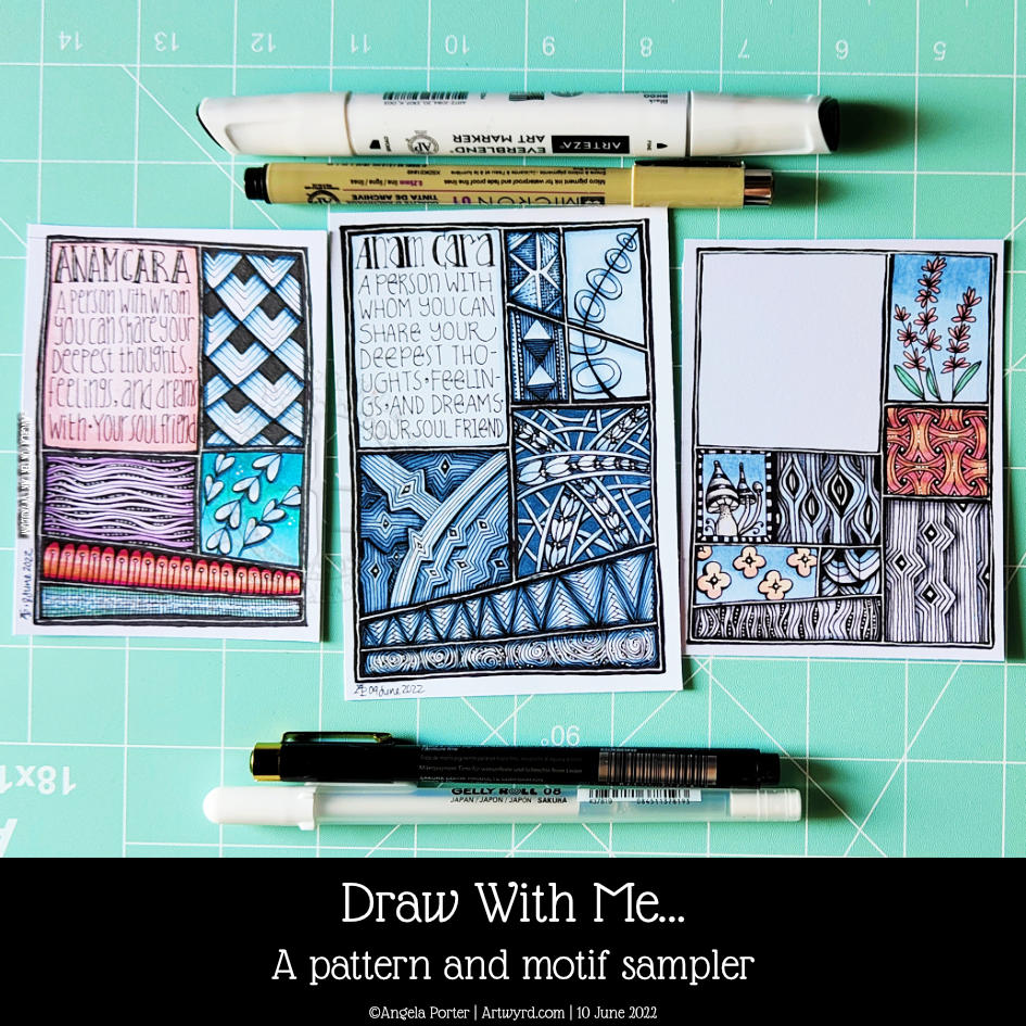
This seems to be the natural progression of my work earlier this week where I put motifs in boxes and added background colour only.
When looking at Rebecca Blair’s artwork, which I absolutely love, I got inspired to create the first ‘sampler’ on the left. I say sampler because splitting space up in this way reminds me of needlework samplers created to practice different stitches.
This is a lovely way for me to indulge my love of hand-lettering, patterns, stylised motifs, colour, shadow, texture and boxes split into boxes!
Colour continues to vex me. I think my favourite is the centre example in a monochrome colour scheme. No chance of any weird colour combinations with that one!
I keep saying this about me and colour, don’t I? But I really need a huge sign that lights up and flashes to remind me to stick to monochrome colours, possibly analogous, and with tiny flashes of a complementary colour. Actually, I need the sign to detect when I reach for colour and shout this advice at me!
Of course, I wanted to share my experiments with the world; well, a few hundred people may be, who may find this an interesting idea to try. If you’d like to see the video then click on this link!
It’s been a quiet day for me. My digestive system is playing up, and self-care is the order of the day. That means not doing anything that has to be the best I can do. I know today that it’ll be harder for me to get things done because I’m under the weather. Fingers crossed, I’ll be fine and dandy again tomorrow.
I had a request from one of my subscribers on YouTube asking how I create this kind of art. Well, a nice request has to be met with a response, in this case, a YouTube video.
I’d tried out this way of working a week or so ago. I’m trying out different ways of combining hand-lettering with my kind of entangled kind of abstract art. In fact, I’m trying to work out my hand-lettering artistic voice. It’s very much a work in progress.
I’m really rather pleasantly surprised with this page. It’s not finished but is a melange of different ideas and pen types. There are a lot of ideas to take away from this and a lot to think upon.
I particularly like how I eventually worked out I could have patterns weaving in and out of the letters, again messing around with volume/dimension/space. I’ve yet to work out how this could work, but I’ve made a start.
My fingers are itching to get to work on something similar to this. I am, however, feeling totally exhausted. I didn’t sleep well last night, and my eyes are constantly on the point of closing as I fall I asleep where I sit.
I have a delivery due soon, I hope. And after that, I’m going to crash and have a nap. Then, I’ll see what happens this evening, as far as art goes!
Looks like yesterday and today are my ‘weekend’ this week. I do know, from past experience, that if I try to do some serious work while falling asleep, I’ll just mess up and have to repeat it again. So, time for self-care for sure.
I’ve seen a bit about slow stitching recently. It kept on catching my attention, so time to take a look at it a bit more.
Permission is given!
I lost my way with textile art many years ago – my attention went to other things. I still have a sizeable stash of threads and beads and sequins and so on. I got a couple of Slow Stitching books on my Kindle, had a quick read/flick through and had a realisation. Slow stitching gives me permission to create with stitches with a similar mindset to my more abstract art – to lose myself in the flow of creating, of just letting things happen and going with it and enjoying the process!
Being given permission – that is such a powerful thing! So often many ‘rules’ seem to be set about how you ‘should’ use a particular medium, or how you ‘should’ draw or create. It’s so refreshing when someone gives you permission to just do want you want, whatever brings you relaxation and pleasure (talking about stitching here!).
The stitching doesn’t have to be perfect. It doesn’t have to look like anything. It’s just creating pattern and texture with colour and so on in a way that is pleasurable to you, to me.
It’s taken me a long time to give myself permission to draw the whimsical art I draw, or the more abstract stuff I do. But sometimes it really does take someone else to give that permission, either overtly or tacitly.
So, last night I dug out some felt and embroidery threads and needles and just started to stitch – cross stitch, seed stitch, running stitch and French knots. I’ve never been able to do French knots before!
Fond stitchy memories
As I stitched I had fond memories of Friday afternoons in primary school, I must’ve been 9 or 10, and being able to take out a sturdy cardboard box that stored my sewing project. Everyone in the class had one of these – boys and girls. A rectangle of navy blue Aida fabric, with the holes forming fairly large grids. A blunt needle was carefully stored in the fabric, and there was a selection of embroidery silks on the teacher’s desk to choose from.
Each week, we added another border or row to this fabric, learning different kinds of decorative stitches as we went. The Aida fabric made it easy to do, the only tricky things were not pulling the thread too tight and getting twisted, tangled and knotted thread!
Eventually, a panel was completed and the entire project was turned into a kind of pouch for pens and pencils. I had to add a linking – bright red – and stitch everything together by hand.
I remember being really proud of what I’d made and I treasured that pouch for years, even when black ink stained it, in one corner. I don’t know what happened to it. It just seemed to disappear at some point never to be found again by me. I remember being a bit upset at it going missing.
When I was in University, studying Chemistry and Environmental Pollution Science, I often used to get acid splashes on my jeans. So, rather than throwing them out, it seemed sensible that I use simple stitches to turn the holes into flowers and extend that pattern beyond the holes.
Over the years I’ve dabbled with cross-stitch and stitched tapestry and patchwork, but nothing really grabbed my attention until I did a lot of textile work during my A-Level art in my early 40s. Yet, that went by the by as other art took over, particularly when I started to work for publishers. I even won an art competition with one textile piece.
Slow Stitching
Returning from a little trip down memory lane, I wanted to take a look at this slow stitching. It feels right that I revisit stitching with the aim of incorporating it into my drawing and hand-lettering work. It may take me a while to work out how I’m going to do that, but unless I make a start it may never happen.
Felt is OK to work on, and I may return to needle-felting beautiful fibres onto black felt and then using slow stitching and beads to embellish the work. First, I have to get some black felt! I have loads of the rest of the stuff in my stash!
I also want to explore stitching on paper, using the stitches as a way to collage papers and so on. Like in the photo above.
Working on paper also gives me the opportunity to draw and/or paint patterns or textures alongside the stitches; giving me the opportunity to find different ways to combine my favourite things!
It may not be everyone’s cuppa, but my first attempt is making me smile and there’s a small sense of achievement.
I have no idea where this will take me, nor how persistent I’ll be with the stitching thing. It is, however, one more technique to add to my toolbox of arty techniques to choose from. And another one that is both relaxing and pleasurable, especially now it’s ok for me to do what I want when it comes to stitching!
I’ve finished it, I think. I’m feeling a bit happier with it now. I really like the abstract, curvy, swirly bits that remind me of La Tene (early Celtic) art. I’m still not happy with that central ‘moat’, though.
Oh, I’m also really pleased I stuck to an analogous colour scheme, mostly. Having the words in an almost complementary colour to the blues and purples makes them stand out. But I still rather like the swirly abstract patterns, and I’m so glad I added them!
I’ve not quite found my way with hand-lettering. I keep trying new and different things out, but nothing seems to sit well with me yet. Although I like the more formal lettering layouts, I don’t think that’s for me. I tend to work fairly instinctively and intuitively with little forethought or planning. When I do think my way through something, that’s when disaster tends to strike!
I suspect a looser, expressive, intuitive kind of style is going to work for me, along with my style of entangled, abstract art. Probably. Possibly. Perhaps…
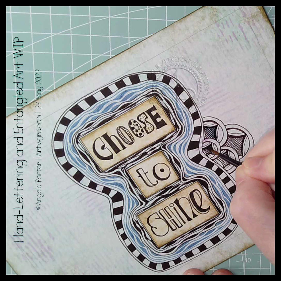
It was one of those mornings when I wake up with what seemed to be a good idea on my mind. Then, I execute the supposedly good idea to realise it’s not working out as expected, and it may not have been such a good idea at all. That is what is happening here!
I think the idea of doing my hand-lettering like this may have some mileage in it. I do feel I have problems pleasingly arranging lettering. If I work on pieces of paper and cut out the words, I can arrange them on the paper until I’m happy with it. So that’s fine. A good plan.
But, I’ve ended up with a birdseye view of an “I” shaped moat around a blocky castle “rolls eyes”. Having “choose to shine” inside a capital I works rather well – I choose to shine. But what possessed me to use blue Diva Dance around the letters? I really didn’t think it through or see the consequences of that choice. Duh!
Of course, this may just be that part in drawing where I think it’s all awful and I should just give up. But I’ve learned to be a bit stubborn and push through to the end, with a drawing at least. Adding colour is an entirely different matter.
So, I will push on and see what happens. Who knows, it may work out nice enough in the end. Or not. Either way, there are plenty of opportunities for me to learn some stuff.
Sheesh, I really can drop some rather heavy clangers at times. But it’s through these that we learn, grow and develop as artists. In my case, I seem to drop the same clangers time after time after time and never quite seem to learn. One day the pennies will drop!
Watching some arty videos yesterday, I stumbled upon one that involved creating “Polaroid Pops”, part of a challenge hosted by AALL and Create back in January 2022. In this challenge, you had to create mixed media polaroid ‘photos’ using stamps by a specific artist in the AALL and Create range.
I really liked the format of the images created and thought it could be fun to try this for myself!
Polaroid photos have the following dimensions: The image is 3.1″ x 3.1″ (approx. 8cm x 8cm) The whole photo is 3.5″ x 4.2″ (approx 9cm x 11cm).
So, yesterday I cut up some of my Neocolour II backgrounds to 8cm x 8cm and got to drawing on them!
I really like the square format. At 3.1″ x 3.1″ (8cm x 8cm), they’re only a wee bit smaller than a standard Zentangle tile. And they do look fab when mounted on the white card to create the polaroid.
After drawing a kind of botanical scene in silhouette (not quite my thing, but you have to try, you know.), I tried popping a hand-lettered monogram into the square and using Zentangle patterns to fill in the negative space.
That was much more ‘me’. And in today’s video, I continue with the letter B, though it looks like an R because I deliberately drew it as bigger than the ‘photo’. Duh, didn’t check for it looking weird before inking it in. Luckily, there’s space on the white background to write in what it is!
While the video was uploading and processing, I drew the ‘H’.
I think I may make an alphabet collection for future reference and inspiration! So, if you fancy having a go take a look at today’s video on YouTube.
I had the hand-lettered part of this sketchbook page completed a couple of days ago. I didn’t really know what else to do with it. I knew adding colour with traditional media was likely to be a disaster.
This morning I woke up knowing what to do with this, along with other things. So, I spent some time adding a border around the lettering and starting to add patterns and motifs. And arches, lots of arches!
I then thought it would be nice to share some of the drawing process through a video, which you can see by clicking this link.
It feels like a long while since I did any entangled style art. The hand-lettering isn’t perfect, nor is the frame around it. But that’s OK. I think it goes with the ‘chaos’, the imperfection, the touch of an imperfect human hand.
A couple of months ago, I may have tried to do something like this, and would likely have been really dissatisfied with the result. Mainly because I wasn’t at all happy with my hand-lettering attempt. But now, after just a couple of months of working in lettering sketchbooks, working with different ways to form letters and finally accepting that whatever lettering I do doesn’t have to be perfect – good enough is good enough!
I’m using variations in the density of pattern and ink to create shadows and highlights in the design. I have no intention of using pencil or markers to add grey shadows to this one. If I decide to add colour, it will be in the style of a linocut or hand-coloured print, perhaps with some extra shadow and highlight added by the depth of colour. Perhaps. Maybe. And if I do, digital is the way I’ll go! First, though, I have to finish drawing this design.
I had fun creating this design in my lettering sketchbook, well one of my lettering sketchbooks!
The main quote is something I’ve found difficult to accept throughout my time exploring and developing my art. I’d bought into the belief that for something to be good it has to be ‘perfect’.
I’m finally accepting that a piece of art I create only has to be good enough, and that means it’s OK to be perfectly imperfect. Just as I had to accept that I am good enough as a person, imperfectly perfect as we all are, then I’m recognising that I’m doing the same thing for my art.
I can accept now, most of the time, that it’s fine if there are imperfections in it, even mistakes that become part of the design. These imperfections, rather variations, add character to the work and make it uniquely mine. Even if others work in a similar way, each is unique.
Art is a practice, a life-long process of learning and developing, and self-discovery too. Is perfection possible? I don’t know, but I’m happy to settle for this is the best I can do now and it is good enough.
This drawing is finished, with cool grey shadows added. Now, I have to decide whether to leave it like this or add colour. If I add colour, do I go with alcohol markers or digital art? I’m not sure, yet. But there’s no rush to decide.