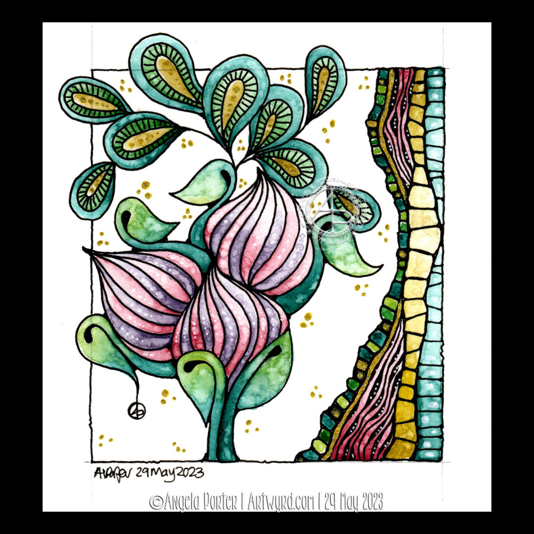
This was a lovely way to spend an hour or so this afternoon! The design isn’t quite finished. I have more colour to add, and textural patterns too. But this gives an idea of where I am going with it.
I started with a simple ‘fragment’ – a square with a diamond in it. From there, I built up the central panel of four motifs. I decided to use the same starting point for the outer borders, just a smaller and simpler version.
Colour was added using Kuretake Gansai Tambi Art Nouveau watercolours and Winsor and Newton gold calligraphy ink.
It will take me a wee while to finish. It depends on my energy levels and ability to focus on a task. I seem to be improving little by little – hurrah!
I drew this design partly as I settled and calmed down for sleep, then completed it when I awoke at stupid o’clock until I was ready to settle back to sleep. Now, I’ve started to add colour – Derwent Chromaflow with Gamsol to blend the colours out. Oh and gold ink for the ‘L’ and the border around it.
This design was drawn on a 21cm x 21cm (8.25″ x 8.25″) piece of Canson Imagine mixed media paper. I used TWISBI Eco fountain pens filled with black Dokumentus ink, fine and extra fine nibs.
This is part of my preparation to throw myself into designing colouring pages for DayDreams. Getting back into my signature kind of art, maybe not this detailed, but …
There’s still plenty of colour to add. Then, there’s the highlights and sparkle and any other details that may be called for. A good level contrast is needed to bring out the illusion of dimension to this!
This design does make me smile gently! I’m rather pleased with the end result. If you’d like to #drawwithme, then the accompanying YouTube video goes live today, 3 June ’23, at 18:00 UK Time.
Distress Ink background. Design drawn with black Dokumentus ink in a TWISBI Eco EF fountain pen. Extra colour/shade added with Derwent Chromaflow pencils and Gamsol. Highlights/shimmer added using a white Uniball Hybrid Gel DX pigment ink pen and gold Winsor and Newton Calligraphy Ink applied with a brush.
I absolutely love the Kuretake Gansai Tambi Art Nouveau set of watercolours! I just had to get that off my chest!
I love the texture created by the watercolours – how uncontrollable it is, but it adds so much to the final drawing and it actually makes my arty heart and soul smile a tad.
This is a drawing completed, for once, in today’s YouTube video, due to premiere at 18:00 UK Time on 29 May 2023. In the video I show how to draw the design, add colour and gold and white details.
After doing this artwork, I really do think the Kuretake Gansai Tambi’s are the watercolours I’ve been searching for. They work with me, helping me to express myself. Also, embracing the imperfections of the textures in the colours as part of my self-expression rather than searching for the unattainable.
I used single colours for each section, except for the larger leaves. And that seems to have worked out well for me.
I love how the gold and green to the right seem to glow like sunlight shining through stained glass.
The only thing I wish I’d done was coloured the paper with Distress Inks before starting the drawing. I know that so little Distress Ink is added to the background that it won’t affect the colours in a noticeable way. So that will be my next arty experiment today!
Oh, and I wish I’d remembered to erase the pencil line before starting to add the watercolour!
Again, I used Canson Imagine mixed media paper(9.5cm x 10.5cm or 3.75″ x 4.25″) and it seems to make it so easy for me and the Gansai Tambi paints to work well together.
I’m absolutely amazed that I’m embracing imperfection! I never thought I’d get to that point, or let it be part of my artistic voice.
I’m actually smiling here. I really am. And a smile that is felt in my heart and soul too; something I’ve not done much for a long while.
A sudden realisation
I had a sudden revelation today, of a practical nature. I suddenly realised I tend to create art in sizes that require custom made frames and/or mats. So, I thought I should try to get a selection of ready cut mats in standard sizes and use them to cut paper and create the right sized art to fit the mat. So that’s what I did.
I can be such a numpty, feeling quite daft it had taken me this long to work that out! But then again, perhaps the time wasn’t right before now. I’ve thought for a while now that I could sell my art, particularly the more abstract, flowy, intuitive art. Next step is to work out how to do that and ‘promote’ it/me. And that is the problem, the promotion… it fills me with horror. But maybe I’ll work it out. Time will tell for sure.
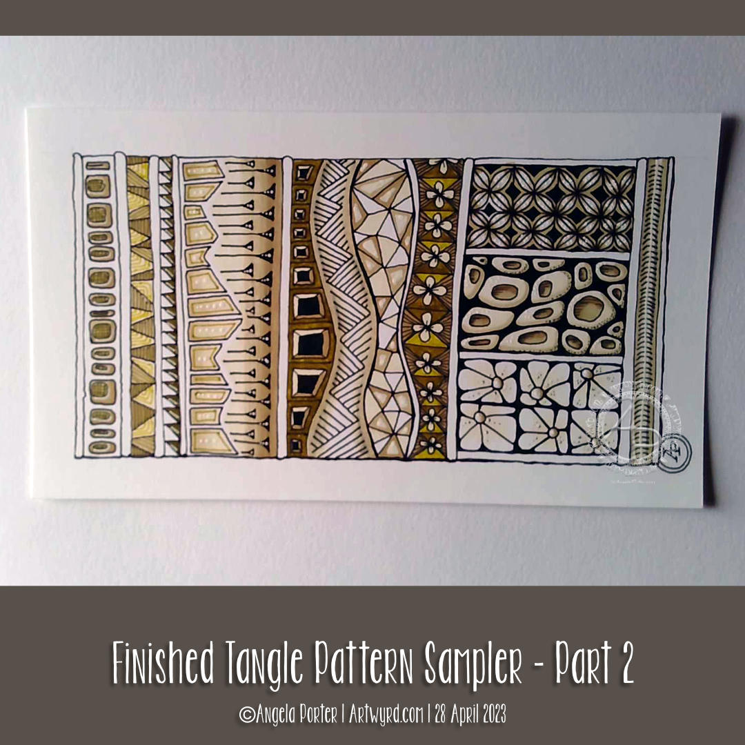
This little pattern sampler has been fun to do! I’ve used patterns inspired by the work of Rebecca Blair, some Zentangle style tangle patterns, and possibly some variations of my own too.
I do love Rebecca’s work. I can see the influence of medieval manuscripts on her work and her love of pattern, texture and a wonderful use of textured lines too! The simplicity of her colour palettes and the myriad of ways she combines her signature patterns/textures is wonderful! I really do suggest you take a look at her work on Instagram.
I used a piece of Ohuhu marker paper that measures 4″ x 7″ ( approx 10cm x 1.7cm) and marked out the basic sections with a Uni Kuru Toga 0.3 mechanical pencil (and a ruler for the straight lines). The pencil lines were just a guide for me.
In the first video, I did most of the black line work using an 03 Sakura Pigma Micron pen. In part 2, I added colour using Winsor and Newton Promarkers in Ivory, Sandstone and Caramel.
After that, I added some fine line work and some colours using three Stabilo Point88 0.4 fine pens. These had olive-green kind of tones to them that worked well with the soft browns of the Promarkers.
I also added some black lines in places using a 0.1 UniPin fineliner pen.
Finally, I added highlights using white gel pens.
I really like the more monochrome, subdued colours of this finished drawing. The various panels really do have the feel of a needlework or cross-stitch sampler; hence the name!
I spoiled myself with a set of Promarkers last week, and I don’t feel a bit guilty about it! I was getting frustrated with the Ohuhu markers – way too many bright, in your face, vibrant colours and not enough subtler, less saturated colours.
I’ve also found that as nice as the Ohuhu marker paper is (and it is lovely and smooth and fab to draw on), I much prefer Winsor and Newton, Daler-Rowney or Canson Marker paper for my alcohol marker work; the ink doesn’t sink into the paper as much and the colours are more vibrant. Also, you use less ink in creating the artwork!
Organising a new pattern, texture and motif ‘repository’ and a bout of illness
I keep faffing about with this. After getting frustrated with a six-ring A5 ringbinder and the limited number of pages that can be stored within, I discovered there’s such a thing as A5 landscape lever arch files! So one was bought post haste! I still can’t draw/write directly in it, but it makes it so much easier to store paper and finished pages. So, I’m one happy bunny.
I’ve spent quite a bit of time in the last couple of weeks starting to put together my collections of patterns etc. Especially as I’ve not been too well. I had been in contact with some people who subsequently tested positive for Covid. I had a nervous few days wondering whether I’d get it. I didn’t. Instead I had runny nose, slight cough, and a mild case or tonsillitis!
I’ve not had tonsillitis for the best part of twenty years. The last time I was getting it 4 times a year and was referred to an ENT surgeon. Let’s just say he didn’t need to use the tongue pressor thing to see my tonsils – they’re permanently large and have lots of tunnels (crypts) inside them from all the tonsillitis I’ve had from a young age. Seeing the surgeon seemed to scare the tonsillitis away; I elected not to go through with surgery to remove the tonsils. There are potentially serious complications that can arise in an, ahem, older person.
Anyhoo, It was a mild case. All covid tests for over a week were negative. But I’m left feeling run down from being ill. I’ll recover gradually!
Losing myself in reorganising and redrawing patterns etc was just what I needed. I’ve barely made a dent in my collection, especially as I’ve added loads more variations as I go! I know it’s going to be a long term project, for sure.
Other arty stuff
I have done other arty projects since my last post here. But the fatigue has been strong and my concentration and focus weak. I will post a gallery of them in the next day or two!
It’s been a while. First, here are three images of the videos I’ve made since my last post. They’re all exploring how I can make colour and colour pens work for me. There’s also been some exploring of filler or textural patterns too; some are zentangle patterns, others are more classic pen drawing textures, and others are inspired by the work of Rebecca Blair.
I’m not quite sure where this is leading…yet. But I do know I’ll work things out.
I do like drawing a design all in one colour ink, such as a rich red-brown, or olive green, or blue-grey. But I also like drawing in black over a coloured background (like the stylised flower drawing).
Figuring out what medium I like to use to add colour is a tricky one. Of course, tradigital art (design traditionally drawn on paper with pen, colour added digitally) is a way I love to work. However, I do enjoy working in sketchbooks on ideas.
Today, I settled on Karin Brushmarker Pro pens and a Kuretake Zig waterbrush. I like to use a waterbrush. There’s a steady flow of water to the brush. I find it much easier to achieve a nice gradient with this brush. I love the vibrancy of colours in the Brushmarker Pro palette, and there are enough earthy ones to keep me happy too!
As well as working in my sketchbooks, I’ve started to sort my collection of patterns, tangles, textures and motifs into an A5 six-ring binder. I thought it was time to make sense of it all and to have a more systematic way of organising them to help in finding inspiration.
And I’ve been sleeping…lots. I’m not sure if the sleep is part of the healing process from the burnout earlier this year, the antidepressant/antianxiety medication I’m taking. My emotions are more stable, my mind is calmer, in the greater part; that is a good thing for sure.
So, thank you for bearing with me while I’m managing the changes with me at this time.
Drawn with Unipin Fineliner pens on A4 Canson Imagine paper. Colour added digitally using ClipStudio Paint.
This is such a typical ‘Angela’ style of entangled art, kind of Zentangle Inspired too. Unusual colour choices for me. I particularly like the moss-green and cream in the arches towards the top right. Though the dusky blues filling in the basket weave pattern to the top left I find nice too. I felt like using coppery tones for the fine borders in the arches rather than gold this time.
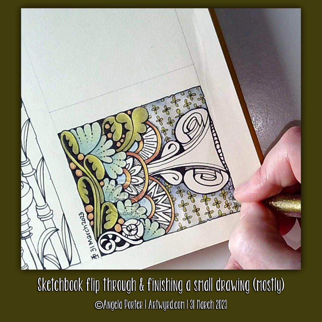
In today’s video on YouTube, I share a look at one of my current sketchbooks. Then, I finish drawing this little design and start to add colour to it.
The drawing is only teeny – a little less than 3″ from side to side – but that makes it fun to do! The tiny floral background pattern just needed to have glittery shimmery gold pen added to the petals; it’s so reminiscent of medieval illuminated manuscripts.
It’s unusual for me to work on such a small scale, but when I do I really enjoy it! I think it’s something I need to do more often. Especially so as I’ve been watching videos showing mixed media grid journal/sketchbook spreads.
Mixed media really isn’t my kind of thing … usually. However, these videos are sparking off some ideas in my noggin. I’ll see how that pans out over time for sure.
As to other things… I’m doing OK. I’m feeling less off with the fairies for sure. A number of ‘peopley’ days last week left me exhausted and needing a lot of quiet time this week. My emotions and thoughts are much more even too, which is a good thing. Fortunately, I can still feel emotions, unlike my last periods of burnout when I had the same meds. So all’s looking better on that front.
I still have an interesting journey to make in knowing and understanding myself better. Slowly is the best way to do that after the confusing and unsettling revelation at the end of last year, yet it was a relief for sure too.
The longer hours of daylight are helping too, though some more sunshiny days would really help! It feels like it’s been raining here in Welsh Wales forever! It hasn’t, but some sun would be welcome for sure.
Until that time, I shall enjoy my times of art and creativity for sure.
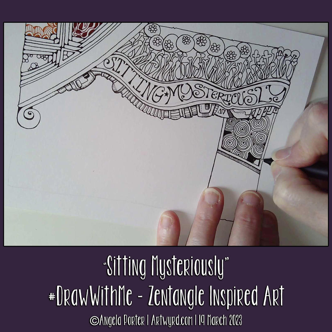
This was a fun ‘Draw With Me’ drawing tutorial on YouTube. Unusually, I used a lot of Zentangle tangle patterns – Arukas variation, Crescent Moon variation, Tipple variation, Quabog, Sez and Mooka. Plus a couple I like to draw – the flowers within circles and the mechanical kind of things under the hand lettering.
It is a work in progress, however. I have no idea what will appear next on it…intuitive art is a wonderful thing to do!
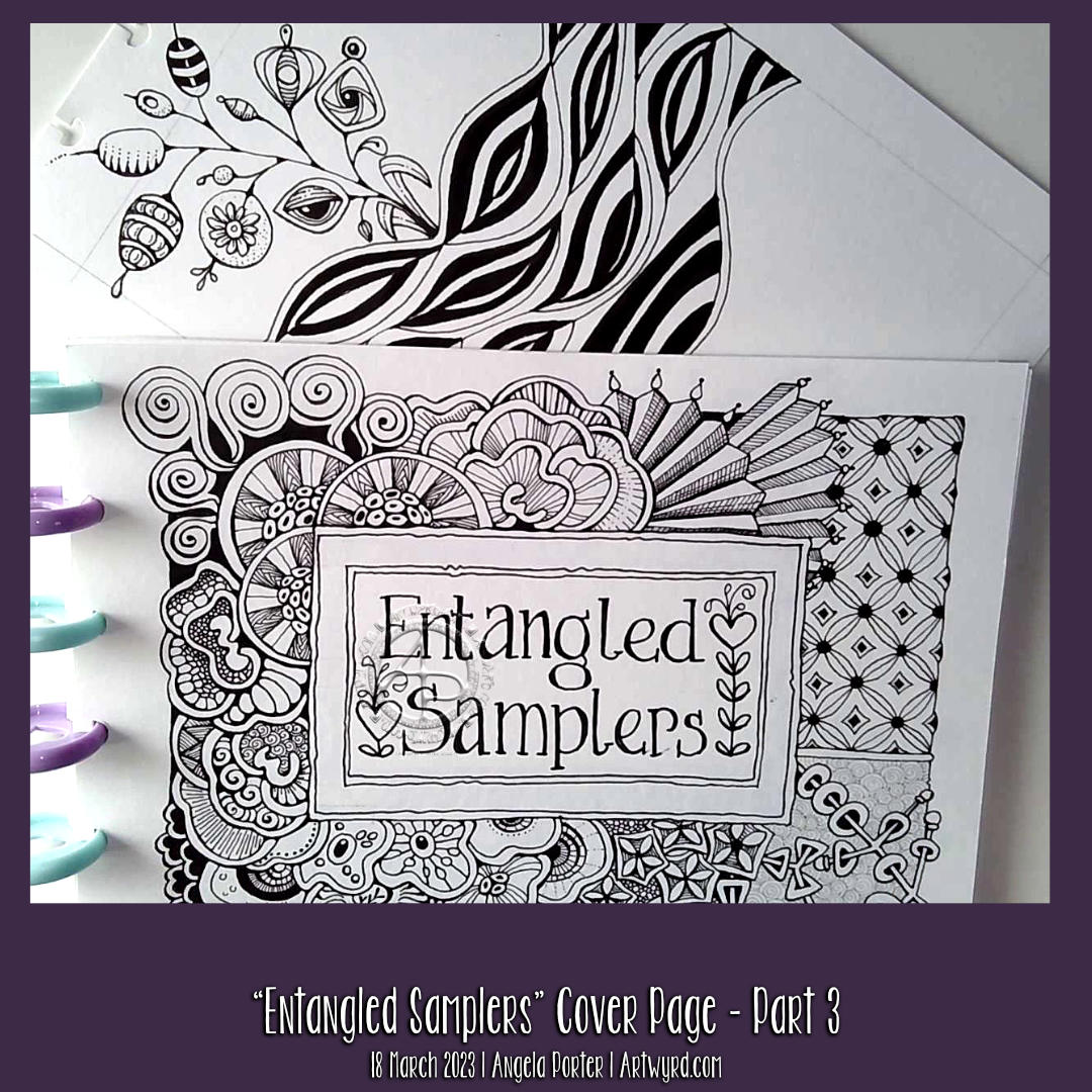
I’ve finished adding all the main patterns on the cover page for my Entangled Samplers collection. I’m happy with the result, which is something I rarely say!
However, I needed a regular grid pattern to contrast with the more organic patterns and motifs. So, I added the gridded tangle to the top right.
At the bottom right is a variation of the Zentangle tangle pattern ‘Rixty’. The plain white paper behind it was crying out for some texture. So, I added some ‘Printemps’ spirals using a 0.1 light grey Unipin pen. As a subtle reminder to use colour and line thickness variations to bring interest into a drawing, this was a good idea.
I have a couple of things to decide before fully finishing the page. Firstly, how do I want to add shade/highlight/contrast to the drawing? Secondly, do I want to add a pattern to the wide border around the title text?
There’s no rush for me to decide. What’s the saying? ‘Act in haste, repent at leisure’? I can let these issues wander around my noggin until the perfect methods come forward.
Exploring ‘Lunaria’ by Ute Andresen and a wavy leafy pattern
I had some time and energy left to do some more drawing. So, I grabbed (gently) a fresh sheet of A5-ish paper and used some patterns from last Tuesday’s Tea and Tangle With Tracy.
The first one is based on waves with leaves. I like the very graphic, high-contrast leaves, for sure. Adding colour between them helps to make sense of the pattern as well.
The second one is my take on a tangle pattern by Ute Andresen called ‘Lunaria’. I like branching and organic patterns. In this drawing, I wanted to explore variations on the ‘fruits’ at the end of each branch. This is always a fun thing to do! No doubt I’ll do another branch of Lunaria explorations in the space beside this one at some point.