Please click on the ‘Watch on Youtube’ button. Cheers!
We all need some whimsy in life at one time or another. Given all that’s going on in the outside world, I definitely need a huge dose of whimsy! So, today, I drew three whimsical houses, one step at a time.
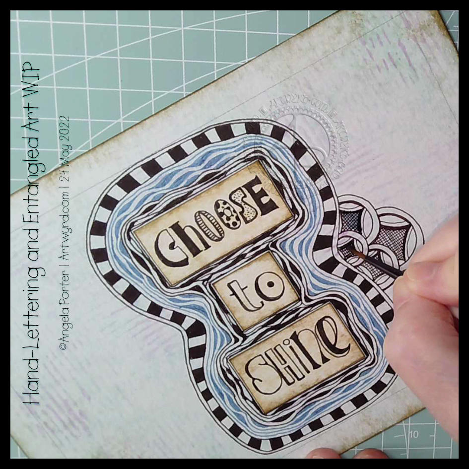
It was one of those mornings when I wake up with what seemed to be a good idea on my mind. Then, I execute the supposedly good idea to realise it’s not working out as expected, and it may not have been such a good idea at all. That is what is happening here!
I think the idea of doing my hand-lettering like this may have some mileage in it. I do feel I have problems pleasingly arranging lettering. If I work on pieces of paper and cut out the words, I can arrange them on the paper until I’m happy with it. So that’s fine. A good plan.
But, I’ve ended up with a birdseye view of an “I” shaped moat around a blocky castle “rolls eyes”. Having “choose to shine” inside a capital I works rather well – I choose to shine. But what possessed me to use blue Diva Dance around the letters? I really didn’t think it through or see the consequences of that choice. Duh!
Of course, this may just be that part in drawing where I think it’s all awful and I should just give up. But I’ve learned to be a bit stubborn and push through to the end, with a drawing at least. Adding colour is an entirely different matter.
So, I will push on and see what happens. Who knows, it may work out nice enough in the end. Or not. Either way, there are plenty of opportunities for me to learn some stuff.
Sheesh, I really can drop some rather heavy clangers at times. But it’s through these that we learn, grow and develop as artists. In my case, I seem to drop the same clangers time after time after time and never quite seem to learn. One day the pennies will drop!
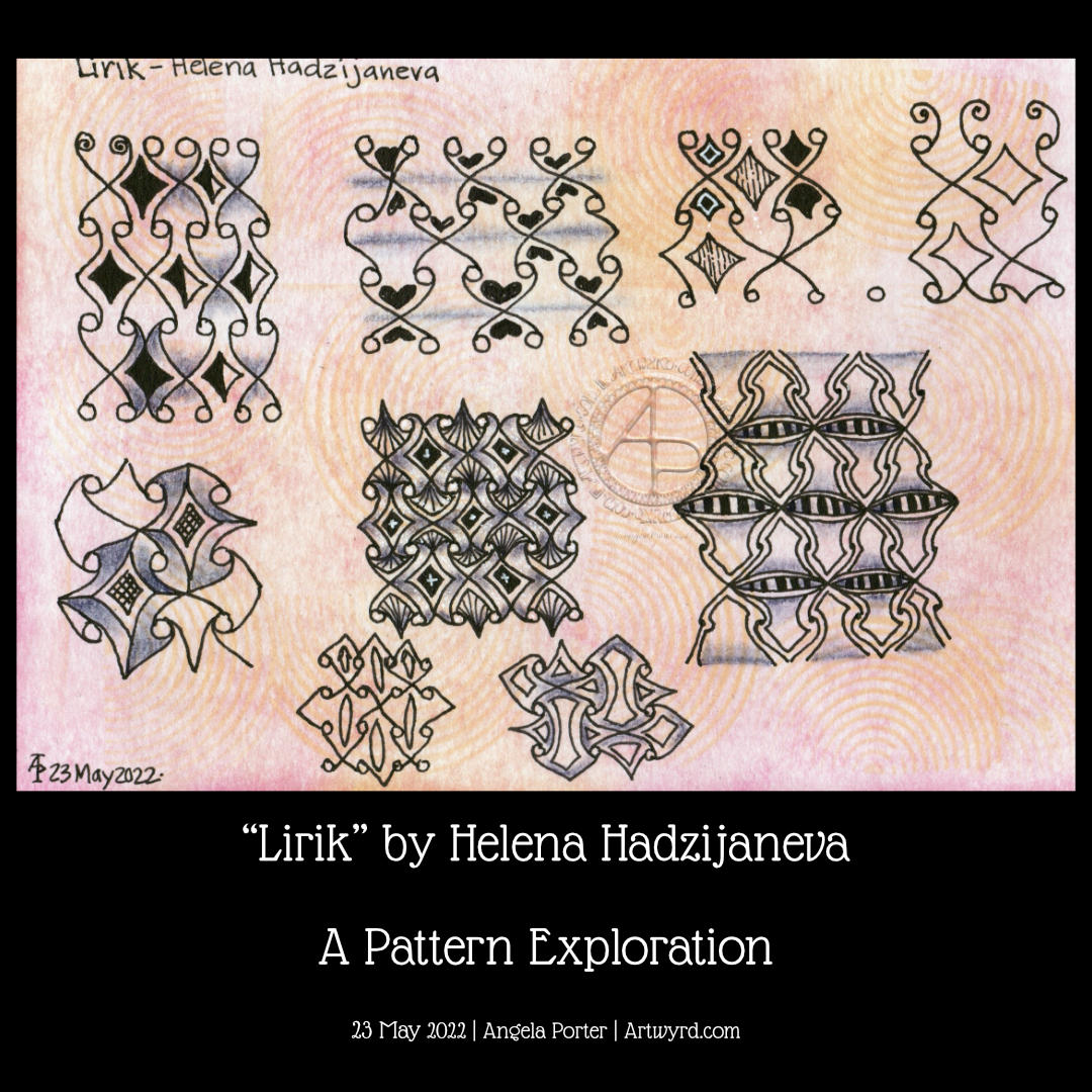
Exploring a totally new tangle pattern may not have been the best choice for me as I wait for the last pain of a migraine to go so I can sleep the rest of it off! Plenty of mistakes and not good choices here, but plenty of opportunities to learn from.
In today’s video on YouTube, I first make some Distress Ink backgrounds, then I explore this lovely tangle pattern, mangling it completely at times! This isn’t a problem as it’s all sketchbook work!
Please click on the “Watch on YouTube” button. Cheers!
Carrying on with my look at arches is an exploration of the tangle pattern “Kruffle” by Kelli King CZT.
It actually took me a little while to understand the deconstruction of this pattern, it’s deceptively tricksy! But, when I’d got it, quite a few variations appeared in my sketchbook.
Of course, I go through these, step by step, in today’s video.
I really do enjoy exploring tangle patterns, as well as all my favourite motifs. They are such a good way to get creative juices flowing, but also of practicing your drawing skills, as well as other techniques, such as adding shadows or colour, or further patterns.
Please click on the ‘Watch on YouTube’ option. Cheers!
Before filming this video, I primed a piece of watercolour card with white gesso. Then, I added colour using Inktense pencils and water. I added each colour separately, drying them before adding the next. Finally, a layer of clear gesso was added to seal the colours.
I had no particular idea as to how I would add the colour or what I wanted to use the paper for after this. But, as I looked at it, the pink areas just looked like very fuzzy flowers, so that was it! A floral based drawing it would be!
I do not intend to fill the whole area with flowers. I have plans for the ‘white space’ around the designs. But you’ll have to wait to see how that pans out!
In the video, I take you through drawing each flower design, one step at a time. I try to vocalise my reasons for doing certain things too.
Please click on the ‘Watch on Youtube’ button. Cheers!
Step 1 – Create a Gesso and Neocolor II background
Yesterday, I had a delivery of Finnabair Art Basics Clear and Heavy White Gessos, made by Prima Marketing. Neocolor II backgrounds are a lot of fun to make, but they do leave a smooth, waxy finish to the paper. I like drawing on it, but my pens aren’t too keen.
So, I wanted a way to seal the Necolor IIs into the paper and a surface I could draw on. Yesterday, I tried some glassy gel medium from my stash. It worked well, and the colours appeared more vibrant. It was OK to draw on, but the pen took a long while to dry, and I’m not sure how permanent the Micron ink would be on it.
Synchronicity-like, some suggested videos cropped up on YouTube where gesso had been used to prepare the paper and then seal in the Neocolor IIs, even using the gesso instead of water.
I have used gesso in the past, but it always felt very rough and gritty. However, the Finnabair Art Basics gessos had reviews that suggested they are smooth and chalky in feel. So, I had to try them.
I’m glad to say that they are smooth and chalky! I did spend a little time last night testing them out and gessoing some “polaroid pops” image tiles.
In today’s video, though, I wanted to quickly show what gesso is and how I’m thinking of using it, particularly in my sketchbooks with paper that won’t take much water.
I covered a page in my Hahnemuhle D&S sketchbook. The paper in this book is for drawing and sketching and is not designed for water-based media. I can get away with a barely damp brush on the paper, but only one, maybe two layers are possible before the paper starts breaking down. Gesso solves this by sealing the paper’s surface and creating a thin, flexible layer that can be worked upon. I used the heavy white gesso to do this.
Gesso dries really quickly, but a craft heat tool (or hairdryer) can help to speed the process up.
The next step was to add colour with the Neocolor IIs. I used water to activate them, though I could’ve used gesso. I wanted to create an uneven, weathered or worn kind of background. I started with the browns, sealed them with clear gesso. After this had dried, I added the blues and finally another layer of clear gesso.
Then, I was ready to try drawing on this.
2. Drawing on the gesso surface
I really didn’t know what would happen. I know I’ve used gesso in the distant past, but couldn’t remember if I’d used pens to draw on it or not.
As it happens, it was really lovely to draw on! The Sakura Pigma Sensei 04 pen did feel like it caught on the tooth of the gesso from time to time, but nothing more than a rough-surfaced paper. It may be my imagination, but the ink seemed darker on the gesso, perhaps because it dries on the surface and doesn’t sink into it, like it would with paper.
I did a test to see if, once dry, the ink would be affected by water or gesso. There was a tiny amount of pigment that seemed to move, but nothing noticeable.
3. The arch motifs/fragments
I really love round arches! It stems from my love of Romanesque architecture. I use them a lot in my artwork. So, I thought it was about time I explored individual arches as if they were fragments of a tangle pattern.
4. Reflections
I’m so glad I rediscovered gesso. I’d forgotten how it could be used. I know the rough grittiness of the gessos I’d used in the past really did put me off using them again. However, this lovely, chalky smooth gesso is really nice to draw on. It also opens up more ways to create backgrounds and use colour. I’m sure I’ll continue to experiment and explore it going forward.
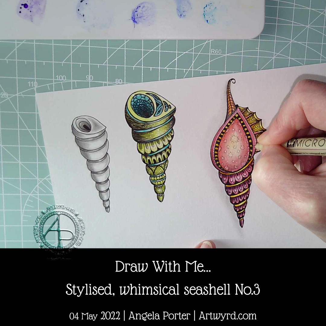
Day 3, shell 3. This time a little more complicated, or so it seems. I took some imaginative liberties with this one, and that’s fine! I’m not trying to accurately draw these shells, just get the essences that make the shell identifiable. Then, I want to add my own ideas of patterns and colours and alter things a tad.
Making those imaginative changes was an enjoyable thing to do. I hadn’t realised how much I do this in my art generally. Sometimes, it takes a while for me to have that kind of insight – this one took about 20 years!
I’m also really chuffed that my YouTube channel has hit 750 subscribers! I was amazed and humbled when I achieved one subscriber. 750 is beyond what I imagined. I’m both amazed and humbled by this. So a huge thank you to all who have subscribed.
In today’s YouTube video, I show and try to explain verbally, how to draw a different kind of shell, one step at a time.
This shell is, perhaps, a bit more challenging than yesterday’s. However, when broken down it’s not much more difficult.
Again, I add shadow to the drawings using a graphite pencil and a paper stump/tortillon or, in the case of part of the second shell, pen lines and density of pattern.
I also added some colour to the second shell, using a damp brush and lime green and turquoise Karin Brushmarker Pro pens. The graphite shading shows through the transparent watercolour inks from the pens.. I think this combination makes the image look quite metallic. Not surprising as graphite, as an element, is rather grey and shiny and metallic looking! Actually, it’s just the cool grey tones of the graphite that makes this so!
It’s really a lot easier to show than to explain in words, spoken or written. This is why I’m creating videos. It also makes that part of me that is a retired science teacher happy to use my teaching skills and feed my passion for helping others learn and grow.
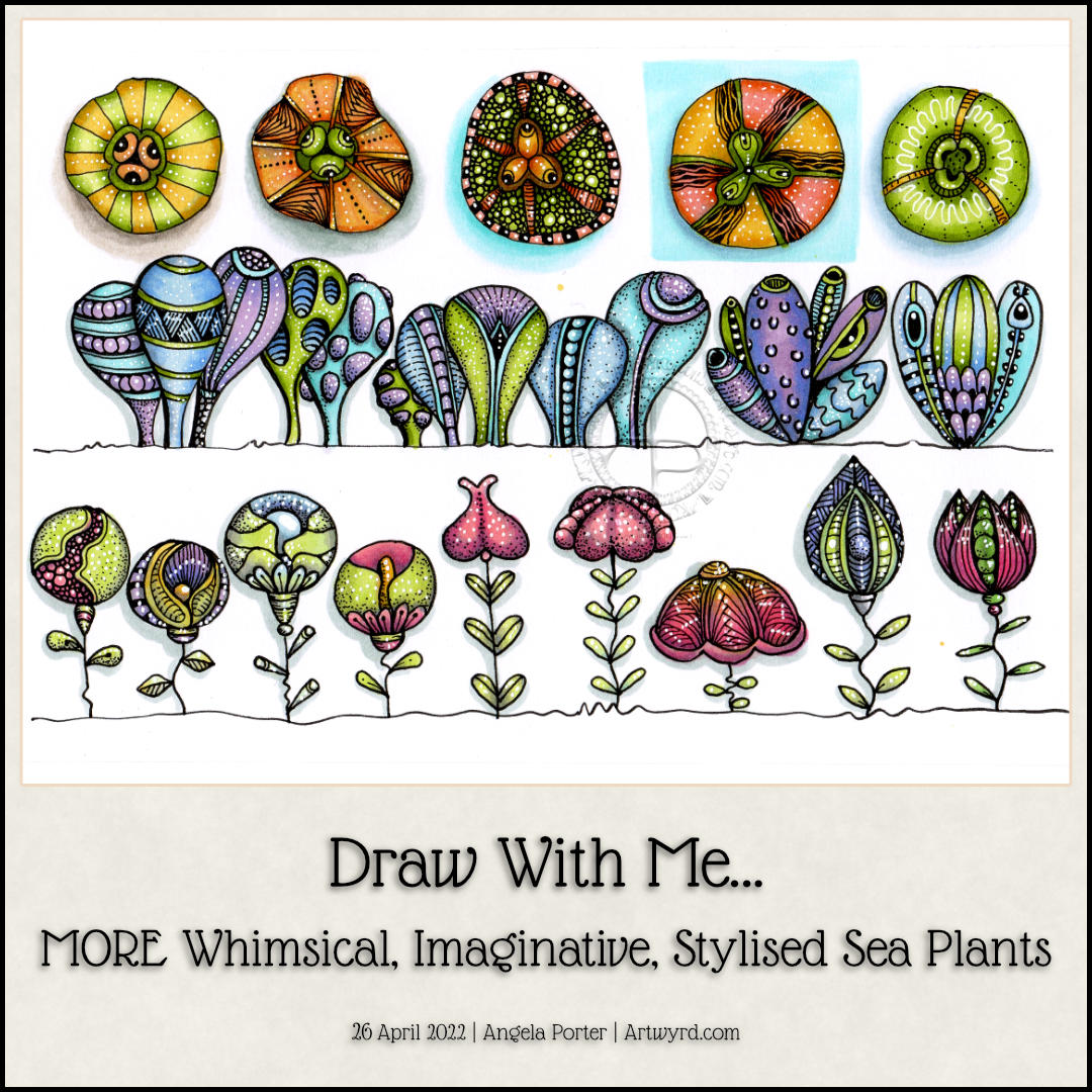
This sketchbook page is now complete! I had so much fun doing this one for sure. There’s a whole host of plants to populate any number of whimsical worlds. There’s a third video tutorial showing how to draw, step by step, the last row as simple line art as well as the start of adding colour and pattern.
Some of the motifs look a bit ‘flatter’ than I like them to, and a couple I’m not quite happy with in terms of pattern/texture. But still, it’s a page full of inspiration and possibility, something I can look back on for inspiration.
I continued the theme of sea plants today with a row of clusters of variations on a shape. Seriously, just one basic shape with small variations from cluster to cluster. The YouTube video that accompanies these drawings takes you through how to draw them, one step at a time.
Of course, I don’t stop with the main shape being varied. It was a lot of fun to add simple patterns and textures to these plants (or creatures if you will).
Alcohol markers in an analogous colour scheme of violet, blue, blue-green and yellow-green were used. The yellow greens were a late addition as I felt the first cluster needed an extra colour. The yellow-greens also link this row to the first one done yesterday.
The final steps are adding the detailed patterns and textures using both a black 0.1 fineliner and a white gel pen.
Oh, I did use a couple of cool greys to add shadow to the drawings before I added colour.
I’ve just realised I haven’t put any drop shadows behind these plants, or sea squirts, or… Maybe I’ll do that before tomorrow’s video session!