Yesterday, 1 July, and today I had a lovely time drawing and adding colour to some stylised flowers. The designs aren’t complete.
I need to add a background texture and a delicate pattern to the one on the left. I’ll do that digitally. If I try to do it now, I’ll end up messing up as I used watercolour inks to add colour. I also recorded a YouTube video of the process (view ithere).
A background pattern or texture is needed on the one to the right and textural patterns being added to the flowers. This time, I remembered to add some background colour using Distress Inks. Again, I used watercolour inks to add colour.
I am spitting feathers, though; as for the drawing on the right, I recorded a video and promptly managed to delete it … permanently. Duh! I feel such an eejit! So, I’ll remake the video soon, I’m sure.
Between some adulting today, I’ve drawn this design in my sketchbook. I’m quite pleased with it, unusually for me!
I like black and white drawings. I like texture and pattern, and I like to then add colour and/or contrast to my artwork. I’ve yet to decide what I’ll do with this, though digital colouring is likely to be my thing. Traditional drawing followed by digital colouring makes it tradigital art! Whoever coined that term is fab.
In the last few days, I have played around with using coloured inks to draw designs. I’m happy if I use one colour for the drawing, texture and pattern. If I start to use other colours, I become confused and not at all happy with the outcome. It never looks ‘right’ to me. Not for my own art, anyway. I do like how other people manage to use different colours for various parts of the lineart, pattern and texture.
Maybe this is because I’m so used to drawing with just one colour. I then use colour to bring out dimension in the finished artwork. I have drawn designs in a colour other than black, using just that colour; I’m quite happy with them.
So, onwards I go, continuing to learn more about my style as I go outside the area I’m comfortable in. I may return to the experiments with different ink colours another time, or not. Only time will tell, though.
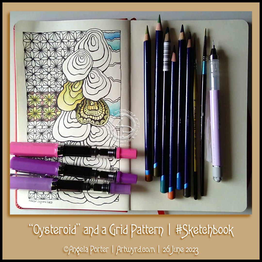
I had a peaceful and content time this afternoon as I created this page in my sketchbook. Well, the pen drawing part with some examples of how I’ll colour it. And I filmed it too, and you can watch it on YouTube.
I started with the stack of Oysteroids, a tangle pattern that I particularly like. I decided that I’d like to use a geometric pattern as a counterpoint to the roundedly organic Oysteroid.
So, I did! I like the way that this instantly gives a feeling of layers or volume.
Colour always vexes me. So, I decided to stick with an analogous colour scheme, choosing Fern and Mustard Inktense pencils to create stripes on the Oysteroids. I carried this palette into the geometric pattern. That was fine until I foolishly decided to use some Red Oxide Inktense. I have no idea what I was thinking! However, it did give a very ‘earthy’ feel to the pattern, in contrast, perhaps, to the sea-related Oysteroid.
That led me to wanting to use colours that remind me of the sea on the right-hand side. I’ll hold judgement on those until more colour is added. If the red oxide doesn’t work out, I have a rather lovely gold ink that can hide it away! Or black with gold highlights…
I used my fine and extra fine nibbed TWISBI Eco fountain pens, which are filled with black Dokumentus ink.
As you can see, I couldn’t help adding some pattern and texture to one of the Oysteroids. I’m sure the others will be treated in a similar way!
Over the past couple of weeks, I’ve been experimenting with monograms and my style of art. It’s fun trying out different things, and it leads to new insights into how I can express myself.
My self-expression is constantly changing and evolving. Sometimes I seem to make some breakthrough and go forwards with it for a while. But something happens, like a slip into poor mental and emotional health, and I retreat into my familiar styles. That doesn’t mean progress is not being made. When I look back, I can see how even my ‘comfort art’ has subtly, or not so subtly, changed as the breakthrough shares its influence subconsciously.
I keep returning to hand lettering, hoping to find out how I can make it work for me. Monograms really do seem to be the way forward.
I’m also thinking about my relationship with colour palettes. I really do struggle at times with the colours I put together, particularly when using traditional media. They seem like a good idea at the time…but…that isn’t always how I feel about them as I continue to add colour.
Contrast can be a thing I struggle with too. I really do think very simple colour palettes – monochromatic or analogous, are likely to be the way for me to go at the moment. They always seem to work nicely, monochromatic, especially as I can focus on contrast far more.
Digitally, I feel I do better, but again a limited palette is the best thing for me.
I know that, like my drawing/design skills, this will improve with time and practice. But I get so frustrated when I make the same silly mistakes over and over with colour choices.
This was a lovely way to spend an hour or so this afternoon! The design isn’t quite finished. I have more colour to add, and textural patterns too. But this gives an idea of where I am going with it.
I started with a simple ‘fragment’ – a square with a diamond in it. From there, I built up the central panel of four motifs. I decided to use the same starting point for the outer borders, just a smaller and simpler version.
Colour was added using Kuretake Gansai Tambi Art Nouveau watercolours and Winsor and Newton gold calligraphy ink.
It will take me a wee while to finish. It depends on my energy levels and ability to focus on a task. I seem to be improving little by little – hurrah!
Today was a day for quiet art, with some colour. I’ve started in a new A5 Sketchbook – A Royal Talens Art Creations one. It seems monograms are the theme for this one, at least for now!
It was a nice way to spend an hour this afternoon. It’s been very warm here in the Valleys of South Wales, UK, today. Thankfully, the sun has moved around from the front of the house and it’s feeling cooler now, just a bit.
Anyways, back to the art.
I drew the basic outlines of the design. I knew I wanted to add colour before adding the details of patterns. It also meant I could just enjoy adding colour without worrying about having to reink the lines affected by the paint; that’s always a recipe for disaster for me!
To add colour, I used soft yellows, greens and pinks from the Kuretake Gansai Tambi Art Nouveau set of watercolours.
I really, really love these watercolours. I love the way the imperfections and water-spots create a wonderful background texture. I think I’ve finally accepted that imperfections can be perfectly acceptable and wonderful! I now want to work out how I can replicate this in my digital and tradigital art. But not now. Not today.
Today, I’m flagging in energy once again. I could just go to sleep. But if I do that, I may not sleep well tonight. So, instead I will go get a drink and make something to eat. And maybe do some more art!
I drew this design partly as I settled and calmed down for sleep, then completed it when I awoke at stupid o’clock until I was ready to settle back to sleep. Now, I’ve started to add colour – Derwent Chromaflow with Gamsol to blend the colours out. Oh and gold ink for the ‘L’ and the border around it.
This design was drawn on a 21cm x 21cm (8.25″ x 8.25″) piece of Canson Imagine mixed media paper. I used TWISBI Eco fountain pens filled with black Dokumentus ink, fine and extra fine nibs.
This is part of my preparation to throw myself into designing colouring pages for DayDreams. Getting back into my signature kind of art, maybe not this detailed, but …
There’s still plenty of colour to add. Then, there’s the highlights and sparkle and any other details that may be called for. A good level contrast is needed to bring out the illusion of dimension to this!
This design does make me smile gently! I’m rather pleased with the end result. If you’d like to #drawwithme, then the accompanying YouTube video goes live today, 3 June ’23, at 18:00 UK Time.
Distress Ink background. Design drawn with black Dokumentus ink in a TWISBI Eco EF fountain pen. Extra colour/shade added with Derwent Chromaflow pencils and Gamsol. Highlights/shimmer added using a white Uniball Hybrid Gel DX pigment ink pen and gold Winsor and Newton Calligraphy Ink applied with a brush.
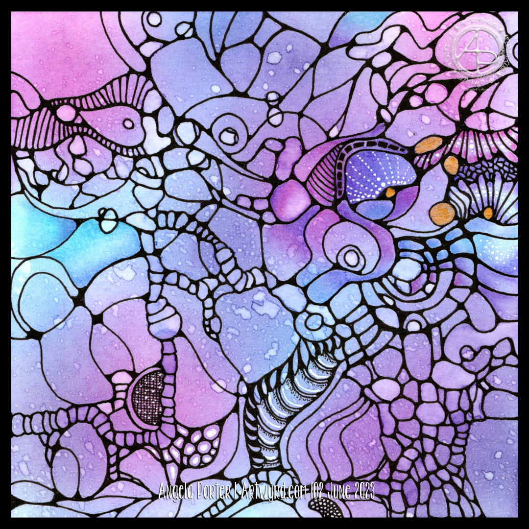
I decided to add colour to this artwork using Derwent Chromaflow pencils and Gamsol with tortillons/paperstumps.
I loved the colour as it was, but the design looked rather flat; there was little sense of ‘volume’. So, I hope to bring that out.
So little of the coloured pencil is needed when it is blended out with Gamsol, and it is translucent enough that the underlying waterdrop texture is still visible.
Although I mostly used pink, purple and blue to create the background, I thought that teal would make a good addition. That was a good decision, in my humble opinion!
White dots and lines from a Uniball Hybrid Gel DX pen add highlights that show up much better on the more intense colours. Spots and lines of gold will also add some interest, but I need to be conscious of not overdoing it!
I was really nervous about using Gamsol with linework drawn with Dokumentus ink. I had no real need to be; the Gamsol didn’t affect the ink. I let out a huge ‘Phew!’ at that!. My TWISBI Eco fountain pen with Dokumentus ink and an extra fine nib worked beautifully on areas where coloured pencil and Gamsol had been added.
I have a lot of work to do until this design is complete. I am, however, in no rush to do that. I can work on it a bit at a time. I am likely to post updates from time to time though!
If you’d like to see how I added colour with pencils and Gamsol, then a YouTube video will be available to view from 16:00 UK time on Friday 2 June 2023.
Neurographic art is an intuitive method for making art. “Neurographics is a way of drawing that recreates the outer from the inner.” – From Neurographic.art.
Intuitive art? A no brainer for me me to work with. It’s my most natural way to create art. So, I had to try it out, and I videoed it for my YouTube Channel (video available from 18:00 UK Time on 1 June 2023).
I started by creating a colourful background. I think Neurographic art usually starts with the ink lines. But Bettina used the shapes and lines created in the random colour background to draw the basic structure of the design from.
Instead of using watercolours, I used Distress Inks in various shades of pink, purple, blue and blue-greens. Splashes and a light spritz of water created interesting watermarks and I preserved the dark edges of these areas by drying them with a heat tool.
Then the real fun began. I started by drawing a kind of oval-ish shape around an area at the top left. All I did next was look for shapes and borders between colours to help me draw more lines and shapes. I made sure I ’rounded the corners’ with ink as I went, though there are, no doubt, some areas where lines connect what I’ve missed.
I wasn’t only fun, it was fascinating. I tried not to think too much, to just let the lines flow and go where they needed to in a shape that seemed ‘right’.
Once I’d got the main structure completed, which took just over an hour, I started to add texture and pattern and some white highlights. There’s a lot more to do. I may even use coloured pencils to add shade to the design. And I just have to use gold ink or paint to add some luxury and shimmer and shine to the finished design!
What do I think of it? It’s fun. It’s a personal expression. I love it’s abstract nature for sure. I think I’ll be doing more of this in the future. Indeed, I plan to work on another this afternoon (it’s 14.40 here in the UK!)
I also want to try making background with other media – watercolours, Inktense and Neocolour II come to mind! And more Distress Ink backgrounds for sure! I’m also thinking that creating these backgrounds may be a way to get me to experiment more with digital painting and textures.