I’ve been lacking artistic oompf and inspiration in the last day or so. This morning, I remembered all those tiles I’d created in the Repper app and thought using one as the basis for some art may be a good idea to get me creating. It seems to have worked.
I’ve finished, I think, the lineart, and I’ve started to add colour along with some pattern/texture. I’m not entirely sure if the glow/shadow patterns are working. Also, I don’t seem to have that intensity of contrast/highlight in the colours. Still there appears to be some volume in the individual shapes, so that’s ok.
The choice of colours, the fussy patterns and the lack of intense contrast between shadow/highlight may just be indicative of my ‘meh’ mood today.
Still, it’s almost time for me to shower and head out for my walk. It’s sunny but very breezy outside. My window is open and I’m revelling in the cool air flowing over my exposed skin. Actually, it’s rather more than breezy, there’s quite a stiff wind blowing! Invigorating and perfect for a walk!
This week, it’s a typically entangled one, with plenty of botanicals, which is quite apt as it’s Earth Day 2021 today.
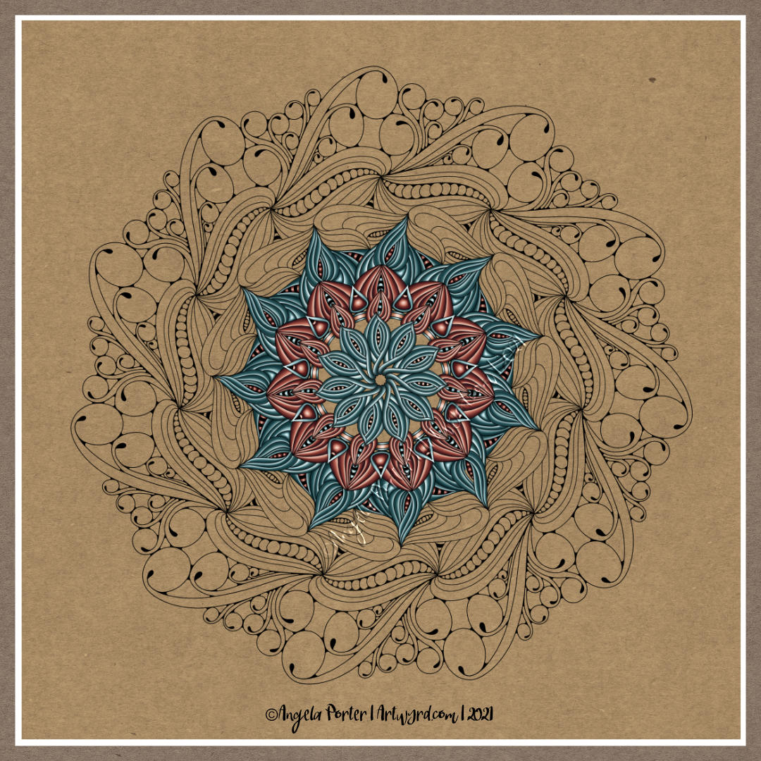
I drew the design with pen on paper, and added the colour and background digitally.
Yesterday, I was missing in action from my blog, and much of social media. It was one of those days where it just didn’t happen. I was awake early for my weekly delivery from Abel and Cole. Mid-morning I had the monthly frustration of getting my prescription from the pharmacy. I then actually went for a walk. It was a shortish one after being relatively inactive for so many months, but it was lovely to be out. To see the spring flowers – primroses, a few early bluebells, celandine, cuckoo flower, birdseye speedwell, daisies, dandelions, lords and ladies, a few colourful primula scattered here and there amongst the primroses, flowering cherries puffballs of pink blossom, wallflowers and tulips. The trees were starting to shake out their new, still-furled leaves, getting ready for their May-ball.
It was lovely to be out and moving. However, in the afternoon, I began to crash and burn. I was getting increasingly frustrated with any attempts to colour part of this template. Nothing seemed to work. So, in the end I decided I was overly tired and had a nap.
On waking, I still didn’t feel like getting frustrated with art again, so I pottered around in the evening, being gentle with myself.
I woke this morning with the solution to my problem – the plain, white background I was working on was what was contributing to the frustration. So, I popped a soft coloured craft paper background, and things just started working. However, I wanted one that resembled the sky, or sea, so I altered the background later on.
That’s where I am at the moment with this template, and that’s how it’s likely to stay. Others will complete it in beautiful and varied ways that express themselves, and I shall look forward to seeing how people tackle it, as always.
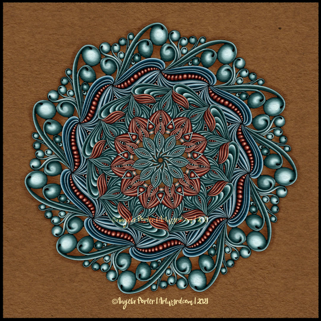
I’ve spent this morning finishing yesterday’s mandala.
I’m fairly pleased with the result. I love the sense of volume I have in the design. I almost feel like I put my fingers inside some of those ‘folds’ around the chains of seeds! And being able to create this intensity of volume or dimension in my artwork is what makes me smile. It’s not often I say I love my work, that’s for sure.
I’m not so happy about the background texture/colour. However, it’ll do for now, as I can always go back and change it.
I added a third colour – cool blues – to this design. The last ring of ‘seed pods’ would’ve been brown, and I thought there was enough brown in the design already. Also, I wanted the furled, stylised leaves in the other ring to be green, so blue was the colour I settled on.
I had a bit of a ‘ta-da!’ moment as I was adding colour to the furled leaves. I recognised that I was starting to use a pattern as a way of adding the highlights and shadows, a shape that could be used in all of these particular forms.
My final task, before calling this mandala done (for now at least) was to add shadow around the whole mandala. I don’t think I’ve been all that successful with it. Again, it’ll do for now until I work out a better way of doing this.
In hindsight, the choice of that coppery brown may not have been the best one I’ve made. However, this mandala really has been a fab learning experience for me – not just of the software I’m using, but of how I work artistically. I’m finally beginning to think a bit more about what I’m doing. I’m still working very intuitively, but I’m recognising the unconscious thoughts that steer me as I work.
I think this is developing as a result of me talking about my artistic process as I create YouTube videos. That’s an interesting and positive side-effect of making the videos – they force me to express in words what is fairly abstract and unconscious as I work. I guess I don’t have many opportunities to talk about my art and process with others, and YouTube, and this blog too, is helping me to discover more about my own inner workings.
Monday is, usually, mandala day. I have at least one mandalas-in-progress, but I started a new one today, primarily because I wanted to try out some different brushes in Clip Studio Paint Pro.
It took me a few experiments to settle on one brush to work with for this mandala – a coloured pencil brush.
It also took me quite a few goes to work out how I wanted to lay down colour for this mandala too. Eventually I settled on highlight on one edge, shadow on the other, and quite a sharp delineation betwixt the two.
I didn’t realise it at the time, but the effect I was achieving reminded me of the abstract oil paintings I did many, may years ago. The abstract patterns came from Romanesque architecture and rusty parts of steam and diesel locomotives. I remember myself playing with light and shadow. I also remember at the AS level exam exhibition I was puzzled as people kept touching the paintings. I asked someone why they had. They answered that they wanted to see if the paintings were 3D in nature. I hadn’t seen that illusion at all, but once it was pointed out to me I could see what others could. I put it down to having worked so closely on the paintings.
This was around 17 years ago now, and I still tend towards working with highlights and shadows, and the resultant illusion of volume or dimension in my work.
I’ve also finally worked out that I tend to use light and shadow as part of the patterns in my work instead of related to a light source. I think that penny dropped when I was listening to a Zentangle video on youtube.
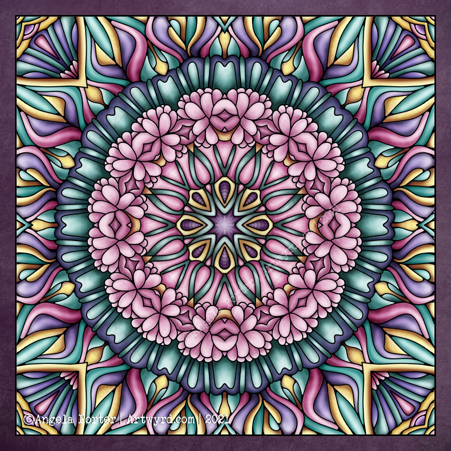
As lovely as it is to work with varied colour palettes, for this one I wanted to return to a simpler palette. I’ve chosen just two colours and various shades of those colours.
I can see how my colour blending technique has developed from the centre outwards! The difference between highlight and shadow has increased a tad.
I have so many works in progress at the moment, and I tend towards creating new all the time. I think I really do need to learn perseverance and get works finished more often!
I woke this morning and something had filtered through my unconscious mind about why I couldn’t get the record screen app in Movavi to work. I had to set my computer into tablet mode. And all worked well, including recording my voice as I worked.
I was a bit flustered and more than usually waffly, but if you’d like to see how I add colour digitally, then you can see the screen, and hopefully the ‘mouse’ pointer.
I can now calm down that I know I can do this!
If you watch the video and enjoy it, like and subscribe. If there’s any helpful advice you can give, or suggestions for future projects, then please leave a comment with them.
I’ve spent much of the day so far adding colour to my ‘Serendipity’ drawing that I completed yesterday. The whole process of drawing has been videoed and is available on my YouTube channel.
I thought it would be an idea to try to record a timelapse of my process in Clip Studio Paint Pro, which has a tool that does it for you. This just didn’t work, it caused everything to freeze up.
So, I thought I’d try the record screen tool in the Movavi Video Suite. It didn’t let me use my digital pen on the screen. So, I’m going to have to spelunk through the settings to see if I can resolve that issue, and the one with Clip Studio Paint Pro. A couple of things to sort out along with how to add a voice-over to a video!
So, after getting another mug of tea, I settled to starting colouring the image digitally. I wanted to use the rich colour palette I’d used for this week’s ‘Template Thursday’ design.
I’ve only got part of the design done. It’s taking me a little longer to add colour in CSPP (Clip Studio Paint Pro) than in Sketchbook as I’m not familiar with the tool layout yet.
Again, I’m taking this as an opportunity to learn more about CSPP, in very tiny, tiny steps. I seem to have found a watercolour brush I like that adds an interesting texture to the colour. Usually, my work is characterised by rather smooth colour gradients. To have such a textured finish is unusual for me, but I quite like it.
I have a lot more of this particular drawing to do, and as I’m working digitally I can always try a different colour palette or way of working.
I think I’m going to take some time away from the computer now, and return to ‘analog’ forms of art. If you’ve watched my video, I gave a short look at one of my collections of patterns and motifs. That notebook is almost full, so I had a new Leuchtturm1917 A5 notebook delivered yesterday. It turns out I’d managed to order a square grid rather than a dot grid. No problem. If anything it may work out better.
I’m not going to transfer the entirety of the nearly full notebook to this new one, just the motifs/patterns I use the most, and start to add others. They really are books full of inspiration, mostly images but sometimes words/notes too.
I love drawing mandalas, if you hadn’t noticed. And creating a mandala is a perfect way to continue exploring and getting familiar with the tools and interface of Clip Studio Paint Pro.
The more I use Clip Studio Paint Pro, the happier I am with it, though I do seem to have had a hissy fit with the quality of this particular image. I need more tea I think.
Even though this particular peek at my work in progress, you can get the sense of the rich colour palette I’m using – magenta/red, purple, orange and golden tones.
My first mandala created in Clip Studio Paint Pro! It was a different yet similar experience to that I’d get in Autodesk Sketchbook Pro. In fact everything is similar, but different. It’s going to take me a while to work out how it all works.
I enjoyed the process, and the challenges it presented me weren’t huge. They were more opportunities to learn than to be frustrated.
One thing I really do need to look into are the settings on the symmetry tools. They didn’t work the way I expected them to, hence the rather unusual way the patterns are repeated around the centre. The fact that they work this way means that there’s a wider range of possibilities for such designs going forward. That is exciting!
I’ve mentioned in previous blogs how I’ve been dissatisfied at times with my artistic expression. It felt stale, samey, and just not working. Every now and again I have a need to explore new things, to shake it up a little. This is turning out to be one of those perfect confluences of frustration, opportunity and freshness.
It has to be said, though, that there are times when I return to what is more familiar, comfortable too. But when I do return to them, I do so with the lessons and outlooks gained from these fresh experiences. And so, my artwork develops, which is a good thing indeed.
Nature – an entangled artwork. It looks like batik, silk painting or stained glass!
The design was drawn in pen on bristol board and then coloured digitally in Clip Studio Paint Pro using a textured watercolour brush.
I’m determined to find my way around this piece of software, along with Affinity Designer at some point. The effects are the same as Sketchbook, but just not quite so easy to find the tools I want to use at first. It’s all a case of familiarity and I’m definitely outside of being familiar with the software at the moment.
Having said that, all that I’ve learned about layers, the various effects that can be applied, brush settings and so on, apply to all digital art platforms. It’s just finding my way around the software and learning more about it.
The one thing that’s top of my list at the moment is setting up a custom colour palette.
I’ve discovered that Clip Studio Paint has symmetry tools – phew! And these tools do a thing or two not available in Sketchbook as well as working slightly differently (and making certain things a lot easier for sure.
It’s been a frustrating few hours. I scanned these two drawings in, went to edit and colour in Autodesk Sketchbook Pro, only to find that Autodesk has cancelled the pro, subscribed version and the only one available is the free version.
The free version doesn’t allow me to alter contrast, or work at different dpi, and it is a tad unstable it seems.
Also, there was no warning of this and I had no chance to save all my own custom brushes.
To say I’m gutted is an understatement. Sketchbook Pro has been my pathway into digital art and I absolutely love its intuitive interface.
So, I’m now looking into other software I have on my ‘puter. I learned to edit and colour and add texture layers, background and text using Clip Studio Paint.
It works well, but the interface isn’t so intuitive, it’s so much like the Adobe products, with menu after menu after menu. I can see that it’s more powerful.
Trying to look on the bright side, maybe I’d become way too comfortable with Sketchbook Pro and it’s now time for me to learn new digital skills and extend the ones I already have. So this may be a blessing in disguise.
All I know is that it’s going to be darn frustrating for a while until I get to grips with this new software.
I’m tempted to have a look at Corel Paint, but I suspect it’s user interface is as confusing and not intuitive either.
I still have access to the free version of Autodesk Sketchbook. But it is missing some of the features I loved so much about the subscription version.
Anyways, I discovered the watercolour brushes in Clip Studio and used them to add colour to the top design, and I like these ones very much. I’ll see how I get along with it, but first I need breakfast. Yes, It’s nearly 2:30pm and I’ve not had breakfast yet! So I’m going to eat and then it’ll be onwards and upwards digitally, I trust.
Now I’ve had my moan, here’s some info about the drawings:
14.5cm x 14.5cm Bristol board Faber-Castell fineliner pen Colours and textures added digitally using Clip Studio Paint