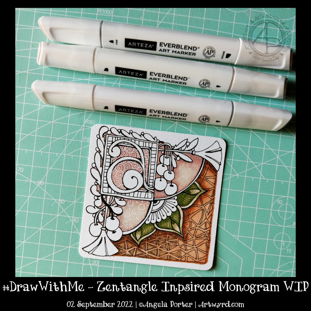
I’ve mostly finished this 3.5″ (11cm) square ’tile’ with a monogram. It’s changed a little since my last blog post this morning.
Apart from completing the colour, I coloured over the brown section in the bottom right. I used dark and light grey Gellyroll Moonlight pens to add the crazy ‘N’Zppel’ Zentangle pattern. It needs tidying up and perhaps some highlight within the inner black spaces.
But for now, it will do. I think I need a break from it to eat and do other things for a while.
This morning, I thought I’d share how I’m exploring creating some Entangled art, particularly monograms, via YouTube.
This little drawing is 11cm by 11cm, which is approximately 3.5″ square – took about an hour or so to get to this point. I wasn’t sure of the green, but I think it’ll work out just fine. There’s quite a way to go yet, but that will have to wait for another time.
The materials I used are: * 03 black Sakura Pigma Micron * Various Arteza Everblend marker pens * Various fineliners in grey and green * A white Sakura Gellyroll pen * A metallic gold Uniball Signo pen
This week’s colouring page for the members of Angela Porter’s Coloring Book Fans Facebook group is intricate. Still, it uses only three motifs – spirally furled leaves, starry flowers and stripey, plumptious seed pods.
I drew the design using a fine nib TWISBI eco fountain pen, filled with Documentus ink, on an A4 sheet of Artway’s Eco paper. To add colour, I used various Arteza Everblend markers. The pattern, textures, and highlights have been added with various Arteza Inkonic, Uniball Signo and Sakura Gellyroll pens.
This is the partly coloured colouring page for the Angela Porter’s Coloring Book Fans Facebook group members. It’s a flowy, abstract, entangled, and zentangle-inspired design. Colour, shadow and highlight bring the design to life and add a lot of volume (dimension if you prefer) too.
I chose a more-or-less monochrome colour scheme, with just a splash of violet here and there. I think if I’d carried on adding colour, I would’ve used a more analogous colour scheme.
I’m pleased that I’m recovering from my people-filled weekend, though still not quite focused and feeling a bit ‘lost’ in myself. And I’m still rather tired. But, these things will not last, and I’ll soon be ticketty boo again.
This morning, I filmed a tutorial based on a request from one of my YouTube subscribers. He asked if I could show him how to draw some ‘flowy’ patterns he’d seen, particularly one by ladyzadzakiya on Instagram.
Well, how could I refuse such a polite request? I’ve just shown how I draw my own kind of such patterns, as I can only really draw in my own way, as can any of us. I’ve included a few Zentangle patterns in the design. And I even got around to adding some shade! Adding shadows and highlights is what really brings the drawing to life. Part of me wished I’d used blues and/or sea greens for this. But no matter, I can always draw another one sometime.
Today, I am exhausted. I’ve had an incredibly busy three days, and as enjoyable as they all were, I managed to get over-stressed, over-anxious, over-wrought and exhausted. Oh, and an upset digestive system also always happens when I’m stressed.
All I need is a couple of stress-free and calm days to recover. Maybe more than a couple of days.
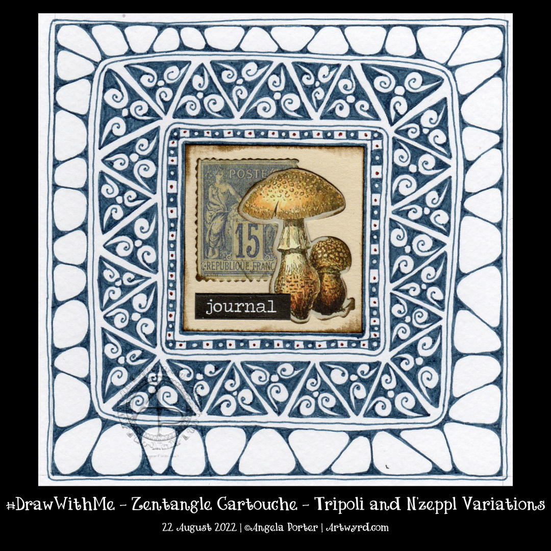
Earlier today, I wanted to draw, and I wanted to draw something that wouldn’t be too challenging – the focus being on calm and meditative. A Zentangle Cartouche seemed to fit the bill.
The central motif was a sticking point. Try as I might, it took me several attempts to get an assemblage of Tim Holtz Ephemera that was to my liking.
I knew I wanted to use a triangular fragment as part of the ‘cartouche’ to frame the focal point. I knew that black would most likely be too harsh. So, I went with a softer blue-grey. And that seemed to work out just fine. Apart from the fact I used a Zebra Sarasa 0.5 gel pen and the areas of dense ink are rather uneven. What is daft about this decision is that I have plenty of fine-liners that would do the job better!
Brain full of fluff and addlement today – told you so!
Anyhoo, I persevered and have got it to a point where I like the contrast between the ink-dense tripoli border and the more open N’zeppl. The next job is to decide how to add some contrast, colour, highlight or any combination of these! Oh, and what medium to use too, but that decision can wait until I’m less overwrought, brain-addled, and my head is less full of fluff to decide.
I have also managed to bake a cherry and coconut cake, which is remarkable, given I’m not too good at baking when I’m emotionally overwrought. It’s cooling down, so will try it later on for sure.
I thought I’d go with some more abstract, pattern-based templates. The last one I drew, at the top right, just ended up having some seed pods.
Abstract designs like these are great fun to add colour to as there are no pre-conceptions about what the colours should be. Also, they’re great for trying out new techniques, media and colour combinations. And, of course, they’re relatively quick to finish, which is great if you’re short on time.
Please click on the “Watch on YouTube” button. Cheers!
I had a lovely time this morning adding colour to yesterday’s drawing.
To be precise, I chose to use Arteza’s EverBlend markers. I’m not at all sure about that green at the moment, but it may look quite different when I’ve finished colouring the drawing in.
In the video, I focus on explaining my method of adding colour and showing how I’ll add colour and contrast to each section of the design.
Drawing Zentangle Tangle Patterns Spoolies and Swerve and adding contrast/colour.
What to do on a Sunday morning? Arty things of course!
So, yesterday I drew the design to the right and added some colour to it. But it was lacking something. I eventually worked out, at around the same time someone made a suggestion on my YouTube video, that it needed more contrast.
So, I set about doing just that, as well as showing/explaining how I add weight to lines to help increase the contrast and sense of volume. That’s what the greyscale drawing is all about.
For the other one, I used sepia and red oxide Inktense pencils and a damp brush to add more colour and increase contrast. I made some bad decisions in adding cross-hatching to some of the elements of that design. But that meant it was a great piece to work on improving my skills.
I’m often way too timid with contrast, at the start. But as long as I use a medium that allows me to gradually build up layers, I eventually get there.
Today’s video shows how I achieved this higher contrast finish with both line weight and colour/shadow, and you can watch it by clicking on this link.
Last night when I arrived home after an absolutely visit with a dear friend, I found the postman had delivered a set of mini Distress Ink pads in the new colours released last year! It was way too late to do anything with the inks, so I decided I’d have a look at them in today’s video for YouTube.
I started by trying blends of the colours. My instincts were not to mix the salmony pink Saltwater Taffy with the other colours – Villanous Violet, Blue Ribbon and Salvaged Patina. Orangey tones with purple, blue and/or pale green-turquoise colour, would make mud, my instincts told me.
However, when I used them all for one background, I was really surprised by the colours that resulted. They were lovely! No mud! Just lovely, aged, vintage-ish colours. What a wonderful surprise!
After spraying water to create water stains, stencilling and another spray of water drops (drying in between each procedure), I edged each paper with Hickory Smoke. Then, it was time to draw!
I used an 0.1 and 0.3 Molotow fineliner pens for drawing. They’re new to me and so was keen to try them out. The ink is lovely! But, I found the pens rather light and awkward to hold. The natural place to rest my fingers was way too high up the pen to be comfortable.
I’ll use the pens until the nibs are wrecked or they run out of ink, whichever comes first. The ink is very black and very opaque. The nibs do write really smoothly on the paper I used. But, they’re just not comfortable for me to hold, and that comes down to personal preference! Otherwise, they really do seem to be great pens!
I started drawing with the tangle pattern ‘spoolies’ to the left. This is where I noticed how the grip I had on the pen was uncomfortable and making it really difficult for me to draw smooth, precise lines. I ended up doing a mash-up of spoolies and diva dance!
The pointy leaves (or shark fins or points of crescent moons, depending on how you want to see them) actually echo the pointed part of spoolies. These then were replaced by the tangle pattern swirl, which is very similar to spoolies. Finally, the pointy leaves/fins/horns of the moon returned.
As I wanted to lift these off the background, I used a crosshatch pattern to darken the spaces between them.
Then, in my not-so-clever wisdom, I decided to help the illusion of volume and layers along by adding colour using Distress Inks as watercolour inks or paints.
I’m not at all sure about the end result, which wasn’t helped as I decided to splatter gold paint over it.
I often ask myself what on earth was I thinking and will I ever learn. This is another of those occasions. I kept compounding the problem as I tried seemingly good ideas.
As I said, I wonder if I’ll ever learn …
No matter what, it was lovely to be sat drawing just for enjoyment. Even though I’m not happy with the end result, I learned a lot about these new-to-me Distress Ink colours. Also, I’ve learned that a spray of water really can make the background lovely. And it’s OK to repeat sprays as more colour or stencilling or edging colours are added.
But perhaps the most important thing is that sometimes the process, the enjoyment of creating and learning is more important than an end piece that I’m happy with. Perhaps, in the coming hours, days, weeks or months, I’ll be able to look at this with fresh eyes and see it as not as bad as I know think it is!