Monday Mandala

Monday is, usually, mandala day. I have at least one mandalas-in-progress, but I started a new one today, primarily because I wanted to try out some different brushes in Clip Studio Paint Pro.

It took me a few experiments to settle on one brush to work with for this mandala – a coloured pencil brush.

It also took me quite a few goes to work out how I wanted to lay down colour for this mandala too. Eventually I settled on highlight on one edge, shadow on the other, and quite a sharp delineation betwixt the two.

I didn’t realise it at the time, but the effect I was achieving reminded me of the abstract oil paintings I did many, may years ago. The abstract patterns came from Romanesque architecture and rusty parts of steam and diesel locomotives. I remember myself playing with light and shadow. I also remember at the AS level exam exhibition I was puzzled as people kept touching the paintings. I asked someone why they had. They answered that they wanted to see if the paintings were 3D in nature. I hadn’t seen that illusion at all, but once it was pointed out to me I could see what others could. I put it down to having worked so closely on the paintings.

This was around 17 years ago now, and I still tend towards working with highlights and shadows, and the resultant illusion of volume or dimension in my work.

I’ve also finally worked out that I tend to use light and shadow as part of the patterns in my work instead of related to a light source. I think that penny dropped when I was listening to a Zentangle video on youtube.

As lovely as it is to work with varied colour palettes, for this one I wanted to return to a simpler palette. I’ve chosen just two colours and various shades of those colours.

I can see how my colour blending technique has developed from the centre outwards! The difference between highlight and shadow has increased a tad.

I have so many works in progress at the moment, and I tend towards creating new all the time. I think I really do need to learn perseverance and get works finished more often!

Tuesday Work In Progress

I love drawing mandalas, if you hadn’t noticed. And creating a mandala is a perfect way to continue exploring and getting familiar with the tools and interface of Clip Studio Paint Pro.

The more I use Clip Studio Paint Pro, the happier I am with it, though I do seem to have had a hissy fit with the quality of this particular image. I need more tea I think.

Even though this particular peek at my work in progress, you can get the sense of the rich colour palette I’m using – magenta/red, purple, orange and golden tones.

Monday Mandala

My first mandala created in Clip Studio Paint Pro! It was a different yet similar experience to that I’d get in Autodesk Sketchbook Pro. In fact everything is similar, but different. It’s going to take me a while to work out how it all works.

I enjoyed the process, and the challenges it presented me weren’t huge. They were more opportunities to learn than to be frustrated.

One thing I really do need to look into are the settings on the symmetry tools. They didn’t work the way I expected them to, hence the rather unusual way the patterns are repeated around the centre. The fact that they work this way means that there’s a wider range of possibilities for such designs going forward. That is exciting!

I’ve mentioned in previous blogs how I’ve been dissatisfied at times with my artistic expression. It felt stale, samey, and just not working. Every now and again I have a need to explore new things, to shake it up a little. This is turning out to be one of those perfect confluences of frustration, opportunity and freshness.

It has to be said, though, that there are times when I return to what is more familiar, comfortable too. But when I do return to them, I do so with the lessons and outlooks gained from these fresh experiences. And so, my artwork develops, which is a good thing indeed.

Mandala Tile

As I was coming around from yesterday’s headache, I plopped yesterday’s drawing into Repper to see what geometric patterns and tiles I could create.

Repper is a browser app that is great fun to play around with and makes the creation of tiling patterns from my artwork so simple.

Rather than save the patterns, I saved the tiles as so many of them looked like perfect inspiration for mandalas.

So, I chose one design, popped it into Autodesk Sketchbook Pro, and used it to inspire this particular pattern.

I chose a colour palette of soft pinks and greens, colours that are related to self-love, self-care, balance and harmony. Perfect for how I was feeling yesterday!

Today, I’m still feeling somewhat tired and fragile. That’s mainly due to a really poor night’s sleep. Emotionally, however, I feel a lot better than I have the past few days. There was an emotional storm brewing and it the headache was the torrential downpour that was needed to clear the skies by forcing me to take care and shelter myself.

So, the rest of today is going to be a quiet. nurturing kind of time to shake off the lingering wisps of stormy clouds.

Monday Mandala

Monday is mandala day! I never tire of creating mandalas, Angela style. It’s always a really lovely way to spend Monday morning and some of the afternoon.

This weeks is a combination of some organic patterns with quite geometric designs. There’s some Zentangle patterns in the design for sure.I’ve used a vintage colour palette once again.

I haven’t used any black outlines for this mandala. I’m not sure which way I prefer – black line drawing or not. Drop me a comment to let me know which you prefer.

Monday Mandala

Mandalas are so much fun to do. In this one are lots of zentangle patterns – can you spot them?

Soft blues and greens play against the coppery tones used in the structure of the mandala. Soft, yet not washed out with plenty of contrast betwixt the highlights and shadows. I’m actually really happy with the color palette I’ve used here, as well as some subtle texture patterns that may not be visible on this smaller, lower resolution image.

What I do like is the light, almost lacy feel to the outermost ring.

A lovely way to spend a few hours on a Monday morning. Indeed, I got so engrossed in this that I’ve not had breakfast yet and it’s gone midday!

Tuesday Mandala

My artistic mood today was for another mandala. Again, I’ve used vintage colours to complete this one. I realised, once I’d collapsed all the layers and saved it, that the outer pattern ring is ‘off’ from vertical/horizontal. Blooming typical! Oh well.

Mind you, in my defence, I was also ‘adulting’ at the same time, so wasn’t quite paying the attention I usually would.

All the same I’m quite pleased with this one, though that central space may need something. I don’t know at the moment. I need tea and some lunch!

Monday Mandala

Yet again, a lovely way to start a Monday. Mandalas are always a pleasure to draw/paint/create. I particularly love creating them digitally for many reasons, not least is the opportunity to experiment and learn new skills. It removes the worry of making a ‘mistake’ on paper and either having to start again or try to make that ‘mistake’ a part of the work. Often, that ‘mistake’ will be worked into the drawing, but not always and if I know it’s there, it bothers me, even if no one else can see it. The perfectionist in me gets a tad upset at it.

Having said that, there are a couple of things I’m not happy with in this mandala, but I can live with them.

One thing I do like is the colour palette of copper/bronze colours and that steely blue-grey. Vintage colours seem to be my thing at the moment for sure.

Mandala Monday

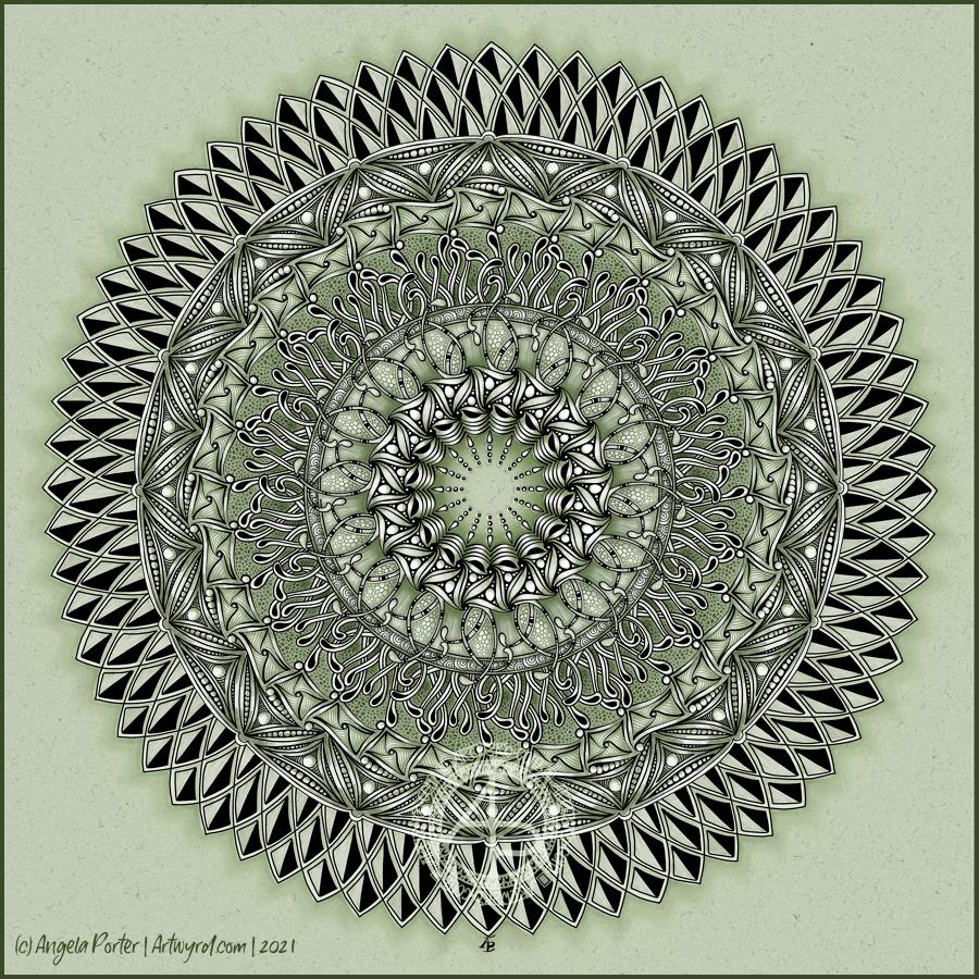
It’s Monday, so it’s time for a mandala. This one includes lots of Zentangle tangle patterns, many quite organic in nature.

I, again, chose a monochrome colour scheme, and enjoyed playing with light and shadow to add dimension to this artwork. Perhaps not quite as contrasting as I’d like, but still interesting.

Digital art – Autodesk Sketchbook Pro, Surface Slim Pen and Surface Studio.

Copper and teal mandala

Finished! The addition of coppery tones was a bit of a surprise, even to me. But it seemed the right thing to do. I do like the combination of copper and the verdigris tones of teals, greens and blues.

I spent some time darkening the shadows in the inner rings of the mandala, as well as adding some depth of colour. They looked so washed out against today’s additions.

Also, I changed the colour of the background. Everything was so lost against the teal background.

Digital art – Autodesk Sketchbook Pro – Microsoft Surface Studio and Surface Slim Pen.