Exploring Zentangle Pattern ‘Bucky’ and some organic motifs

Click on this link to watch the accompanying #DrawWithMe video on YouTube.

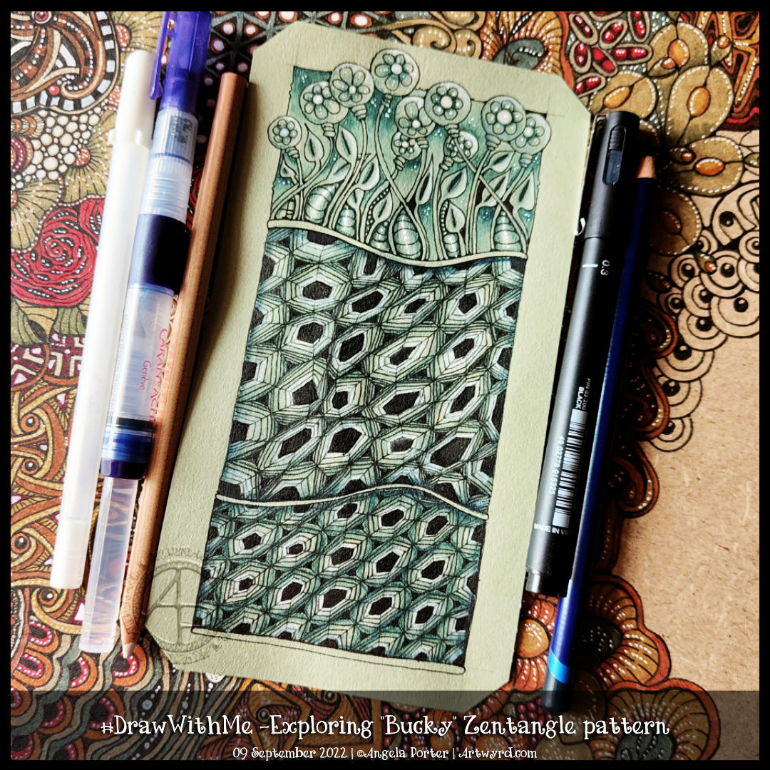
This morning I had no idea what I wanted to draw, so I visited the random tangle generator on tanglelist.com, which suggested Bucky.

Bucky is an official Zentangle pattern that I’ve never drawn before. I had to look up the deconstruction, which you can find on Zentangle.com. So, in typical Angela style, I threw myself in at the deep end by using a ‘crazy’ asymmetric grid (the middle section in the artwork). It worked out fine in the end, but not with a few mis-strokes!

I thought I’d add some organic patterns/motifs to balance out the rather geometric Bucky pattern.

To add shade, I used an Iron Green Inktense pencil with a water brush to produce some colour gradients. I really wasn’t at all tidy and controlled about this. And you’d never really have known that if I’d not said it! I tried embracing the fluidity and random nature of a watery medium and it worked out just fine.

I used a white charcoal pencil and a paper stump/tortillon for the highlights. That meant I had to re-ink the black hexagons, but that was fine.

Finally, I drew Bucky in a more regular grid at the bottom. I didn’t film this part, but it worked out just fine, I think.

Indeed, I’m fairly happy with the overall result. I like the monochrome colour scheme; it gives coherence. The one thing I haven’t done is add shadow and highlight to the narrow bands between the sections.

Exploring a square Zentangle fragment

Click on this link to view the accompanying video on YouTube.

Time seems to fly when I get engrossed in a task. Today, that was exploring a simple Zentangle fragment – a circle in a square.

In Zentangle terms, a fragment is the basic unit of a repeating pattern, whether repeated as is or rotated/reflected.

It is always a lot of fun to see what kinds of fragments I can develop using the chosen one to spark some creativity.

It’s always lovely, too, to work on toned paper, in this case, it’s from Fabriano and is in the colour ‘Clay’. Whenever I use toned paper, I realise I’m drawing in shadow and light; the paper is the mid-tone. This is why I love to colour plain paper with Distress Inks or NeoColor II water-soluble wax crayons. The colour immediately becomes the backdrop for dark and light and a strong contrast ‘twixt the two extremes.

In art, chiaroscuro is the term used for the use of high contrast between light and dark in a composition. In drawing, this is affected by using a coloured background, and black and white ink or media are used to create the drawing.

As I was typing this, I realized I’ve long loved working in this way. Since my early days of exploring my artistic nature that started some 20 years ago, I discovered I loved to use coloured paper with white and a black or much darker tone of the paper to draw with. It was far more fascinating to me to draw in light and shade rather than tones of grey graphite on white paper. It was my chosen way to work when I did some life drawing. When I go out and about sketching, I will colour the pages in my sketchbook with Distress Inks and use black and white pens/pencils to draw on them. The shapes of shadows and highlights fascinate me; everything becomes very architectural.

I’ve often mentioned the only oil paintings I’ve ever done and how three-dimensional they appear. When people see them for the first time, they’ll touch them because they think they are dimensional and are always surprised to find out they are totally flat. The high contrast I favour in my work creates the illusion of volume.

This little journey down the pathways of memory has allowed me to make some connections. I’m smiling as some pieces of the jigsaw puzzle that is me fall into place, clicking together satisfyingly.

There are times when I have to work with black pen on white paper, but there are many times when I can choose what colour paper to use. And going forward, I think much of my entangled drawing that isn’t for colouring books will be done on toned paper.

Another Flowy Zentangle Inspired Pattern

In today’s video, I started drawing this design inspired by one by Doodlillusion on Instagram. I’d been asked to look at this one by a YouTube subscriber, so today I have.

I definitely used Doodlillusion’s art as inspiration, drawing it in my own way. I trust that I can show and explain how I approached this kind of pattern, along with some hints and tips and various ways of working with it.

I’m quite pleased with the end result. I like the graphic black and white. Something I need to consider more in my monogram and other explorations, maybe!

Monogram “b”, Zentangle Inspired

To view the accompanying video which shows most of the drawing and adding background patterns and colour, click on this link!

I’m continuing with my exploration of monograms and patterns. This one is a bit odd with the ba sitting above a pool or pebble..or something. But I quite like the patterns I’ve used to embellish it. I’m also rather fond of the background patterns, especially the very faint ones to the bottom right.

I’m not too fussed about the greens, yellows and the colours I used for the flowers. Pretty much every colour apart from the background colours and the colours of the patterns around the b!

Must write a HUGE reminder and stick it where I can see it “WORK IN MONOCHROME!”

All the same, it’s a learning exercise for me, as drawing always is. The ones that turn out not quite to my liking at the ones I learn most from. Having said that, I still haven’t learned that ‘work in monochrome’ thing yet! One day, maybe, I will.

Monogram ‘a’ – Zentangle Inspired Art

I’ve mostly finished this 3.5″ (11cm) square ’tile’ with a monogram. It’s changed a little since my last blog post this morning.

Apart from completing the colour, I coloured over the brown section in the bottom right. I used dark and light grey Gellyroll Moonlight pens to add the crazy ‘N’Zppel’ Zentangle pattern. It needs tidying up and perhaps some highlight within the inner black spaces.

But for now, it will do. I think I need a break from it to eat and do other things for a while.

Zentangle Inspired Monogram WIP

Click on this link to watch the Draw With Me tutorial video on YouTube

This morning, I thought I’d share how I’m exploring creating some Entangled art, particularly monograms, via YouTube.

This little drawing is 11cm by 11cm, which is approximately 3.5″ square – took about an hour or so to get to this point. I wasn’t sure of the green, but I think it’ll work out just fine. There’s quite a way to go yet, but that will have to wait for another time.

The materials I used are:
* 03 black Sakura Pigma Micron
* Various Arteza Everblend marker pens
* Various fineliners in grey and green
* A white Sakura Gellyroll pen
* A metallic gold Uniball Signo pen

Colouring Page – 01 September 2022

This week’s colouring page for the members of Angela Porter’s Coloring Book Fans Facebook group is intricate. Still, it uses only three motifs – spirally furled leaves, starry flowers and stripey, plumptious seed pods.

I drew the design using a fine nib TWISBI eco fountain pen, filled with Documentus ink, on an A4 sheet of Artway’s Eco paper. To add colour, I used various Arteza Everblend markers. The pattern, textures, and highlights have been added with various Arteza Inkonic, Uniball Signo and Sakura Gellyroll pens.

#DrawWithMe – Exploring some square Zentangle pattern fragments

Click on this link to view the accompanying video tutorial on YouTube

Earlier today, I just wanted to explore a simple Zentangle Pattern fragment, or two. I started with two square fragments, each with a circle in the centre. One had a diagonal cross, the other vertical/horizontal. And I went from there to create some more ornate versions of them.

I never know where this kind of exercise is going to go, but it is always interesting and some pleasant kinds of fragments result.

These are just a few fragments I came up with during the course of the video; I’ve barely scratched the surface of all the possible variations.

This exercise is good for flexing your creative ‘muscles’, warming up hand-eye coordination and fine motor skills, and playing around with colour, shade and highlight. Also, it’s perfect for relaxing, taking a break from all that is happening in this world. Even if for just a short while.

#DrawWithMe – The start of a flowy, Zentangle patterned colouring page

Click on this link to watch the accompanying video tutorial on YouTube

I enjoyed losing myself in the intricate, flowing, Zentangle-inspired drawing done yesterday; I thought I’d use the idea as the basis of a colouring page.

Not quite so intricate, and everything drawn on a larger scale to make it suitable for colouring, it was still very much a lovely thing to do.

The page is now finished and ready for its release to the Angela Porter’s Coloring Book Fans Facebook group tomorrow.

Template Thursyay!

Click on this link to view today’s YouTube video tutorial where I draw the bottom two panels.

I held a poll in the Angela Porter’s Coloring Book Fans Facebook group, and a template of four small drawings was at the top. So here’s the finished and partly coloured template.

I thought I’d go with some more abstract, pattern-based templates. The last one I drew, at the top right, just ended up having some seed pods.

Abstract designs like these are great fun to add colour to as there are no pre-conceptions about what the colours should be. Also, they’re great for trying out new techniques, media and colour combinations. And, of course, they’re relatively quick to finish, which is great if you’re short on time.