Phew! It’s another scorcher already! I feel so drained, and it’s not even 11am. Mind you, I have been awake since around 5am, again.
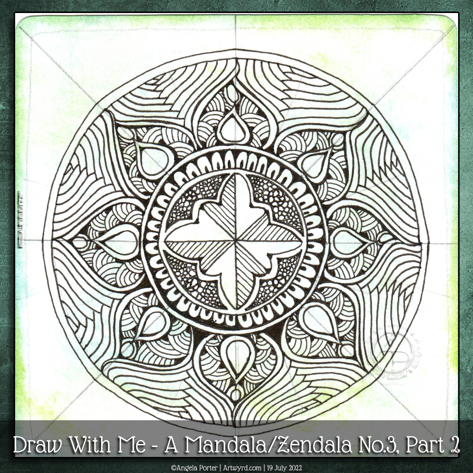
Waking early has it’s benefits in this seriously hot weather; it’s cool enough to get some things done early on. Such as today’s video where I draw some more of this mandala.
I’m quite happy with how this mandala is taking shape. I know that shadow/highlights, and/or colour will really bring some dimension to this design. But first, I need to finish drawing it. And work out how to set my scanner up so the background colours don’t get washed out…
Today is not the day for that. It’s way too warm, and I need to retire very soon to a cooler part of the house.
Just enough time before the heat has become uncomfortable to layout a mandala grid and complete the central motif. This was a lovely way to spend a wee bit of time this morning.
The video takes you through, one step at a time, how I got this far.
Now, it’s just about time for me to move myself to a cooler part of my home for the rest of this heat-scorched day.
In today’s YouTube video, I show how, step by step, I draw a mandala, or zendala, with traditional media. And the help of the Markus Operandus for Mandalas from Zentangle.com! A nifty printable that helps set out a mandala!
I’ve used two tangle patterns in this design – tripoli and between. I’ve taken inspiration from each to complete the outer ring.
To start with, I pre-cut a piece of ClaireFontaine Paint On mixed-media paper using an 11cm circle die, and a Sizzix Big Shot die cutting machine. In fact, I cut four at 11cm and four at 9cm in size, so I have a few that are good to go.
Next, I coloured one large and one small circle with Distress Inks. Then, I set about using the Markus Operandus to lay out the basic bones of the mandala.
Only then could I start to draw the design, though I had no idea what I was going to do.
The photo above is the final mandala. I used Arteza Everblend markers to add shadows to the zendala. A white gel pen was used to add dots of white for highlights. A silver Gelly Roll pen was used to add silver to the fine ring borders, to the circles and to the darker areas in the tripoli pattern pieces.
I’m quite happy with the outcome. More so, as it’s been a very long time since I drew a mandala without using digital tools.
Today’s video is rather long – well over an hour. It’s kind of a celebration that I’ve reached 900 subscribers on my YouTube channel! I never thought I’d get even one subscriber. So, a huge thank you to you if you’re one of my subscribers.
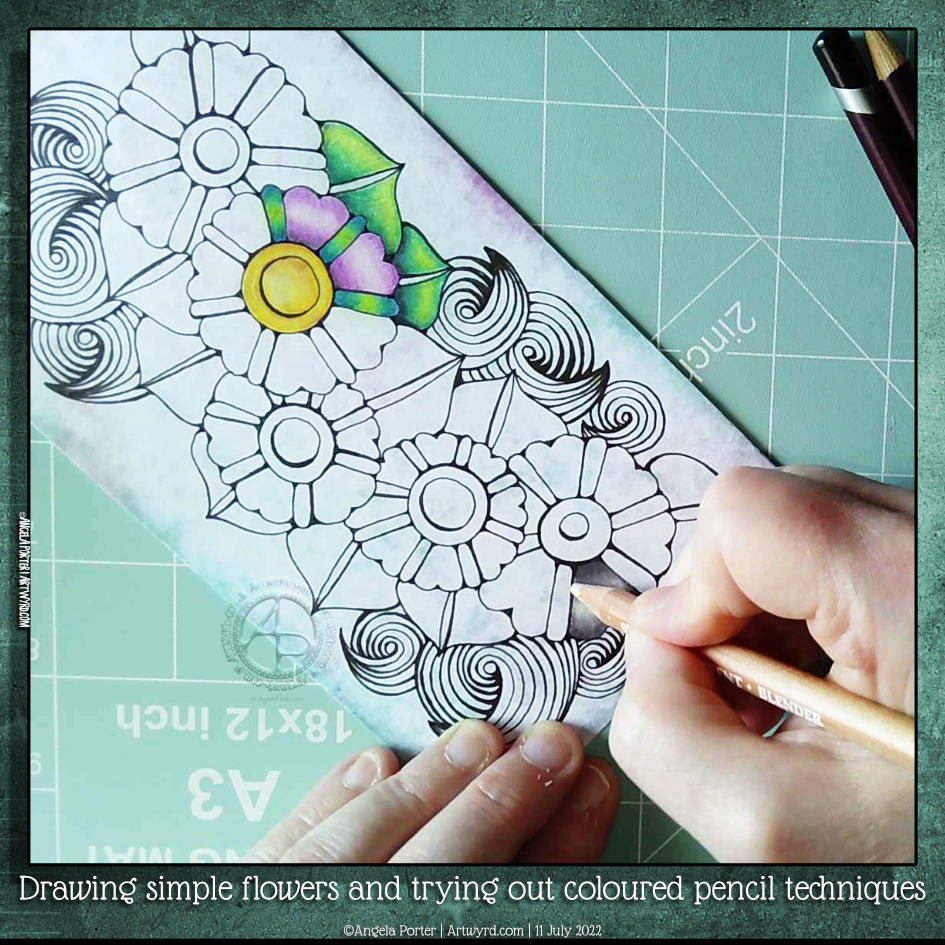
One of my YouTube subscribers (Chen Keith) requested I draw some simple flowers and show how I’d use coloured pencils to colour and add contrast.
Drawing, not a problem! Colouring? Yeuch colour choices! But I do show different approaches I use to adding colour with coloured pencils, or rather what I’ve done in the past. I rarely ever used coloured pencils now. Digital coloring or marker pens are my mediums of choice, with Inktense and the Karin Brush Markers close behind.
While the video was uploading and processing, I did try out other ways of adding colour and/or contrast. It’s way too hot here in the Valleys of South Wales for me to think clearly and explain things at the moment. The heat is making me feel very, very tired.
Please click on the ‘Watch on YouTube’ button – cheers!
I’m fine, but feeling a tad out of sorts today. So, I needed some art that would be self-soothing for a bit of selfcare. Nothing is better than starting to fill a page with tangle patterns, and all of these are new to me!
From top to bottom, the zentangle patterns I used are: Wigwag – Jody Genovese CZT Moonrice – Ilonka Weerts QuaSahnt – Heidi Kay
I coloured the page with Distress Inks (Wild Honey, Spiced Marmalade) then added some Ripe Persimmon through a stencil.
I’m really not feeling too grand again today. Tummy cramps kept waking me up through the night. I know what the cause of them is – hormones is all I’ll say. But I am so tired today, but I don’t want to sleep as that will impact on my sleep tonight. So, quiet art time it is!
I like the idea of pattern and motif sampler pages in my sketchbook. However, I like to work on paper on the worksurface rather than in a book. So, I dug out one of my Distress Ink coloured papers to work on.
I used a selection of Zentangle tangle patterns for the first row. They are, from left to right Savana by Yvette Cambell CZT Holly by Linda Farmer CZT ‘Nzepple by Zentangle Inc Dorsal by Anita Aspfors Westin Crazy ‘Nzeppl by Zentangle Inc Pufanflower by YuRu Chen
I used alcohol markers to add shadow to the patterns and a white Gelly roll for the highlights.
This will be a series of posts with accompanying videos until the page is done.
Please click on the ‘Watch on YouTube’ button. Cheers!
This was a lovely way to spend an hour or so at lunchtime today. I’d finished the last couple of sketches for my next colouring book and just wanted some quiet, chilled, relaxing time drawing with no pressure at all. I woke with another migrainey headache today, and it’s left me so tired yet again.
Anyway, flowers and plants, and some rocks, were the perfect thing for me to draw during this time. I started to add pattern and colour to some of the motifs as well, with a surprising discovery!
Time to take a nap, I think, and sleep off this blasted post-migraine exhaustion.
This was a lovely way to spend an hour or so on a sunny Saturday morning! I’ve often said it and will say it again and again, I do enjoy drawing things of whimsy.
Houses are one of my current themes. As they’re all imaginary, I can ignore any architectural/structural rules. Towers I love, in particular. I’d love to be able to afford to buy or build a wonderful, quirky tower to live in. I’d like a dome on top so I can watch the night sky or thunderstorms clearly. For now, though, I can dream of living in a tower and create what I can imagine on paper with pen and ink.
I hope you’ll join in and try your hand at whimsical buildings and create your own village full of peace and harmony!
Please click on the ‘Watch on YouTube’ option. Cheers!
Before filming this video, I primed a piece of watercolour card with white gesso. Then, I added colour using Inktense pencils and water. I added each colour separately, drying them before adding the next. Finally, a layer of clear gesso was added to seal the colours.
I had no particular idea as to how I would add the colour or what I wanted to use the paper for after this. But, as I looked at it, the pink areas just looked like very fuzzy flowers, so that was it! A floral based drawing it would be!
I do not intend to fill the whole area with flowers. I have plans for the ‘white space’ around the designs. But you’ll have to wait to see how that pans out!
In the video, I take you through drawing each flower design, one step at a time. I try to vocalise my reasons for doing certain things too.
Please click on the ‘Watch on Youtube’ button. Cheers!
Step 1 – Create a Gesso and Neocolor II background
Yesterday, I had a delivery of Finnabair Art Basics Clear and Heavy White Gessos, made by Prima Marketing. Neocolor II backgrounds are a lot of fun to make, but they do leave a smooth, waxy finish to the paper. I like drawing on it, but my pens aren’t too keen.
So, I wanted a way to seal the Necolor IIs into the paper and a surface I could draw on. Yesterday, I tried some glassy gel medium from my stash. It worked well, and the colours appeared more vibrant. It was OK to draw on, but the pen took a long while to dry, and I’m not sure how permanent the Micron ink would be on it.
Synchronicity-like, some suggested videos cropped up on YouTube where gesso had been used to prepare the paper and then seal in the Neocolor IIs, even using the gesso instead of water.
I have used gesso in the past, but it always felt very rough and gritty. However, the Finnabair Art Basics gessos had reviews that suggested they are smooth and chalky in feel. So, I had to try them.
I’m glad to say that they are smooth and chalky! I did spend a little time last night testing them out and gessoing some “polaroid pops” image tiles.
In today’s video, though, I wanted to quickly show what gesso is and how I’m thinking of using it, particularly in my sketchbooks with paper that won’t take much water.
I covered a page in my Hahnemuhle D&S sketchbook. The paper in this book is for drawing and sketching and is not designed for water-based media. I can get away with a barely damp brush on the paper, but only one, maybe two layers are possible before the paper starts breaking down. Gesso solves this by sealing the paper’s surface and creating a thin, flexible layer that can be worked upon. I used the heavy white gesso to do this.
Gesso dries really quickly, but a craft heat tool (or hairdryer) can help to speed the process up.
The next step was to add colour with the Neocolor IIs. I used water to activate them, though I could’ve used gesso. I wanted to create an uneven, weathered or worn kind of background. I started with the browns, sealed them with clear gesso. After this had dried, I added the blues and finally another layer of clear gesso.
Then, I was ready to try drawing on this.
2. Drawing on the gesso surface
I really didn’t know what would happen. I know I’ve used gesso in the distant past, but couldn’t remember if I’d used pens to draw on it or not.
As it happens, it was really lovely to draw on! The Sakura Pigma Sensei 04 pen did feel like it caught on the tooth of the gesso from time to time, but nothing more than a rough-surfaced paper. It may be my imagination, but the ink seemed darker on the gesso, perhaps because it dries on the surface and doesn’t sink into it, like it would with paper.
I did a test to see if, once dry, the ink would be affected by water or gesso. There was a tiny amount of pigment that seemed to move, but nothing noticeable.
3. The arch motifs/fragments
I really love round arches! It stems from my love of Romanesque architecture. I use them a lot in my artwork. So, I thought it was about time I explored individual arches as if they were fragments of a tangle pattern.
4. Reflections
I’m so glad I rediscovered gesso. I’d forgotten how it could be used. I know the rough grittiness of the gessos I’d used in the past really did put me off using them again. However, this lovely, chalky smooth gesso is really nice to draw on. It also opens up more ways to create backgrounds and use colour. I’m sure I’ll continue to experiment and explore it going forward.