Between a couple of ‘meh’ days, busy days with appointments, I’ve managed to colour this particular illustration of mine.
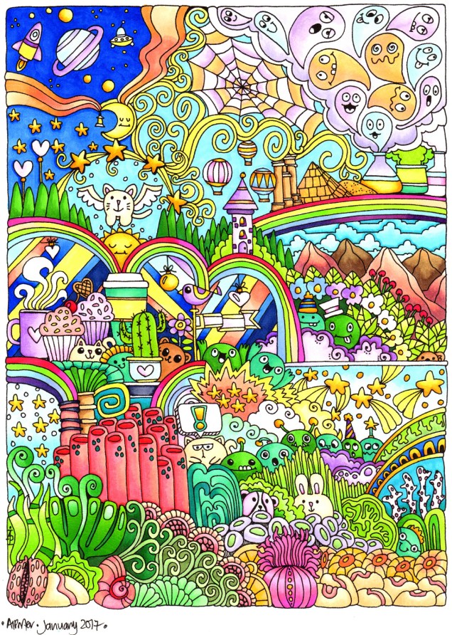
I coloured this one using copics, and the scan has washed some colours out.
Between a couple of ‘meh’ days, busy days with appointments, I’ve managed to colour this particular illustration of mine.
I coloured this one using copics, and the scan has washed some colours out.
New year, new books out!
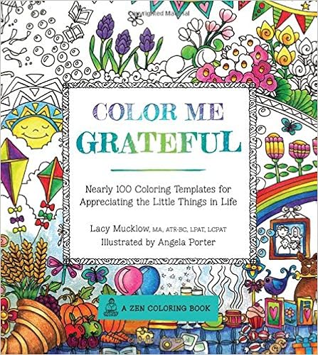
The first is the sixth in the ‘Color Me’ series from Race Point Publishing, part of the Quartos group. This one is called Color Me Grateful, and is Lacy Mucklow and I It’s already available in the US, and in the UK from Thursday.
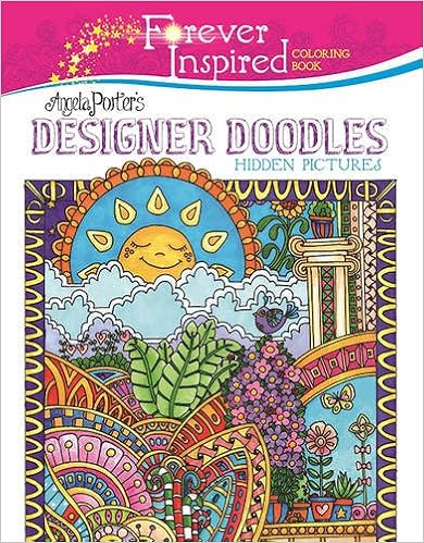
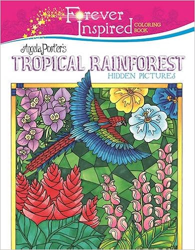
Out now, are two titles in the Forever Inspired series from Skyhorse Publishing – Angela Porter’s Designer Doodles and Angela Porter’s Tropical Rainforest.
To see all the books which have coloring templates designed by me, check out Angela Porter’s Amazon Author Page
I could be accused of enjoying myself way too much!
A pal requested more badgers and more squid … so here they are!
At the weekend, I finished all the illustrations for the upcoming colouring book ‘By the Sea‘, to be one of the titles in the Escapes series from Dover publications.
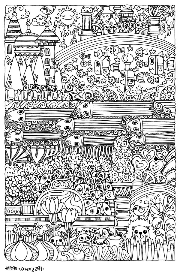
So, over the last couple of days I’ve been doing other things, some arty, some not. However, after watching some videos on YouTube by piccandle, I thought I’d have a go at their particular style of doodle art, and this is my homage to them.

I had a lot of fun drawing this I must admit. It’s full size is shy of A4 in size, and I drew it on squared paper, scanned it in, cleaned it up using GiMP, then printed it out ready to colour, most probably with Copics, Spectrum Noir Illustrator markers and Promarkers.
I’m busy drawing colouring templates for a book entitled By the Sea, one in the ‘Escapes’ range of colouring books from Dover Publications.
When I completed this template, I couldn’t resist printing it and colouring it in.

Another page for you to print and colour, if you wish.
All I ask is that you please respect my copyright to the image; it is for personal use only, not for any commercial projects either in it’s entirety or in part. If you share the image, please share the link to this page instead! Of course, I’d love to see how you colour it!
Happy New Year to you all, and may it be a year full of colouring and creativity, peace and love to all.
The second of the templates I posted yesterday has been coloured. I went with a cooler colour palette than I would usually choose.
Coloured using Caran D’Ache Luminance pencils and a blending solution was used, which actually brought out the colours beautifully!
I also forgot to mention that these wreaths were drawn in Autodesk Sketchbook on my Microsoft Surface Book.
I know that for most of you it’s a busy time of year. So, I’d like to share a couple of colouring templates to help calm you, even if it’s for just a few minutes.
Many studies have been done that show colouring to be as relaxing and therapeutic as meditation, even if you do it for just a few minutes!
All I ask is that you don’t share the uncoloured images, and that if you share coloured images you provide a link back to either this page or my facebook page. Oh, and the images are for personal use only, not for commercial use in any way.
Enjoy!


And here’s one I coloured!
Today, I popped into my local craft shop – Dandie Crafts (Dandie Crafts Facebook Page)- in their new premises in Caerphilly.
The shop is larger, smells fresh and new, has more space for stock and much more space for classes and demos. The warm welcome was very much the same.
I had gone there to stock up on paper for my printer; I like their own range of acid-free heavy-weight paper (usually 160g/m²) and found the Spectrum Noir Illustrator twin-tip alcohol markers in stock.
I bought the six packs of pens, which cost £12.99, so the pens work out a little over £2 each, which is about half the price of a Copic Sketch marker, Promarkers you can get for a little over £1 each at the moment.
Debbie, the lovely lady in charge today, told me they’re supposed to be a new formulation of ink that blends more easily with quality Japanese nibs. One of the nibs is a bullet nib, the other a brush nib.
On the Illustrator marker packaging it says:
For smooth, natural linework and detailed colouring. Fully blendable, streak-free coverage. Perfect for drawing and illustration.
So, I just had to buy and try them out!
I drew the design using the True Black marker and the bullet tip.
The bullet tip isn’t as fine as I thought it would be. The tip is softer than the bullet tips found on the Promarker pens. Personally, I’d prefer the bullet nibs to be firmer.
The pen drew nicely with plenty of ink in the new pen (something that hasn’t always happened with my experience of Spectrum Noir pens in the past). Also, the ink seems jucier in a different way that I can’t describe. It does seem to be a different formulation.
The black lines are thicker than I’d usually draw, but I’m hoping they’ll give a stained-glass kind of feel to the art.
Once I’d inked out the design on 160gsm smooth white card, I started to colour in the design using just two colour blending. That was going to be a bit of a challenge as I have eight of the six pen sets which aren’t the full range of colours in the Illustrator pens.
What I did notice is that the colours do blend much more easily than the original Spectrum Noir markers, and also the Promarkers and the Copics! The ink in the Illustrator pens is definitely different to the others.
Also, where I coloured fairly large areas with one colour, there was no streaking! Admittedly I didn’t colour a huge area, but so far so good. The lack of streaks was the case with both the bullet nib and the brush nib.
For the green leaves, I also used a tip-to-tip method to transfer a little of the darker colour on to the lighter colour to help blending with two quite different shades of green. That worked well.
The brush nib is made up of fibres that do spread out – more like the Chameleon pen nibs than Copics. I don’t now how that will affect their ability to get into small nooks and crannies as they are used over time.
I also noticed that the inks are a lot more vibrant and ‘cleaner’ in colour than the original Spectrum Noir pens, which is a huge plus for them.
The only downside is that as I was colouring, the inks would blend out the black ink, so some of the lines have bled where I don’t want them to bleed.
I do need to test them out with the usual pens I use for drawing and also with the Epson Ultra-brite ink I favour, which hasn’t been affected by alcohol markers previously.
Overall, I’m happy with the pens. I most probably will get the full set of 96 and will use them along with my other alcohol markers as I’m sure they’ll work well with them.
All coloured, using Chameleon pens.


