I love curvy, flowy, abstract patterns and the illusion of depth, volume, twisting, and bending space. And seed pods. And seeds. So lots of my favourite things in this design. I even snuck in a few spirals!
To add shade, I used three cool grey Faber-Castell Pitt Artist Pens. Though they haven’t blended smoothly, I’m quite happy with that. The design looks almost metallic as a result. In fact, I am happy with this design in its entirety. I could increase the contrast a bit more between the darkest shadowed areas and the white highlights. But I can always revisit that in my own time.
I’ve been slowly working on this drawing over several days. Little by little, it’s been finished and brought to life with colour.
I’m not quite finished yet; I’m still adding white dots as highlights! That’ll take me a goodly amount of time, no doubt.
Slowly is the correct description of my ability to work, slowly and a little at a time with breaks in between. This muscle healing process is very slow and I’m really learning I can’t push myself too hard. But I really do feel I’m making some kind of progress, which is all that matters.
I’m really enjoying adding panels to this infinity card. Each panel is a quick project, with no pressure to be perfect or polished. I’m finding them a fun way to explore patterns that develop from one into another, that share common features in some way, or that spark off an idea for another. It’s always a bit of a mystery trip, never knowing what the destination is, only where the journey began.
Today’s journey started in the bottom right with the Zentangle pattern “TagH”. The plumptious, rounded shapes of each part of Tagh, led me to think of circles with flowers inside, like blooming discs or spheres. That led me to Moonberry by Debbie New CZT at the top right. I used some of my favourite leaves and more TagH to fill in the remaining space.
To add volume, I used some red-grey Ohuhu brush markers. Oh, and to draw the design, I used a black Uni Emott everfine pen.
Oh, you may have noticed the notch at the top left. That shows this is also a pocket!
Although not all the ‘hats’ worked out well, they were still fun to explore as possibilities. As this is a sketchbook page, the permission to experiment, explore, and try things out is implicit. A sketchbook is a place to do all these things and more. You can finish a piece of art or not. You can show people or not.
A safe place to be artful, that’s how I think of my sketchbooks more and more. I put too much pressure on myself to always finish a drawing, to have it polished and “imperfectly perfect”. If I don’t finish something, I can beat myself up. But I’m learning that in a sketchbook, I can do all I need to learn, grow, and develop. And sometimes that includes knowing when enough has been done!
It may take me a long while to be able to set aside my perfectionism to fully embrace this, but like everything in life, it is a work in progress!
I’m having one of those days, it seems. You know, the kind of day when you’re careless in deleting files, thinking that the video that’s processing is today’s. The reality is different. I managed to delete today’s video, and reprocess yesterday’s video as today’s!
I’m not going to repeat what I called myself when I discovered that… but at least I discovered what I’d done before I uploaded it to YouTube!
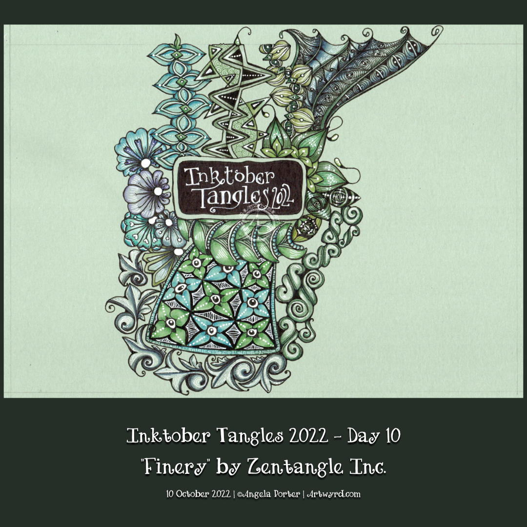
Inktober Tangles Day 10
I added ‘Finery‘ to the top right of my Inktober Tangles ‘sampler’ today, using its sections as a ‘reticulum’ to contain other patterns. To fill one part of Finery, I used Isea-u from day 3. I also used Well and B’tweed for two other sections. The last one is one that is a bit of a nod to one of the sections of ‘Souk‘, the tangle pattern for day 4.
I used Finery as a kind of reticulum (grid or net for a repeating pattern of fragments) as I, yet again, struggled with this tangle. I don’t know what it is about it, but I always mess it up somehow! However, if I hadn’t messed up this time, I may not have got the idea to fill the spaces with other tangles! So, it worked out fine(-ery) in the end!
It’s a shame I managed to send the file into the netherworlds of the recycling bin, never to be recovered or seen again. I realised my mistakes (yes, there were more than one!), but persevered saying that I had to trust I could recover from it(them). I think I did. As Adam Savage would say, I managed to ‘hide the crimes’!
One of my lovely YouTube subscribers asked if I could look at some zentangles by Patrica Aragon (myzenarts.ctz on Instagram) and see if I could do some artwork inspired by her work. As a YouTube drawing tutorial, of course, he asked.
Well, I looked at the artwork and then did my own version. It took a little over an hour to get to where it is in the drawing above. And there it remains until I decide how to complete the picture. If I’m going to, that is.
It was an excellent way to spend Saturday lunchtime.
This week, I’ve designed a mandala full of layers and patterns. I’ve chosen a limited colour palette of soft greens, pinks, reds, oranges and browns; a softer, calmer selection of colours that have that late summer, early autumn feel.
I love drawing mandalas. Seeing the repeating pattern building up is both fascinating and relaxing. Adding colour to bring out the layers and breathe life into the design is a magical process. I’ve not done much with high contrast to bring out the dimension today. Gentleness is the approach needed today both to my art and to myself.
I find it fascinating how my colour choices are often softer, more muted and in limited palettes nowadays. It does make a change from the riotous colours that I so often used not all that long ago, and still do when it comes to the more whimsical and cute colouring books that I create for Creative Haven.
Seeing how others choose to add colour to the colouring page designs I create is also endlessly fascinating and varied.
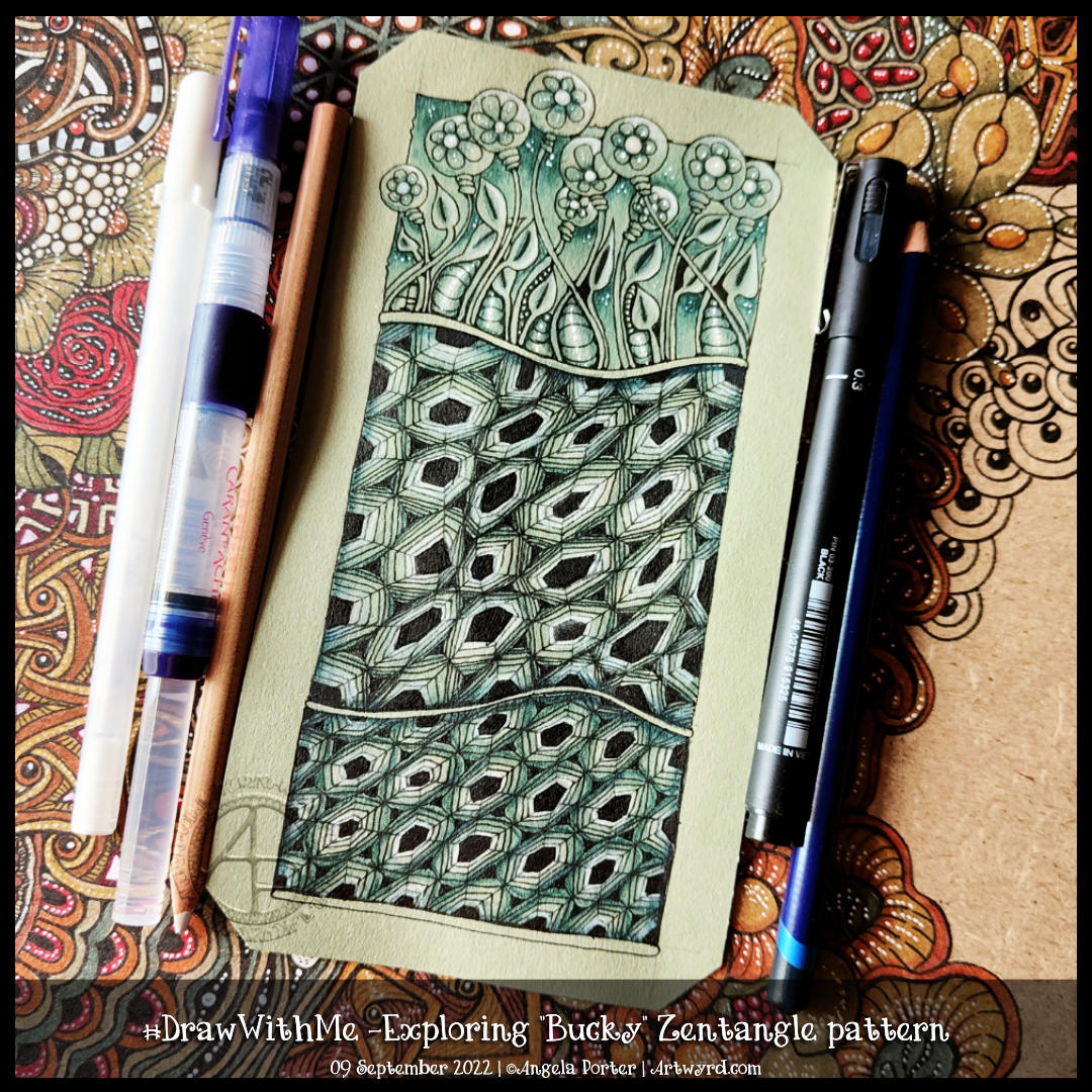
Bucky is an official Zentangle pattern that I’ve never drawn before. I had to look up the deconstruction, which you can find on Zentangle.com. So, in typical Angela style, I threw myself in at the deep end by using a ‘crazy’ asymmetric grid (the middle section in the artwork). It worked out fine in the end, but not with a few mis-strokes!
I thought I’d add some organic patterns/motifs to balance out the rather geometric Bucky pattern.
To add shade, I used an Iron Green Inktense pencil with a water brush to produce some colour gradients. I really wasn’t at all tidy and controlled about this. And you’d never really have known that if I’d not said it! I tried embracing the fluidity and random nature of a watery medium and it worked out just fine.
I used a white charcoal pencil and a paper stump/tortillon for the highlights. That meant I had to re-ink the black hexagons, but that was fine.
Finally, I drew Bucky in a more regular grid at the bottom. I didn’t film this part, but it worked out just fine, I think.
Indeed, I’m fairly happy with the overall result. I like the monochrome colour scheme; it gives coherence. The one thing I haven’t done is add shadow and highlight to the narrow bands between the sections.
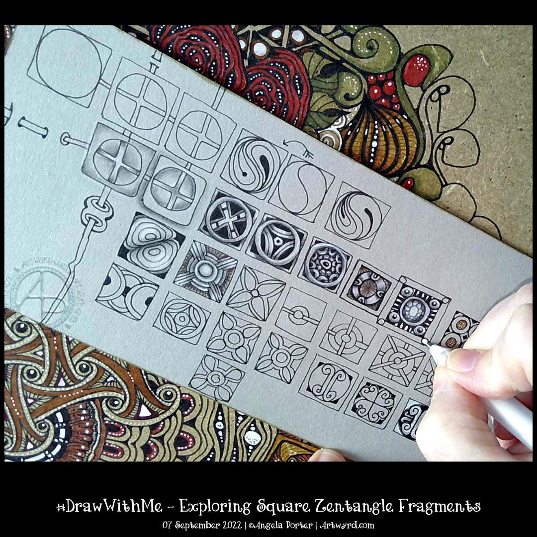
Time seems to fly when I get engrossed in a task. Today, that was exploring a simple Zentangle fragment – a circle in a square.
In Zentangle terms, a fragment is the basic unit of a repeating pattern, whether repeated as is or rotated/reflected.
It is always a lot of fun to see what kinds of fragments I can develop using the chosen one to spark some creativity.
It’s always lovely, too, to work on toned paper, in this case, it’s from Fabriano and is in the colour ‘Clay’. Whenever I use toned paper, I realise I’m drawing in shadow and light; the paper is the mid-tone. This is why I love to colour plain paper with Distress Inks or NeoColor II water-soluble wax crayons. The colour immediately becomes the backdrop for dark and light and a strong contrast ‘twixt the two extremes.
In art, chiaroscuro is the term used for the use of high contrast between light and dark in a composition. In drawing, this is affected by using a coloured background, and black and white ink or media are used to create the drawing.
As I was typing this, I realized I’ve long loved working in this way. Since my early days of exploring my artistic nature that started some 20 years ago, I discovered I loved to use coloured paper with white and a black or much darker tone of the paper to draw with. It was far more fascinating to me to draw in light and shade rather than tones of grey graphite on white paper. It was my chosen way to work when I did some life drawing. When I go out and about sketching, I will colour the pages in my sketchbook with Distress Inks and use black and white pens/pencils to draw on them. The shapes of shadows and highlights fascinate me; everything becomes very architectural.
I’ve often mentioned the only oil paintings I’ve ever done and how three-dimensional they appear. When people see them for the first time, they’ll touch them because they think they are dimensional and are always surprised to find out they are totally flat. The high contrast I favour in my work creates the illusion of volume.
This little journey down the pathways of memory has allowed me to make some connections. I’m smiling as some pieces of the jigsaw puzzle that is me fall into place, clicking together satisfyingly.
There are times when I have to work with black pen on white paper, but there are many times when I can choose what colour paper to use. And going forward, I think much of my entangled drawing that isn’t for colouring books will be done on toned paper.
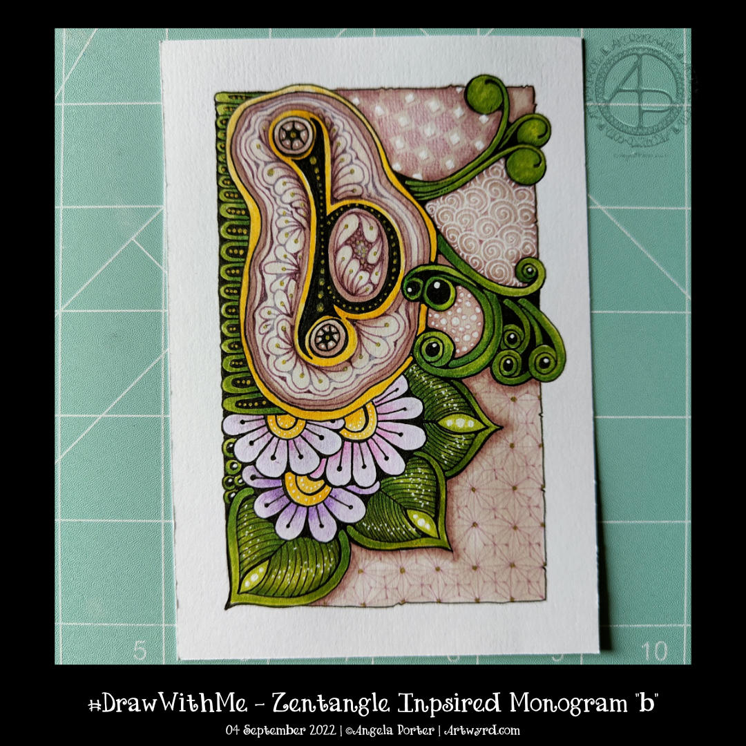
I’m continuing with my exploration of monograms and patterns. This one is a bit odd with the ba sitting above a pool or pebble..or something. But I quite like the patterns I’ve used to embellish it. I’m also rather fond of the background patterns, especially the very faint ones to the bottom right.
I’m not too fussed about the greens, yellows and the colours I used for the flowers. Pretty much every colour apart from the background colours and the colours of the patterns around the b!
Must write a HUGE reminder and stick it where I can see it “WORK IN MONOCHROME!”
All the same, it’s a learning exercise for me, as drawing always is. The ones that turn out not quite to my liking at the ones I learn most from. Having said that, I still haven’t learned that ‘work in monochrome’ thing yet! One day, maybe, I will.