Inktober Tangles 2024

It’s been a couple of years since I last took part in the Inktober Tangles challenge. I feel like a focus for daily (or mostly daily) art is a good idea for me at the moment, so I’ll be doing my best to complete it.

The challenge is hosted by Stephanie Jennifer in the facebook group ‘7F5R Challenge’. This link will take you a file you can download for the challenge.

Today is the first day, it being 1st October. The tangle for today is ‘Ambler‘ by Zentangle Inc..

This is not a tangle pattern I would choose to use in my art; *shrugs* it’s just not ‘me’. However that made it interesting to work with in it’s own right and to explore. I do enjoy exploring variations on a theme and seeing where they lead me.

I did create a video showing the process, and this can be viewed on YouTube. Here’s the link to the video.

Some of August’s Artyness…

August has been a weird old month. I managed to get all the pages for my next colouring book called “Daydreams” done. The work was enjoyable, but the constant fatigue hasn’t been. All I have to do now is to add colour to two templates!

I’ve managed to get some videos done, too, three in the last few days! They can be seen on my YouTube channel @AngelaPorter.

I have rediscovered an old love and source of inspiration – Ernst Haeckel. I bought myself a collection of his work for my birthday. It fascinates me and entrances me – both the beauty, the detail, the stylised way of drawing and the science that goes with it! It’s all the things I love most about scientific drawings and illustrations. And that love has followed me through my life.

Unsurprisingly, I’ve dipped my toes into the richly inspirational waters of the Arts and Crafts movement. Again, the wonderfully stylised yet richly intricate designs fascinate me.

I’ve taken time since finishing the artwork for the book to indulge myself in sketchbook work, pattern and motif explorations, and the simple joy of drawing.

I had thought about creating a ‘junk’ journal. Well, more of a sketchbook cross art journal cross zibaldone/commonplace book cross journal cross elements of junk journaling.

As I started to work on it, I got so overwhelmed. So, I started to put together a disc-bound sketchbook. As I’ve added work to the sketchbook, ideas of how to incorporate elements of the various kinds of journals/sketchbooks start to make sense.

This tells me I really do need to stop getting overwhelmed and start with a drawing. Then, just trust that creative intuition will work its magic and meld ideas together – one at a time.

One thing at a time. One thing at a time, as in one focus at a time, is easy to do. I find it hard to juggle multiple projects. I have a couple or more on hold. I know if I start on them again, then that project may totally take over my focus. But starting at any one of the projects after a break can fill me with anxiety and fear of failure. I know that to do nothing is the only real failure, but picking up a project after a break from it and having to pick up the flow of it again …

Well, perhaps I need to learn to trust the creative and inspirational flow and put aside the fear, doubts, and negative inner voice. Easier typed than done!

Linked to this is I’ve started to read Julia Cameron’s “The Artist’s Way”. It’s surprising how much of this I recognise so far – I just needed the words for how I work. I am going to work my way through it, though. I have a feeling it will be very valuable to me. And some lined paper for the daily pages has arrived today, so no excuses tomorrow morning!

Pattern Explorations 23 August ;23

Link to the Draw With Me video on YouTube.

Zentangle Inspired Drawing 29 July ’23 and why I’ve been missing…

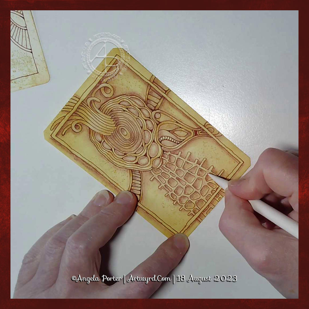
A #DrawWithMe video tutorial featuring this design is available from 21:00 UK time today, 29 July 2023.

Missing from social media…

It’s been nearly two weeks since I last posted any art to social media. I managed to burn myself out with too much adulting, a people-y couple of hours, and pushing myself way too much to get all the sketches done for the Daydreams book. I just ended up exhausted, unable to focus, and couldn’t even muster the energy to draw for my own pleasure. That is a bad sign.

I’m having to learn and understand a lot about myself at this time in my life. Lots of things have changed – not the big things in life, but things of personal matters to me, including health, age and a couple of other things. This means I really need to make sure I start to set limits for myself as to how much I realistically can do. It seems that it may be better for me to do less, rather than push myself to my maximum limit which results in the start of burnout.

What does burnout look like for me? Intense fatigue, inability to focus, a loss of joy in things I usually enjoy, a desire not to communicate or leave my home, an upset digestive system, and frustration if I try to do anything slightly demanding.

I still remember how I was when I have my first huge burnout and all the health problems (physical, mental and emotional) that built up in the run-up to it. Back in February this year, I nearly ended up in such a state again. Just a few months isn’t quite enough to fully recover, however. It took me years to recover from the first two big burnouts, which happened within a year and a half of each other.

It’s taken me until now to recognise the connection between what’s happening to me, which is only being exacerbated by perimenopause.

This means that I’ve had two weeks without being able to make any social media posts. I’ve avoided social media, apart from reposting posts I’ve found interesting on the times I’ve checked in. I’m not the most sociable person, being an introvert, but am less sociable during times like this.

I’m exhausted not just from the pressure I’ve put on myself to get as much work done as possible. There’s also been the masking when I go out where people are so they don’t know how much I’m struggling inside. Keeping that appearance up is exhausting. I’m a bit like a swan – calm and serene above the surface, but underneath I’m going ninety-to-the-dozen to keep myself afloat and moving.

Yes, I know the expression is nineteen-to-the-dozen, but I really have felt like it’s ninety not nineteen.

The thing is, that’s how I’ve always been for as long as can remember. I didn’t have the words or way to describe how I felt or thought when I was a child or teen, or even an adult. In therapy, I had to learn what emotions were. I was astounded to discover that not everyone thinks or feels like I do.

Not having conversations about my constant anxiety bordering on fear, or my negative self-talk meant I thought this was all normal. If only I’d had those conversations as a child!

Still, I got there eventually…and am still learning about myself and how this impacts me, especially at this time. I have to know my own limits and do a lot more self-care of my energy and focus, mind and emotions, body and soul.

I’d like to think I’m making progress. However, when everything crashes in it can be hard to remember all of this. I get caught up in a maelstrom of fear and the old negative, destructive thoughts of that inner voice that is so damn judgemental.

The positive thing is I recognised that I was spiralling down back in February and sought out medical help. The hard thing is working out what my new limits are. I need to learn to stop before I start to crash and fatigue and low mood and other problems set in.

I think I may have overdone it today – I recorded, sorted out and am uploading a 2 hour how-to tutorial today. I enjoyed drawing and so on very much, but I feel so tired now. Perhaps all the social media was a bit too much! But I do want to do it and will take a break in a wee while for sure.

Seed Pods and Tangle L’s by Cyndi Knapp

I drew this design in my latest YouTube video, which premieres today, 16 July 2023, at 21:00 UK time.

It’s a draw with me video, where I show you how to draw this design, step by step. I also do some colouring, shading, highlighting and addition of texture patterns. I don’t, however, complete the drawing in the video.

Currently, I really enjoy drawing designs where there are layers included, like a collage or a break and the floor or wall to see what lies beneath or behind them.

Seed pods are one of my favourite things to draw. There are so many different kinds, both based on reality and imagination. Today, I stuck with the familiarity of plump, teardrop-shaped pods. The tangle pattern between the faux ripped edges is called L’s, and it’s by Cyndi Knapp. It is a bit of a challenge to draw, well, for me at least. It does result in a curious interweaving pattern, however, and is worth the time spent mastering it.

I used a piece of grey-green PaintOn mixed media paper from Claire Fontaine. The colours almost glow against the paper. To add colour, I used Derwent Coloursoft pencils along with tortillons and Gamsol to blend them.

Although I haven’t finished this drawing yet, I’m quite happy with how it’s working out.

I have needed a couple of days of quiet time this weekend. I over-stretched myself last week in some ways. When I find inspiration lacking, I know I’ve overdone it. Hopefully, these two quiet days will give me renewed energy to carry on with the illustrations for Daydreams, my next colouring book. The self-doubt and fear that I’m not good enough – imposter syndrome – has awakened for some reason, and it robs me of my oompf. I will push through it, however. I always do.

A collection of some of my recent ‘small art’

I’ve been doing smaller pieces of art lately, and here a just a small selection of them.

The top design is one I drew and started to add colour and highlight to in a YouTube #DrawWithMe video.

Small artworks are just the thing needed when I don’t have the energy or brain power to do anything larger. They do have, however, their own challenges!

What I had a flash of inspiration from somewhere, probably watching an arty crafty YouTube video. The inspiration was to use gloss Mod Podge to coat the artwork. The glossy surface really brings out the colour and cleans up the watercolour from the black lines. There is no, or very little, movement of colour when it’s applied, so long as it’s applied quickly with little fussing. I did apply a second coat as there were brush marks in the first one.

All are Zentangle and diaper patterns from Medieval Illuminated Manuscripts inspired, apart from one. The one with trees, birds and buntings was inspired by Danielle Donaldson in her book “Creative Girl”.

Two Stylised Flower Designs, Both WIP

Yesterday, 1 July, and today I had a lovely time drawing and adding colour to some stylised flowers. The designs aren’t complete.

I need to add a background texture and a delicate pattern to the one on the left. I’ll do that digitally. If I try to do it now, I’ll end up messing up as I used watercolour inks to add colour. I also recorded a YouTube video of the process (view it here).

A background pattern or texture is needed on the one to the right and textural patterns being added to the flowers. This time, I remembered to add some background colour using Distress Inks. Again, I used watercolour inks to add colour.

I am spitting feathers, though; as for the drawing on the right, I recorded a video and promptly managed to delete it … permanently. Duh! I feel such an eejit! So, I’ll remake the video soon, I’m sure.

A5 Sketchbook Page

Between some adulting today, I’ve drawn this design in my sketchbook. I’m quite pleased with it, unusually for me!

I like black and white drawings. I like texture and pattern, and I like to then add colour and/or contrast to my artwork. I’ve yet to decide what I’ll do with this, though digital colouring is likely to be my thing. Traditional drawing followed by digital colouring makes it tradigital art! Whoever coined that term is fab.

In the last few days, I have played around with using coloured inks to draw designs. I’m happy if I use one colour for the drawing, texture and pattern. If I start to use other colours, I become confused and not at all happy with the outcome. It never looks ‘right’ to me. Not for my own art, anyway. I do like how other people manage to use different colours for various parts of the lineart, pattern and texture.

Maybe this is because I’m so used to drawing with just one colour. I then use colour to bring out dimension in the finished artwork. I have drawn designs in a colour other than black, using just that colour; I’m quite happy with them.

So, onwards I go, continuing to learn more about my style as I go outside the area I’m comfortable in. I may return to the experiments with different ink colours another time, or not. Only time will tell, though.

Oysteroid and A Grid Pattern

I had a peaceful and content time this afternoon as I created this page in my sketchbook. Well, the pen drawing part with some examples of how I’ll colour it. And I filmed it too, and you can watch it on YouTube.

I started with the stack of Oysteroids, a tangle pattern that I particularly like. I decided that I’d like to use a geometric pattern as a counterpoint to the roundedly organic Oysteroid.

So, I did! I like the way that this instantly gives a feeling of layers or volume.

Colour always vexes me. So, I decided to stick with an analogous colour scheme, choosing Fern and Mustard Inktense pencils to create stripes on the Oysteroids. I carried this palette into the geometric pattern. That was fine until I foolishly decided to use some Red Oxide Inktense. I have no idea what I was thinking! However, it did give a very ‘earthy’ feel to the pattern, in contrast, perhaps, to the sea-related Oysteroid.

That led me to wanting to use colours that remind me of the sea on the right-hand side. I’ll hold judgement on those until more colour is added. If the red oxide doesn’t work out, I have a rather lovely gold ink that can hide it away! Or black with gold highlights…

I used my fine and extra fine nibbed TWISBI Eco fountain pens, which are filled with black Dokumentus ink.

As you can see, I couldn’t help adding some pattern and texture to one of the Oysteroids. I’m sure the others will be treated in a similar way!

Entangled Monograms – D and F

Over the past couple of weeks, I’ve been experimenting with monograms and my style of art. It’s fun trying out different things, and it leads to new insights into how I can express myself.

My self-expression is constantly changing and evolving. Sometimes I seem to make some breakthrough and go forwards with it for a while. But something happens, like a slip into poor mental and emotional health, and I retreat into my familiar styles. That doesn’t mean progress is not being made. When I look back, I can see how even my ‘comfort art’ has subtly, or not so subtly, changed as the breakthrough shares its influence subconsciously.

I keep returning to hand lettering, hoping to find out how I can make it work for me. Monograms really do seem to be the way forward.

I’m also thinking about my relationship with colour palettes. I really do struggle at times with the colours I put together, particularly when using traditional media. They seem like a good idea at the time…but…that isn’t always how I feel about them as I continue to add colour.

Contrast can be a thing I struggle with too. I really do think very simple colour palettes – monochromatic or analogous, are likely to be the way for me to go at the moment. They always seem to work nicely, monochromatic, especially as I can focus on contrast far more.

Digitally, I feel I do better, but again a limited palette is the best thing for me.

I know that, like my drawing/design skills, this will improve with time and practice. But I get so frustrated when I make the same silly mistakes over and over with colour choices.