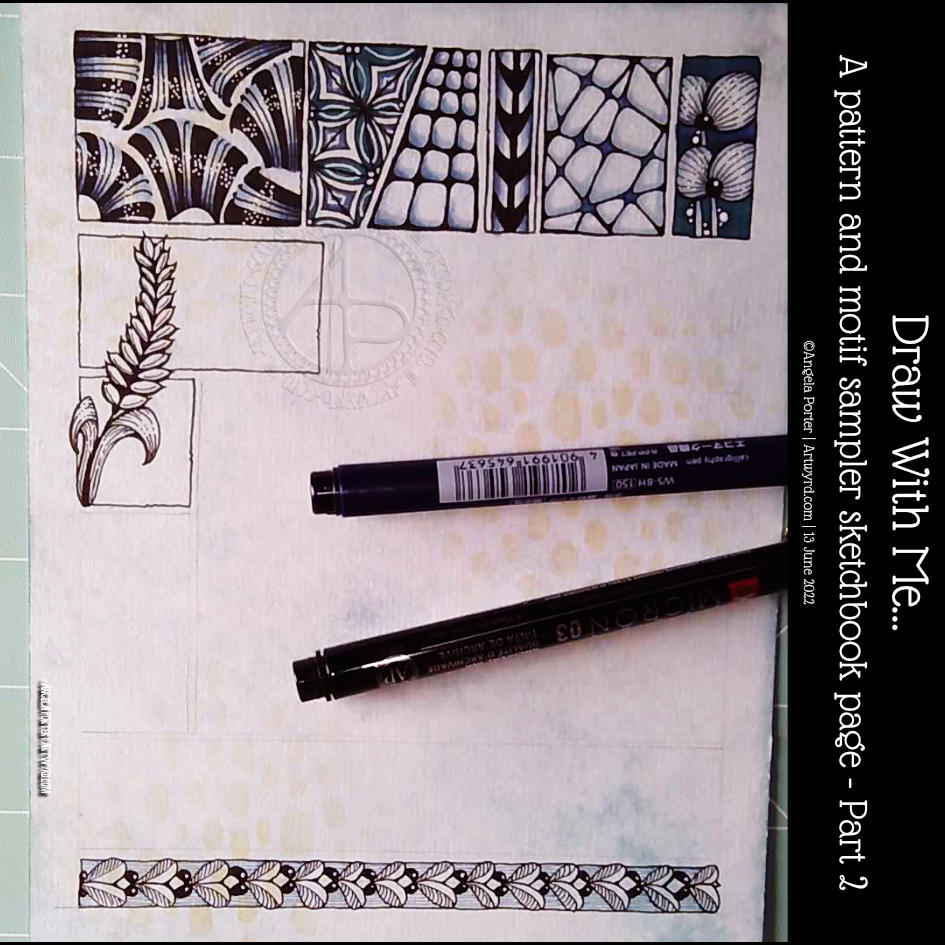
This was a lovely way to start my day. At the bottom is a tangle pattern that is new to me – Zhuer by Yuru Chen.
I also wanted to add a motif across a couple of boxes in the sample. This one ended up like a stylised ear of wheat. As I look at it now, I wish I’d had it going behind the boxes and maybe the top bending towards the left and reaching outside of the upper box. That’s something to think about for the next motif I add.
Still, it was a nice half hour or so before my attention turned to inking in colouring templates.
Please click on the ‘Watch on Youtube’ button. Cheers!
Step 1 – Create a Gesso and Neocolor II background
Yesterday, I had a delivery of Finnabair Art Basics Clear and Heavy White Gessos, made by Prima Marketing. Neocolor II backgrounds are a lot of fun to make, but they do leave a smooth, waxy finish to the paper. I like drawing on it, but my pens aren’t too keen.
So, I wanted a way to seal the Necolor IIs into the paper and a surface I could draw on. Yesterday, I tried some glassy gel medium from my stash. It worked well, and the colours appeared more vibrant. It was OK to draw on, but the pen took a long while to dry, and I’m not sure how permanent the Micron ink would be on it.
Synchronicity-like, some suggested videos cropped up on YouTube where gesso had been used to prepare the paper and then seal in the Neocolor IIs, even using the gesso instead of water.
I have used gesso in the past, but it always felt very rough and gritty. However, the Finnabair Art Basics gessos had reviews that suggested they are smooth and chalky in feel. So, I had to try them.
I’m glad to say that they are smooth and chalky! I did spend a little time last night testing them out and gessoing some “polaroid pops” image tiles.
In today’s video, though, I wanted to quickly show what gesso is and how I’m thinking of using it, particularly in my sketchbooks with paper that won’t take much water.
I covered a page in my Hahnemuhle D&S sketchbook. The paper in this book is for drawing and sketching and is not designed for water-based media. I can get away with a barely damp brush on the paper, but only one, maybe two layers are possible before the paper starts breaking down. Gesso solves this by sealing the paper’s surface and creating a thin, flexible layer that can be worked upon. I used the heavy white gesso to do this.
Gesso dries really quickly, but a craft heat tool (or hairdryer) can help to speed the process up.
The next step was to add colour with the Neocolor IIs. I used water to activate them, though I could’ve used gesso. I wanted to create an uneven, weathered or worn kind of background. I started with the browns, sealed them with clear gesso. After this had dried, I added the blues and finally another layer of clear gesso.
Then, I was ready to try drawing on this.
2. Drawing on the gesso surface
I really didn’t know what would happen. I know I’ve used gesso in the distant past, but couldn’t remember if I’d used pens to draw on it or not.
As it happens, it was really lovely to draw on! The Sakura Pigma Sensei 04 pen did feel like it caught on the tooth of the gesso from time to time, but nothing more than a rough-surfaced paper. It may be my imagination, but the ink seemed darker on the gesso, perhaps because it dries on the surface and doesn’t sink into it, like it would with paper.
I did a test to see if, once dry, the ink would be affected by water or gesso. There was a tiny amount of pigment that seemed to move, but nothing noticeable.
3. The arch motifs/fragments
I really love round arches! It stems from my love of Romanesque architecture. I use them a lot in my artwork. So, I thought it was about time I explored individual arches as if they were fragments of a tangle pattern.
4. Reflections
I’m so glad I rediscovered gesso. I’d forgotten how it could be used. I know the rough grittiness of the gessos I’d used in the past really did put me off using them again. However, this lovely, chalky smooth gesso is really nice to draw on. It also opens up more ways to create backgrounds and use colour. I’m sure I’ll continue to experiment and explore it going forward.
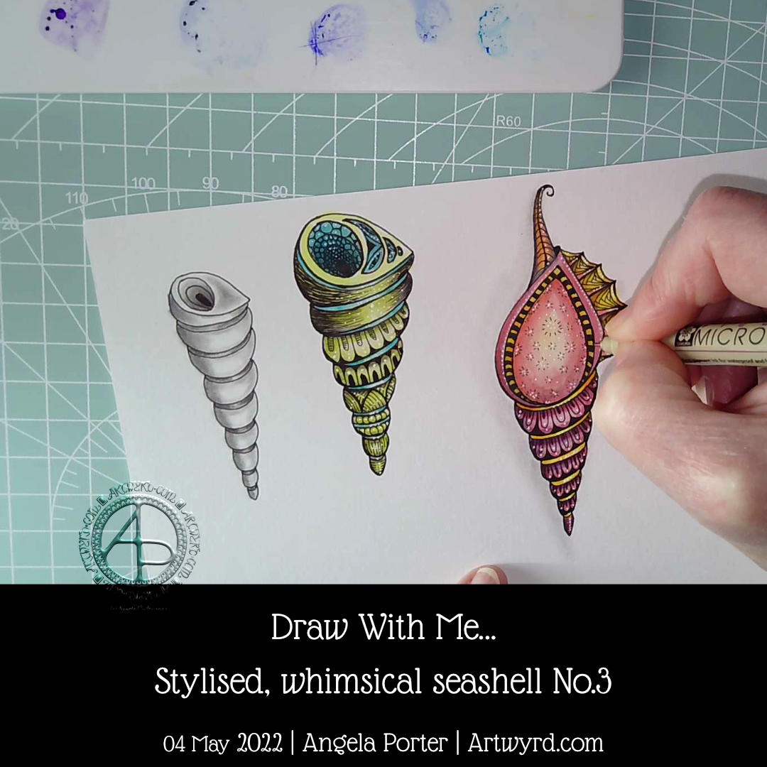
Day 3, shell 3. This time a little more complicated, or so it seems. I took some imaginative liberties with this one, and that’s fine! I’m not trying to accurately draw these shells, just get the essences that make the shell identifiable. Then, I want to add my own ideas of patterns and colours and alter things a tad.
Making those imaginative changes was an enjoyable thing to do. I hadn’t realised how much I do this in my art generally. Sometimes, it takes a while for me to have that kind of insight – this one took about 20 years!
I’m also really chuffed that my YouTube channel has hit 750 subscribers! I was amazed and humbled when I achieved one subscriber. 750 is beyond what I imagined. I’m both amazed and humbled by this. So a huge thank you to all who have subscribed.
I had a request on YouTube from a subscriber to show how I would add shadows to this design. So that’s just what I did, and of course filmed the process.
I used three shades of cool grey alcohol markers. Using alcohol markers is a bit of a dance from light to dark and back to light again, usually. Today, I did some really simple blending, so streamlined the process a bit.
It never ceases to amaze me how much such subtle shadows add depth and volume to the design.
My next conundrum is whether to add colour. I could use alcohol markers, or I could do that digitally. I’m not quite sure what I want to do, yet. I have digital images of both the un-shadowed and shadowed versions, so whatever I do I’ll always have a copy of the original.
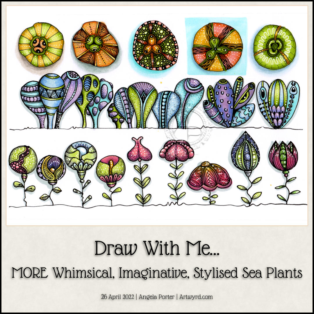
This sketchbook page is now complete! I had so much fun doing this one for sure. There’s a whole host of plants to populate any number of whimsical worlds. There’s a third video tutorial showing how to draw, step by step, the last row as simple line art as well as the start of adding colour and pattern.
Some of the motifs look a bit ‘flatter’ than I like them to, and a couple I’m not quite happy with in terms of pattern/texture. But still, it’s a page full of inspiration and possibility, something I can look back on for inspiration.
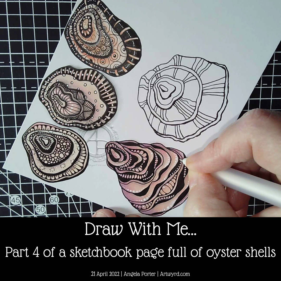
Finally, the page is as full as I’d like it to be of oyster shells! I did some hand-lettering before filming the video. I just wanted to add a quote about oyster shells and practice hand lettering.
I really enjoyed drawing all of these shells. The last one, a more whimsical one than the others, is my least favourite. It did, however, give me the chance to do something a little different when adding textures.
I really didn’t think out the layout of the hand-lettering. Maybe I’ll work that out, eventually. Maybe!
Overall, I now have a great reference page in my sketchbook as far as oyster shells are concerned.
I may do some further work on this page. Part of me wants to add words/quotes/facts as a background to at least one shell. I’ll see how I think about that after a little break from it.
In the process of drawing this page over the past five videos, I’ve gained some insights and understanding about my motivation to start a YouTube channel. I didn’t seem to have any clear purpose for making the videos, but with time and working on it all I think the pennies have finally dropped. That’s a good thing, maybe. All I have to do is to keep this purpose in mind (and remember it!). Fortunately, I’ve recorded my ah-ha moments in a journal, just in case I need to refer to them.
Now all I need to do is work out the next motif to focus on!
In part 4 of this video series, I draw a couple of oyster shells, one of which I add colour, shadow, highlight and pattern to. The other I’ve left until my next video.
I really enjoyed drawing these oyster shells. The one I’ve completed has used a kind of variation of the Diva Dance tangle pattern to construct it.
I’m really quite happy with how this one has turned out. I actually think I’ve done a fairly good job on adding colour – so unusual for me! Alcohol markers really do seem to be working well for me. Something to seriously consider going forward, that’s for sure.
I like how the areas of dense black add a lot of contrast. But I like how I’ve added white dots to soften the harshness of them and make them feel they belong in the pattern.
As I was wittering and musing during filming, I realised how much I enjoy creating line art. I enjoy the elegance of simplicity, focusing on the key elements that make the drawing instantly recognisable. This hearkens back to my time studying science and then the 28 years I spent as a science teacher. In science, observational drawings have to focus on the essence of what you see, making sure you get the essential identifying features correct. I was always a bit of a maverick going a little further than the bare essentials and even adding some colour! I got a tad chastised for that, but it didn’t stop me.
Now, this love of focusing on the essentials, the basic line art, shows in my artwork so much. In fact, it’s essential for me to do this otherwise I try to incorporate everything I can see into the drawing. Then, the drawing ends up so detailed it’s not really recognisable!
There seems to be a lot of sudden realisations and connections being made with my relationship to art and my particular style lately. Signs, I hope, that I’m finally settling into what is ‘me’ and recognising where my artistic roots lie and what I really enjoy doing.
Speaking my thoughts and reasoning out loud for the videos brings this process into awareness. I’ve often written about how I don’t think in words, but in feelings or abstractions. I have to be forced to put them into words by being given the opportunities to speak them out loud to people, or sometimes to write them in journals or blogs.
I hope that by sharing these thoughts and processes with others it will help them to find ways to discover and become comfortable with their own artistic style, as well as gaining some confidence in expressing themselves artistically just for the pleasure of creating art.
The other thing that working with the bare essentials line art style is that there are plenty of spaces for me to get creative with pattern and texture! I’ve learned over time how not to become overly ornate. What I like about today’s artwork is how I didn’t try to fill every section in with intense and intricate pattern. Oh, there’s plenty of white highlight dots scattered around, but the tangle pattern style of textures are thoughtfully placed and not too many of them.
This is something I’m still developing – not to overwhelm the drawing with pattern/texture. How much to use, and how much ’empty’ space to leave.
Carrying on with the sea-life theme, I filled a sketchbook page with simple drawings of stylised, whimsical starfish, sea urchins and mussel shells. I recorded my process as a tutorial video, showing and explaining my step by step process of drawing. I start with simple shapes and gradually add more and more complexity.
There is something very intriguing and curiosity-provoking about exploring variations based on the same simple shapes and steps. The possibilities are endless and it certainly gives creativity a bit of a workout!
These kinds of exercises are what sketchbooks are perfect for. A sketchbook is a safe place to experiment and explore, and the end result is a valuable resource of ideas as well as a visual record of your development of artistic skills. They’re a place to practice fine motor skills, hand-eye coordination, and for trying out new media or techniques.
Sketchbooks chart the development of our skills, our pattern and motif preferences, and show how we develop and evolve our artistic style.
This revelation about sketchbooks is exciting to me. I don’t know why it’s taken me so long to work this out. I think the Inktober Tangle Pattern Challenge back in 2021, the Fragments of Your Imagination Challenge earlier this year (both challenges hosted by the 7F5R Challenge Facebook group) as well as the Lettering Sketchbook course on Domestika have definitely been significant activities that have helped me reach this realisation.
The other major realisation I’m having at this time is that I think I’ve finally found what kind of YouTube content I like to make!
I was a science teacher for 28 years. Teaching is part of who I am. My focus as a teacher was always to inspire and encourage my students, to help them to believe they could do science, and to have better self-esteem and self-confidence. I loved to see them grow and develop and gain skills and knowledge they never thought they could, and that was a wonderful thing to be a part of.
If I can do the same thing for others, who have no confidence in drawing. If I can use my love of whimsical and stylised art/motifs, the function of a sketchbook to encourage others to take up pen and paper and draw, then that is a good thing!
I also think it’s important that I show my process, warts and all. Variations that are lovely, and others that are not so. It’s all part of the process of developing as an artist. I think my work with traditional coloured media is a testament to my ability to make a total mess of a fairly nice drawing! I am better with digital colours, but not much!
It all takes time to work these things out, and I can be really dense and stubborn at times! But I do get there … eventually. ‘There’ being a point of understanding myself and accepting something or a sudden revelation, you know the kinds of things. But ‘there’ isn’t the final destination. The journey of exploration and development never ends, and a sketchbook is now, for me, a vital companion going forward.
Today felt like the right day to start jazzing up these simple circle motifs with some texture and pattern before adding colour.
I kept the methods of adding pattern/texture really simple – just lines and circles combined in different ways. It’s amazing how just small, simple patterns can make a difference to the motifs, making them look a lot more intricate than they are.
It’s sketchbook work, so this is a pretty messy page, but that’s fine. I’m learning that getting ideas down quickly as a reference/resource for future work is a good thing. And if they’re messy, then that’s fine! Even with the messy bits, the ideas are clearly seen.
Colour is still the thing that vexes me, and the sketchbook is where I can explore colours and, perhaps, find my confidence in them.
Cute and whimsical fish! What a lovely way to fill a sketchbook page and end up with a shoal of fishies.
Being whimsical, and cute, is so much fun when it comes to drawing as anything goes. All are recognisable as fish, even if only one looks like an actual fish that exists! And I’m fine with that!
Drawing practice, or indeed lettering, has to be fun, enjoyable and something to look forward to. Yes, I know it’s important to develop and advance skills, but that doesn’t mean that just drawing for fun can’t be important too. Drawing for relaxation, to de-stress, to learn how new media work, is also important, as well as expanding and exercising the imagination and creativity that we all have.
So, today fish seemed an appropriate subject to populate a page or three in my sketchbook. If you’d like to grab a pen and a sketchbook (or paper) and draw along with me, click on this link to watch today’s YouTube tutorial.