Distress Inks and Tangle patterns

Last night when I arrived home after an absolutely visit with a dear friend, I found the postman had delivered a set of mini Distress Ink pads in the new colours released last year! It was way too late to do anything with the inks, so I decided I’d have a look at them in today’s video for YouTube.

I started by trying blends of the colours. My instincts were not to mix the salmony pink Saltwater Taffy with the other colours – Villanous Violet, Blue Ribbon and Salvaged Patina. Orangey tones with purple, blue and/or pale green-turquoise colour, would make mud, my instincts told me.

However, when I used them all for one background, I was really surprised by the colours that resulted. They were lovely! No mud! Just lovely, aged, vintage-ish colours. What a wonderful surprise!

After spraying water to create water stains, stencilling and another spray of water drops (drying in between each procedure), I edged each paper with Hickory Smoke. Then, it was time to draw!

I used an 0.1 and 0.3 Molotow fineliner pens for drawing. They’re new to me and so was keen to try them out. The ink is lovely! But, I found the pens rather light and awkward to hold. The natural place to rest my fingers was way too high up the pen to be comfortable.

I’ll use the pens until the nibs are wrecked or they run out of ink, whichever comes first. The ink is very black and very opaque. The nibs do write really smoothly on the paper I used. But, they’re just not comfortable for me to hold, and that comes down to personal preference! Otherwise, they really do seem to be great pens!

I started drawing with the tangle pattern ‘spoolies’ to the left. This is where I noticed how the grip I had on the pen was uncomfortable and making it really difficult for me to draw smooth, precise lines. I ended up doing a mash-up of spoolies and diva dance!

The pointy leaves (or shark fins or points of crescent moons, depending on how you want to see them) actually echo the pointed part of spoolies. These then were replaced by the tangle pattern swirl, which is very similar to spoolies. Finally, the pointy leaves/fins/horns of the moon returned.

As I wanted to lift these off the background, I used a crosshatch pattern to darken the spaces between them.

Then, in my not-so-clever wisdom, I decided to help the illusion of volume and layers along by adding colour using Distress Inks as watercolour inks or paints.

I’m not at all sure about the end result, which wasn’t helped as I decided to splatter gold paint over it.

I often ask myself what on earth was I thinking and will I ever learn. This is another of those occasions. I kept compounding the problem as I tried seemingly good ideas.

As I said, I wonder if I’ll ever learn …

No matter what, it was lovely to be sat drawing just for enjoyment. Even though I’m not happy with the end result, I learned a lot about these new-to-me Distress Ink colours. Also, I’ve learned that a spray of water really can make the background lovely. And it’s OK to repeat sprays as more colour or stencilling or edging colours are added.

But perhaps the most important thing is that sometimes the process, the enjoyment of creating and learning is more important than an end piece that I’m happy with. Perhaps, in the coming hours, days, weeks or months, I’ll be able to look at this with fresh eyes and see it as not as bad as I know think it is!

Whimsical Work In Progress

This was just some fun! I had no idea where the drawings would lead … but drunken party skulls, mushrooms and tentacles seem to be the theme of the day! It’s nowhere near finished yet, but something fun for me to do later today, after I run an errand.

There is a video of me drawing this as far as it’s gone.

#DrawWithMe | Patterned letters – “h”

I’ve finished inking all the templates for ‘Fanciful Birds’! So how to I celebrate? I hand letter a lower case h! And video the process too.

I added the ‘g’ early this morning. I woke way too early and did some drawing until I was ready to go back to sleep.

#DrawWithMe | Patterned Letters

Phew, what a day! First, I focused on getting some of the final templates for “Fanciful Birds” done. I have just two left to do tomorrow.

After several hours working at a computer screen, I needed some time working with pen and paper. So, I continued with this page from my hand-lettering sketchbook.

I started this page yesterday and completed the ‘e’ and ‘f’ in today’s YouTube video.

The ‘e’ is completed in a dusty blue Chameleon fineliner pen. For the ‘f’ I used a rusty brown Staedtler Triplus fineliner.

I’m not at all fussed on the lilac ‘e’ on the top line. I much prefer either black or the more vintage, muted tones. That seems to be a bit of a theme with a lot of my art.

It was lovely and relaxing to just draw for the pleasure of drawing, and it was really comforting to return to this kind of intricate, abstract, patterned kind of art too.

Draw With Me – A Whimsical Bird, Part 3 – Starting to add colour.

Today, I’m experiencing some emotional ‘weather’. I know what the trigger for this is. I know what to do. And I also know that being creative will help me greatly. So, I decided to start to add colour to this bird drawing.

This may not be the best time for me to tackle colour. I feel I struggle with colour at the best of times. Still, I worked with a limited colour palette of blues and turquoises, as well as yellow, orange and red.

The Distress Ink on the paper reactivates with water, so there is some ‘greening’ of the blues. I’m fine with that. The mixing of colours will lead to a bit more harmonious outcome, I trust.

Oh, I’m using Karin Brushmarker Pro pens to add colour. They have watercolour ink in them, so I’m scribbling them onto a white plastic palette and using them from there. This way, I have a bit more control of the intensity of colour and how they blend and mix.

So far, so … OK I think.

I now need to work out how to tackle the body of the bird. Do I use masking fluid to cover the dots before or after painting the body? Should I use something like a gel medium to seal the dots once I’ve coloured them in before tackling the body? Or what about a clear glaze pen, even though the dots will be slightly raised and shiny?

I don’t have any masking fluid, but I’m not sure what I want to do. So it’s time to sit and let the possibilities be worked through in my subconscious to come up with a decision.

One thing’s for sure, however. I will not be starting work on the flowers and leaves until the bird is finished! And I will need to be careful about the colours I choose. That’s where it can all go totally wrong.

For the rest of the day, I’m going to lose myself in some hand-lettering practice in my hand-lettering sketchbook. There’s a lot swirling around in my emotions, my mind and my subconscious.

Various patterns – getting a design ready for some handlettering!

Click on this link to see a video showing how these designs were drawn.

I needed a break from digital drawing this afternoon. So, I did some traditional drawing!

I want to hand letter a quote in the top left corner, but first, panels of patterns are going to be completed. They weren’t all done in the video and I’ve yet to add any more. But I will!

Draw With Me – Whimsical Bird and flowers part 1

Link to the YouTube video that goes with this image and post.

I’ve been busy inking in colouring pages (or templates if you prefer) for my next book – “Fanciful Birds” in the Creative Haven series. But at lunchtime, I took a break to do some drawing. And I drew another bird!

Actually, I started to plan out and draw an A5-ish-sized pen drawing that includes a bird, flowers and so on, all done in a whimsical, fanciful style.

In the video, I explain my thinking process as I lay out the basic design in pencil. And I do it all one step at a time, including the inking in the section I’ve already done.

Of course, the drawing isn’t finished… yet. This is but part 1 of a series. And given I have to focus on the inking in of templates, my videos may be more sporadic than usual, as will my social media posts. So please bear with me!

I seriously need some more tea and probably something to eat; it’s just about tea-time here as I type!

Draw With Me … A texture and filler pattern reference page.

This morning, I woke thinking that I really do need to pop all my favourite texture and filler patterns somewhere so I can refer to them easily. So, a sampler page it is! And yes, I videoed it and you can see the video on YouTube by clicking on this link!

I’m actually looking at the artwork I’ve done in the past few days or so that has been inspired by the work of Rebecca Blair. I’m really enjoying these kinds of simple, straightforward and rather graphic patterns. As they’re new to me and I keep coming up with my own variations, my fear of forgetting things kicks in.

Athazagoraphobia is the psychological term for the irrational fear of being forgotten or ignored, or just of forgetting things. Forgetting things like patterns or textures I like. That’s why I have a number of A5 journals with collections of drawings and patterns and so on in them – my visual references. This partly comes from a desire to collect such things and have a reference at hand to get inspiration from. But it also comes as I do worry about forgetting things as well, especially when I’m exploring or learning something new.

And it’s a totally irrational fear! My memory is usually really good, but I worry about forgetting things as well. Maybe it’s a result of seeing the devastating effect of Alzheimer’s on my father. I can’t remember if I was this way before that. Actually, I was. For a long period of time I kept a journal to keep my thoughts and memories in. Oddly, I don’t really do that now. I have a large collection of journals here and my only desire is to destroy them as I don’t look through them and I really don’t want anyone else to be able to look through them either. They are way too personal for that!

Anyways, I’m making a page full of my favourite patterns from my recent artistic endeavours, just in case! If nothing else, it will be something to spark creativity at a time when I’m a tad stumped for it. It’s also a fun thing to do and a lovely way to review my recent drawings.

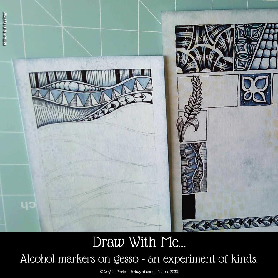
Draw With Me – Alcohol markers and gesso – an experiment.

Click on this link to watch my YouTube video that accompanies this post.

I’m most probably not the first to discover this, but it is entirely new to me!

Early this morning, I added some alcohol markers to a pen drawing I’d finished. I’d drawn over a Distress Ink background with some old book pages collaged and gessoed onto it.

I know gesso coats a surface with a waterproof and slightly textured finish. I do know this. But that didn’t occur to me as I added alcohol markers to the drawing.

I was absolutely delighted with the interesting variations in the intensity of colour that resulted. Also, the application of alcohol marker also brought out the texture where the gesso was patchy, even a little bit. The paper soaked up so much more colour than the gesso – duh go me for not realising that first, but that’s not the important thing – it’s the effects that result!

It’s not all that easy to see on the image to the left. But, behind the triangular pattern, I used just one soft blue marker, but you can see the variation in intensity! Usually, it would be a very flat kind of colour. The darker areas are where there is no gesso.

This is something I really want to use as I go forward. I love the crazy, random variations in colour and texture that happen. It seems to me a way to bring a little unpredictability to the rather predictable results you get with marker pens.

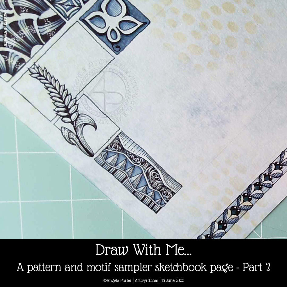
Draw With Me … A pattern, tangle pattern and motif sampler sketchbook page – part 3

Another couple of panels were completed on this sampler this morning. I like something like this to gently start the day and a bit of a drawing warm-up. If you’d like to draw with me, then click on this link to see today’s video on YouTube.

Today I’ve added the tangle pattern Kos, deconstructed by Anica Gabrovec CZT, known as Zen Linea. This panel is to the top and centre-right. The other panel is towards the bottom left and is one inspired by Rebecca Blair.

It’s funny how the internet seems to conspire to remind me of my early artwork nearly 20 years ago. One of my drawings turned up on Pinterest today. And it was this kind of sampler, but with patterns from Romanesque architecture, nature and textures drawn in pen and white ink on a kraft paper background. Seems I was doing this kind of thing before I’d heard of Zentangle or Rebecca Blair or many other artists and CZTs!

I keep trying to settle on a clear artistic voice, if not chorus, and it may always have been there, but I just don’t seem to accept it for some reason.

Perhaps these kinds of synchronicities are nudging me to accept this is something that I like to do and need to work more with. Time will tell, that’s for sure.

I think I’ve accepted, mostly, that I need to put watercolours and similar media to one side and focus on alcohol markers. I like the control I have over them. And using digital art to add colour, shadow and highlight too.

As much as I like the fluid, random effects you can get with water-soluble media, my ability to work with these media seems to be limited. Still, no doubt I’ll keep returning to them in the hope I’ll have a different outcome at some point in time. I’m not going to hold my breath on that, though!

I also think that I’m zeroing in on the best way for me to work with colour – monochrome or analogous colour schemes, maybe with a pop of complementary colour here and there.