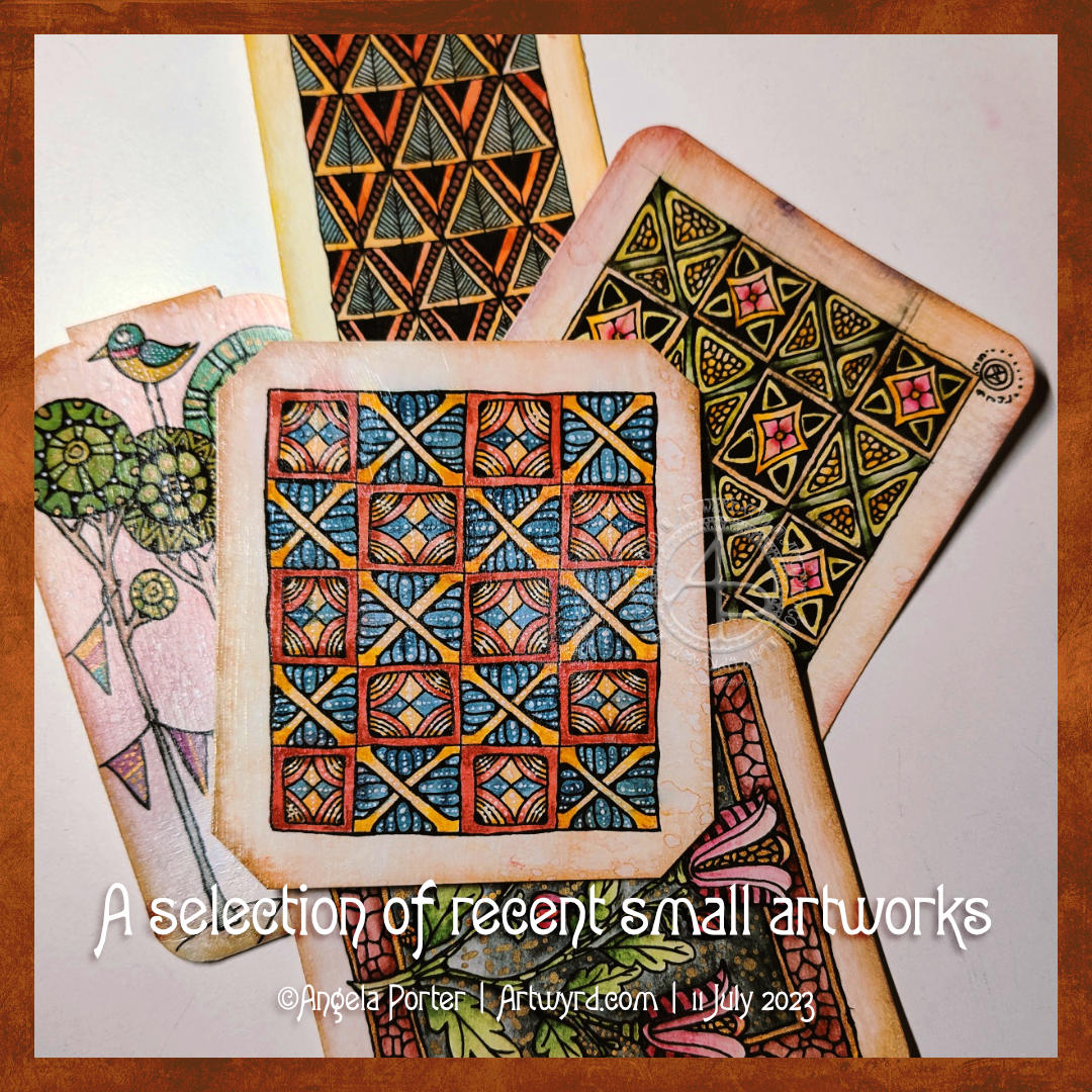
I’ve been doing smaller pieces of art lately, and here a just a small selection of them.
The top design is one I drew and started to add colour and highlight to in a YouTube #DrawWithMe video.
Small artworks are just the thing needed when I don’t have the energy or brain power to do anything larger. They do have, however, their own challenges!
What I had a flash of inspiration from somewhere, probably watching an arty crafty YouTube video. The inspiration was to use gloss Mod Podge to coat the artwork. The glossy surface really brings out the colour and cleans up the watercolour from the black lines. There is no, or very little, movement of colour when it’s applied, so long as it’s applied quickly with little fussing. I did apply a second coat as there were brush marks in the first one.
All are Zentangle and diaper patterns from Medieval Illuminated Manuscripts inspired, apart from one. The one with trees, birds and buntings was inspired by Danielle Donaldson in her book “Creative Girl”.
More small pieces of artwork today. These are perfect for when I’m feeling overwhelmed by a large sheet of paper. Also, they are sources of ideas for patterns and motifs for future work. I do need to spend some time with all this art and add some of the newer motifs and patterns to my visual dictionary/zibladone. Or, just stick them all into a sketchbook. At least then I’d know where they are!
It’s snowing outside. It’s cold outside, and warming up inside as I put the heating on a couple of hours ago. I think I may curl up in bed today with Din Djarin and Grogu. I still have three episodes of Season 2 to watch, and that sounds like a good plan to me!
Here’s a plethora of small drawings I’ve done over the past couple of days when I’ve woken up repeatedly through the night and needed to cool down before I could sleep again..
The various sizes are : circles – 8.5 cm and 10.5 cm diameter squares – 7 cm x 7 cm and 7.5 cm x 7.5 cm rectangles – 12.7 cm x 7.7 cm
Media used : Sakura pigma micron and sensei pens Distress Inks to colour the backgrounds Inktense pencils and Kuretake Zig Clean Colour Real Brush pens – colour spread with a damp brush Claire Fontaine Mixed Media Paper and St Cuthbert’s Mill Bockingford watercolour paper.
I sure do have a lot of colour, shadow and light to add to these! It takes me a lot longer to add colour and so on than it does to draw them!
Also, I have a larger drawing that is a work in progress. I think I’ll turn my attention to that one for a while.
I really needed some structure to my artwork yesterday and early this morning. This kind of work has really hit the mark. The smaller size also meant I wasn’t feeling overwhelmed by the task. The symmetrical nature of the patterns/designs really soothed me. All these things let me find that sense of peace and contentment that I needed from art.
Making square ’tiles’.
I cut some 100% cotton watercolour paper into squares of different sizes, trying to get the most out of each sheet. These squares are either 4½” x 4½” or 3½ x 3½” in size (approx 11.5 cm x 11.5 cm or 9 cm x 9 cm).
Next, I used Tea Dye, Old Paper, Vintage Photo, Rusty Hinge, Gathered Twigs, and Old Burlap Distress Inks to colour the tiles. I used one colour only on each tile. On the watercolour paper the colour wasn’t even, and I really like the aged, distressed look that gives, along with the darker edge.
I set out a net of pencil lines to help keep my designs fairly symmetrical. I did draw the lines free hand rather than using a ruler. The result is perfectly imperfect symmetry. I then set to creating patterns/designs with 05 and 01 black Pigma Micron pens.
Other materials used.
In the bottom left tile, I used Carbothello pencils and a Prismacolor Ebony pencil to add colour and shadow to the design, smoothing them with a paper tortillon.
In some of the other tiles, I used Chameleon and Triplus fineliners to add detailed patterns to the design. A happy accident resulted in me using a waterbrush to see what I could do with it. The ink flowed to colour the space, but the pattern was still visible, but more subtle. I liked the effect! So, I made use of it in the designs.
That led to me experimenting with Inktense pencils and a waterbrush. These pencils are great for adding intense, waterproof colour to areas.
A white gelly roll pen was used to add highlights to all the designs. Also, a gold gelly roll pen was used to add metallic highlights to a couple of the designs.
Reflections
I like all of these tiles for different reasons. But I can see how I could add more shadow and highlight to the designs to bring out an illusion of depth and dimension. I may turn my attention to that in a short while.
There’s an antique feel to all the tiles, which is an unusual thing for me. But I do like it! Working on a coloured background really prompts me to play with shadow and highlight.
I do want to scan in the blank, coloured tiles to use as backgrounds in digital art. It’s the distressed nature of the colour along with the darker border that really appeals to me.
Now, I need to work out what to do with these little works of art. Also, my mind is trying to work out how I can convert these designs to coloring pages/templates. But, these will have to be looked at later on today. I’m really needing to sleep. I was up at stupid o’clock again, and I’m now beginning to flag, a lot.