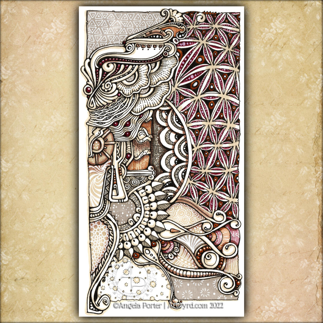
I started this drawing in the wee small hours of the night when some night sweats woke me up. I’ve continued to work on it throughout the day as other things allowed me to.
I’m actually quite happy with this now it’s done. Along the way, I had some wobbly moments where I almost gave up. But I’m really glad I didn’t.
A friend thought it was rather ‘heraldic’ and expected to see a big letter in it! My next one will have a monogram as part of the design. It has a rather medieval feel and is typically Entangled with some Zentangle inspiration.
The drawing is approx 3.75″ x 7.5″ (10cm x 19cm) in size and was worked with a variety of fine liners, Arteza EverBlend markers and a white Gellyroll pen on All-Media paper by Seawhite of Brighton.
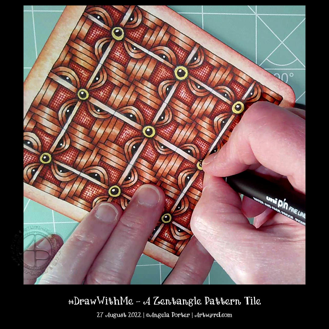
Today, I spent more than two hours creating this tile. I like how it’s turned out, particularly the volume and dimension achieved by shadow and highlight.
I started with a 4½” (11.5 cm) square of Artway’s Flat White Enviro mixed media paper, which is sturdy and works well with alcohol markers. My first step was to colour the paper with some Distress inks – I used Dried Marigold, Spiced Marmalade, Saltwater Taffy, Seedless Preserves and a hint of Aged Mahogany around the edge.
In true Zentangle fashion, no pencil was used to set the grid. And I chose to use a square fragment from my explorations yesterday. Of course, the fragment had a bit of a twist, with some weaving done in the style of the Zentangle pattern ‘Hurry’. Oh, and I used an 0.3 Unipin fineliner pen to do all the line drawing. Apart from the tattered burlap pattern, which I used a rusty red Staedtler Triplus fineliner for
The next step was to start to add shadow and highlight to warp space. Not really, but the illusion of dimension! I chose to use a trio of red-brown Ohuhu Art Markers. They don’t blend as well on this paper as they would on marker paper, but I like the texture that results in this case.
The final steps included: adding some shadow to the overlying grid with alcohol markers, highlights with a white charcoal pencil and a white 08 Gelly roll pen, and finally, the gold outer of the ‘buttons’ or ‘beads’ that hold the grid together.
I wanted to complete a piece of art for today’s video to mark a YouTube achievement of getting 1000+ subscribers. If you are one of those subscribers, I thank you from the bottom of my heart!
Earlier today, I just wanted to explore a simple Zentangle Pattern fragment, or two. I started with two square fragments, each with a circle in the centre. One had a diagonal cross, the other vertical/horizontal. And I went from there to create some more ornate versions of them.
I never know where this kind of exercise is going to go, but it is always interesting and some pleasant kinds of fragments result.
These are just a few fragments I came up with during the course of the video; I’ve barely scratched the surface of all the possible variations.
This exercise is good for flexing your creative ‘muscles’, warming up hand-eye coordination and fine motor skills, and playing around with colour, shade and highlight. Also, it’s perfect for relaxing, taking a break from all that is happening in this world. Even if for just a short while.
This is the partly coloured colouring page for the Angela Porter’s Coloring Book Fans Facebook group members. It’s a flowy, abstract, entangled, and zentangle-inspired design. Colour, shadow and highlight bring the design to life and add a lot of volume (dimension if you prefer) too.
I chose a more-or-less monochrome colour scheme, with just a splash of violet here and there. I think if I’d carried on adding colour, I would’ve used a more analogous colour scheme.
I enjoyed losing myself in the intricate, flowing, Zentangle-inspired drawing done yesterday; I thought I’d use the idea as the basis of a colouring page.
Not quite so intricate, and everything drawn on a larger scale to make it suitable for colouring, it was still very much a lovely thing to do.
I’m pleased that I’m recovering from my people-filled weekend, though still not quite focused and feeling a bit ‘lost’ in myself. And I’m still rather tired. But, these things will not last, and I’ll soon be ticketty boo again.
This morning, I filmed a tutorial based on a request from one of my YouTube subscribers. He asked if I could show him how to draw some ‘flowy’ patterns he’d seen, particularly one by ladyzadzakiya on Instagram.
Well, how could I refuse such a polite request? I’ve just shown how I draw my own kind of such patterns, as I can only really draw in my own way, as can any of us. I’ve included a few Zentangle patterns in the design. And I even got around to adding some shade! Adding shadows and highlights is what really brings the drawing to life. Part of me wished I’d used blues and/or sea greens for this. But no matter, I can always draw another one sometime.
Today, I am exhausted. I’ve had an incredibly busy three days, and as enjoyable as they all were, I managed to get over-stressed, over-anxious, over-wrought and exhausted. Oh, and an upset digestive system also always happens when I’m stressed.
All I need is a couple of stress-free and calm days to recover. Maybe more than a couple of days.
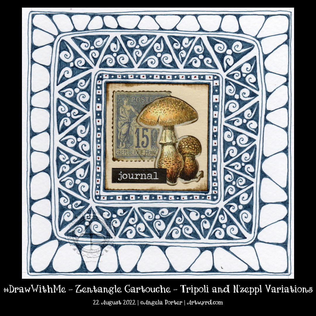
Earlier today, I wanted to draw, and I wanted to draw something that wouldn’t be too challenging – the focus being on calm and meditative. A Zentangle Cartouche seemed to fit the bill.
The central motif was a sticking point. Try as I might, it took me several attempts to get an assemblage of Tim Holtz Ephemera that was to my liking.
I knew I wanted to use a triangular fragment as part of the ‘cartouche’ to frame the focal point. I knew that black would most likely be too harsh. So, I went with a softer blue-grey. And that seemed to work out just fine. Apart from the fact I used a Zebra Sarasa 0.5 gel pen and the areas of dense ink are rather uneven. What is daft about this decision is that I have plenty of fine-liners that would do the job better!
Brain full of fluff and addlement today – told you so!
Anyhoo, I persevered and have got it to a point where I like the contrast between the ink-dense tripoli border and the more open N’zeppl. The next job is to decide how to add some contrast, colour, highlight or any combination of these! Oh, and what medium to use too, but that decision can wait until I’m less overwrought, brain-addled, and my head is less full of fluff to decide.
I have also managed to bake a cherry and coconut cake, which is remarkable, given I’m not too good at baking when I’m emotionally overwrought. It’s cooling down, so will try it later on for sure.
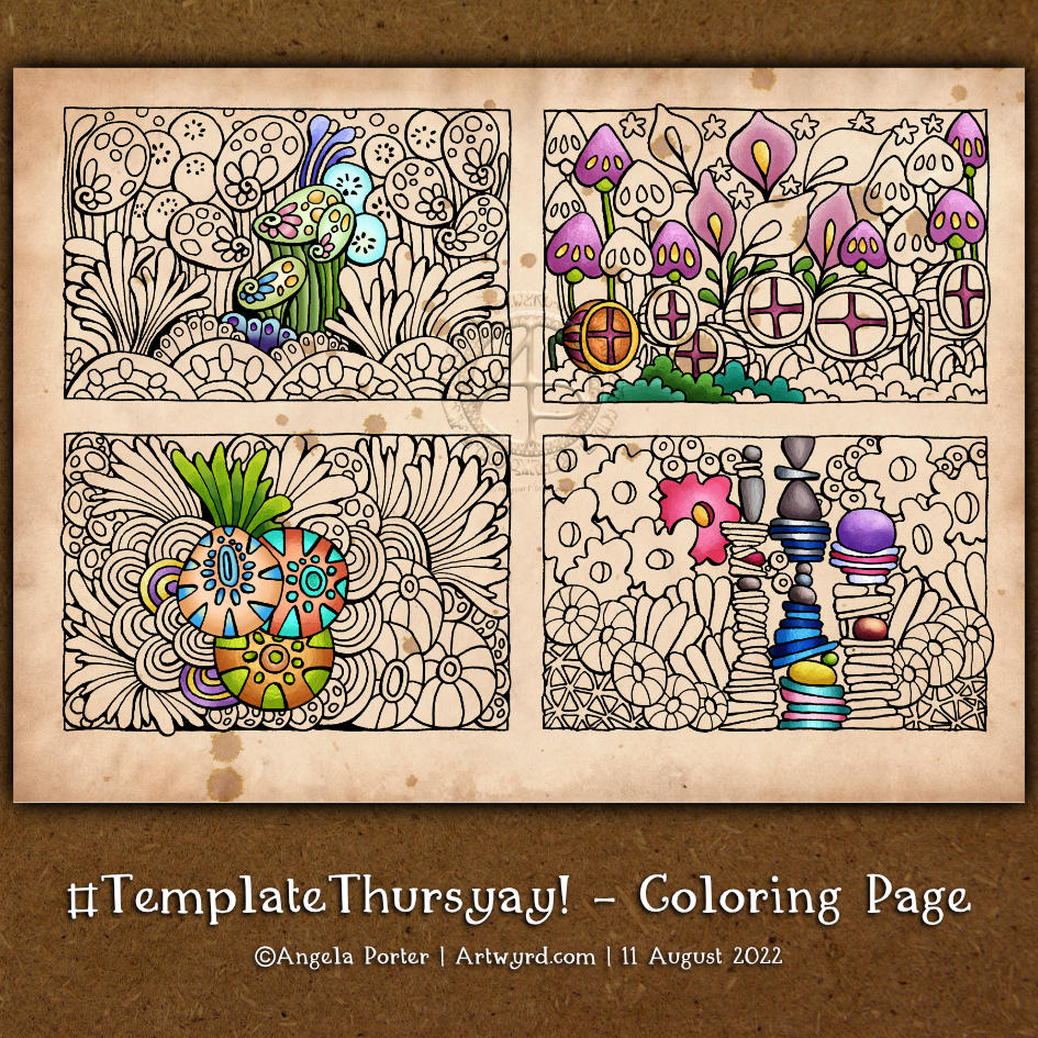
I thought I’d go with some more abstract, pattern-based templates. The last one I drew, at the top right, just ended up having some seed pods.
Abstract designs like these are great fun to add colour to as there are no pre-conceptions about what the colours should be. Also, they’re great for trying out new techniques, media and colour combinations. And, of course, they’re relatively quick to finish, which is great if you’re short on time.
Phew! It’s really hot again today here in the Valleys of South Wales, UK. And in many other places too. I’ve slowly been wilting through the morning. However, I was determined to get a video done and uploaded before I find somewhere cooler in my home for the rest of the day.
I had a really poor night’s sleep, and so I’m also struggling to keep awake. But keep awake I must. Delivery is due in the next three hours or so, and then I have errands to run.
So, my frazzled emotions, sleep-deprived brain and overly hot body really wanted to do some art that was soothing, comforting and simple. I knew I had this circular piece of paper already coloured with Distress Ink, so all I needed was a tangle pattern or two to add some pattern to it.
A very quick look on Tanglepatterns.com, and I saw Calibree by Nancy Domnauer CZT and thought it perfect. It’s got an uneven grid pattern, so it will deliberately turn out all lovely and wonky. I actually feel rather wonky myself today, so that fit perfectly!
I decided to stick to a monochrome colour scheme, again keeping it simple. You can see the whole process and materials I used in the video.
Although I may not have made the best choices with some of the colours, I’m fairly pleased with how it turned out. I’m also really pleased with how it picked up my mood as well.
This week’s colouring page is a little different. It has four designs on it. Each one would look adorable when coloured and mounted on a blank or postcard card. They would make a lovely decoration for a bullet journal, journal or diary.