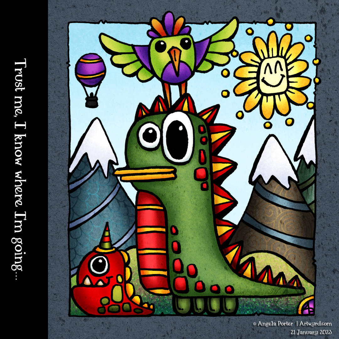
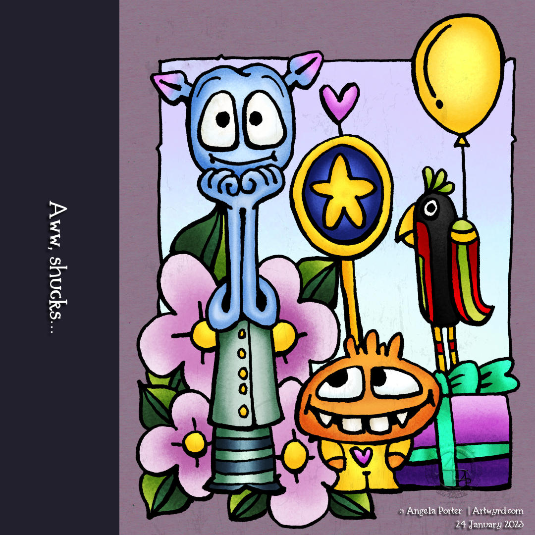
Aww, shucks…

Aww, shucks…

Another daily creepy cute critter. Well, almost daily. I’ll explain more in a moment, first to this lovely bunch of pals, or not lovely, depending on your interpretation.

I’m not sure what the possible story is or what stories are here. But that’s part of the fun. I suspect we’ll each see what makes sense to us, given where we are at any particular moment. I feel the tall one is having an aww shucks moment, especially as the ears are blushing (not the cheeks!). Is it a celebration? Or surprised someone would think of them, and the little one is rolling their eyes… again! Is tall always blue in colour, or is it a sign of their low mood and the others have thought to cheer them up?

But, of course, that is just one interpretation. It’s fun to muse about what’s going on for sure.

‘Puter Probs…

I’ve been missing from blog posts, social media and YouTube for a few days thanks to some computer problems. But all seems to be fine now, and I have a shiny new laptop that will function as a backup for digital art should my main computer have problems again. I have no idea what went wrong, but I went into full flap and panic mode. Or, an enormous flap and panic mode as I was already overwhelmed with a second deadline looming at the end of this week. The only problem with the new one is the pen on the screen is not as good as my main puter. So, I see a drawing tablet in the future, just in case…

I still have a lot of anxiety left over from this flap and panic, which is tiring me out. But that will fade. Tea will definitely help this morning! As will some art just for art’s sake too.

Trust me, I know where I’m going…

But who is leading, and who is doing the trusting? Little, big, bird or balloonist?

And how many times have we all heard that particular statement, only to find out they didn’t know where they were going. Sometimes that ends in disaster, but sometimes it results in a fantastic adventure!

All I know is there are multiple possible tales to be told from this illustration. And that kind of excites me!

Drawn with a Tombow Fudenosuke pen on paper. Colour added using Clip Studio Paint. Tradigital art.

A Grand Day (Creepy Cute Style!)

Where has this monstrous mushroom been? And why has the raven accompanied him? The sun has set on the day, and the stars twinkle in an alien sky. Yet the mushroom has managed to acquire a cute heart balloon and a rainbow lollipop, and a bit of a sickly complexion too. Where in the galaxy have these companions been and what have they been up to?

I’m sure there’s a story to tell, but if there is, these unlikely companions are keeping it to themselves… for now. And if I know the tale, and I’m not saying I do, then I will have been sworn to secrecy too!

I could be accused of having too much fun with my creepy cuties (Kreepy Kuties?). Does that bother me? Not one tiny bit! I’m enjoying drawing, exploring a new kind of style to add to my toolbox, and just plain indulging myself in some creepy, crazy, cute, critter-y, klutzy monsters!

I finally turned to digital art to colour in my pen drawing. What a sigh of relief I gave as I did so. Yes, it’s fun to add colour with traditional media, to a degree in my case. But it’s so much more satisfying for me to add colour and texture digitally.

Traditional pen drawing on paper combined with the addition of digital colour makes it tradigital art!

Colouring page for 11 Nov 2022

Usually, I gift a colouring page to Angela Porter’s Coloring Book Fans Facebook Group on a Thursday. This week, it’s been delayed by a day, but I do hope it’s been worth the wait.

This week, it’s a flowy, swirly, abstract mandala. There is a lot of potential for playing with contrast to bring out depth, dimension, volume, layers … There’s no right or wrong way to add colour, the only essential is to enjoy! Oh, and find calm and relaxation as you do so too.

I used a limited colour palette for mine. Though I’d started off thinking I wanted to keep the colours pretty much flat, like in Arts and Crafts or Art Nouveau, but it didn’t end up that way. The colours are, however, inspired by some work in these movements, just given a slightly more modern and ‘Angela’ feel to them.

Moon Poppies

A bookmark decorated with whimsical and stylised ‘moon’ poppies.

I really enjoyed drawing this one and adding shades of blue-grey to bring out the volume in the drawing. Of course, there is a drawing tutorial on YouTube showing how I created this bookmark.

Whimsical, stylised Seed Pods #ComeDrawWithMe #DrawWithMe

I love seed pods! They are often so architectural in nature. They lend themselves to whimsy and stylised drawings so well too.

I love giving them sturdy stems with tops that look like column capitals. The leaves on these are inspired by medieval illuminated manuscripts, something else I absolutely love!

For the panel behind them, I decided to keep the pattern fairly simple – Tripoli, a Zentangle tangle pattern.

If you’d like to draw your own seedpods, then take a look at the accompanying draw with me tutorial on YouTube.

Colouring Page – 3 November 2022

This week’s colouring page is a typically ‘Angela’ entangled one; it’s just what wanted to flow out of my pen today. And that most probably has a lot to say about what’s going on in my subconscious today. I’m well out of sorts for sure. I think I know what is causing it, but, like the weather, it will pass along.

Inktober Tangles 2022, Days 26 and 27 – Feliz and Narfello(ish)

Click on this link to view today’s drawing tutorial (for the bottom design) on YouTube.

Oh, I got my right royal knickers into a twist today over Narfello! I ended up doing two videos and still managed to muck up with Nafello.

The top design was my first attempt. There are lots of things I like about it. But after nearly an hour and a half video, I convinced myself I’d made a total mess of Narfello. So, I drew breath and started over and produced the design at the bottom, but without the colour; I added the colour while the video was uploading and processing.

Even with the second attempt, I still managed to not get Narfello ‘right’. But I think it’s probably close enough for today.

I’m so glad I did a second version, as I like my Feliz (to the left). I like the way the variations gradually change from left to right (or right to left!). It feels more coherent than the first version of Feliz, where I went to town exploring ways to fill the pattern!

I also like how the Narfello-ish appears from under the Feliz in the second version. I can see that I need to add some quite intense shade to the right of the Feliz to enhance this illusion. However, I’ve just about run out of energy for today, so that is a job for another time.

One thing that I am enjoying is the contrast between the geometrical Feliz and the organic, flowy Narfello.

I’m also pleased with how much volume I’ve created using monochrome Arteza Everblend markers, particularly on the bottom design.

Both of these designs will end up in my sketchbook. There are some variations in the upper one I’d like to try. The lower one is a reminder to look at how I can slowly change the filler patterns, if that’s the right term, to change the pattern subtly.

I really have enjoyed working with this pair of patterns. I hope you take a look at the accompanying drawing tutorial on Youtube and have a go at drawing your own version!

“Thistle” – An Art Nouveau Inspired Drawing

I’ve spent some time over the last day or two looking at Art Nouveau flower designs. I was particularly fascinated by a thistle design.

This is my interpretation of the design drawn with Copic Multiliner SP pens (0.1, 0.25 and 0.5) on paper. Then, after scanning the drawing, I added colour digitally using Clip Studio Paint. So, this counts as ‘tradigital’ art!

I chose a simple colour palette; I was inspired by William Morris, the Arts and Crafts Movement and Art Nouveau. And, the colours are more mellow than is, perhaps, characteristic of my work.

The version on the left has just flat colours, no shade or highlight; I let the contour lines suggest volume. This is more true, I think, to the Arts and Crafts Movement and Art Nouveau.

To the version on the right, I added some shadows and highlights, but subtly for me. And even though they are subtle, they have a distinct effect, which surprised me.

These show just two of the many coloured backgrounds I tried out. This is why I love adding colour digitally! It’s so easy to try out different colour combinations, methods of adding colour, and so on.

Which version do you prefer?

I like them both, but I think the one on the right is my favourite; I like the stronger background colour which allows the flower to ‘pop’. I also think the subtle shadows and highlights do add a little something to it too.

“Bs” – Inktober Tangles 2022, Day 21

YouTube drawing tutorial.

Bs by Midori Furuhashi CZT is a lovely floral zentangle pattern, yet it managed to throw me a few curve balls! I explore this pattern in today’s YouTube drawing tutorial video.

However, those curveballs helped me to better understand the tangle. They also helped me discover some interesting variations and a beautiful flower bud too!

I tried adding some texture lines and patterns to the petals, but they just didn’t feel right. However, using colour to add shadow and highlight worked well. To do this, I used Inktense pencils and a water brush. They reacted in some surprising, but nice, ways with the Distress Inks (Picked Raspberry, Seedless Preserves and Villainous Potion) I’d used to add colour to the paper.