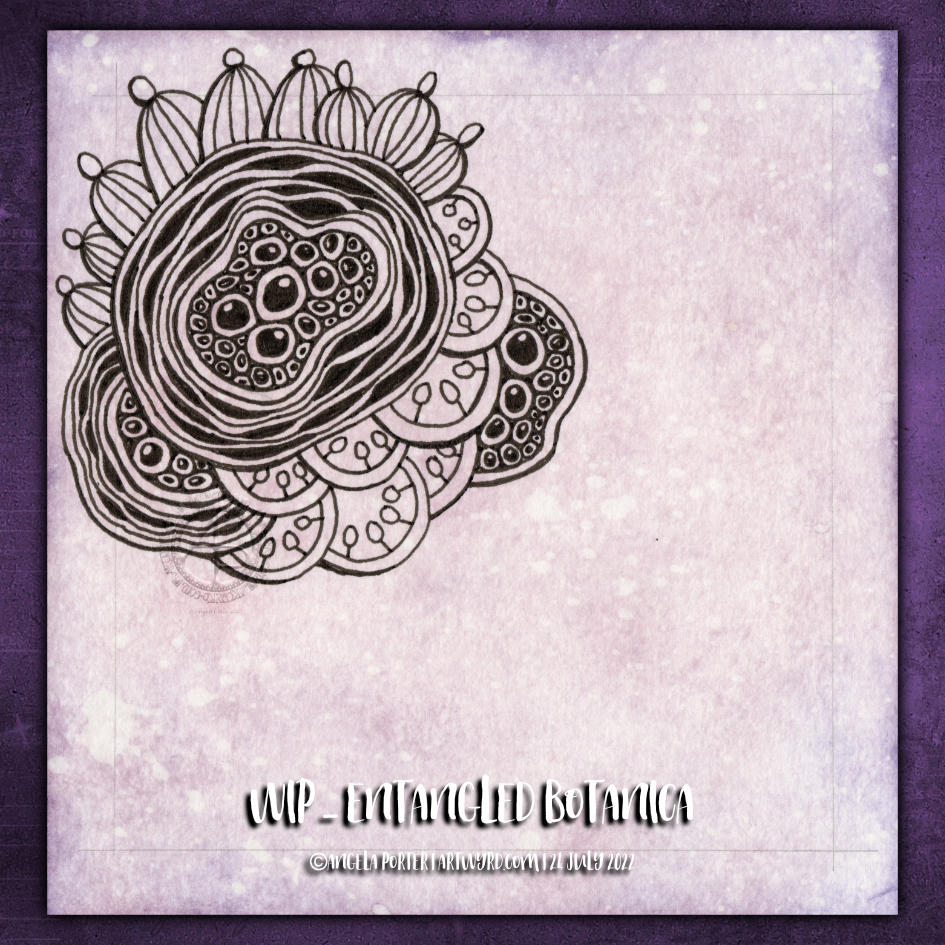
Botanica. Botanicals. Abstract, stylised and imaginary seed pods. Pen drawing. Entangled, intricate, with a touch of the Zentangle tangle pattern Diva Dance.
All some of my favourite things to draw. No idea how it’s going to turn out, just letting it flow as it needs to. One of my favourite ways to create!
And there’s a video showing how I drew this design, as far as it’s got, over on YouTube, if you want to draw along with me!
Just enough time before the heat has become uncomfortable to layout a mandala grid and complete the central motif. This was a lovely way to spend a wee bit of time this morning.
The video takes you through, one step at a time, how I got this far.
Now, it’s just about time for me to move myself to a cooler part of my home for the rest of this heat-scorched day.
Drawing Zentangle Tangle Patterns Spoolies and Swerve and adding contrast/colour.
What to do on a Sunday morning? Arty things of course!
So, yesterday I drew the design to the right and added some colour to it. But it was lacking something. I eventually worked out, at around the same time someone made a suggestion on my YouTube video, that it needed more contrast.
So, I set about doing just that, as well as showing/explaining how I add weight to lines to help increase the contrast and sense of volume. That’s what the greyscale drawing is all about.
For the other one, I used sepia and red oxide Inktense pencils and a damp brush to add more colour and increase contrast. I made some bad decisions in adding cross-hatching to some of the elements of that design. But that meant it was a great piece to work on improving my skills.
I’m often way too timid with contrast, at the start. But as long as I use a medium that allows me to gradually build up layers, I eventually get there.
Today’s video shows how I achieved this higher contrast finish with both line weight and colour/shadow, and you can watch it by clicking on this link.
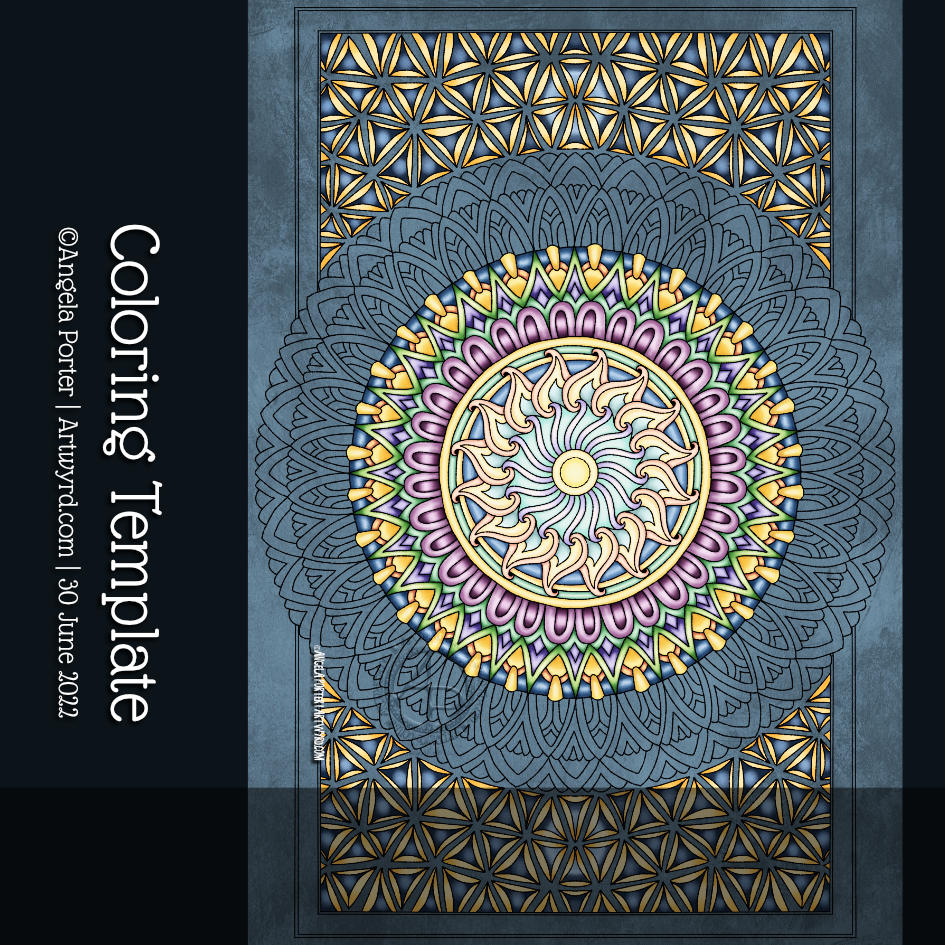
Mandalas are mesmerising to me. There is something so soothing about their rhythmic, symmetrical design. Creating volume in the design is always part of the fun! Choosing colours is always a bit tricky for me, however. So today I’ve gone with golds, yellowy greens and turquoise blues. A fairly analogous colour scheme, which means the colours will always work together.
I’ve not finished colouring the mandala, and it’s likely to sit unfinished somewhere on my hard drive. But it’s fulfilled its purpose of making me smile; a contented half-smile that is accompanied by a soft, warm, glow in my heart. That’s such a lovely feeling, and it took me many years of EMDR therapy to discover what contentment was. That glow, my touchstone of contentment, is always there. I can sense it even when the dark storm clouds of some emotional upset gather. It’s like a gently glowing lantern that leads me on through the storm back to contentment. It’s an amazing thing for sure!
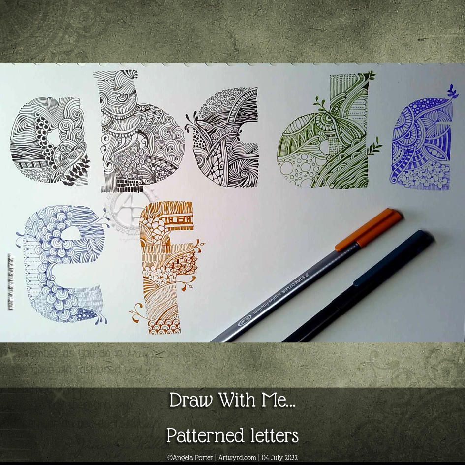
Phew, what a day! First, I focused on getting some of the final templates for “Fanciful Birds” done. I have just two left to do tomorrow.
After several hours working at a computer screen, I needed some time working with pen and paper. So, I continued with this page from my hand-lettering sketchbook.
I started this page yesterday and completed the ‘e’ and ‘f’ in today’s YouTube video.
The ‘e’ is completed in a dusty blue Chameleon fineliner pen. For the ‘f’ I used a rusty brown Staedtler Triplus fineliner.
I’m not at all fussed on the lilac ‘e’ on the top line. I much prefer either black or the more vintage, muted tones. That seems to be a bit of a theme with a lot of my art.
It was lovely and relaxing to just draw for the pleasure of drawing, and it was really comforting to return to this kind of intricate, abstract, patterned kind of art too.
I’m feeling a tad delicate today. I ate something that disagreed with me yesterday it seems. So, some soothing art needed to be done, with no pressure involved.
Mandalas are drawings I turn to when I need soothing. I know they’ll work out for me, that I can indulge myself in abstract patterns, and even if the colours are a bit of a mess, they kind of work out in the way a kaleidoscope always does.
Having said that, I’m fairly happy with my colour scheme! The only thing I’d change is the saturation of the colours in the centre; they look a tad insipid next to the next few rings!
I really like the way the Zentangle pattern Tripoli looks all bumpy at the top and bottom too. That playing with shadow and highlight is something I really, really love.
I woke before 5am today and so I did what I do until I’m ready to go back to sleep – letter and/or draw.
Today, this quote from the wonderful Maya Angelou appeared on my Facebook newsfeed. So, it deserved to be used in some way.
This lettering thing is still vexing me. Today I thought I’d try using some vintage, grungy lined paper from a digital download from WhichCraft Do You Do.
Yes, lined paper. Because, why not! Not that it’s made much of a difference to me feeling a bit better about my lettering. But, you gotta keep trying things out until you find what just sits right, yes?
Next step, after gluing the quote in what seems a suitable space on my sketchbook page, was to add patterns to the background. I started with the border of the Zentangle pattern Crescent Moon around the quote. Then, I added the river of Diva Dance upon which the quote floats. The tangle pattern at the bottom is Crazy ‘Nzeppel.
It seem that looking at and creating some work inspired by Rebbeca Blair has influenced me here. Instead of splitting the background up into smaller sections, like a quilt, I’ve worked in layers that look a bit like torn paper. Now that is an idea to explore further.
I’ve started to add colour with Inktense pencils – Red Oxide and Deep Indigo so far, but I will use some Mustard too. I also intend to add some gold to design, probably in the narrow channels either side of the rusty red section and a few ‘Nzeppel ‘pebbles’.
I think I prefer the torn paper edge of the quote panel, though I may re-try this with straight cut edges.
Digital Downloads
Using digital downloads is a bit new to me. Well, in this fashion at least. I have used digital backgrounds a lot in my digital art, and still do. But printing them out is something I’ve not considered before.
I do think I could make my own papers, going forward, to use in this way. All I need to do is remember to scan them in before using the paper! Easier said than done though. We’ll see.
Having some papers already in my digital stash is a worthwhile start to experiment and see where this leads me.
I’m most probably not the first to discover this, but it is entirely new to me!
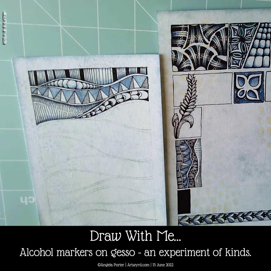
Early this morning, I added some alcohol markers to a pen drawing I’d finished. I’d drawn over a Distress Ink background with some old book pages collaged and gessoed onto it.
I know gesso coats a surface with a waterproof and slightly textured finish. I do know this. But that didn’t occur to me as I added alcohol markers to the drawing.
I was absolutely delighted with the interesting variations in the intensity of colour that resulted. Also, the application of alcohol marker also brought out the texture where the gesso was patchy, even a little bit. The paper soaked up so much more colour than the gesso – duh go me for not realising that first, but that’s not the important thing – it’s the effects that result!
It’s not all that easy to see on the image to the left. But, behind the triangular pattern, I used just one soft blue marker, but you can see the variation in intensity! Usually, it would be a very flat kind of colour. The darker areas are where there is no gesso.
This is something I really want to use as I go forward. I love the crazy, random variations in colour and texture that happen. It seems to me a way to bring a little unpredictability to the rather predictable results you get with marker pens.