
In today’s YouTube video #DrawWithMe, I finish drawing the mandala or zendala design.
I’m quite happy with the finished project. Next step? Colour, shadow, highlight, or any combinations thereof!
In today’s YouTube video #DrawWithMe, I finish drawing the mandala or zendala design.
I’m quite happy with the finished project. Next step? Colour, shadow, highlight, or any combinations thereof!
Link to the accompanying #DrawWithMe YouTube video.
Phew! It’s another scorcher already! I feel so drained, and it’s not even 11am. Mind you, I have been awake since around 5am, again.
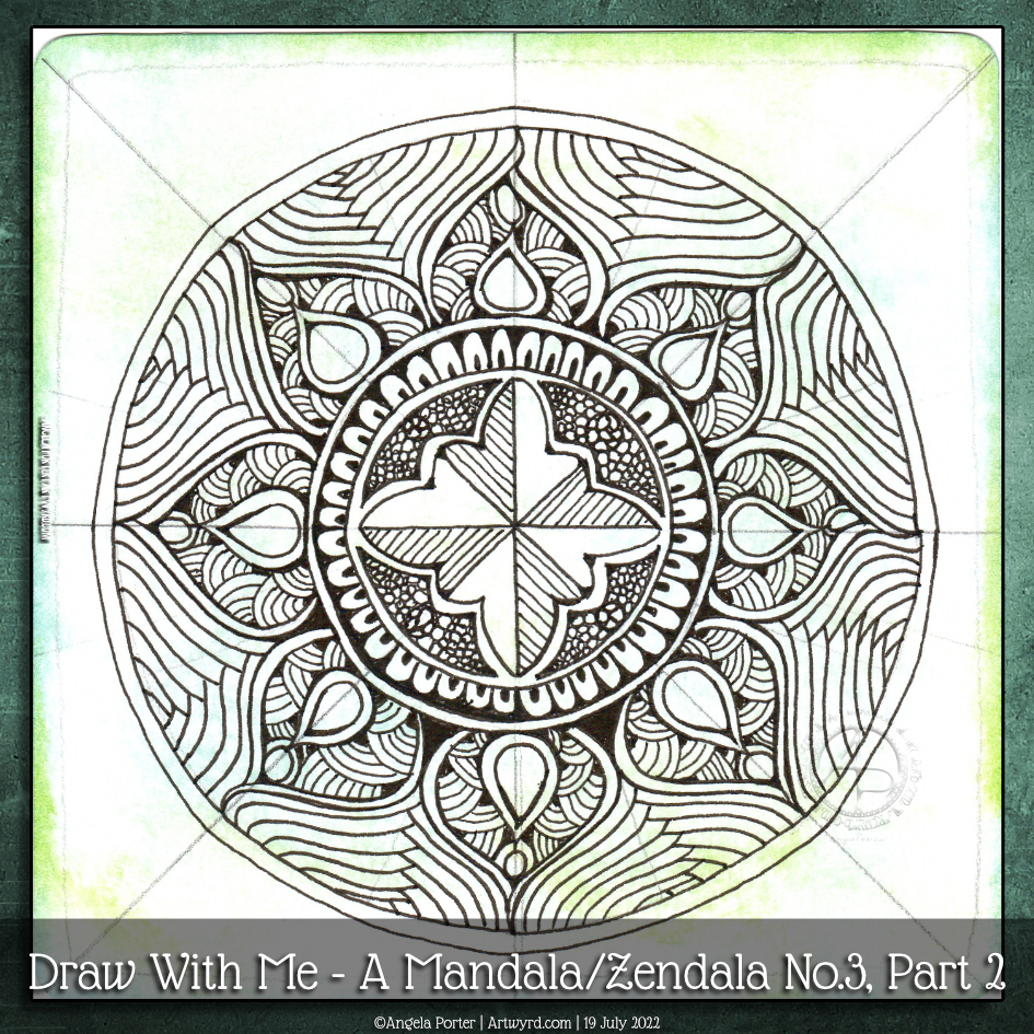
Waking early has it’s benefits in this seriously hot weather; it’s cool enough to get some things done early on. Such as today’s video where I draw some more of this mandala.
I’m quite happy with how this mandala is taking shape. I know that shadow/highlights, and/or colour will really bring some dimension to this design. But first, I need to finish drawing it. And work out how to set my scanner up so the background colours don’t get washed out…
Today is not the day for that. It’s way too warm, and I need to retire very soon to a cooler part of the house.
Just enough time before the heat has become uncomfortable to layout a mandala grid and complete the central motif. This was a lovely way to spend a wee bit of time this morning.
The video takes you through, one step at a time, how I got this far.
Now, it’s just about time for me to move myself to a cooler part of my home for the rest of this heat-scorched day.

Link to today’s YouTube video tutorial
In today’s YouTube video, I show how, step by step, I draw a mandala, or zendala, with traditional media. And the help of the Markus Operandus for Mandalas from Zentangle.com! A nifty printable that helps set out a mandala!
I’ve used two tangle patterns in this design – tripoli and between. I’ve taken inspiration from each to complete the outer ring.
To start with, I pre-cut a piece of ClaireFontaine Paint On mixed-media paper using an 11cm circle die, and a Sizzix Big Shot die cutting machine. In fact, I cut four at 11cm and four at 9cm in size, so I have a few that are good to go.
Next, I coloured one large and one small circle with Distress Inks. Then, I set about using the Markus Operandus to lay out the basic bones of the mandala.
Only then could I start to draw the design, though I had no idea what I was going to do.
The photo above is the final mandala. I used Arteza Everblend markers to add shadows to the zendala. A white gel pen was used to add dots of white for highlights. A silver Gelly Roll pen was used to add silver to the fine ring borders, to the circles and to the darker areas in the tripoli pattern pieces.
I’m quite happy with the outcome. More so, as it’s been a very long time since I drew a mandala without using digital tools.
Today’s video is rather long – well over an hour. It’s kind of a celebration that I’ve reached 900 subscribers on my YouTube channel! I never thought I’d get even one subscriber. So, a huge thank you to you if you’re one of my subscribers.

The past couple of days have seen me creating videos that go in a slightly different direction to my usual.
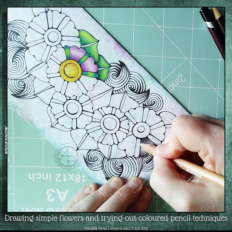
Yesterday’s YouTube video was a look at using and blending coloured pencils – not a skill I’m great at, especially when it comes to choosing colours.
I carried on experimenting with my drawing and trying out various media either alone or in various combinations – coloured pencils, Inktense, and/or graphite. I quite like the way graphite dirties up the colours and creates an almost metallic feeling. Not a shiny metallic, but a dull kind of one.
Today’s video was a response to a comment left for me on YouTube about fineliners smearing with alcohol markers. So, I thought I’d do a look at some of the various fineliners I have, the tricks I use to avoid this, and a bit more about achieving contrast, volume and blending markers.
Click on this link to watch the accompanying video on YouTube.
One of my YouTube subscribers (Chen Keith) requested I draw some simple flowers and show how I’d use coloured pencils to colour and add contrast.
Drawing, not a problem! Colouring? Yeuch colour choices! But I do show different approaches I use to adding colour with coloured pencils, or rather what I’ve done in the past. I rarely ever used coloured pencils now. Digital coloring or marker pens are my mediums of choice, with Inktense and the Karin Brush Markers close behind.
While the video was uploading and processing, I did try out other ways of adding colour and/or contrast. It’s way too hot here in the Valleys of South Wales for me to think clearly and explain things at the moment. The heat is making me feel very, very tired.

What to do on a Sunday morning? Arty things of course!
So, yesterday I drew the design to the right and added some colour to it. But it was lacking something. I eventually worked out, at around the same time someone made a suggestion on my YouTube video, that it needed more contrast.
So, I set about doing just that, as well as showing/explaining how I add weight to lines to help increase the contrast and sense of volume. That’s what the greyscale drawing is all about.
For the other one, I used sepia and red oxide Inktense pencils and a damp brush to add more colour and increase contrast. I made some bad decisions in adding cross-hatching to some of the elements of that design. But that meant it was a great piece to work on improving my skills.
I’m often way too timid with contrast, at the start. But as long as I use a medium that allows me to gradually build up layers, I eventually get there.
Today’s video shows how I achieved this higher contrast finish with both line weight and colour/shadow, and you can watch it by clicking on this link.
In this video, I take a small panel of some paper coloured with Paper Artsy Fresco Paints and white gesso and create a small design. Seed pods, Mooka, and a spiral shell – some of my favourite things to draw!
I used Inktense pencils and a damp brush to add colour and shadow. Finally some gold dots for the seeds in the pods.
Small, but nice enough and a needed change while my mind processes what I’m doing with collage and lettering and, and, and …
Today, I’m experiencing some emotional ‘weather’. I know what the trigger for this is. I know what to do. And I also know that being creative will help me greatly. So, I decided to start to add colour to this bird drawing.
This may not be the best time for me to tackle colour. I feel I struggle with colour at the best of times. Still, I worked with a limited colour palette of blues and turquoises, as well as yellow, orange and red.
The Distress Ink on the paper reactivates with water, so there is some ‘greening’ of the blues. I’m fine with that. The mixing of colours will lead to a bit more harmonious outcome, I trust.
Oh, I’m using Karin Brushmarker Pro pens to add colour. They have watercolour ink in them, so I’m scribbling them onto a white plastic palette and using them from there. This way, I have a bit more control of the intensity of colour and how they blend and mix.
So far, so … OK I think.
I now need to work out how to tackle the body of the bird. Do I use masking fluid to cover the dots before or after painting the body? Should I use something like a gel medium to seal the dots once I’ve coloured them in before tackling the body? Or what about a clear glaze pen, even though the dots will be slightly raised and shiny?
I don’t have any masking fluid, but I’m not sure what I want to do. So it’s time to sit and let the possibilities be worked through in my subconscious to come up with a decision.
One thing’s for sure, however. I will not be starting work on the flowers and leaves until the bird is finished! And I will need to be careful about the colours I choose. That’s where it can all go totally wrong.
For the rest of the day, I’m going to lose myself in some hand-lettering practice in my hand-lettering sketchbook. There’s a lot swirling around in my emotions, my mind and my subconscious.
Click on this link to see a video showing how these designs were drawn.
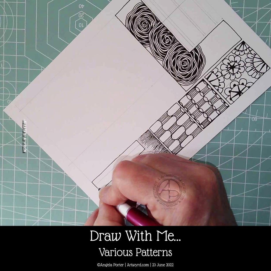
I needed a break from digital drawing this afternoon. So, I did some traditional drawing!
I want to hand letter a quote in the top left corner, but first, panels of patterns are going to be completed. They weren’t all done in the video and I’ve yet to add any more. But I will!


