I’ve been asked several times if I’d make my visual dictionary, pattern and motif collection, journal or art zibaldone available for others. I’ve shown it a few times in videos. It’s my go-to reference when I need some inspiration for my art.
So, today, I thought I’d take some elements from a current WIP and start to put a page together.
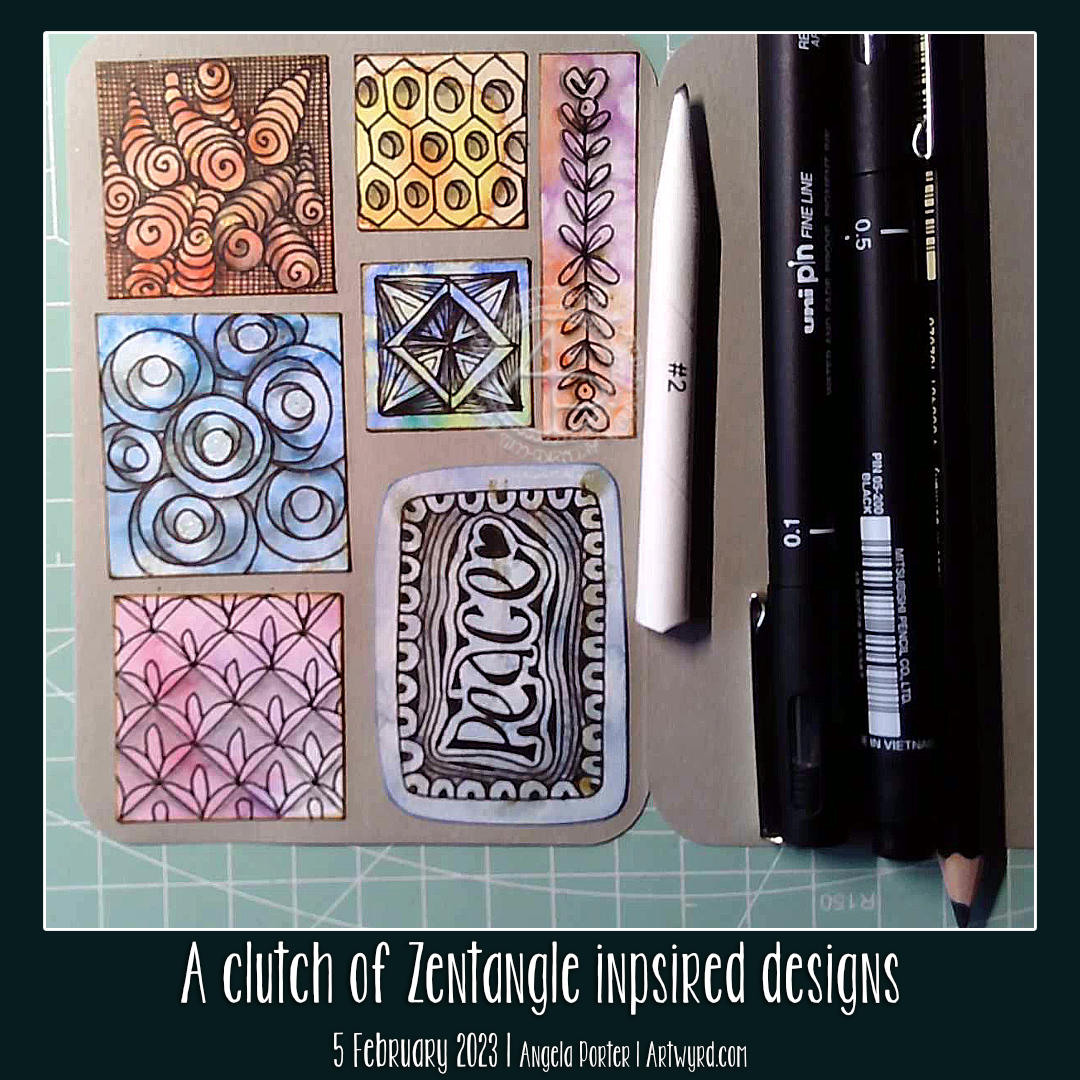
I used a piece of A5 dot grid paper with holes punched in it for a six-ring binder. However, I may use an A5 dot grid notebook. To draw the design, I used an 05 Sakura Pigma Micron Pen. Shade was added with a 2B matt Pitt graphite pencil and paper stump/tortillon.
I enjoyed doing this. It was fun to add alternative ways of approaching various elements. That’s how I like to work in my visual zibaldone. And, of course, the variations are not exhaustive! No doubt more will appear in time, either in the zibaldone or in some artwork.
That is what I love doing. Varying and shifting the pattern or motif into something new and different.
Of course, I have filmed myself drawing this page so far, and you can draw along with me by clicking this YouTube video link.
It took me a long time to summon the oompf and draw. And my creative brain defaulted to this style of art – comfort art. It’s familiar to me and doesn’t need much focus. I trust my intuition. And the last pen stroke determines the next. There’s a flow to this kind of drawing that is soothing, calming, and healing. And I really, REALLY need that today!
It’s been a very people-y week. I’ve been overwrought emotionally and mentally for a few weeks now, at least a few weeks. And venturing into the world where I’ve had to interact with people means putting that smiley, happy mask on. And that is very draining all on its own.
Although time with one friend this week helped to sort out where I was latching the fear and anxiety, my upset and downright glum mood was not where it should be docked.
But, the fear, anxiety, exhaustion and inner gloom have settled in again. I am peopled out. While I’m this emotionally and mentally tired, I can’t trust the thoughts that arise from the emotions. Yes, that anxiety has been there for as long as I can remember. It has been relatively quiet for the past three or four years since I found my touchstone of contentment. However, things are happening that have provoked the beast. I’m trying to remember and re-learn that I can feel anxiety even if there is no reason to. My mind will try to find a logical explanation for it.
So, today has been a day where I need some time to recover. I must remember how to be gentle to myself and give myself the space I need to express my emotions and rest. Drawing entangled art, my default style, was in order. And a hefty dose of Star Wars has definitely been needed! Oh, to be a Jedi!
Ice cream would be most welcome too. However, it’s not good for me, so I’ll decide what to eat later.
This was an interesting experiment. I was inspired by a video tutorial by Ellen Crimi-Trent Artist. In the video, she used a charcoal pencil to create an abstract line design. Next, watercolours were used to fill the spaces. Finally, details were added with pen.
I thought it could be a lot of fun to use this as a way to display some Zentangle style patterns. So I did! However, in true Angela style, I’d first tried not only a charcoal pencil, but a watersoluble graphite pencil, an Inktense pencil and an Inktense Outliner to create the grids on separate pieces of mixed media paper. Then I added watercolour to them to see which method of laying out the main pattern I liked the most.
As it turns out, it was the charcoal! I didn’t expect that!
I filled in the majority of the spaces with tangle patterns. Finally, I used charcoal and white chalk to add shade and highlight to each section of the design. I should say I didn’t do all the sections in the video. Oh, and I added some white highlights/patterns with a white GellyRoll pen.
The intense black of the charcoal really dials up the contrast by quite a few notches! I really did have a lot of fun playing with the illusion of volume in this design.
I’m also glad that I didn’t fill all the sections with pattern; I like that I have some simple, volumised areas whose simplicity contrasts with the complexity of the patterns.
I now have quite a few pieces of coloured, patterned paper to play with in the coming days.
Well and truly people-d out!
It’s true. I’ve not had such an intensely people-y week since well before the pandemic hit. I both feel very much by myself and a little sad about that, but also rather relieved that I get to sigh, relax and breathe for the next couple of days at least.
And with the relaxation may come the introvert hangover or social migraine! Maybe not. I’ll see tomorrow. I know as I take my time to relax, unwind, settle back into my solitary existence I will feel intense tiredness creep over me. Indeed, I can feel it beginning to extend it’s soft cloudy folds and start to enevolop me. I will give in, later. I have a few things to do first! Social media posts, a huge mug of tea, maybe something to eat. And then…I’ll see!
Yesterday, I found the oompf at some point to create this small drawing. The colouring looks messier in the photon than it really is, honest! But I don’t mind the grungy messiness at all!
It was an interesting journey with this design. I kept confusing myself about how to draw the main motifs and got in a right dither at some points. Still, I think it worked out fine in the end. I didn’t finish adding colour/shading in the video, but I will do it at some point…probably.
I’m still on a rollercoaster ride of ups and downs. The tiniest perceived rejection or misunderstanding can trigger a sudden tsunami of upset that takes me from quite content to rock bottom in an instant. That touchstone of contentment gets concealed by tenebrous, sharp shards of brokenness, shame, grief, despair, existential dread, loneliness, and more.
It can take me a while to recover from that sudden drop to the depths of emotions. Art helps, or writing, or, surprisingly, a walk around my local cemetery in the sunshine. I try to put a brave, smiley face on for the benefit of others I may meet or talk to. However, I’m afraid some of this inner angst will spill out. The last thing I want to do is create upset in others I care about or come into contact with. I hope those who know me will understand, especially those who know what is happening here.
Oh, all is fine. Really, it is. I’m just having to learn some, well, a lot of things about myself and understand me a bit more. I’ve been hurled a planetary-sized curveball, and it’s knocked me off my balance more than just a tad. I know that at the end of the process, I will have a much better understanding of myself and, hopefully, a better relationship with myself. But it’s going to take some time and a few hoops to jump through yet.
This design was inspired by a Zentangle Tile I did in the Tea and Tangle session organised and run by Tracy Hough CZT.
I wanted to do a design that was simple (ish?) and didn’t use too many patterns. This will form a page in my accordion journal.
The paper is Clay toned paper from Fabriano. The pens I use are an 0.3 Unipin fine liner and a Tombow Fudenosuke. To add colour, I used some Derwent Drawing Pencils in Chinese White, Pale Cedar and Olive Earth. White dots were added with a white Sakura Gelly Roll pen. Gold details added using a gold glitter Unball Signo gel pen.
Yesterday, I had a stinking cold. One trip to a café for lunch by myself, and I pick a bug up! I’m feeling a lot better today; still not right, but better. Anyhoo, I just ran out of steam after filming the video and uploading it. I had to stop and sleep.
So, the drawing is an unusual one for me. I used an 05 brown Sakura Pigma Micron pen and added some shade/colour with a port Graphitint pencil and waterbrush. The white patterns were added using an 08 GellyRoll pen, also by Sakura.
The paper is ‘naturel’ coloured PaintON Mix media paper by Claire Fontaine, and it’s approx 10cm x 14 cm in size.
There’s more to do in terms of colour, shade and highlight with this drawing. But not today. Today I need quiet time to rest, recover, and maybe do some quiet work. I have three colouring pages to add colour to as soon as possible. Then I can breathe for a while and really take some time to recover my strength, resilience, and equilibrium after what seems like months of hiccoughs, starting with the muscle damage between my ribs nearly three months ago.
I very much enjoyed drawing this design. It all began with a bit of chance. I grabbed my notebook full of motifs and patterns and opened it randomly. On the pages were some Early Celtic Art patterns dating back to the Iron Age. So, I started at the top left with one of these and let the rest of the design flow intuitively. Some patterns and practices were inspired by Zentangle principles. Oh, I did include some motifs inspired by the work of Yellena James.
I love Early Celtic (La Tene) art. It’s full of swirls and spirals and asymmetry too. It just intrigues me so much. Of course, I really enjoy drawing these kinds of non-representational designs very much.
Next, this design will need colour/shade/highlight somehow. I don’t know whether to use Inktense pencils or chalk pastel pencils. Either would work on the paper I used – ClaireFontaine’s PaintON mixed media paper.
I used 0.5 and 0.3 Unipin Fine Line pens from Uniball. The paper measures approx 4″ x 5.5″ (10cm x 14cm).
I love curvy, flowy, abstract patterns and the illusion of depth, volume, twisting, and bending space. And seed pods. And seeds. So lots of my favourite things in this design. I even snuck in a few spirals!
To add shade, I used three cool grey Faber-Castell Pitt Artist Pens. Though they haven’t blended smoothly, I’m quite happy with that. The design looks almost metallic as a result. In fact, I am happy with this design in its entirety. I could increase the contrast a bit more between the darkest shadowed areas and the white highlights. But I can always revisit that in my own time.
After a day of focusing on inking in colouring pages, I needed something a little familiar and soothing to calm some overwhelmed emotions. So, I chose to make a little tag for my accordion journal. To decorate the tag, I created a monogram, a Zentangle style embedded letter A.
As I was drawing it, It struck me how much the folded patterns remind me of metamorphic rocks. That made me smile for sure!
I enjoyed the graphic black and white of the finished design, so I chose not to add any shade.