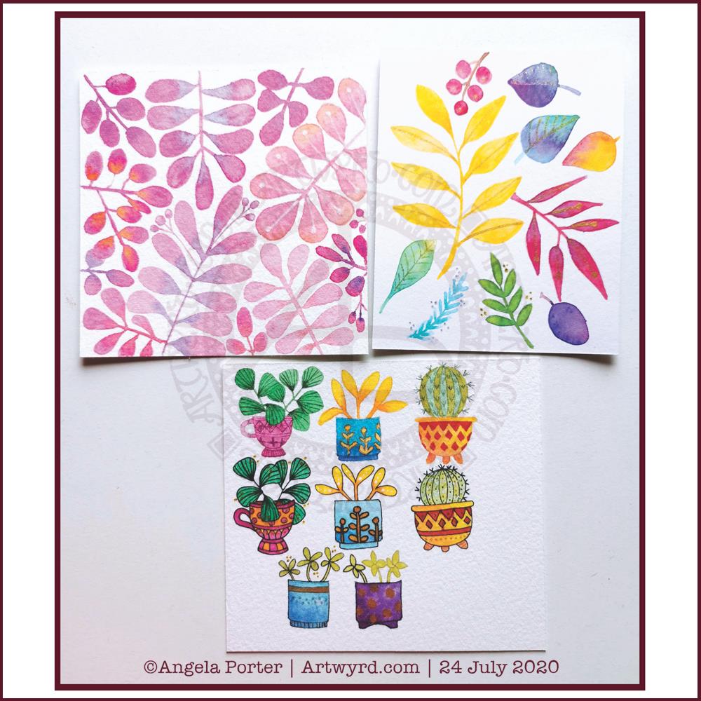
Yesterday, after taking a walk and getting a few bits and bobs done, I settled down to spend some time with watercolours.
Each piece of paper is approx 4″ square. The top ones were just playing around with foliage, wet into wet, and adding some details with metallic ink, a gold glitter gel pen and a white Souffle pen. I just wanted to see how the different details could add to, or mess up, the watercolours.
I do like the one on the top left. It satisfies my inner need to not leave much in the way of white space.
The bottom image was me trying out painting plants in pots – the top row with very faint pencil guidelines and the middle with Pitt Artist pen outlines in black. The bottom two were comparing like ot like with black outline and pencil outline.
I had trouble with the details in the first two plants in pots on the top row. That was when I thought I’d try the black outlines.
I’m really not sure which I like most, or if either of them really work out.
I’m rather tired and headachy, again, today. I think that I’ll soon be going out for a walk. It’s another overcast and cooler day with a breeze. I love to walk on days like this.
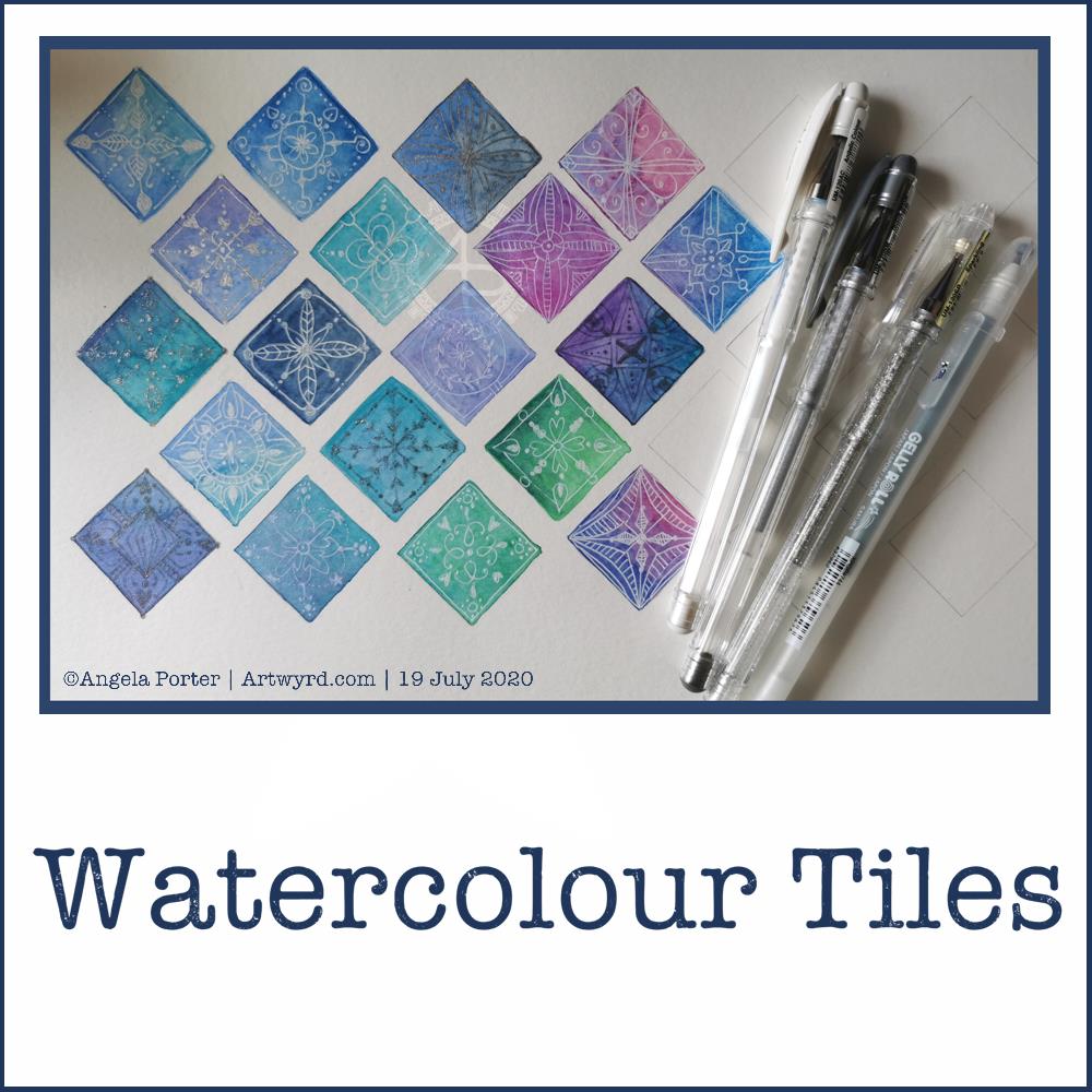
Good news – the headache has gone! Yay! The sun is shining, I have uplifting music playing, and I’ve spent some of the morning practicing watercolour skills and working out how to subtly draw/paint on top with white.
The little tiles at the bottom have designs painted on them with white gouache. There’s a lot more variability in line width with these.
The book marks have had the designs drawn using a white Soufflé pen by Sakura. The ink goes on clear but dries a matt and opaque white.
I used som Molin du Roy watercolour paper from Canson for these. The tiles are approx 2″ x 2″, the book marks are approx 2″ x 7″.
I may mount the tiles on greeting card blanks. The bookmarks need a hole punching in the top and then some string/ribbon threaded through.
I did try out the Sakura Quickie Glue pen and embossing powder yesterday, but really wasn’t happy with it. I also tried using a variety of Sakura pens to draw the outlines before watercolouring – black Glaze, metallic siver Gelly Roll and silver Stardust. They were waterproof, but just didn’t give me the borders for the patterns that I wanted. The black was very bold and gave a rather stained-glass feel to the tile. But, white turns out to be my favourite.
It’s been nice to spend quite a few hours working with watercolours and trying out ideas without any pressure to create anything that is finished. Sometimes making art for the fun of making art is enough and much needed to soothe some rather battered emotions.
Another day, another migraine type headache. Nothing helped yesterday, not even painkillers. I woke up with the same headache, though some painkillers did ease it somewhat, eventually. Enough that I could go out for a short walk around my local cemetery.
I needed to create in order to create a mindful space within me. So, I thought a collection of square tiles may be a nice thing to do. A way to practice with watercolours and to do a bit of pattern making on them.
I used a square template to mark the squares out, not very evenly it has to be said. Faint pencil lines that would, hopefully, become part of the watercolour.
I used Daler-Rowney Aquafine Smooth watercolour paper. That shows how little I was thinking clearly. I really don’t like working on this paper at all. The watercolours dried too quickly, and when they were just wet enough to drop more wet colour into them, they just didn’t flow and mix as I like them to.
I tried using watercolour pencils, with similar frustrating results. So much for this being a meditative, mindful, relaxing exercise!
Oddly, they all look fairly OK in the photo.
Once they’d dried, I used a mixture of metallic silver, silver glitter and white gel pens to add patterns to each tile. I could’ve used white gouache and/or pearlescent watercolours or pearlescent acrylic inks with a fine brush. However, by this point I was so frustrated with brush and wet media that I just wanted to draw. So I did.
It may not be a wonderful, finished, polished piece of art – it was never meant to be. It was practice.
What I may do, on a larger scale, is to heat emboss a design in white and then add watercolours. I can do this using a Sakura glue pen or a versamark embossing pen with embossing powders. Maybe not today, but another day. And I need to use a different paper to the Aquafine to avoid frustration.
7″ x 2″, St Cuthbert’s Mill Bockingford watercolour paper, White Nights watercolours and a Faber-Castell Pitt Artist pen.
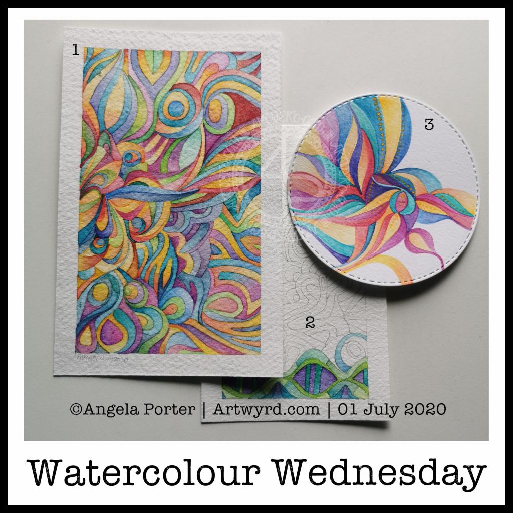
Abstract patterns, bright, almost 1960s psychedelic colours and a small project that doesn’t overwhelm me are what I need today. I’m feeling under the weather, and bright cheery colours and a simple project are what I needed to do.
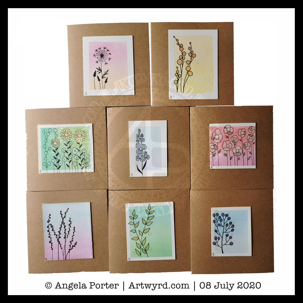
It was a morning for some simple art. Art just for fun, relaxation and self-soothing. So, I thought that small watercolour gradient panels with really simple drawings on them and metallic and pearlescent paint highlights would be perfect.
For the first time ever I managed to create smooth colour gradients with watercolour. The secret, for me, was using a mix of water and gum arabic to wet the paper before applying the colour. Of course, working on such small pieces of watercolour paper helped. Still, it’s a personal achievement!
Once the panels were all done, itseemed a good idea to mount the little panels on some 4″ x 4″ blank cards. So I did just that and added a few more cards to my stash.
Stress and self-care
I had a really poor night’s sleep after the stress of my trip out to the pharmacy yesterday. I woke around 2:30am with a splitting headache and found it hard to get back to sleep. When I did, my alarm went off and woke me with quite a jolt.
I’d set my alarm last night as Wednesday is my delivery day with Able & Cole, and I like to get the deliver in and stored asap.
Once the delivery had come, around 6:30am. I had breakfast and then went back to bed to sleep.
I’m feeling a bit more centred and content now, but I’m still exhausted. So, today will be a quiet, self-care kind of day for me. I’ll be doing my best not to give in to the temptation to take a nap this afternoon so that I can sleep myself our properly tonight.
Last night, I bought a book called “Paint Yourself Calm” by Jean Haines. It’s about playing with watercolours and colour to gain a sense of calm. Not for any other purpose. Not to create great art. Not to produce anything. Just for the sheer enjoyment of working with watercolours and colour.
The concept appealed to me. I do find it hard to let go of the idea that I have to create finished art. I think that’s part of the instinct to start up a sketchbook practice again too. There’s no pressure to complete finished art in a sketchbook.
So, I was taken by one exercise in the book, which is to draw a shape, with watercolour, around five blank areas on the paper, and then colour the rest of the page with watercolours.
I grabbed one of the A5 Arteza mixed media sketchbooks I have. The paper isn’t the thickest and it did warp, but the colour does bloom and flow when the paper is wet in almost as good a way as it does on the high quality 100% cotton papers I have. I was just playing around and, despite the advice in the book, I just couldn’t feel I was wasting some of my best paper.
I used yellow to start with. I needed some sunshine yesterday evening. It had been a dull, grey, high-windy, wet day here in Wales, UK. So, sunshine was needed, and watercolours could provide it.
Once I’d got the area around the white spaces wet with watercolour, I dropped some oranges and reds into it. Small drops that blossom and bloom like tiny flowers and then flow one into another to create patterns of colour.
I also ran water down the page in rivulets to move the colours some more. And I added some pearlescent gold acrylic ink to these rivulets and let it flow and move, blossom and bloom as it wished.
Once it was all dry, I felt the need to add patterns in black pen. I ended up with patterns that remind me very much of plant cells under a microscope.
The whole process was very calming, meditative and settled me down to go to sleep.
Art Journal Covers
To the right of the watercolour, you can see two covers I’ve made for an art journal. I used some really sturdy cardboard and punched two holes in each. This way I’ll be able to use book binding rings to assemble the covers and internal pages. Each board measures 4.5″ x 5″ and I’ll use papers that are a maxium size of approx 4″ square in it.
I covered both sides with white gesso before using PaperArtsy Fresco chalk paints to colour them in a patchy, grungy way. I’m so grateful I hadn’t got rid of them, as I am thinking of having a major clearout of my stash at some point in time.
I wanted the colours to look a bit like the verdigris on weathered copper. Once dry, on the fronts, I added some medium grain texture gel. Once that was dry, I dry-brushed copper paint so it picked up the texture on both the back and fronts of the covers. Finally, I used the copper paint to edge the boards.
You can’t really see the copper in the photos, but it is there! I’m quite pleased with this.
It’s taken me a couple of days to complete this small watercolour. The paper is approx 5¼” x 3¼”. So, it’s tiny and rather detailed.
I stuck to my intention of using blues, teals, greens and purples. This palette gives a rather calming and tranquil feel to the artwork. That was also the mood I was doing my best to create for myself.
I’m usually calm, content when I create. However, events in life can disrupt that to some degree, mainly my ability to relax and settle into my artistic or creative pursuits.
I do enjoy doing these abstract watercolours; the lack of black lines is a change for me, but something I’m learning to be comfortable with. It’s taken me a long time and many, many trials with that. Digital art has been the medium that has helped me find that sense of comfort at leaving out the black lines.
It’s nice that I’m able to translate those skills into more traditional media, particularly watercolours. I love the way watercolours work, but I’ve never found a way for them to work for me. I’ve struggled with them time and time again. However, I think that these abstract watercolour art experiments have helped me.
I love to see people create beautiful botanical watercolours, especially the looser kinds. Whenever I try it, as successful as I may be, it never seems right to me. It never sits ‘right’ in my creative soul. It’s another case of finding out what isn’t me to help me discover, or accept, what is me.
In that vein, my sketchbook is gaining small drawings of abstract designs. Whether I use all of them for paintings is a moot point at the moment. Making use of a sketchbook again is something that seems important at this time. In some ways it’s nice as there is no pressure to get something right or perfect. There’s still quite a bit of the hyper-perfectionist in me, though I’m better at recognising when something is ‘good enough’ to be finished.
RedBubble
Just a little message to say I have a RedBubble shop – there’s a link to it in the sidebar to the right. Please take a look, and a share of the shop would be most appreciated. There’s a wide range of quality products available at prices to suit all budgets.
Last night, I had a play around with one of my latest watercolours in an app that creates patterns from your artwork. The process was mesmerising. I didn’t realise that they now do metamorphosing patterns like these two!
The top image is directly from the artwork, the bottom one has been lightened, the colours more saturated and adjusted slightly.
I fell in love with metamorphosing tessellations thanks to the works of M C Escher, like so many other people. I love the detail, observational skills and the way he plays with the illusion of space.
Anyways, creating these patterns, albeit digitally, was fascinating and something I can definitely lose myself in for hours! Being able to adjust colours in Autodesk Sketchbook Pro or Affinity Photo is an added fascination too.
I like both colour variations of the same metamorphosis above.
I have made both available in my RedBubble Shop on a wide range of quality products. Please take a look and support my art by sharing with others. #findyourthing
I know, it’s been a watercolour day nearly every day for the past week or so. However, I do like alliteration. As did the Anglo-Saxons, who used alliteration in their poetry rather than rhymes.
Anyway, a fair amount of watercolour being done here in the past day.
Painting (1) This one is now finished. It was an unusual one to do as I didn’t start with a sketch, but just added shapes as the painting grew. It’s colourful, for sure, which is my usual way of working with colour. I know I needed some colour to brighten my heart up yesterday.
Painting (2) A work in progress, this one is on a piece of Arteza Premium watercolour paper, which is 100% cotton. It works in much the same way as the other 100% cotton paper I have, but it’s slightly more offwhite, with a yellow-ish tone, than the Khadi paper. It also has a different texture that is finer and not quite so bumpy. I’ve yet to work out which I prefer.
I’ve decided to complete this painting in shades of blue, green and purple, mostly. I’m sure I’ll end up changing that idea, or sneaking in other colours here and there.
With the 100% cotton paper, I am starting to become comfortable with dropping wet into wet and letting the colours spread and blend with each other. Judging the quantity to get the depth of colour and a smooth gradient is still a tricky task for me.
Painting (3) I don’t know what got into my head this morning, but I felt the need to paint a mandala in much the same way that Carl Jung would to start his day with an idea of what is going on mentally and emotionally on a subconcious level.
I also had a kind of bright idea to use a diecutting machine to cut out circles of paper, in this case Daler-Rowney Mixed media paper.
With the first circles I tried watercolour and had really unsatisfactory results. This surprised me given the fairly pleasing experience I had with the ClaireFontaine mixed media paper.
So, rather than use watercolours, I thought I’d try Inktense pencils, using a damp brush to pick colour up from the pencil nib. I also used a solution of gum arabic to help keep the colour wet for longer. Gum arabic also increases the translucency of the pigments, and can add a glossiness to the colour too. This helped the Inktense colours to work more like watercolours.
I also added dots of gold Daler-Rowney FW Pearlescent acrylic inks to the design here and there. To finish the design off. I had thought of adding patterns in gold to the blank areas, but that just didn’t feel the right thing to do. It felt finished, white space and all.
The aim of this painting wasn’t to create a work of art, but to give an insight into what is going on within me at this time. I’ll keep my observations on this to myself. What I will say is I’m feeling out of sorts and rather sad and low today. I have a lot of confusion, anxiety, fear and despair surrounding various things going on and I’m just feeling a bit overwhelmed by it today. It’s all just emotional weather – just as the clouds cover the sun, they will move along by and the sun (or moon) will shine bright and clear once again, so it is with emotions.
I’ve finished the editing for a colouring book due out later this year, and coloured the cover design for the next one. So, I turned my attention to a bit of watercolouring this morning, and this is how far I’ve got.
I actually started this one last night, and it’s taken me around 6 hours to complete so far. Oh, the paper I’m working on is 100% cotton rag and is approx 5″ x 4″ size, but the design is around quarter of an inch smaller on each side. I’m using White Knights watercolours from St Petersburg. I’m also using a grey watercolour pencil to draw the design. This way, the lines will disappear, mostly, as I paint over them.
Nothing much else to say today. The rest of the day is going to be some self-care time.