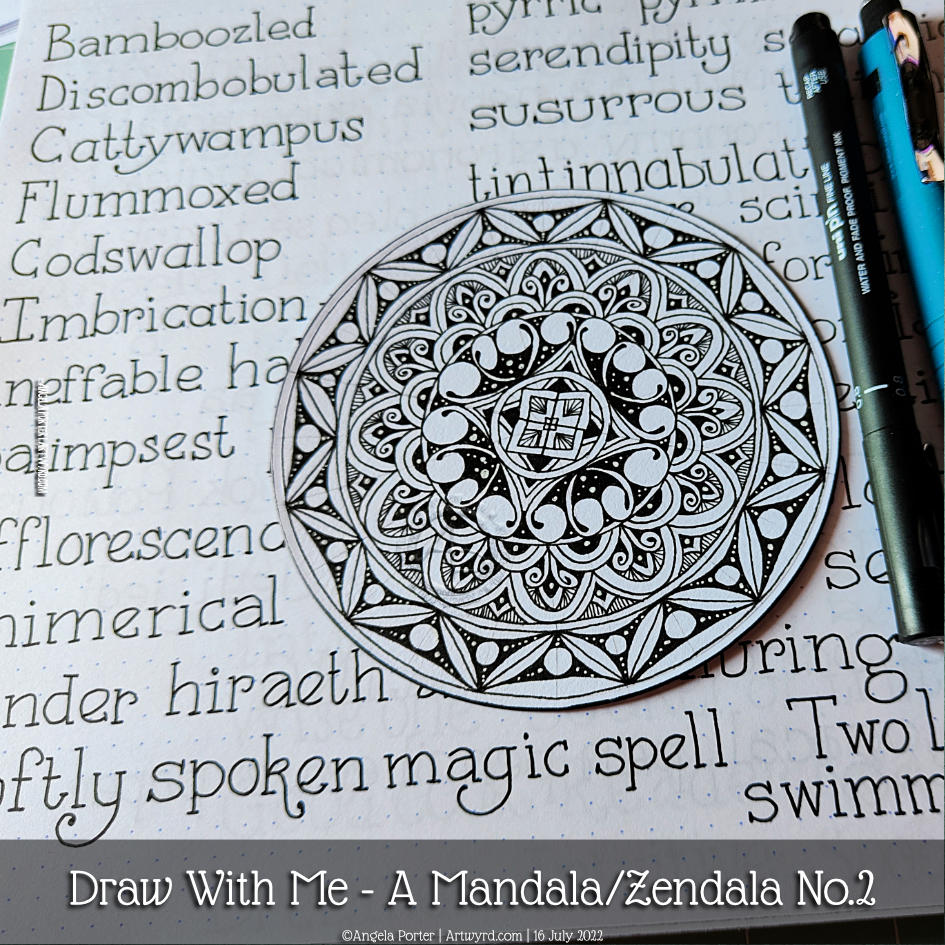
Just enough time before the heat has become uncomfortable to layout a mandala grid and complete the central motif. This was a lovely way to spend a wee bit of time this morning.
The video takes you through, one step at a time, how I got this far.
Now, it’s just about time for me to move myself to a cooler part of my home for the rest of this heat-scorched day.
Please click the ‘Watch on YouTube” button, if you’d be so kind. Cheers!
In this video, I draw a mandala (or zendala) step by step so you can join in with me.
I enjoyed creating yesterday’s mandalaso much, that I thought I’d repeat the experience! I finished drawing the mandala in this video, but I’ve yet to add shadow, highlight and/or colour. I’m not quite sure how I’m going to do that, yet; but there’s no rush to get it done either.
And here’s a photo of the mandala as it is at the moment, with some of my handlettering practice in the background!
Drawing Zentangle Tangle Patterns Spoolies and Swerve and adding contrast/colour.
What to do on a Sunday morning? Arty things of course!
So, yesterday I drew the design to the right and added some colour to it. But it was lacking something. I eventually worked out, at around the same time someone made a suggestion on my YouTube video, that it needed more contrast.
So, I set about doing just that, as well as showing/explaining how I add weight to lines to help increase the contrast and sense of volume. That’s what the greyscale drawing is all about.
For the other one, I used sepia and red oxide Inktense pencils and a damp brush to add more colour and increase contrast. I made some bad decisions in adding cross-hatching to some of the elements of that design. But that meant it was a great piece to work on improving my skills.
I’m often way too timid with contrast, at the start. But as long as I use a medium that allows me to gradually build up layers, I eventually get there.
Today’s video shows how I achieved this higher contrast finish with both line weight and colour/shadow, and you can watch it by clicking on this link.
Last night when I arrived home after an absolutely visit with a dear friend, I found the postman had delivered a set of mini Distress Ink pads in the new colours released last year! It was way too late to do anything with the inks, so I decided I’d have a look at them in today’s video for YouTube.
I started by trying blends of the colours. My instincts were not to mix the salmony pink Saltwater Taffy with the other colours – Villanous Violet, Blue Ribbon and Salvaged Patina. Orangey tones with purple, blue and/or pale green-turquoise colour, would make mud, my instincts told me.
However, when I used them all for one background, I was really surprised by the colours that resulted. They were lovely! No mud! Just lovely, aged, vintage-ish colours. What a wonderful surprise!
After spraying water to create water stains, stencilling and another spray of water drops (drying in between each procedure), I edged each paper with Hickory Smoke. Then, it was time to draw!
I used an 0.1 and 0.3 Molotow fineliner pens for drawing. They’re new to me and so was keen to try them out. The ink is lovely! But, I found the pens rather light and awkward to hold. The natural place to rest my fingers was way too high up the pen to be comfortable.
I’ll use the pens until the nibs are wrecked or they run out of ink, whichever comes first. The ink is very black and very opaque. The nibs do write really smoothly on the paper I used. But, they’re just not comfortable for me to hold, and that comes down to personal preference! Otherwise, they really do seem to be great pens!
I started drawing with the tangle pattern ‘spoolies’ to the left. This is where I noticed how the grip I had on the pen was uncomfortable and making it really difficult for me to draw smooth, precise lines. I ended up doing a mash-up of spoolies and diva dance!
The pointy leaves (or shark fins or points of crescent moons, depending on how you want to see them) actually echo the pointed part of spoolies. These then were replaced by the tangle pattern swirl, which is very similar to spoolies. Finally, the pointy leaves/fins/horns of the moon returned.
As I wanted to lift these off the background, I used a crosshatch pattern to darken the spaces between them.
Then, in my not-so-clever wisdom, I decided to help the illusion of volume and layers along by adding colour using Distress Inks as watercolour inks or paints.
I’m not at all sure about the end result, which wasn’t helped as I decided to splatter gold paint over it.
I often ask myself what on earth was I thinking and will I ever learn. This is another of those occasions. I kept compounding the problem as I tried seemingly good ideas.
As I said, I wonder if I’ll ever learn …
No matter what, it was lovely to be sat drawing just for enjoyment. Even though I’m not happy with the end result, I learned a lot about these new-to-me Distress Ink colours. Also, I’ve learned that a spray of water really can make the background lovely. And it’s OK to repeat sprays as more colour or stencilling or edging colours are added.
But perhaps the most important thing is that sometimes the process, the enjoyment of creating and learning is more important than an end piece that I’m happy with. Perhaps, in the coming hours, days, weeks or months, I’ll be able to look at this with fresh eyes and see it as not as bad as I know think it is!
Phew, what a day! First, I focused on getting some of the final templates for “Fanciful Birds” done. I have just two left to do tomorrow.
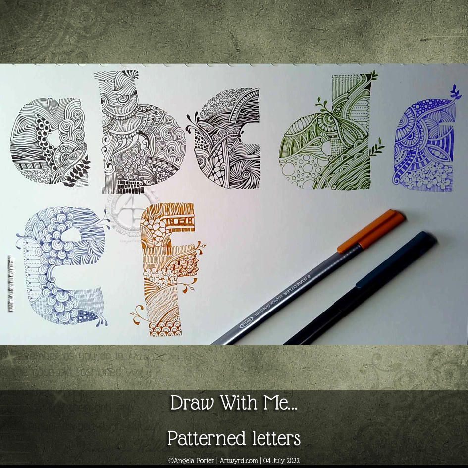
After several hours working at a computer screen, I needed some time working with pen and paper. So, I continued with this page from my hand-lettering sketchbook.
I started this page yesterday and completed the ‘e’ and ‘f’ in today’s YouTube video.
The ‘e’ is completed in a dusty blue Chameleon fineliner pen. For the ‘f’ I used a rusty brown Staedtler Triplus fineliner.
I’m not at all fussed on the lilac ‘e’ on the top line. I much prefer either black or the more vintage, muted tones. That seems to be a bit of a theme with a lot of my art.
It was lovely and relaxing to just draw for the pleasure of drawing, and it was really comforting to return to this kind of intricate, abstract, patterned kind of art too.
Please click on the “Watch on YouTube” button. Cheers!
This was a lot of fun to do earlier today. Before I filmed my process and thoughts, I made some collage papers using Paper Artsy Fresco paints, which are chalky, soft acrylic paints. I remembered I had some in my stash after watching a video about collaging by Art With Em. I suspect I have other acrylic paints somewhere, but the Paper Artsy paints were the ones I liked – they dry quickly, the opaque ones act like a coloured gesso, and they have nice flat, ‘soft’ surfaces which you can write/draw on.
Next, I made some A6 (approx 4″ x 6″) background panels. I added colour with Distress Inks and used a stencil to add some background patterns.
Creating a collage ‘cluster’ was my next step. So, as well as using a torn piece of one of the Paper Artsy papers, I used some digital papers and a quote I’d printed.
The quote didn’t stand out on the damask patterned paper, so I used some Inca Gold Alchemy Was from Imagination crafts to add a sheer layer of gold. When the light hits the gold just right, that’s what you see. Otherwise, the pattern is partly hidden by a dull, gold-brown. I quite like the ghostly look of the print on the paper this way.
As I put this three-layer ‘cluster’ onto the background, I didn’t like the blue-green against the yellow-green of the background panel. So, I used the Inca Gold Alchemy Wax to colour the area behind the panel. And that felt so much better!
Next, I drew some Zentangle style patterns above and below this central collage cluster. To do this, I used olive green and rusty brown Arteza Inkonic fineliners. With the leaves on the Fleavy pattern, I used a damp brush to kind of fill them in with some of the colour. Then, I wanted to bleach out parts of the panels with water splatters. A paper towel picked up the water with some of the ink – pen and Distress- and I ended up with a ghostly kind of pattern. I did the same with the rusty patterns, one of which is the Zentangle pattern Tripoli.
I wanted to add some Peeled Paint and Shabby Shutters Distress Ink to replace some that had been lifted off. Then, to finish it off, I splattered little drops of gold watercolour .
This is so different for me, yet I like it. I know that I’m in my early days exploring and experimenting with this kind of technique. One thing I really do want to do is practice, practice, practice and develop a hand lettering style that will work well with this.
Again, I woke before 5am today, even though I didn’t go to sleep until nearly midnight. This is getting ridiculous!
What else to do until I’m either ready to sleep again or give up on sleep and start my day proper? Oh, art of course!
So, I decided to divide a page up in my lettering sketchbook. Then, I coloured the vertical sections with distress inks. The colour themes from left to right are blue, pink and green, with bits of crossover.
Next step? Collage some papers to create areas for hand lettering to go. That squared paper needs to be toned back a bit – white gesso will be just the ticket!
Then, I did some hand lettering and added some patterns. I thought I’d use some fineliners – Inktonic Pens from Arteza to be exact. the collaged paper does like to soak the ink up when just the edge of the pen nib touches it.
Fineliners are not my favourite pens to colour in with. But, they usually have water-soluble ink in them. So, on the lower panel, I used a damp brush to move the ink around to even out the colour.
On the upper panel, I splattered some water on it and used a paper towel to lift the water up. That created a nice splatter pattern. Then I had a thought, “What would happen if I sprayed water on it, lightly and used a paper towel to pick the water up?” I lost the pretty water-bleached spatter patterns. But, some of that ink really bled into the edge of the collaged paper. That was unexpected and rather interesting.
So, some more interesting experiments with this idea I’m working with.
Oh, the letters of lacuna had colour added with a deep indigo Inktense pencil, brush and water.
Oh, I did use a pencil to write out the letters and position them, and I still made a pig’s ear of the ‘And still I rise”. Sheesh! Perhaps I’m being way too critical of my own lettering and what is there. I focus on all the imperfections I perceive, rather than taking a step back and trying to see what I’ve drawn and lettered through someone else’s eyes.
I managed to get myself totally engrossed in creating these small designs in my lettering sketchbook.
I much prefer the quote in a band across the whole design, though I do have to work on weight of line, the arrangement of words and so on.
This leaves, of course, plenty of space for bands of patterns and different colours and so on. which has been fun and kind of interesting to do.
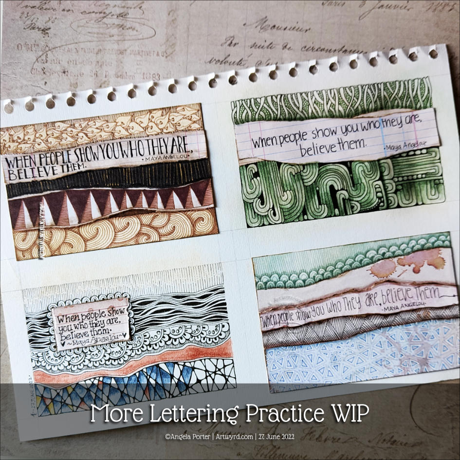
I don’t know how many of these I had to redo the quote as I misspelt ‘believe’ in ink. Another note to self – pencil in the quote first and then check the spelling and adjust the arrangement of the words!
The one at the bottom left isn’t finished yet.
My two favourites, I think, are the top two. Monochrome colour schemes, no surprises there!
I woke before 5am today and so I did what I do until I’m ready to go back to sleep – letter and/or draw.
Today, this quote from the wonderful Maya Angelou appeared on my Facebook newsfeed. So, it deserved to be used in some way.
This lettering thing is still vexing me. Today I thought I’d try using some vintage, grungy lined paper from a digital download from WhichCraft Do You Do.
Yes, lined paper. Because, why not! Not that it’s made much of a difference to me feeling a bit better about my lettering. But, you gotta keep trying things out until you find what just sits right, yes?
Next step, after gluing the quote in what seems a suitable space on my sketchbook page, was to add patterns to the background. I started with the border of the Zentangle pattern Crescent Moon around the quote. Then, I added the river of Diva Dance upon which the quote floats. The tangle pattern at the bottom is Crazy ‘Nzeppel.
It seem that looking at and creating some work inspired by Rebbeca Blair has influenced me here. Instead of splitting the background up into smaller sections, like a quilt, I’ve worked in layers that look a bit like torn paper. Now that is an idea to explore further.
I’ve started to add colour with Inktense pencils – Red Oxide and Deep Indigo so far, but I will use some Mustard too. I also intend to add some gold to design, probably in the narrow channels either side of the rusty red section and a few ‘Nzeppel ‘pebbles’.
I think I prefer the torn paper edge of the quote panel, though I may re-try this with straight cut edges.
Digital Downloads
Using digital downloads is a bit new to me. Well, in this fashion at least. I have used digital backgrounds a lot in my digital art, and still do. But printing them out is something I’ve not considered before.
I do think I could make my own papers, going forward, to use in this way. All I need to do is remember to scan them in before using the paper! Easier said than done though. We’ll see.
Having some papers already in my digital stash is a worthwhile start to experiment and see where this leads me.