recent art and thoughts

The woes of social media…

I’ve been almost totally absent from social media for a while. For a few reasons, I’ve been finding it somewhat overwhelming. I’m seriously considering how many social media platforms I use, deciding which ones suit how I enjoy communicating, and how to sort this out. I’ve not made any decisions other than keeping my blogs, Curious Stops, and Tea Shops.

The realisation has dawned on me about how much time social media can suck from my day, but also how much energy. Also, to be honest, I really don’t get social media. I have the same problems interacting with people on social media as I do with humans in person! Ah, the wonders of neurospiciness! And I’m slowly working out how to balance my energy levels as I learn more about my neurospiciness.

Two YouTube videos and one livestream over Monday and Tuesday depleted my energy levels. I enjoyed creating the content for my YouTube channel, but I had no idea how much this affected me. I had to go back to sleep a couple of times between 7 a.m. and 11:30 a.m.

Postie saves the day with New Noodlers Ink!

It was only a door knock by my friendly postie that got me up and moving. The last time I saw my postie was last week when I was suffering an IBS flare-up with a migraine; I was feeling and looking more than a tad grim. He asked if I was feeling better. I said kind of but migraine-y, which was true. But two mugs of tea, some food and some pain killers has worked it’s magic.

I’m glad it did, as he had a parcel with a bottle of Noodlers Walnut ink for me. After some brunch, I had to clean out one of my TWISBI Eco fountain pens and fill it with this ink. The first try of the ink was disappointing as it looked pale orange-brown; I was hoping for a much richer colour. However, it darkened to a beautifully rich, red-brown colour as it dried. The ink is semi-bulletproof, which means it’s waterproof primarily, but some will dissolve in water. That’s something I want to try!

Oh, and there are more semi-bulletproof inks in the Noodlers range. The green-brown one intrigues me!

A flip-through of my Recent Art…

So, even though I’ve been absent from social media, including this blog, for a while, I’ve been enjoying creating different kinds of art.

One of the videos I released on YouTube was a flip-through of my recent art. This included my more abstract, twiddly, entangled art, creepy-cute drawings, and some whimsical people and animals inspired by the work of Danielle Donaldson.

All of the art I’ve produced I’ve enjoyed for various reasons. Learning how I can ‘overegg’ a drawing with too much texture/pattern and not enough open space is a lesson I have yet to learn.

Working with some of the lessons in Danielle Donaldson’s book The Art of Creative Watercolour is helping me better understand watercolour, colour mixing, and how I like to work with this medium.

I’ve enjoyed drawing ‘littles’ from the same book by Danielle – whimsical people, often with wild hair and fun clothes. Then, I tried drawing cute, whimsical critters in the same manner.

However, I’m so used to drawing with a fineliner pen that using pencil instead of pen to draw the characters and adding colour felt wrong. However, looking back on my sketchbook work, I realised I immensely like it! What a revelation!

So, I tried drawing an ‘illuminated letter’ with pencil and adding colour with soft, pastel watercolours. That still doesn’t feel ‘right’ to me. My love of Celtic, Anglo-Saxon and Medieval manuscripts doesn’t let me use just pencil for such work. That’s not a problem at all!

My creepy-cute drawings bring me joy and laughter as the characters appear on the page! Ink is the suitable medium for these, though I may try the Danielle Donaldson method out of curiosity at some point. I enjoy the more ‘cartoony’ feeling of the black fineliners, but I’m open to experimenting with a different style.

The creepy-cute critters have lent themselves to using alcohol markers and cross-hatching/textural patterns to bring them more to life. I’ve particularly enjoyed using more vintage colours for them.

I’ve made some choices with the creepy cuties that I regret in hindsight. Colour choice really can be an issue for me. Using a limited palette is the best way for me to work, though I sometimes forget that (and I rolled my eyes at myself as I typed that!).

I can’t say often enough that I love creepy cuties! Pure imagination and fun, and they bring out the pink and sparkly goth in me!

Exploring motifs based on a shape.

This was a livestream I did on YouTube. It’s a technique I love to do, and encourage viewers to draw along with me.

So, I begin with a shape or basic motif. Then, I work on variations of inner patterns, basic shapes, etc. I drew some variations in ink, left others with pencil lines, and added colour with watercolour pencils and a waterbrush. The brush was used to pick up colour from the tip of the pencils, allowing me to get delicate colours.

I managed to fill a page with variations in my A5 sketchbook. However, I didn’t get to add colour and details of highlights/shading to more than one and a half lines.

I really enjoy YouTube live streams. Interacting with people through live chat is a lot of fun. It’s also nice to know that people are joining in with me and finding inspiration in what I share, both the art and my words.
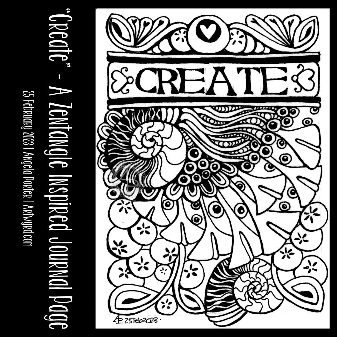
A Stylised Ammonite

The image at the top of this blog post was created in another YouTube video.

To start, looked back at the page full of the motifs created in the livestream mentioned above. My aim was to use it to make a pattern.

Now, I love ammonites. Indeed, spirals of all kinds have always fascinated me. There’s something so beautiful and joyful about drawing a spiral, or any curved line. Even my ‘straight lines’ have a softer feeling to them than those drawn with a ruler. Curvy seems to be a signature of my art! The imperfections are a manifestation of the way I draw, and I’m good with that. I’m human, not robot or AI!

Anyway, I started with a small ammonite, drawn with an 0.2 fineliner. I filled it with the Zentangle pattern Diva Dance. Diva Dance reminds me so much of the patterns you can see on shells, and it’s a pattern I love to use in various ways.

After that, I used a pencil to draw a guideline for an outer spiral. The chosen motif was repeated to fill the space and to create the pattern.

The next job was to add an underpainting. As I was completing work on the page of motifs, I’d used a Van Dyke Brown watercolour pencil to add shadows to some of the motifs. I loved this so much more than graphite and a tortillon, so I decided to use a burnt umber Inktense pencil to do similar here.

Inktense was chosen because it’s waterproof when dry. This was important as the paper I was using wasn’t watercolour paper.

The next step was to add colour. I decided to use reds, yellows, and pinky oranges for some of the motifs and turquoise and green for others. Complementary colours are one of my favourite ways of using colour. In this instance, I added the watercolour pencils to the paper and blended it with a waterbrush. I should have used a finer brush for the smaller and narrower areas. However, I wasn’t too worried if the colours ran or overspilled; this was more of a sketchbook page to try an idea out rather than a finished artwork.

I can have a tendency to hyperperfectionism. I’m learning that it’s okay not to be perfect in the art I create, that it’s OK to make mistakes or be a bit slapdash. I know I can re-draw the design, improve it, and choose how to add colour.

I often think that I’d be better off adding colour digitally—creating tradigitalart. That way, I can easily change my mistakes. That’s not something I can do on a livestream. But if I decide to redraw this design, I can scan it and colour it digitally.

Overall, I was pretty pleased with how it turned out. I’m painfully aware of all the icky bits of the artwork, but I remind myself that it’s not a finished work.

Closing thoughts

I need to consider and think about a lot of stuff. The biggie is not tiring myself out, so I’m good for nothing for several days. Social media is a constant bugbear for me. I prefer to create and explore art, knit, nap or read. Oh, and cook, eat and sleep and do all the other things that I have in my life.

I have to think about how to increase my income, too, trying to forget about my worries about AI art. So much is overwhelming, though. I will get there.

All I know, for now, is that I really enjoyed creating YouTube videos and doing a live stream. There was something energising about it, as well as tiring, in a good way.

I may be ‘missing for a couple of days, especially as I have something ‘people-y’ to do this evening; as lovely as it will be, it will exhaust me.

But for now I will sign off and do some drawing and get ready to pop out for a while this evening.

And Another …. Pen Drawing and Witter!

YouTube Video showing the creation of this drawing.

This afternoon was sunny and gusty-breezy. The shiny leaves on some rose bushes sparkled and shimmered as the wind danced with them. The wind was noisy as it blew the branches and whistled past buildings, yet the sound was soothing. The energy of the wind and sun uplifted my spirits, and I felt it was time to do an impromptu YouTube livestream.

I knew I wanted to do something similar to my previous video—a pen drawing, graphite shading, and a watercolour background in the ‘white spaces’. So, I did that, and I shared my thoughts and joy with those who found their way to the livestream.

I can’t remember what I wittered about during the 2 hour or so livestream, but I know it mentioned finding joy in small things, a childlike wonder of the world and life, taking breaks from the pressures and responsibilities of adulting wherever possible.

One thing I can say is that even in the darkest times of my life, I’ve always been able to find joy and wonder in nature, books, films and more. It may only give me a sparkle of light for a moment, but that sparkle is a reminder that it will fully return and hasn’t gone anywhere – it’s merely clouded by the dark and low mood that gathers around my heart and mind.

If anything, the darkness allows me to enjoy the sparkles more; they are more vibrant when surrounded by gloom. It would be hard to recognise the sparkles and joy if all was bright. Contrast is needed.

Perhaps that’s why I love using high contrast in my art. In today’s drawing, the darkness of the watercolour background really lets the pen drawing almost glow. The texture in the watercolour reminds me of the subtle patterns seen in glowering clouds or the ripples in a darkling sea. Either description works for the constantly shifting and changing emotions and thoughts; not all are gloomy, as the lighter areas show.

The birds in the left-hand column were a surprise! I certainly didn’t plan that. In fact, I didn’t plan any of this drawing. I just let it grow, one line at a time. Sometimes, a line, or combination of lines, suggests a recognisable motif, and I go with that.

Working intuitively always surprises me; though I may make some decisions along the way, they are instinctive. Speaking out what I’m doing just expresses in words what my hand/eye want to do next.

Turquoise is definitely the colour of the moment with me. This time, however, I added rich indigo to it to intensify the colour and depth of shadow. I let the watercolours play with each other as they will, just allowing the end result to be what it will be.

It’s not easy for me to let go of control in this way, but watercolour is showing me that it is possible. And when I let go, the results are always a wondrous surprise!

It’s Been A While…

About the drawing…

I’ve been away from social media for quite a while (I’ll tell you a little more later in this post). So today, I had the energy and time to record a YouTube video in which I drew the design in the photo. The video is due to be available to view at 20:00 UK time today, 14 June 2024.

I started with a 6.75″ x 5″ piece of Ohuhu Mixed Media paper. For those of us who prefer metric, that’s 17.5 x 12.7 cm. I like this paper. It takes watercolour nicely enough for my limited ability to use it. It’s also nice to draw on with a pen or pencil, with its light texture.

The next step was to draw a square, approximately 4″ x 4″ (10 cm x 10cm), in pencil. I like to frame my drawings as if they’re a small glimpse into a much larger imaginary world of abstract and stylised wonders.

Then, it was time to wield my UniPin pens (0.5, 0.3 and 0.1).

I knew I wanted to leave some empty space for watercolour. I also knew I wanted to use a 4B graphite pencil with a tortillon to add shade. Other than that, my mind was empty of any plan. Working intuitively called to me, so I followed that calling.

So, I started with a bit of a wibbly wobbly circle. Then, I just let the design flow and grow using my favourite lines and shapes. I added details as I went, starting to bring the design to life using the density of ink to add some shadow and highlight.

Once the penwork was finished, it was time to add shade. My aim was to bring out a feeling of dimension to the drawing. I’ve long loved playing with contrast more than numerous colours in my work. My goal was to give the appearance of the design floating above the background.

The graphite shadows partly completed that goal. I used turquoise watercolour to add intense colour to the empty spaces. It also allowed me to play with the magic blooming of watercolour dotted into the damp areas to provide more texture.

I love to watch watercolours bloom and spread in this way. Having no control over this blooming and spreading is good for me; I can be too controlling about how I draw and create.

Little by little, I’m learning to allow a little more imperfection into my art to make it more ‘human’ It becomes not wrong but charmingly imperfect. At least, that’s how I like to think of it, and perhaps myself too. Maybe learning that I’m charmingly perfectly imperfect is a personal goal.

I really enjoyed the hour or so I spent creating this small piece of art. I did think about adding some gold, black, or white pen to the turquoise parts to bring out some of the beautiful textures that are there. I’ve decided, however, to err on the side of caution and to leave well alone.

Overall, I had a lovely time, and I hope you enjoy watching the video if you choose to do so.

Why have I been missing for a while?

For around 18 months, I’ve been struggling with my health – nothing serious. Between anaemia (iron and B12), peri-menopause, and IBS, I’ve been so tired a lot of the time. My concentration hasn’t been what it could be. All the energy I had needed to be put into my latest book for Creative Haven – Haunted – and is full of creepy cute characters.

I thoroughly enjoyed doing the book, even though I got tired quite quickly.

Then, my main computer, a Microsoft Surface Studio, unexpectedly died. So, after much thought, I switched to using a 24″ XP-Pen graphics tablet and my new-ish laptop to do the same job. I had a lot to learn and a way to set up Clip Studio Paint that would work efficiently for me on this new device, But I got there.

In the process of using the new gadgets, I’ve realised how much I love to draw on pen and paper. I think I’ll be doing much more of that going forward for my work on colouring books and moving more towards tradigital working.

That was a bit of a meandering journey through what happened. It’s not the only stuff. I needreevaluate my view of myself as being ‘broken’ to being ‘different’ and accept these revelations. There are a lot of ‘OH!’ moments as I recognise things in my past that point to my differences. There’s also some grieving for what could’ve been if I’d only known sooner about them, But it really does help me accept myself and adjust the wrong beliefs I’ve held about my life forever. It’s an acceptance of who I really am, not what I’ve been led to believe. That’s progress for me, for sure. I ama always amazed by the feeling of some tension in my body being released as I recognise a memory for what it is-a new understanding of myself with the new information I have.

All of this has been both exciting and draining in many different ways. It has been totally necessary. This self-acceptance is working its way into my artistic style, too.

Circle Motif Variations

I spent some lovely, peaceful time today recording a video showing how I work to create variations on a theme.This theme is motifs based around circles and how I go from simple to more complex, possibly over complex.

You are welcome to come and #drawwithme as the #YouTube video is published at 19:30 UK time today, 4 April 2024 – https://youtu.be/tCHrlWi

An Entangled Drawing 3 Feb ’24

YouTube video is published at 19:00 UK Time today, 3 Feb 2024

It’s been a few weeks full of adulting, leaving me drained of energy. Dealing with fraudulent use of my PayPal account lasted a week, and I still have a couple of things to sort out that I’ve not been up to doing. Thankfully, it was all mostly sorted, my account is as secure as possible, so phew!

I’ve also had a lot of ‘people-ing’ (for me) to do, which has been lovely but has also left me drained.

I have had enough sense to take time for myself to sleep, rest, and do things that relax and soothe me. The last thing I’d want to happen is another burnout like I had last year at almost this exact time. I seem to have mostly avoided that this time. Seems that I’m finally learning to take care of my energy/stress levels.

I have done some art, some that are landmark pieces for me. I will scan and share them over the coming days/weeks. These works have taken a week or more of work to do, an unusually long time for me. But it was worth it.

The drawing above I did earlier today for a YouTube video. It was lovely to do. A small drawing. Detailed. Intricate. Diamine Oxblood ink and a Tom’s Studio Lumos duo refillable fineliner pen – I used 05 and 02 nibs.

I have to say that the Lumos pen was a delight to use! The weight of the barrel actually stopped me from pressing so hard with the nib; there’s some kind of counterbalance effect going on, methinks.

I may just have to invest in another of the Lumos pens (the duo version again). That way, I can have a range of nib sizes in just two beautifully made pens.

Although pricey at £99 (including P&P), I expect to save money on buying Sakura Micron or Uniball Unipin disposable fine-liner pens. That has to be a good thing.

The pen comes with 9 different nibs. It’s unlikely I’ll use all of them, though you never know! But I know I can order more nibs and new ink reservoirs as needed.

Oh, and the ink reservoirs are easy to fill; when you want to change to a new ink colour, you just wash them out with water.

Only water-based dye inks with no glittery bits in them are recommended. Though Rohrer and Klinger SketchINK was mentioned in the information that came as working well in the pens. I believe SketchINK is waterproof. It is after it’s thoroughly dried – I just checked! So that is something I may consider experimenting with, especially as it comes in a range of lovely colours!

“B” Entangled Monogram WIP

Accompanying YouTube #DrawWithMe Video.

Today was a day for quiet art, with some colour. I’ve started in a new A5 Sketchbook – A Royal Talens Art Creations one. It seems monograms are the theme for this one, at least for now!

It was a nice way to spend an hour this afternoon. It’s been very warm here in the Valleys of South Wales, UK, today. Thankfully, the sun has moved around from the front of the house and it’s feeling cooler now, just a bit.

Anyways, back to the art.

I drew the basic outlines of the design. I knew I wanted to add colour before adding the details of patterns. It also meant I could just enjoy adding colour without worrying about having to reink the lines affected by the paint; that’s always a recipe for disaster for me!

To add colour, I used soft yellows, greens and pinks from the Kuretake Gansai Tambi Art Nouveau set of watercolours.

I really, really love these watercolours. I love the way the imperfections and water-spots create a wonderful background texture. I think I’ve finally accepted that imperfections can be perfectly acceptable and wonderful! I now want to work out how I can replicate this in my digital and tradigital art. But not now. Not today.

Today, I’m flagging in energy once again. I could just go to sleep. But if I do that, I may not sleep well tonight. So, instead I will go get a drink and make something to eat. And maybe do some more art!

Intuitive, Abstract, Neurographica Style Art – Adding colour WIP

I decided to add colour to this artwork using Derwent Chromaflow pencils and Gamsol with tortillons/paperstumps.

I loved the colour as it was, but the design looked rather flat; there was little sense of ‘volume’. So, I hope to bring that out.

So little of the coloured pencil is needed when it is blended out with Gamsol, and it is translucent enough that the underlying waterdrop texture is still visible.

Although I mostly used pink, purple and blue to create the background, I thought that teal would make a good addition. That was a good decision, in my humble opinion!

White dots and lines from a Uniball Hybrid Gel DX pen add highlights that show up much better on the more intense colours. Spots and lines of gold will also add some interest, but I need to be conscious of not overdoing it!

I was really nervous about using Gamsol with linework drawn with Dokumentus ink. I had no real need to be; the Gamsol didn’t affect the ink. I let out a huge ‘Phew!’ at that!. My TWISBI Eco fountain pen with Dokumentus ink and an extra fine nib worked beautifully on areas where coloured pencil and Gamsol had been added.

I have a lot of work to do until this design is complete. I am, however, in no rush to do that. I can work on it a bit at a time. I am likely to post updates from time to time though!

If you’d like to see how I added colour with pencils and Gamsol, then a YouTube video will be available to view from 16:00 UK time on Friday 2 June 2023.

Abstract, Intuitive, Neurographic Style Art

Earlier today, I watched a couple of videos by @_bettina_fernandez on YouTube, I really enjoyed how she created neurographic art her way, and thought I needed to give this a go.

Neurographic art is an intuitive method for making art. “Neurographics is a way of drawing that recreates the outer from the inner.” – From Neurographic.art.

Intuitive art? A no brainer for me me to work with. It’s my most natural way to create art. So, I had to try it out, and I videoed it for my YouTube Channel (video available from 18:00 UK Time on 1 June 2023).

I started by creating a colourful background. I think Neurographic art usually starts with the ink lines. But Bettina used the shapes and lines created in the random colour background to draw the basic structure of the design from.

Instead of using watercolours, I used Distress Inks in various shades of pink, purple, blue and blue-greens. Splashes and a light spritz of water created interesting watermarks and I preserved the dark edges of these areas by drying them with a heat tool.

Then the real fun began. I started by drawing a kind of oval-ish shape around an area at the top left. All I did next was look for shapes and borders between colours to help me draw more lines and shapes. I made sure I ’rounded the corners’ with ink as I went, though there are, no doubt, some areas where lines connect what I’ve missed.

I wasn’t only fun, it was fascinating. I tried not to think too much, to just let the lines flow and go where they needed to in a shape that seemed ‘right’.

Once I’d got the main structure completed, which took just over an hour, I started to add texture and pattern and some white highlights. There’s a lot more to do. I may even use coloured pencils to add shade to the design. And I just have to use gold ink or paint to add some luxury and shimmer and shine to the finished design!

What do I think of it? It’s fun. It’s a personal expression. I love it’s abstract nature for sure. I think I’ll be doing more of this in the future. Indeed, I plan to work on another this afternoon (it’s 14.40 here in the UK!)

I also want to try making background with other media – watercolours, Inktense and Neocolour II come to mind! And more Distress Ink backgrounds for sure! I’m also thinking that creating these backgrounds may be a way to get me to experiment more with digital painting and textures.

“Entangled Samplers” – Cover Page WIP, Part 2

YouTube drawing tutorial

‘Create’ – A Zentangle Inspired Journal Page

Click on this link to view the #DrawWithMe video on YouTube.

Today was a day to just draw for the pleasure, joy and contentment the process of creativity brings.

I knew I wanted to include some hand lettering in the design, and that’s where I started. The rest just flowed from there as it needed to. I put no pressure on myself to be perfect, nor did I have a design in mind. It was pure, intuitive art.

And that intuitive process let me relax and enjoy being able to just create for the sake of it.