Kaas, by Emiko Kaneko CZT, is not a tangle pattern I’m familiar with. So, first I had to wrangle with it to understand it’s construction. It’s a lovely pattern, but for some reason these kinds of patterns just don’t compute too well in my head.
Eventually, I kind of worked it out, and pencil lines are definitely needed for me to draw it well! So, go me!
At first look, I really wasn’t sure how I could vary this fragment. But as I started making small changes the ‘what would happen if I …’ thoughts started to come.
I like many of these variations, some not quite so much. There’s a fair few I’d like to see arranged in a grid pattern. Perhaps I’ll spend some of this afternoon/evening trying that out.
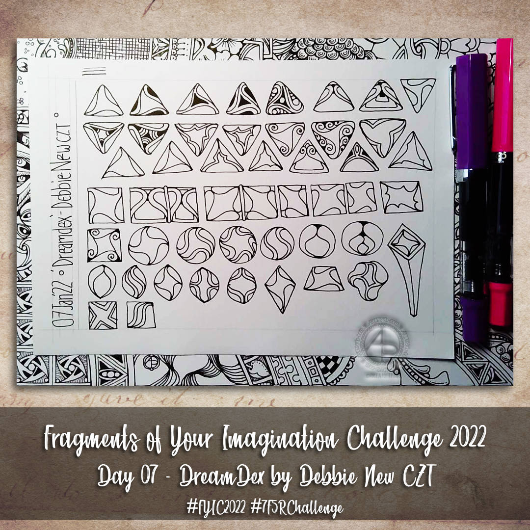
Oh, DreamDex turned out to be a bit of a dream fragment for me. So many variations ended up reminding me of La Tene / Early Celtic / Anglo-Saxon designs, which are probably my most favourite of all.
Again, I’m sure I’ve only scratched the surface of the variations that are possible. But it’s a start!
D23 has turned out to be a rather interesting fragment with some really fun and pleasing avenues to wander down. Yet again, I’ve only scratched the surface of variations of this one. No doubt it’ll be something I’ll return to.
The most important thing I’m learning through this challenge is about the ways to vary tangles, and also which ways will best suit different fragments. And, of course, that will translate to my other arty stuff too.
This was one of those fragments where I thought there wouldn’t be much I could do with. I wasn’t sure if it would transfer to other shapes and so on.
Turns out I need not have worried at all. Admittedly, some shapes and variations work better than others. Also, I’m aware I’ve barely scraped the surface.
This page also gave my TWSBI Eco fine nib fountain pen a work out. Treating Canson Imagine mixed media paper with Distress Ink does make it a bit more absorbent and the pen ink does result in a broader line. Such an effect wasn’t noticeable on the ClaireFontaine Paint On paper coloured with Distress Inks. It’s going to be a bit of trial and error process going on until I get the hang of it!
And the third day of trees. Why? Because I can! And there’s so many variations on the theme I can share. It can be difficult to work out which to do so.
For this series of videos, I have drawn lots, and lots of trees in my A4 sketchbook (two pages full, near enough). Some are successes, others not quite so. Indeed, there were a couple of “Oh, that didn’t go so well” trees in today’s video.
All of this, however, is sketchbook work. It’s OK to try things out. It’s just fine that things don’t always work out the way you thought they might. It’s quite okay that what may have seemed like a good idea in the head doesn’t translate too well onto paper.
In fact, it’s the ‘oops’ trees (and other drawings) that lead to artistic growth. They make me work out what’s not right, what I don’t like about them, and what I can learn from this. Sometimes I have another go at the idea, but better informed from the first version. Sometimes I realise it’s a lost cause…for now perhaps. Other times, it’s worked out, but it’s not just my thing. And that too, is perfectly OK.
Without trying things out we won’t know what we do and don’t like. It’s like cooking and tasting to see if the seasoning and spices are right or need adjusting. And just like cooking, sometimes things just don’t work, and occasionally can’t be saved!
The only difference is I’m not likely to make someone ill by drawing in a sketchbook!
Today’s video really brought home how important colours is in artwork. And shadows/highlights. But colour especially. Colour serves not only to bring life to the drawing, but to lift it from the background.
Yes, that can be done with various ways of adding shadow – cross hatching, line width, stippling, and so on. But there’s just something about colour, even simple colour, that just helps things along.
Indeed, simple colour seems to be my kind of style. At the moment. And looking at the upper picture, mixing coloured elements with monochrome is an interesting approach too. That may be a way I can move forward adding more colour to drawings, but only to parts that are focal points or where colour would really help with the composition. Otherwise, shading is the way to go.
And not just graphite pencil shading. I need to spend some time experimenting with other media – alcohol markers, grey watersoluble media, Pitt Artist pens, and so on.
Lots of things to think about and consider today. All insights I may have missed if I wasn’t making videos and having to talk about what was passing ephemerally and abstractly through my mind. Giving those passing thoughts words results in awareness, understanding, and, perhaps, learning.
In the spirit of the day, I’m so grateful for everyone who supports me in my artistic journey, who so kindly communicates with me, who brings my drawings alive in so many, different, wonderful ways. Thank you once and all!
There are so many other people in my life I’m grateful for too. And, there’s so much else I have to be grateful for.
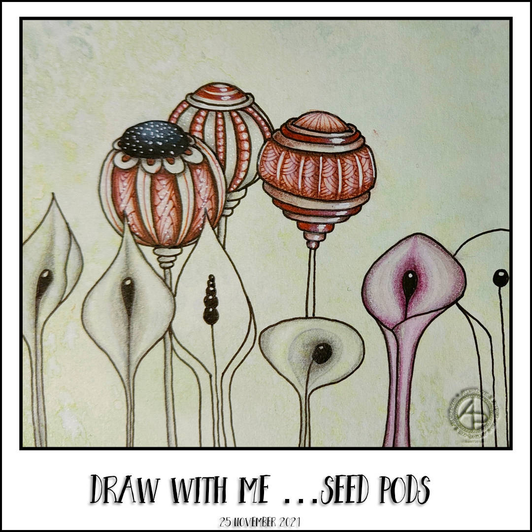
Draw with me … Seed Pods
My day started with, unsurprisingly, some drawing. This time of some seedpods that turned out rather ornate and fancy-schmancy! Of course, I created a video showing how I did these.
Even though I’m feeling totally overwhelmed by Adorable Dogs at the moment, I still think it’s important I take the time to do art that is entirely for me. Making these videos, sharing my thoughts, materials, methods is part of that practice now it seems. I’m so grateful to all who watch, comment, subscribe, like and/or share these videos.
The day started off with working on the revisions of template sketches for the Adorable Dogs book. It’s a kind of fussy and detailed process. Erasing, altering and/or adding to the templates can take a lot of focus. And a lot of kneadable eraser to pick up the eraser dust from a soft polymer eraser! Still, all that needed revisions were seen to and sent off for review. I did get one more new template drawn as well.
It was then time to pop out in the car. Binky, my SmartCar, hadn’t been out for over a week. So, a longer drive was needed to make sure the battery is topped up.
It was lovely to be driving around and seeing the autumnal colours. The skies were a dull grey and drizzly. The dampness made the colours shine all the more brightly against the gloomy skies and dark trunks and branches. So beautiful.
I also braved a local-ish supermarket to get some supplies. And I do mean braved! I’m so anxious to be out around other human beings it’s quite a stressful thing. Luckily, the supermarket was quiet and I was able to whizz around and pick up what I needed, and some treats too.
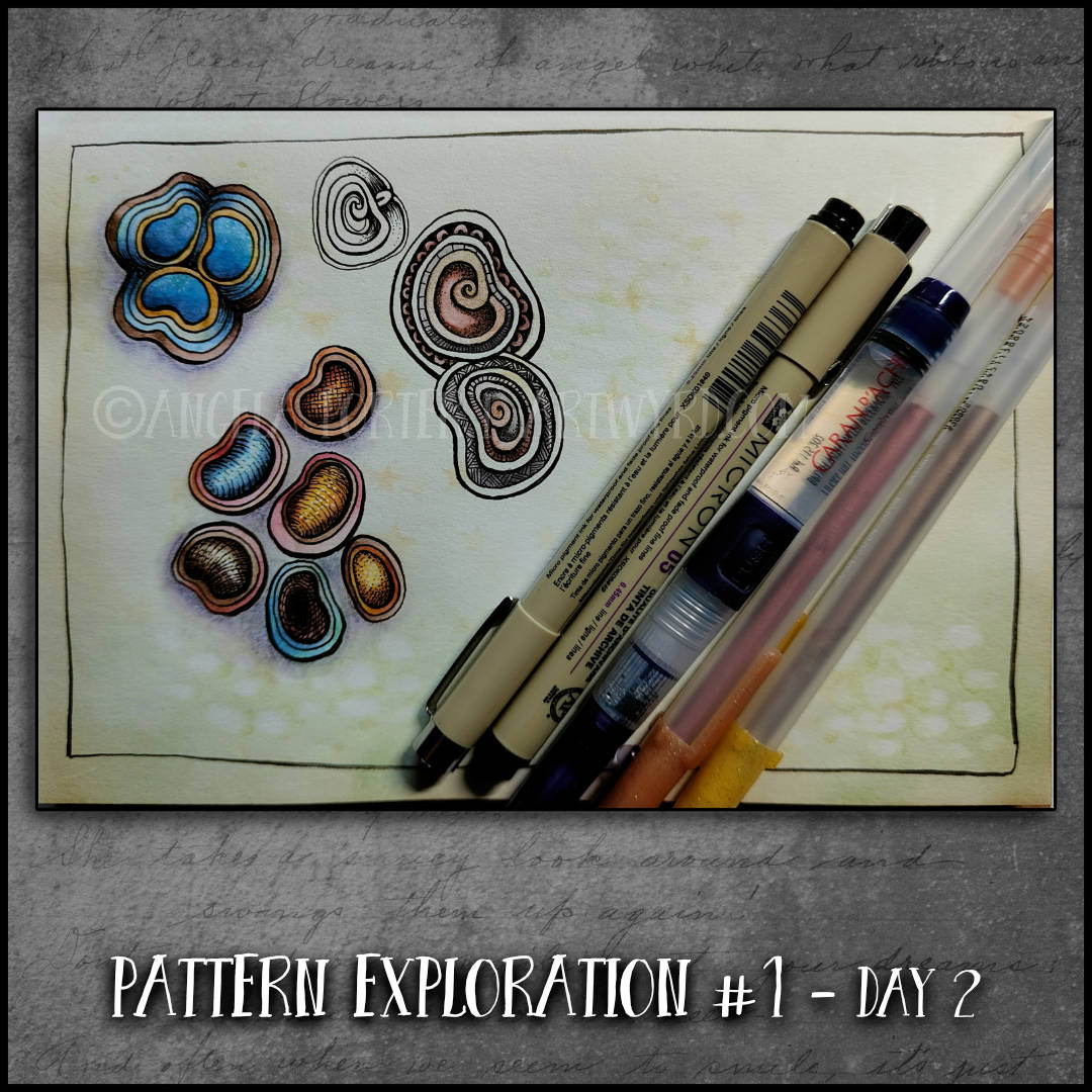
After lunch, I turned my attention to today’s video, which is a bit different. I’d had a request from a viewer of my videos to put close up images of the patterns at the end of the video. I’d been thinking about doing zoomed-in pattern drawing on a larger scale in a step by step manner.
I actually really enjoyed the drawing process and the insights it gave me into patterns. I’m not quite sure I’ve worked out the best way to do it yet.