Expressing the inner workings of me?

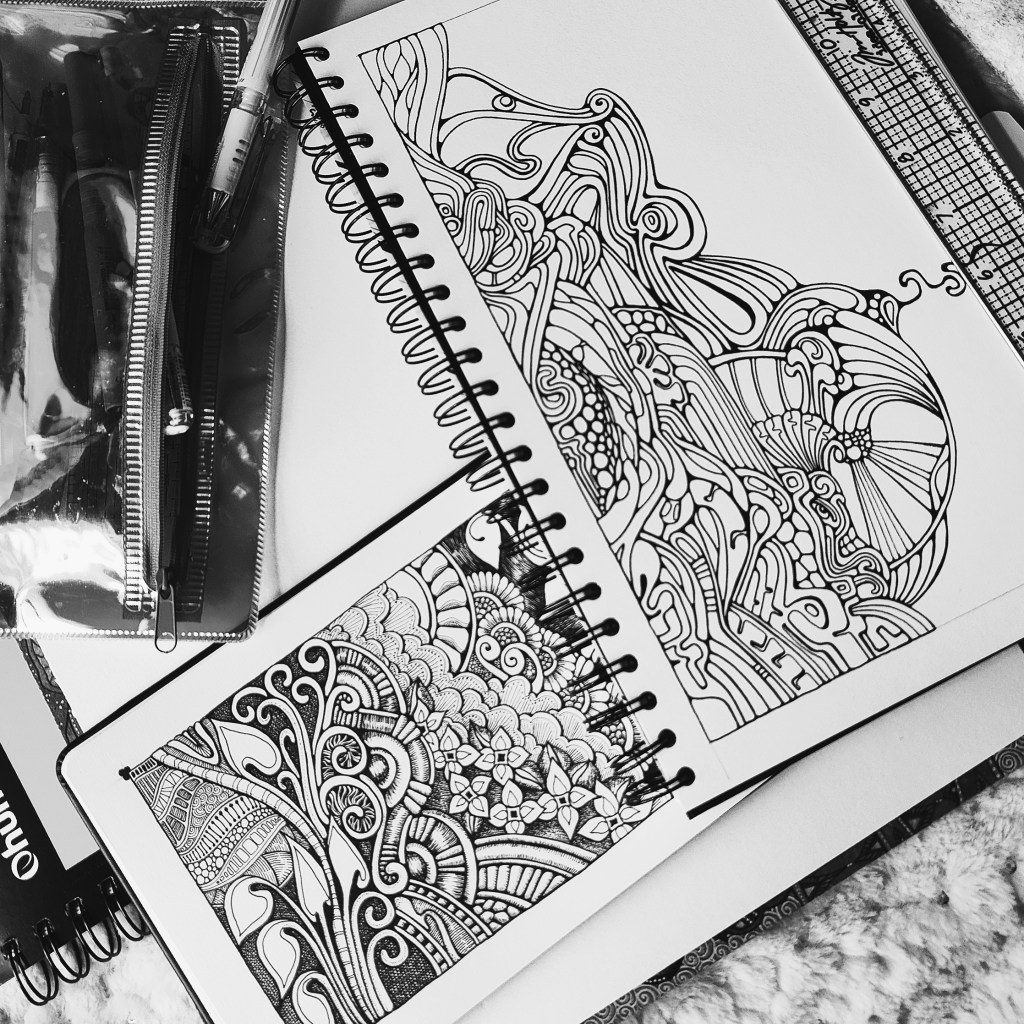
Two pen drawings I share with you. One with chalk pastel color added, the other black ink alone.

In both drawings I’ve used a limited number of patterns and textures, a limited texture palette, if you will.

This, along with the limited colour palette in the upper artwork, bring a feeling of cohesiveness and calm to what are quite intricate designs.

I think calm is the correct word to use, but I’m not sure. I have trouble identifying and recognising emotions unless they are very strong.

Over the past few weeks, months perhaps, I’ve needed a lot of gentle, peaceful time. When I am like this, I tend to go inside myself and withdraw from the world and social media. I’d like to believe that healing is happening unbeknownst to myself. Healing that brings peace, harmony, acceptance of lots of things that have happened in the past eleven months or so.

It’s been a turbulent time for me in terms of physical, emotional and mental health. I sometimes feel I’ve lost my way, or have too many interests and sources of inspiration for art.

Over the past couple of weeks, I’ve begun to go back to this style of art, an artistic expression of my inner self, my unconscious. Or at least that’s what I’d like to believe.

There’s always a pleasure and joy in drawing for me. However, when it flows in a truly intuitive way as in these two drawings, there is a sense of other things happening within. Peace, calm, yes. But also a feeling of harmonious creation in the design that flows from my pen.

Did I really make a conscious decision to use so few textures? I’m not sure at all. It just felt the right thing to do as I worked.

Of late, so much of my work has felt disjointed, I cohesive, out of balance. These two don’t feel that way to me; well, maybe a bit.

Look at me, writing about feelings after saying I’m not aware of emotions. But this feeling is more of an aesthetic appreciation where my art satisfies a part of me in some way. I have no vocabulary that can explain more. Perhaps I don’t need to explain

I wonder if this is just comfort art, or whether it’s a sign of self acceptance and healing. Maybe it’s both or neither, but I do feel it is showing a change in the inner parts of me emotionally and mentally.

If my art brings you a sense of calm, gentleness, pleasure, or another numinous feeling of enjoyment, no matter how small, then I’ve shared a part of myself through my art. At the same time I’m discovering more about myself and my journey, I trust.

Entangled Art 20 October 2023

The last couple of weeks have been … tiring. I’ve needed plenty of quiet time and rest. I have been drawing, and this is my latest drawing. It’s taken about a day’s work or so.

I’m quite happy with it. The open space creates balance with the fussier areas.

All the lines are ones I enjoy drawing. It never ceases to amaze me that the design possibilities are endless even with just a few shapes I like!

Will I add colour and/or shading to this one? I don’t know yet. Shading is needed at the very least. But, I’m not sure what to use to do that – graphite, chalk pastel, or another medium, even digital art.

There’s absolutely no rush for me to decide; the drawing isn’t going anywhere.

It’s still been a pleasure to lose myself in drawing for a while and to delight in the intuitive drawing that appears as ink flows from the tip of my pen.

#abstractart #pendrawing #linedrawing #entangledart #AngelaPorter #Artwyrd #artist

Some of my latest work.

I’m enjoying the movement of pen and line on the paper. It’s like writing, but with line and shape and texture.

This intuitive way of working, I draw lines that I enjoy the motion of brings me contentment, peace, calm and enjoyment.

I’m beginning to wonder why I am forever thinking that this is not good enough art. I’m questioning myself why I keep exploring new media, new styles, new inspiration, especially as it leads back to this kind of art.

Perhaps it’s because I find this so easy to do and therefore don’t value it. Perhaps it’s part of my journey to extend my memory hoard of lines and motifs that I love. Perhaps it’s to discover new patterns and textures I like.

I know that colour vexes me, though I enjoy drawing on a coloured background, Also, I enjoy adding colour digitally which allows me to change colours when I realise the colours I’m using are not pleasing to me.

I like adding contrast, and working with very simple colour palettes. This lets me play around with layers and dimension.

The one thing I need to remember is to leave ‘white space’. I’m learning the power of this.

This is gentle, soothing artistic activity for me as I am going through a yeuchy IBS flare up, which I think may be linked to dairy this time. It’s also making me very fatigued. But I will get through this! I seem to be more resilient than I think I am.

A5 Sketchbook Page

Between some adulting today, I’ve drawn this design in my sketchbook. I’m quite pleased with it, unusually for me!

I like black and white drawings. I like texture and pattern, and I like to then add colour and/or contrast to my artwork. I’ve yet to decide what I’ll do with this, though digital colouring is likely to be my thing. Traditional drawing followed by digital colouring makes it tradigital art! Whoever coined that term is fab.

In the last few days, I have played around with using coloured inks to draw designs. I’m happy if I use one colour for the drawing, texture and pattern. If I start to use other colours, I become confused and not at all happy with the outcome. It never looks ‘right’ to me. Not for my own art, anyway. I do like how other people manage to use different colours for various parts of the lineart, pattern and texture.

Maybe this is because I’m so used to drawing with just one colour. I then use colour to bring out dimension in the finished artwork. I have drawn designs in a colour other than black, using just that colour; I’m quite happy with them.

So, onwards I go, continuing to learn more about my style as I go outside the area I’m comfortable in. I may return to the experiments with different ink colours another time, or not. Only time will tell, though.

A peek inside my new sketchbook

Earlier this week, I started a new sketchbook. This is an A5-sized one from Royal Talens Art Creations range. The paper in it is ivory, sturdy and reasonably stiff. It’s smooth enough to be a pleasure to draw on with all kinds of pens, yet it has enough ‘tooth’ to work with coloured pencils. It will also take very light washes of water-based media. Distress Inks blend nicely on the paper, making less smoothly blended backgrounds easy.

Page 1 started the sketchbook off, and a dragon surprised me by peeking out of the entangled foliage and artefacts! That wasn’t a conscious decision; it just happened. This makes this dragon the guardian of this particular sketchbook!

The other pages are me trying out monograms, some more successfully than others. And that’s the whole point of a sketchbook; it’s a place to try things out, experiment, practice, and become familiar with new (or old) media and techniques. It becomes a storehouse of ideas, a record of my artistic journey.

I also allow myself to finish a drawing or leave it as it is. I can write notes and ideas, commentary and reflections on the pages themselves or if there’s not enough room on pieces of paper, that can be attached at an appropriate point. This way, it becomes more than just drawings. It really becomes that record of an artistic journey.

The A5 format means it’s easy to carry while away from home, along with a small pencil case with the bare essentials. I can record things I see that interest me.

There are elements of stylised art, abstract art, Zentangle-inspired art, Rebecca Blair-inspired patterns, botanical, architectural details, imaginative designs and intuitive work, to name a few!

Entangled Monogram WIP 6 June ’23

I drew this design partly as I settled and calmed down for sleep, then completed it when I awoke at stupid o’clock until I was ready to settle back to sleep. Now, I’ve started to add colour – Derwent Chromaflow with Gamsol to blend the colours out. Oh and gold ink for the ‘L’ and the border around it.

This design was drawn on a 21cm x 21cm (8.25″ x 8.25″) piece of Canson Imagine mixed media paper. I used TWISBI Eco fountain pens filled with black Dokumentus ink, fine and extra fine nibs.

This is part of my preparation to throw myself into designing colouring pages for DayDreams. Getting back into my signature kind of art, maybe not this detailed, but …

There’s still plenty of colour to add. Then, there’s the highlights and sparkle and any other details that may be called for. A good level contrast is needed to bring out the illusion of dimension to this!

“Purple Roses” Entangled Botanica Tag/Bookmark WIP

Cool, soothing, calming blues, teals and purples are just what my migraine befuddled self needed this afternoon. The migraine had mostly lifted, but left me feeling tired, ‘off with the fairies’. I decided to film this drawing as I thought those who like to draw along with me would enjoy some flowers, this time roses.

I coloured the background with Distress Inks, and added a little texture with a stencil. Water splatters are a must, dried with a heat gun to give that darker edge to them.

I love the way the texture and variation in the depth of colour shows through the coloured pencils that are applied to bring volume to the drawing. I used Gamsol and tortillons/paperstumps to blend the colour pencils out and create highlights and shadows.

Touches of gold ink will bring some precious luxury to the design.

There’s still a lot to do, however. The first coat of added pencil colour needs to be completed. There may be a need to intensify contrast. And then there’s the patterns and contour lines to be completed with ink. A drop shadow, white ink highlights, and more shimmery golden details.

The appearance of torn, collaged, patterned paper to the right of the tag is becoming a favourite thing of mine to add.

I hope a good night’s sleep will come tonight and I’ll wake tomorrow feeling as ‘with it’ as I’m able to be. I have work to do for my next colouring book called “Daydreams”.

Accompanying YouTube #DrawWithMe Tutorial Premieres at 20:00 UK Time 5 June 2023.

Intuitive, Abstract, Neurographica Style Art – Adding colour WIP

I decided to add colour to this artwork using Derwent Chromaflow pencils and Gamsol with tortillons/paperstumps.

I loved the colour as it was, but the design looked rather flat; there was little sense of ‘volume’. So, I hope to bring that out.

So little of the coloured pencil is needed when it is blended out with Gamsol, and it is translucent enough that the underlying waterdrop texture is still visible.

Although I mostly used pink, purple and blue to create the background, I thought that teal would make a good addition. That was a good decision, in my humble opinion!

White dots and lines from a Uniball Hybrid Gel DX pen add highlights that show up much better on the more intense colours. Spots and lines of gold will also add some interest, but I need to be conscious of not overdoing it!

I was really nervous about using Gamsol with linework drawn with Dokumentus ink. I had no real need to be; the Gamsol didn’t affect the ink. I let out a huge ‘Phew!’ at that!. My TWISBI Eco fountain pen with Dokumentus ink and an extra fine nib worked beautifully on areas where coloured pencil and Gamsol had been added.

I have a lot of work to do until this design is complete. I am, however, in no rush to do that. I can work on it a bit at a time. I am likely to post updates from time to time though!

If you’d like to see how I added colour with pencils and Gamsol, then a YouTube video will be available to view from 16:00 UK time on Friday 2 June 2023.

Abstract, Intuitive, Neurographic Style Art

Earlier today, I watched a couple of videos by @_bettina_fernandez on YouTube, I really enjoyed how she created neurographic art her way, and thought I needed to give this a go.

Neurographic art is an intuitive method for making art. “Neurographics is a way of drawing that recreates the outer from the inner.” – From Neurographic.art.

Intuitive art? A no brainer for me me to work with. It’s my most natural way to create art. So, I had to try it out, and I videoed it for my YouTube Channel (video available from 18:00 UK Time on 1 June 2023).

I started by creating a colourful background. I think Neurographic art usually starts with the ink lines. But Bettina used the shapes and lines created in the random colour background to draw the basic structure of the design from.

Instead of using watercolours, I used Distress Inks in various shades of pink, purple, blue and blue-greens. Splashes and a light spritz of water created interesting watermarks and I preserved the dark edges of these areas by drying them with a heat tool.

Then the real fun began. I started by drawing a kind of oval-ish shape around an area at the top left. All I did next was look for shapes and borders between colours to help me draw more lines and shapes. I made sure I ’rounded the corners’ with ink as I went, though there are, no doubt, some areas where lines connect what I’ve missed.

I wasn’t only fun, it was fascinating. I tried not to think too much, to just let the lines flow and go where they needed to in a shape that seemed ‘right’.

Once I’d got the main structure completed, which took just over an hour, I started to add texture and pattern and some white highlights. There’s a lot more to do. I may even use coloured pencils to add shade to the design. And I just have to use gold ink or paint to add some luxury and shimmer and shine to the finished design!

What do I think of it? It’s fun. It’s a personal expression. I love it’s abstract nature for sure. I think I’ll be doing more of this in the future. Indeed, I plan to work on another this afternoon (it’s 14.40 here in the UK!)

I also want to try making background with other media – watercolours, Inktense and Neocolour II come to mind! And more Distress Ink backgrounds for sure! I’m also thinking that creating these backgrounds may be a way to get me to experiment more with digital painting and textures.

Flower Buds – 29 May 2023

Flower Buds

I absolutely love the Kuretake Gansai Tambi Art Nouveau set of watercolours! I just had to get that off my chest!

I love the texture created by the watercolours – how uncontrollable it is, but it adds so much to the final drawing and it actually makes my arty heart and soul smile a tad.

This is a drawing completed, for once, in today’s YouTube video, due to premiere at 18:00 UK Time on 29 May 2023. In the video I show how to draw the design, add colour and gold and white details.

After doing this artwork, I really do think the Kuretake Gansai Tambi’s are the watercolours I’ve been searching for. They work with me, helping me to express myself. Also, embracing the imperfections of the textures in the colours as part of my self-expression rather than searching for the unattainable.

I used single colours for each section, except for the larger leaves. And that seems to have worked out well for me.

I love how the gold and green to the right seem to glow like sunlight shining through stained glass.

The only thing I wish I’d done was coloured the paper with Distress Inks before starting the drawing. I know that so little Distress Ink is added to the background that it won’t affect the colours in a noticeable way. So that will be my next arty experiment today!

Oh, and I wish I’d remembered to erase the pencil line before starting to add the watercolour!

Again, I used Canson Imagine mixed media paper(9.5cm x 10.5cm or 3.75″ x 4.25″) and it seems to make it so easy for me and the Gansai Tambi paints to work well together.

I’m absolutely amazed that I’m embracing imperfection! I never thought I’d get to that point, or let it be part of my artistic voice.

I’m actually smiling here. I really am. And a smile that is felt in my heart and soul too; something I’ve not done much for a long while.

A sudden realisation

I had a sudden revelation today, of a practical nature. I suddenly realised I tend to create art in sizes that require custom made frames and/or mats. So, I thought I should try to get a selection of ready cut mats in standard sizes and use them to cut paper and create the right sized art to fit the mat. So that’s what I did.

I can be such a numpty, feeling quite daft it had taken me this long to work that out! But then again, perhaps the time wasn’t right before now. I’ve thought for a while now that I could sell my art, particularly the more abstract, flowy, intuitive art. Next step is to work out how to do that and ‘promote’ it/me. And that is the problem, the promotion… it fills me with horror. But maybe I’ll work it out. Time will tell for sure.