Phew, what a day! First, I focused on getting some of the final templates for “Fanciful Birds” done. I have just two left to do tomorrow.
After several hours working at a computer screen, I needed some time working with pen and paper. So, I continued with this page from my hand-lettering sketchbook.
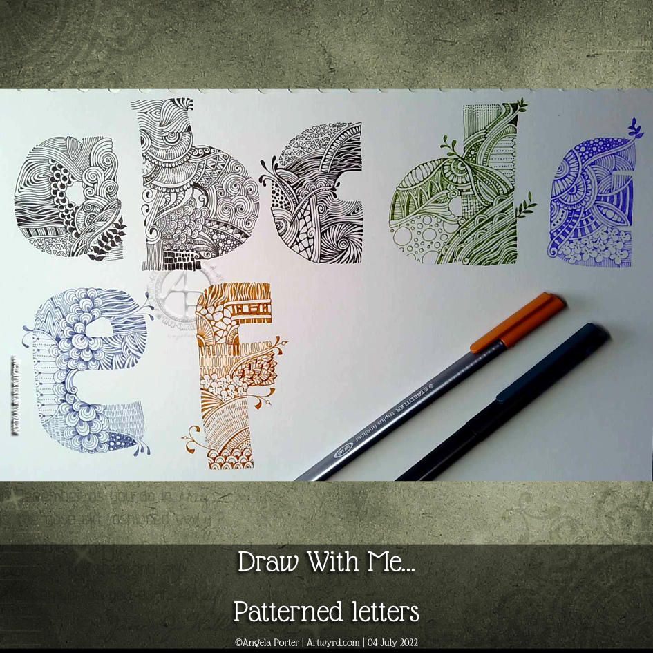
I started this page yesterday and completed the ‘e’ and ‘f’ in today’s YouTube video.
The ‘e’ is completed in a dusty blue Chameleon fineliner pen. For the ‘f’ I used a rusty brown Staedtler Triplus fineliner.
I’m not at all fussed on the lilac ‘e’ on the top line. I much prefer either black or the more vintage, muted tones. That seems to be a bit of a theme with a lot of my art.
It was lovely and relaxing to just draw for the pleasure of drawing, and it was really comforting to return to this kind of intricate, abstract, patterned kind of art too.
Please click on the ‘Watch on YouTube’ button. Cheers!
In this video, I take a small panel of some paper coloured with Paper Artsy Fresco Paints and white gesso and create a small design. Seed pods, Mooka, and a spiral shell – some of my favourite things to draw!
I used Inktense pencils and a damp brush to add colour and shadow. Finally some gold dots for the seeds in the pods.
Small, but nice enough and a needed change while my mind processes what I’m doing with collage and lettering and, and, and …
I’m really not feeling too grand again today. Tummy cramps kept waking me up through the night. I know what the cause of them is – hormones is all I’ll say. But I am so tired today, but I don’t want to sleep as that will impact on my sleep tonight. So, quiet art time it is!
I like the idea of pattern and motif sampler pages in my sketchbook. However, I like to work on paper on the worksurface rather than in a book. So, I dug out one of my Distress Ink coloured papers to work on.
I used a selection of Zentangle tangle patterns for the first row. They are, from left to right Savana by Yvette Cambell CZT Holly by Linda Farmer CZT ‘Nzepple by Zentangle Inc Dorsal by Anita Aspfors Westin Crazy ‘Nzeppl by Zentangle Inc Pufanflower by YuRu Chen
I used alcohol markers to add shadow to the patterns and a white Gelly roll for the highlights.
This will be a series of posts with accompanying videos until the page is done.
I had a request from one of my subscribers on YouTube asking how I create this kind of art. Well, a nice request has to be met with a response, in this case, a YouTube video.
I’d tried out this way of working a week or so ago. I’m trying out different ways of combining hand-lettering with my kind of entangled kind of abstract art. In fact, I’m trying to work out my hand-lettering artistic voice. It’s very much a work in progress.
I’m really rather pleasantly surprised with this page. It’s not finished but is a melange of different ideas and pen types. There are a lot of ideas to take away from this and a lot to think upon.
I particularly like how I eventually worked out I could have patterns weaving in and out of the letters, again messing around with volume/dimension/space. I’ve yet to work out how this could work, but I’ve made a start.
My fingers are itching to get to work on something similar to this. I am, however, feeling totally exhausted. I didn’t sleep well last night, and my eyes are constantly on the point of closing as I fall I asleep where I sit.
I have a delivery due soon, I hope. And after that, I’m going to crash and have a nap. Then, I’ll see what happens this evening, as far as art goes!
Looks like yesterday and today are my ‘weekend’ this week. I do know, from past experience, that if I try to do some serious work while falling asleep, I’ll just mess up and have to repeat it again. So, time for self-care for sure.
I’ve finished it, I think. I’m feeling a bit happier with it now. I really like the abstract, curvy, swirly bits that remind me of La Tene (early Celtic) art. I’m still not happy with that central ‘moat’, though.
Oh, I’m also really pleased I stuck to an analogous colour scheme, mostly. Having the words in an almost complementary colour to the blues and purples makes them stand out. But I still rather like the swirly abstract patterns, and I’m so glad I added them!
I’ve not quite found my way with hand-lettering. I keep trying new and different things out, but nothing seems to sit well with me yet. Although I like the more formal lettering layouts, I don’t think that’s for me. I tend to work fairly instinctively and intuitively with little forethought or planning. When I do think my way through something, that’s when disaster tends to strike!
I suspect a looser, expressive, intuitive kind of style is going to work for me, along with my style of entangled, abstract art. Probably. Possibly. Perhaps…
Please click on the ‘Watch on Youtube’ button. Cheers!
We all need some whimsy in life at one time or another. Given all that’s going on in the outside world, I definitely need a huge dose of whimsy! So, today, I drew three whimsical houses, one step at a time.
Please click on the ‘Watch on YouTube’ option. Cheers!
Before filming this video, I primed a piece of watercolour card with white gesso. Then, I added colour using Inktense pencils and water. I added each colour separately, drying them before adding the next. Finally, a layer of clear gesso was added to seal the colours.
I had no particular idea as to how I would add the colour or what I wanted to use the paper for after this. But, as I looked at it, the pink areas just looked like very fuzzy flowers, so that was it! A floral based drawing it would be!
I do not intend to fill the whole area with flowers. I have plans for the ‘white space’ around the designs. But you’ll have to wait to see how that pans out!
In the video, I take you through drawing each flower design, one step at a time. I try to vocalise my reasons for doing certain things too.
Please click on the ‘Watch on Youtube’ option. Cheers!
I spent some lovely time adding a bit more to this drawing. In the video, I share how, step by step, I draw some of the motifs so you can use them too!
Peace, calm, and just creating for the contentment it brings me.
I had the hand-lettered part of this sketchbook page completed a couple of days ago. I didn’t really know what else to do with it. I knew adding colour with traditional media was likely to be a disaster.
This morning I woke up knowing what to do with this, along with other things. So, I spent some time adding a border around the lettering and starting to add patterns and motifs. And arches, lots of arches!
I then thought it would be nice to share some of the drawing process through a video, which you can see by clicking this link.
It feels like a long while since I did any entangled style art. The hand-lettering isn’t perfect, nor is the frame around it. But that’s OK. I think it goes with the ‘chaos’, the imperfection, the touch of an imperfect human hand.
A couple of months ago, I may have tried to do something like this, and would likely have been really dissatisfied with the result. Mainly because I wasn’t at all happy with my hand-lettering attempt. But now, after just a couple of months of working in lettering sketchbooks, working with different ways to form letters and finally accepting that whatever lettering I do doesn’t have to be perfect – good enough is good enough!
I’m using variations in the density of pattern and ink to create shadows and highlights in the design. I have no intention of using pencil or markers to add grey shadows to this one. If I decide to add colour, it will be in the style of a linocut or hand-coloured print, perhaps with some extra shadow and highlight added by the depth of colour. Perhaps. Maybe. And if I do, digital is the way I’ll go! First, though, I have to finish drawing this design.