I drew this design partly as I settled and calmed down for sleep, then completed it when I awoke at stupid o’clock until I was ready to settle back to sleep. Now, I’ve started to add colour – Derwent Chromaflow with Gamsol to blend the colours out. Oh and gold ink for the ‘L’ and the border around it.
This design was drawn on a 21cm x 21cm (8.25″ x 8.25″) piece of Canson Imagine mixed media paper. I used TWISBI Eco fountain pens filled with black Dokumentus ink, fine and extra fine nibs.
This is part of my preparation to throw myself into designing colouring pages for DayDreams. Getting back into my signature kind of art, maybe not this detailed, but …
There’s still plenty of colour to add. Then, there’s the highlights and sparkle and any other details that may be called for. A good level contrast is needed to bring out the illusion of dimension to this!
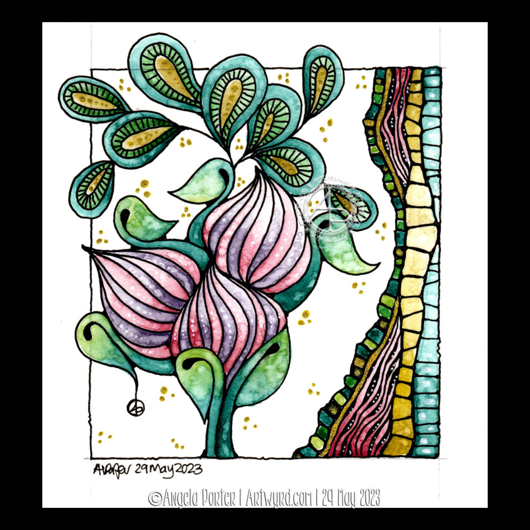
Cool, soothing, calming blues, teals and purples are just what my migraine befuddled self needed this afternoon. The migraine had mostly lifted, but left me feeling tired, ‘off with the fairies’. I decided to film this drawing as I thought those who like to draw along with me would enjoy some flowers, this time roses.
I coloured the background with Distress Inks, and added a little texture with a stencil. Water splatters are a must, dried with a heat gun to give that darker edge to them.
I love the way the texture and variation in the depth of colour shows through the coloured pencils that are applied to bring volume to the drawing. I used Gamsol and tortillons/paperstumps to blend the colour pencils out and create highlights and shadows.
Touches of gold ink will bring some precious luxury to the design.
There’s still a lot to do, however. The first coat of added pencil colour needs to be completed. There may be a need to intensify contrast. And then there’s the patterns and contour lines to be completed with ink. A drop shadow, white ink highlights, and more shimmery golden details.
The appearance of torn, collaged, patterned paper to the right of the tag is becoming a favourite thing of mine to add.
I hope a good night’s sleep will come tonight and I’ll wake tomorrow feeling as ‘with it’ as I’m able to be. I have work to do for my next colouring book called “Daydreams”.
This design does make me smile gently! I’m rather pleased with the end result. If you’d like to #drawwithme, then the accompanying YouTube video goes live today, 3 June ’23, at 18:00 UK Time.
Distress Ink background. Design drawn with black Dokumentus ink in a TWISBI Eco EF fountain pen. Extra colour/shade added with Derwent Chromaflow pencils and Gamsol. Highlights/shimmer added using a white Uniball Hybrid Gel DX pigment ink pen and gold Winsor and Newton Calligraphy Ink applied with a brush.
I decided to add colour to this artwork using Derwent Chromaflow pencils and Gamsol with tortillons/paperstumps.
I loved the colour as it was, but the design looked rather flat; there was little sense of ‘volume’. So, I hope to bring that out.
So little of the coloured pencil is needed when it is blended out with Gamsol, and it is translucent enough that the underlying waterdrop texture is still visible.
Although I mostly used pink, purple and blue to create the background, I thought that teal would make a good addition. That was a good decision, in my humble opinion!
White dots and lines from a Uniball Hybrid Gel DX pen add highlights that show up much better on the more intense colours. Spots and lines of gold will also add some interest, but I need to be conscious of not overdoing it!
I was really nervous about using Gamsol with linework drawn with Dokumentus ink. I had no real need to be; the Gamsol didn’t affect the ink. I let out a huge ‘Phew!’ at that!. My TWISBI Eco fountain pen with Dokumentus ink and an extra fine nib worked beautifully on areas where coloured pencil and Gamsol had been added.
I have a lot of work to do until this design is complete. I am, however, in no rush to do that. I can work on it a bit at a time. I am likely to post updates from time to time though!
If you’d like to see how I added colour with pencils and Gamsol, then a YouTube video will be available to view from 16:00 UK time on Friday 2 June 2023.
Neurographic art is an intuitive method for making art. “Neurographics is a way of drawing that recreates the outer from the inner.” – From Neurographic.art.
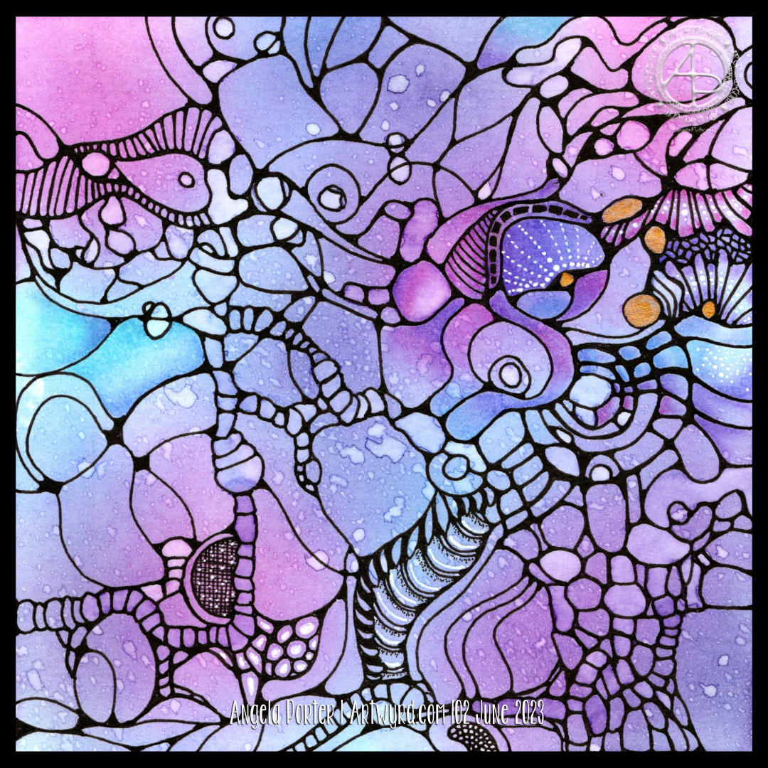
Intuitive art? A no brainer for me me to work with. It’s my most natural way to create art. So, I had to try it out, and I videoed it for my YouTube Channel (video available from 18:00 UK Time on 1 June 2023).
I started by creating a colourful background. I think Neurographic art usually starts with the ink lines. But Bettina used the shapes and lines created in the random colour background to draw the basic structure of the design from.
Instead of using watercolours, I used Distress Inks in various shades of pink, purple, blue and blue-greens. Splashes and a light spritz of water created interesting watermarks and I preserved the dark edges of these areas by drying them with a heat tool.
Then the real fun began. I started by drawing a kind of oval-ish shape around an area at the top left. All I did next was look for shapes and borders between colours to help me draw more lines and shapes. I made sure I ’rounded the corners’ with ink as I went, though there are, no doubt, some areas where lines connect what I’ve missed.
I wasn’t only fun, it was fascinating. I tried not to think too much, to just let the lines flow and go where they needed to in a shape that seemed ‘right’.
Once I’d got the main structure completed, which took just over an hour, I started to add texture and pattern and some white highlights. There’s a lot more to do. I may even use coloured pencils to add shade to the design. And I just have to use gold ink or paint to add some luxury and shimmer and shine to the finished design!
What do I think of it? It’s fun. It’s a personal expression. I love it’s abstract nature for sure. I think I’ll be doing more of this in the future. Indeed, I plan to work on another this afternoon (it’s 14.40 here in the UK!)
I also want to try making background with other media – watercolours, Inktense and Neocolour II come to mind! And more Distress Ink backgrounds for sure! I’m also thinking that creating these backgrounds may be a way to get me to experiment more with digital painting and textures.
I absolutely love the Kuretake Gansai Tambi Art Nouveau set of watercolours! I just had to get that off my chest!
I love the texture created by the watercolours – how uncontrollable it is, but it adds so much to the final drawing and it actually makes my arty heart and soul smile a tad.
This is a drawing completed, for once, in today’s YouTube video, due to premiere at 18:00 UK Time on 29 May 2023. In the video I show how to draw the design, add colour and gold and white details.
After doing this artwork, I really do think the Kuretake Gansai Tambi’s are the watercolours I’ve been searching for. They work with me, helping me to express myself. Also, embracing the imperfections of the textures in the colours as part of my self-expression rather than searching for the unattainable.
I used single colours for each section, except for the larger leaves. And that seems to have worked out well for me.
I love how the gold and green to the right seem to glow like sunlight shining through stained glass.
The only thing I wish I’d done was coloured the paper with Distress Inks before starting the drawing. I know that so little Distress Ink is added to the background that it won’t affect the colours in a noticeable way. So that will be my next arty experiment today!
Oh, and I wish I’d remembered to erase the pencil line before starting to add the watercolour!
Again, I used Canson Imagine mixed media paper(9.5cm x 10.5cm or 3.75″ x 4.25″) and it seems to make it so easy for me and the Gansai Tambi paints to work well together.
I’m absolutely amazed that I’m embracing imperfection! I never thought I’d get to that point, or let it be part of my artistic voice.
I’m actually smiling here. I really am. And a smile that is felt in my heart and soul too; something I’ve not done much for a long while.
A sudden realisation
I had a sudden revelation today, of a practical nature. I suddenly realised I tend to create art in sizes that require custom made frames and/or mats. So, I thought I should try to get a selection of ready cut mats in standard sizes and use them to cut paper and create the right sized art to fit the mat. So that’s what I did.
I can be such a numpty, feeling quite daft it had taken me this long to work that out! But then again, perhaps the time wasn’t right before now. I’ve thought for a while now that I could sell my art, particularly the more abstract, flowy, intuitive art. Next step is to work out how to do that and ‘promote’ it/me. And that is the problem, the promotion… it fills me with horror. But maybe I’ll work it out. Time will tell for sure.
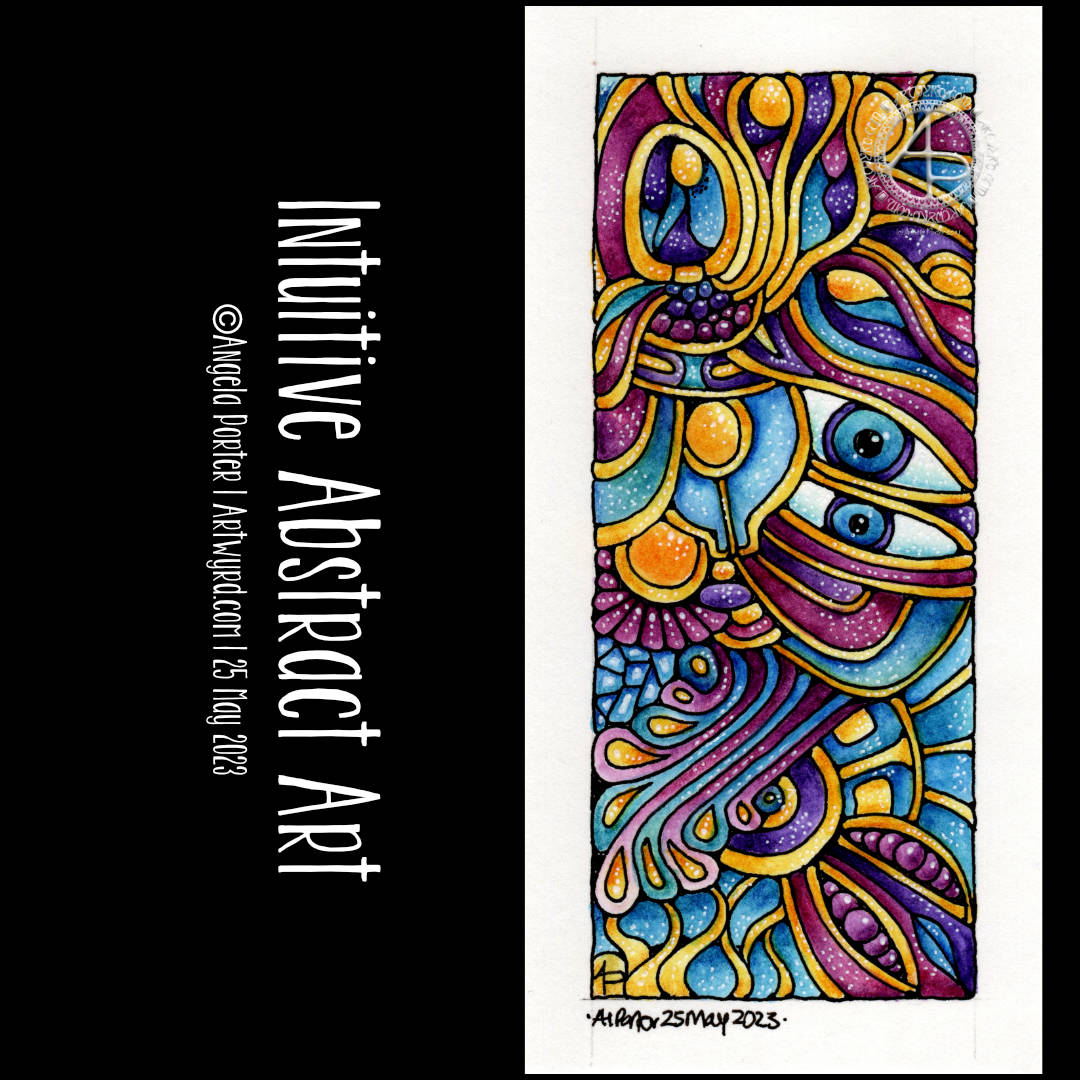
It’s been a funny few days here, culminating in a bit of shopping therapy yesterday. One of the items I bought was a set of the Art Nouveau Kuretake Gansai watercolour paints.
I’ve been eyeing them up often since I knew they were a thing. Yesterday, I finally splurged out on them, as well as various metallic (mostly gold) acrylic paints and inks and some beautiful ramen bowls. Well, even an artsy person has to eat!
This little drawing was done in my latest video, all for the purpose of trying out the colours and the paints.
I absolutely love the colour palette and I need to recreate it digitally for sure!
I get so frustrated with watercolours, perhaps because I’m trying to do it the way other people do watercolour rather than trusting my own way of expressing myself with colour. So, I did my very best to let go of any preconceptions of these watercolours as I worked with them.
I love the way some delicious textures appear spontaneously. How different for me to like this compared to my usual very smooth colour blends. I find the randomness, the spontaneity and magic with which they appear quite fascinating. It’s something I can’t control, and I find that I don’t want to control it. I want to be surprised!
Oh, before adding the Gansai Tambi, I used a Payne’s Grey Inktense pencil and a waterbrush to add some shade to the areas I’ve added colour to.
The Gansai Tambi colours are transluscent enough to let the shading show through. Indeed, they fade gradually and wonderfully as they are blended out in an area.
The other thing I did, well one of them, was to add colours to the sections before adding any texture patterns. That worked nicely; the paint does seem to have a chalky residue that shows up on the black lines. Must remember to make the gaps between lines big enough for my favourite paintbrush! Or, just use traditional brushes and a jar of water; but with that comes the danger of clumsy me knocking the water over…
I tried out a white pigment ink gel pen (Pilot choose) to draw with, as well as a gold Pentel Hybrid Dual Metallic pen.
This drawing really is an opportunity for me to try things out, with no stressing about wrecking an original drawing. I’ve already managed that with one drawing that will now be kept for trying out different colours, media, mixes of media and so on. Luckily, I had scanned that one in before I attacked it with Inktense pencils and gold acrylic paint! Tradigital it is for that design then …
It’s so nice to feel comfortable with a medium I’ve struggled with so much -watercolour. Doing it my way seems to be somethign I need to accept as being acceptable. Art is a personal expression, as such is there a wrong or right way to create? I know in my videos I often mention ‘this is how I do things, it’s not the only way and if it helps you find your way, then that’s fantastic!’.
I think we have to try lots of different things and eventually we circle in to what are the ways that really express something of ourselves creatively. It means many attempts that end in frustration or disappointment or failure. But these aren’t really failures; the lesson is that this may not be right for us at this time, if ever. They aren’t a failure if they spur us on to try out something new.
And that is why it’s important to take time to create more personal art, just for the joy of creating and exploring and trying things out. It freshens us up, even if, as I have done recently, we return to way of drawing that is is so familiar it’s comforting to do.
And perhaps art that gives us that comforting, satisfying feeling along with true self expression is the place where our arty heart wishes to reside, with trips out to add inspiration and blow the cobwebs out of the vault of motifs, patterns, textures, themes, techniques and materials. And that trip out can be physical or through looking at books or online or even through dreams and daydreams or the view from a window, music or stories, films or tv programs, and more. Not all journeys are physical ones, are they?
My brain now hurts, so I need some tea to drink soon! Just some social media posts to finish first…
The last couple or so days I’ve been immersed in drawing intuitive, abstract art. I really wanted to bring one to life with colour, but the ones drawn on A4 paper just felt too much to do.
My solution? Cut some paper into smaller pieces and use one of them! So I did. The paper is 14cm x 7cm and is Canson Imagine mixed media paper. To draw the design I used a TWISBI Eco filled with black Dokumentus ink and fitted with an extra fine nib.
I just let the lines flow as they needed to, each one leading to the next, doing whatever felt right.
Then, it was time to add colour and I dug into my Inktense pencils. This time, I layered colours to get the intensity of colour I wanted and added highlights with a white pigment gel pen from Pentel.
Oddly, I didn’t want to add much in the way of patterns or details in the sections. I just thought they were just fine as they are.
I’m left puzzling a little as to why eyes so often appear in my intuitive art. I don’t even realise I’m drawing or have drawn them until the drawing is done!
As it’s intuitive art, it speaks for what is going on within me. The shapes and lines and colours chosen represent my inner wellbeing in terms of my mind and emotions. Or maybe they speak about what I need at this time. Blue for peace, calm, tranquility. Pinks for gentleness, compassion and kindness towards myself. The purple is more to do with the wonders there are in nature and the universe and life. The threads of gold … well … light, warmth, sunshine that supports the vast majority of life on this planet…child-like joy, pleasure, wonder with what I have in my life, the things that are precious, golden, to me.
It’s easy when the traumas of the past rear their heads and do their best to drag me down into a dark abyss of the heart and mind. I think I needed to do this drawing today to help remind me of what there is in me and what I need at this time.
My intuitive, entangled, abstract art is perhaps the most personal kind of art I share with people. It comes from within, from my heart and soul, not my head. And today was the day I fully realised that this is why I create art like this, and almost face palm at how long it’s taken me to realise it! Almost facepalmed…as I also know these insights and realisations come when we’re ready for them.
All the same, I feel kind of exposed when I share this kind of art as you get to see past the mask I wear to try to fit into a world where I feel out of step, awkward, clumsy, weird, different, a square peg in a world that only has round holes for round pegs. I’ve always felt that way and I’m on a journey to discover why that is.
Through this kind of art, I get to express my sense of wonder and emotions that aren’t easy to access. The visual-hoard of patterns and shapes and forms that is stored in my subconscious flows out naturally and easily in ways that are pleasing to me, and I’m really chuffed if you find them pleasing too!
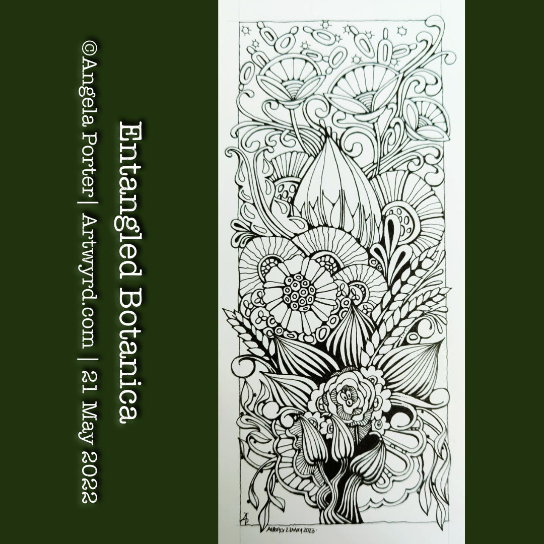
The need came over me to draw something botanical in nature. So, I picked up an 01 Sakura Micron Pigma pen and a piece of Canson Imagine mixed media paper approx 10cm x 21cm (4″ x 8.25″). I let the ink flow from the pen to form all the various stylised, imaginative botanical motifs.
It has been a lovely few hours drawing this small (in size) and intricate design. I now need to decide how to add shade and colour to it. But there is no rush on this. I’m accumulating a sizeable number of drawings that all need to be coloured either traditionally or digitally. This drawing I really do want to scan in before I start to attack it with traditional media, just in case I seriously mess up.
My favourite medium to use on the Canson Imagine paper is Inktense by Derwent. I love the vibrancy of the colours when they are activated with water. Tomorrow, I should have the new colours in the range delivered. So, I will definitely hold off adding colour until I’ve familiarised myself with them.
For now, it’s on to the next piece of small art, probably with a botanical theme, though who knows what kinds of patterns will fill the space too!
The design was drawn with a medium nib TWISBI Eco fountain pen filled with Documentus Ink on an A4 sheet of Canson Imagine mixed media paper.
I’ve added colour digitally, so making this tradigital art! Why digital colouring? Well, partly because I can, but also I can try different colours out.
Adding colour was interesting it seems. I started thinking I’d use softer, more muted, less saturated colours. But that soon changed, without any conscious decision, to richer and glowing jewel-like or metallic colours.
As I tend to work very intuitively, whether drawing or adding colour, what appears in my creation is an expression of my unconscious, inner self. I’m sure there’s a message of some kind here for me about me!