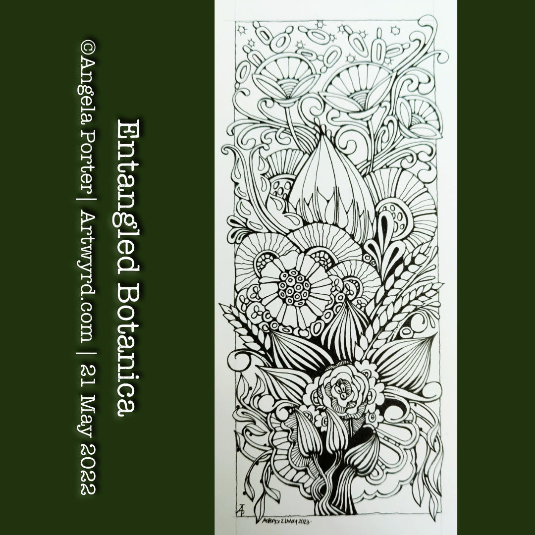
Twiddly Art…

The Art

Shells, spirals, foliage and arcs. Things that make me smile!

This drawing was a departure from my recent, more whimsical work—a much-needed change. Indeed, change is as good as a rest. Not just a rest, but the change brings a different kind of energy to my drawing and to myself.

I’ve found it very difficult to settle to do art for more than half an hour or so for a few days. I’ve felt a bit ‘bored’ with the whimsical things. Perhaps jaded is a better description. I’d become frustrated with watercolours, with colours, with my hand lettering.

So, it’s time to take that break from the whimsy and spend some time with pen and paper and some abstract twiddles.

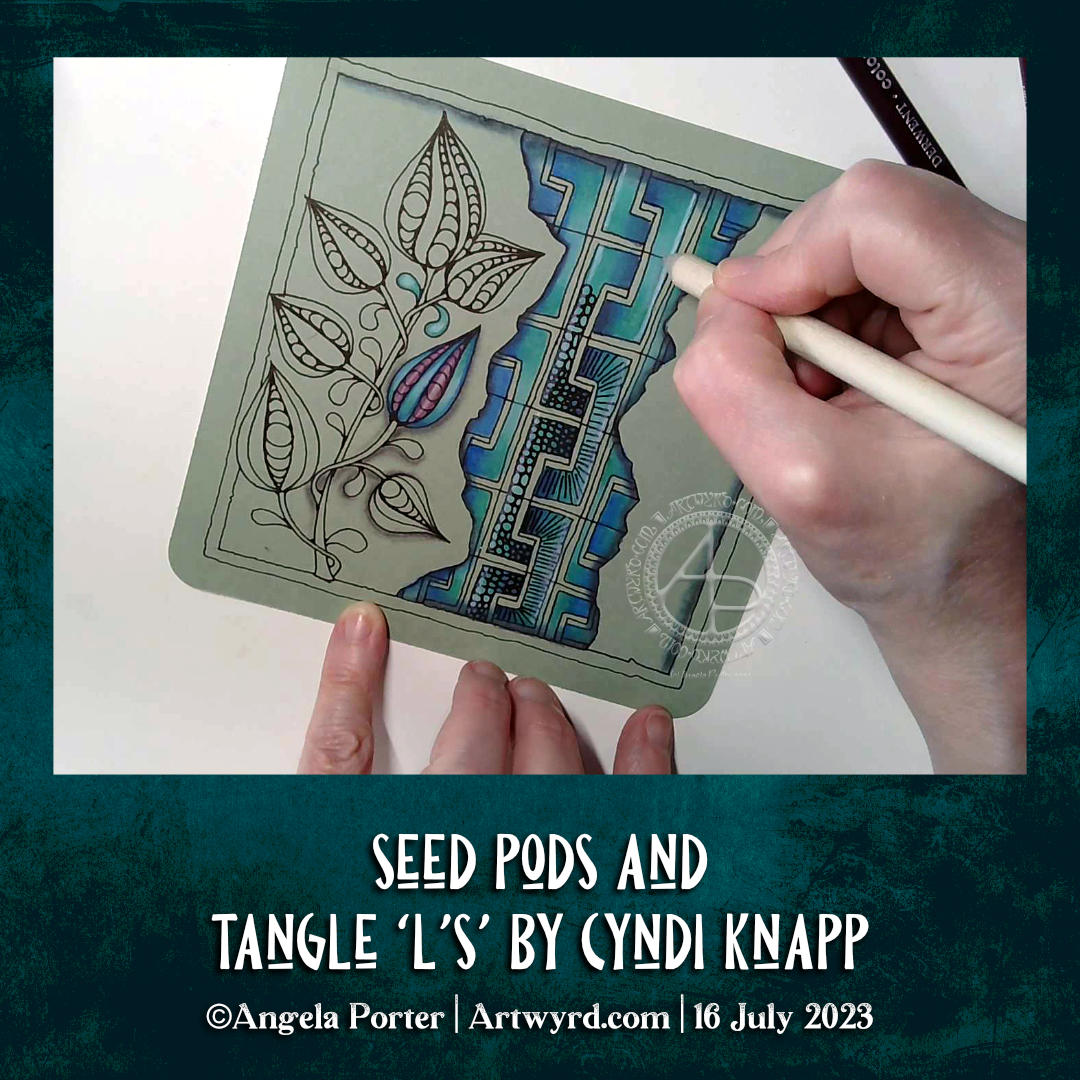
One thing I’ve taken from the whimsical drawings is the use of 01 and 005 fineliner pens to draw with. These are much finer than I’d usually work with. However, they were a delight to use! I like the more delicate lines that result.

I’ve not quite finished this drawing, however. I’ve decided to add some crosshatching to the background. Not solid black, but very fine crosshatching. It’s going to take a while to finish that though.

My Mood

I’m out of sorts today. In fact, I have been for a few days. I’ve been sleeping a lot more than usual. I think I know what’s the matter, and it’s something only I can do something about, even though I don’t know how to do anything about it…yet.

The change in art style, a return to something that is kind of familiar yet a little different, is comforting and a solace for me. It’s like visiting with old friends. It’s giving me a break from the whimsical work that has pushed me towards discomfort with it. So, it’s time to rest in some comfort. As I do so, I will gather my wits and strength to continue the exploration of whimsical people when I’m good and ready to do so.

There is nothing wrong in retreating from discomfort, unease, and that which results in becoming jaded and ‘bored’. In fact, it is essential to find the pleasure once again, to delight in a familiar style of art and remind myself how I need to feel with any creative endeavours.

The areas of discomfort allow progress and new things to be learned. However, it’s a fine line between discomfort being a positive thing, and discomfort becoming a ‘boredom’ that is a sign that the discomfort and dissatisfaction with the work being produced is just too much and counterproductive.

I’ve worked that out, kind of. All I need to do is remember this lesson in the future. That may be difficult, as I tend to focus so much on something new that I find it hard to set it aside for a while. The hyperfocus can be strong! However, I will return to the whimsical art, when I’m ready to. When I’ve refreshed my creative soul and my mood lifts too.

It’s good that I have art styles to fall back on that always bring my contentment and relaxation. Remembering this is the hard part!

Creepy Cute Artwork and Burnout…Again!

I’m delighted with this artwork/illustration. I love the colours, the silly, creepy, cute characters, and the whimsical nature of the design. There was a smile on my face, a giggle on my lips and joy in my heart as I gradually brought the characters to life. The joy also came from the sensuous pleasure of working entirely with traditional media.

I hope I’m gradually getting to grips with using crosshatching and textural patterns to add shadows to the designs. There’s a way to go before I work out all the intricacies and the way I like to do this, but I’m quite happy with it for now.

To add colour, I used Chameleon Color Tones and Color Tops alcohol markers, with a couple of Winsor and Newton Promarkers in places. The Chameleons worked really well for me. Also, I remembered to use tip-to-tip blending so I could fade the colours out with the Promarkers, too.

Today, I very much needed some time to work quietly in an artistic manner. I’ve burned myself out through too much ‘peopling’ in the past couple of weeks. I’d nearly recovered, but an encounter with scammers threw me into total emotional overwhelm yesterday and I now need a few days to recover. Well, at least I will after I phone my bank again tomorrow to start the fraud investigation.

I love to draw and create. My creepy cute critters are currently my favourite thing to do. They’ve followed on from the colouring book I finished at the beginning of this month – “Haunted”, which is due to be released towards the end of October 2024.

Actually, as I think about it, I was playing around with silly creepy creatures about a year and a half ago, but put them to one side for a while.

Of course, the artwork above was entirely for my own pleasure and exploration of how I’d like to create these critters. I already know that some, if not all of them, will be featured in their own artwork, perhaps with a story to tell or some lore about them. I wonder what kinds of things that will be. I don’t know for now, but I trust my imagination will come out in words too. That won’t be now, however. I’m now tired for today and need to prepare for bed, for me and my creepy weirdies to rest and sleep and to dream up some joyful tales. And names. They definitely need names!

William Blake Quote and some Entangled Art.

This drawing has taken a bit of an unexpected turn, to say the least.

Two black ink-filled Parker Jotter XL fountain pens, one with an M nib and the other with an F, were used to draw the structure of this drawing and add some patterns and textures.

I then decided to use some Zebra Sarasa gel pens with vintage colours to add more patterns and textures. All was fine, but it all looked flat and not finished in any way.

So, I added some flat colours with softly coloured alcohol markers. This improved things a little, but it wasn’t quite right. The drawing was missing contrast and dimension.

A deep breath was taken as I broke out a graphite pencil and tortillon and set to adding shade to the design. And that really did help, much to my surprise. Even more surprising was I actually preferred this way of adding shade to using alcohol markers, and it was easy to remove any overspill of shading with an eraser!

Next, I added some layers of the colours I’d already used to intensify the colour in some areas. I also added some more darkness with pen textures.

Finally, I was happy-ish with what had been created on the paper, so much so that I felt it was finished!

Yes, that’s right, I’m happy-ish with this! Using less saturated alcohol markers to add colour also works for me, especially the more muted, vintage and less bright and garish.

What works for me is seeing the drawing scanned in, as scanning seems to improve how I view the graphite shading.

So, is this an onward process for me? Yes, I think so. I think the graphite shading needs to be added last. Also, I think the use of Pitt Graphite Matt pencils will improve how I view the use of graphite in this way. Maybe coloured fineliners would work better for me than the gel pens. Things to consider (and make a note of too!)

Seed Pods and Tangle L’s by Cyndi Knapp

I drew this design in my latest YouTube video, which premieres today, 16 July 2023, at 21:00 UK time.

It’s a draw with me video, where I show you how to draw this design, step by step. I also do some colouring, shading, highlighting and addition of texture patterns. I don’t, however, complete the drawing in the video.

Currently, I really enjoy drawing designs where there are layers included, like a collage or a break and the floor or wall to see what lies beneath or behind them.

Seed pods are one of my favourite things to draw. There are so many different kinds, both based on reality and imagination. Today, I stuck with the familiarity of plump, teardrop-shaped pods. The tangle pattern between the faux ripped edges is called L’s, and it’s by Cyndi Knapp. It is a bit of a challenge to draw, well, for me at least. It does result in a curious interweaving pattern, however, and is worth the time spent mastering it.

I used a piece of grey-green PaintOn mixed media paper from Claire Fontaine. The colours almost glow against the paper. To add colour, I used Derwent Coloursoft pencils along with tortillons and Gamsol to blend them.

Although I haven’t finished this drawing yet, I’m quite happy with how it’s working out.

I have needed a couple of days of quiet time this weekend. I over-stretched myself last week in some ways. When I find inspiration lacking, I know I’ve overdone it. Hopefully, these two quiet days will give me renewed energy to carry on with the illustrations for Daydreams, my next colouring book. The self-doubt and fear that I’m not good enough – imposter syndrome – has awakened for some reason, and it robs me of my oompf. I will push through it, however. I always do.

“Purple Roses” Entangled Botanica Tag/Bookmark WIP

Cool, soothing, calming blues, teals and purples are just what my migraine befuddled self needed this afternoon. The migraine had mostly lifted, but left me feeling tired, ‘off with the fairies’. I decided to film this drawing as I thought those who like to draw along with me would enjoy some flowers, this time roses.

I coloured the background with Distress Inks, and added a little texture with a stencil. Water splatters are a must, dried with a heat gun to give that darker edge to them.

I love the way the texture and variation in the depth of colour shows through the coloured pencils that are applied to bring volume to the drawing. I used Gamsol and tortillons/paperstumps to blend the colour pencils out and create highlights and shadows.

Touches of gold ink will bring some precious luxury to the design.

There’s still a lot to do, however. The first coat of added pencil colour needs to be completed. There may be a need to intensify contrast. And then there’s the patterns and contour lines to be completed with ink. A drop shadow, white ink highlights, and more shimmery golden details.

The appearance of torn, collaged, patterned paper to the right of the tag is becoming a favourite thing of mine to add.

I hope a good night’s sleep will come tonight and I’ll wake tomorrow feeling as ‘with it’ as I’m able to be. I have work to do for my next colouring book called “Daydreams”.

Accompanying YouTube #DrawWithMe Tutorial Premieres at 20:00 UK Time 5 June 2023.

Intuitive Abstract Art WIP

It’s been a funny few days here, culminating in a bit of shopping therapy yesterday. One of the items I bought was a set of the Art Nouveau Kuretake Gansai watercolour paints.

I’ve been eyeing them up often since I knew they were a thing. Yesterday, I finally splurged out on them, as well as various metallic (mostly gold) acrylic paints and inks and some beautiful ramen bowls. Well, even an artsy person has to eat!

This little drawing was done in my latest video, all for the purpose of trying out the colours and the paints.

I absolutely love the colour palette and I need to recreate it digitally for sure!

I get so frustrated with watercolours, perhaps because I’m trying to do it the way other people do watercolour rather than trusting my own way of expressing myself with colour. So, I did my very best to let go of any preconceptions of these watercolours as I worked with them.

I love the way some delicious textures appear spontaneously. How different for me to like this compared to my usual very smooth colour blends. I find the randomness, the spontaneity and magic with which they appear quite fascinating. It’s something I can’t control, and I find that I don’t want to control it. I want to be surprised!

Oh, before adding the Gansai Tambi, I used a Payne’s Grey Inktense pencil and a waterbrush to add some shade to the areas I’ve added colour to.

The Gansai Tambi colours are transluscent enough to let the shading show through. Indeed, they fade gradually and wonderfully as they are blended out in an area.

The other thing I did, well one of them, was to add colours to the sections before adding any texture patterns. That worked nicely; the paint does seem to have a chalky residue that shows up on the black lines. Must remember to make the gaps between lines big enough for my favourite paintbrush! Or, just use traditional brushes and a jar of water; but with that comes the danger of clumsy me knocking the water over…

I tried out a white pigment ink gel pen (Pilot choose) to draw with, as well as a gold Pentel Hybrid Dual Metallic pen.

This drawing really is an opportunity for me to try things out, with no stressing about wrecking an original drawing. I’ve already managed that with one drawing that will now be kept for trying out different colours, media, mixes of media and so on. Luckily, I had scanned that one in before I attacked it with Inktense pencils and gold acrylic paint! Tradigital it is for that design then …

It’s so nice to feel comfortable with a medium I’ve struggled with so much -watercolour. Doing it my way seems to be somethign I need to accept as being acceptable. Art is a personal expression, as such is there a wrong or right way to create? I know in my videos I often mention ‘this is how I do things, it’s not the only way and if it helps you find your way, then that’s fantastic!’.

I think we have to try lots of different things and eventually we circle in to what are the ways that really express something of ourselves creatively. It means many attempts that end in frustration or disappointment or failure. But these aren’t really failures; the lesson is that this may not be right for us at this time, if ever. They aren’t a failure if they spur us on to try out something new.

And that is why it’s important to take time to create more personal art, just for the joy of creating and exploring and trying things out. It freshens us up, even if, as I have done recently, we return to way of drawing that is is so familiar it’s comforting to do.

And perhaps art that gives us that comforting, satisfying feeling along with true self expression is the place where our arty heart wishes to reside, with trips out to add inspiration and blow the cobwebs out of the vault of motifs, patterns, textures, themes, techniques and materials. And that trip out can be physical or through looking at books or online or even through dreams and daydreams or the view from a window, music or stories, films or tv programs, and more. Not all journeys are physical ones, are they?

My brain now hurts, so I need some tea to drink soon! Just some social media posts to finish first…

Adding a bit more colour to the bookmark

Accompanying colour with me video on YouTube.

I so love Inktense pencils! However, I noticed that a lot of graphite was picked up by the brush and dissolved Inktense when I was adding colour. I had a sudden flash of insight; try using a grey Faber-Castell Pitt Artist brush pen to put in the shadows. So I did.

The Pitt artist brushes have india ink in them; when the ink dries it is waterproof. If I was working on larger areas, I’d use a damp brush to soften the edge of the shadow before the ink dries. That wasn’t an option for me with this small drawing.

As I added Inktense, I could tell the colour was much more vibrant, but the shadows subtly show through. There was such a difference between the latest sections added and the ones in my previous video/post that I went back and added another layer of colour to these areas. That then matched the vibrancy and clarity of colour across the whole coloured area.

I decided to add some jewel-toned blue. Though I’m not sure that was a good idea at this point, it kind of works as it is kind of a complementary colour to all those yellow-orange-red tones! I also added the blue to the green areas, which seemed to make them more vibrant too.

I always find it easier to add colour to more abstract artworks, using a fairly limited palette too. I have started adding colour to the Entangled Botanic drawing in my previous blog post. I’m really not sure about the colours at all. Fortunately, I scanned the drawing in before setting to it with Inktense pencils and waterbrush. I also know that if some of the colours are a bit garish, I can always tone them down with a layer of another colour. I also think I may add some golden texture/dots to the design too.

Today, I spent a rather lovely couple of hours swatching all my Inktense pencils, including the new set of 24 released this year. There are some beautiful colours in that set and they fill in some holes in the original colour palette. I may very well scan my swatch in and use it to create a colour palette in Clip Studio Paint.

The pot I keep all my Inktense in is a tad small for them all, so I’ve splurged on a case that will hold all of the Inktense and my set of Chromaflow pencils (as long as I weed out the duplicate Inktense pencils). Putting them in order in the case will reduce the frustration of not being able to find the pencil I need in the pot they’re in now!

For now, I think I need some tea!

Entangled Botanica 21 May 2023

The need came over me to draw something botanical in nature. So, I picked up an 01 Sakura Micron Pigma pen and a piece of Canson Imagine mixed media paper approx 10cm x 21cm (4″ x 8.25″). I let the ink flow from the pen to form all the various stylised, imaginative botanical motifs.

It has been a lovely few hours drawing this small (in size) and intricate design. I now need to decide how to add shade and colour to it. But there is no rush on this. I’m accumulating a sizeable number of drawings that all need to be coloured either traditionally or digitally. This drawing I really do want to scan in before I start to attack it with traditional media, just in case I seriously mess up.

My favourite medium to use on the Canson Imagine paper is Inktense by Derwent. I love the vibrancy of the colours when they are activated with water. Tomorrow, I should have the new colours in the range delivered. So, I will definitely hold off adding colour until I’ve familiarised myself with them.

For now, it’s on to the next piece of small art, probably with a botanical theme, though who knows what kinds of patterns will fill the space too!

An intuitive, abstract, entangled piece of small art

Link to the accompanying Draw With Me video on YouTube

I had a lovely couple of hours this afternoon drawing and then adding colour to this small artwork. And small it is; the paper I used is an approx 10cm x 10cm (about 4″ square) piece of Canson Imagine mixed media paper.

I chose this paper as I enjoy drawing on it with a fountain pen. Today’s pen was an extra fine nibbed TWISBI Eco pen filled with black Documentus ink. This particular ink is archival and waterproof. Perfect as I had decided to add colour using Inktense pencils and a waterbrush.

The more muted, earthy tones do suit my present mood. I’m feeling rather tired, flat and disconnected from everything. Perhaps the earthy tones represent a need to spend more time with the physical world rather than in my head, imagination and creativity?

I do know what has caused this mood – too much adulting, people-ing and a couple of other things that I’m not going to share (sorry!). Out of sorts is what I am and have been for a while. I know it’s a temporary thing for me, a readjustment to changes that are ongoing.

The daily dose of anti-depressant/anti-anxiety meds keep me from sliding down into a dark pit of despair and tsunamis of tears. I know they only mask the anxiety I feel when I’m around people, whether one or many. My hands shake, my vision is different as the hypervigilance kicks in. Getting home means time relax and rest and it can take me days to recover from each people-ing.

All I’ve wanted to do for the past couple of weeks (or even few months) is to lose myself in art, audiobooks, music, and interesting tTV.

And, to circle back, my art tends to reflect this in one way or another.

I am learning to embrace the imperfections that appear as I use Inktense pencils and a water brush to add colour. I’m starting to accept that the imperfections create intriguing textures.

Discovering interesting shapes and patterns in my drawings is also fascinating to me. I need to remember to use a ‘viewfinder’ as I did two decades ago when my art journey began. Isolate a section of a drawing to re-draw on a bigger scale and work on developing it as a new work.

Hanging on my walls are three oil paintings I did about twenty years ago. They are abstracts of patterns from the robes of a Romanesque angel sculpture, the cogs from a diesel locomotive and the worm screws from a steam locomotive. I used a view finder to isolate the sections of my photographs/drawings to enlarge and recreate as abstract paintings. The colours I used for each painting reflected my emotional response to the original items and places where I found them.

Each of these oil paintings have a lot of contrast and trick the eye into thinking they are three dimensional. I didn’t realise I’d done that until the art exhibition at the end of my AS course. People kept touching these paintings and I didn’t know why. So, I asked a friend. She said she expected to feel ridges and valleys and was surprised to find they were totally flat and the illusion was purely optical.

Once she’d pointed it out to me, I could see what she meant!

That love of using high contrast to bring out dimension hasn’t left me. I’m not sure I’ve achieved a great level of contrast in this small drawing; there are some areas where shapes appear to curve up or down and where layers are more apparent. I may revisit this little artwork to increase the contrast at some point in the future. Maybe.

Tangle Pattern Sampler

YouTube #DrawWithMe Video Part 1
YouTube #DrawWithMe Video Part 2

About the pattern sampler

This little pattern sampler has been fun to do! I’ve used patterns inspired by the work of Rebecca Blair, some Zentangle style tangle patterns, and possibly some variations of my own too.

I do love Rebecca’s work. I can see the influence of medieval manuscripts on her work and her love of pattern, texture and a wonderful use of textured lines too! The simplicity of her colour palettes and the myriad of ways she combines her signature patterns/textures is wonderful! I really do suggest you take a look at her work on Instagram.

I used a piece of Ohuhu marker paper that measures 4″ x 7″ ( approx 10cm x 1.7cm) and marked out the basic sections with a Uni Kuru Toga 0.3 mechanical pencil (and a ruler for the straight lines). The pencil lines were just a guide for me.

In the first video, I did most of the black line work using an 03 Sakura Pigma Micron pen. In part 2, I added colour using Winsor and Newton Promarkers in Ivory, Sandstone and Caramel.

After that, I added some fine line work and some colours using three Stabilo Point88 0.4 fine pens. These had olive-green kind of tones to them that worked well with the soft browns of the Promarkers.

I also added some black lines in places using a 0.1 UniPin fineliner pen.

Finally, I added highlights using white gel pens.

I really like the more monochrome, subdued colours of this finished drawing. The various panels really do have the feel of a needlework or cross-stitch sampler; hence the name!

I spoiled myself with a set of Promarkers last week, and I don’t feel a bit guilty about it! I was getting frustrated with the Ohuhu markers – way too many bright, in your face, vibrant colours and not enough subtler, less saturated colours.

I’ve also found that as nice as the Ohuhu marker paper is (and it is lovely and smooth and fab to draw on), I much prefer Winsor and Newton, Daler-Rowney or Canson Marker paper for my alcohol marker work; the ink doesn’t sink into the paper as much and the colours are more vibrant. Also, you use less ink in creating the artwork!

Organising a new pattern, texture and motif ‘repository’ and a bout of illness

I keep faffing about with this. After getting frustrated with a six-ring A5 ringbinder and the limited number of pages that can be stored within, I discovered there’s such a thing as A5 landscape lever arch files! So one was bought post haste! I still can’t draw/write directly in it, but it makes it so much easier to store paper and finished pages. So, I’m one happy bunny.

I’ve spent quite a bit of time in the last couple of weeks starting to put together my collections of patterns etc. Especially as I’ve not been too well. I had been in contact with some people who subsequently tested positive for Covid. I had a nervous few days wondering whether I’d get it. I didn’t. Instead I had runny nose, slight cough, and a mild case or tonsillitis!

I’ve not had tonsillitis for the best part of twenty years. The last time I was getting it 4 times a year and was referred to an ENT surgeon. Let’s just say he didn’t need to use the tongue pressor thing to see my tonsils – they’re permanently large and have lots of tunnels (crypts) inside them from all the tonsillitis I’ve had from a young age. Seeing the surgeon seemed to scare the tonsillitis away; I elected not to go through with surgery to remove the tonsils. There are potentially serious complications that can arise in an, ahem, older person.

Anyhoo, It was a mild case. All covid tests for over a week were negative. But I’m left feeling run down from being ill. I’ll recover gradually!

Losing myself in reorganising and redrawing patterns etc was just what I needed. I’ve barely made a dent in my collection, especially as I’ve added loads more variations as I go! I know it’s going to be a long term project, for sure.

Other arty stuff

I have done other arty projects since my last post here. But the fatigue has been strong and my concentration and focus weak. I will post a gallery of them in the next day or two!